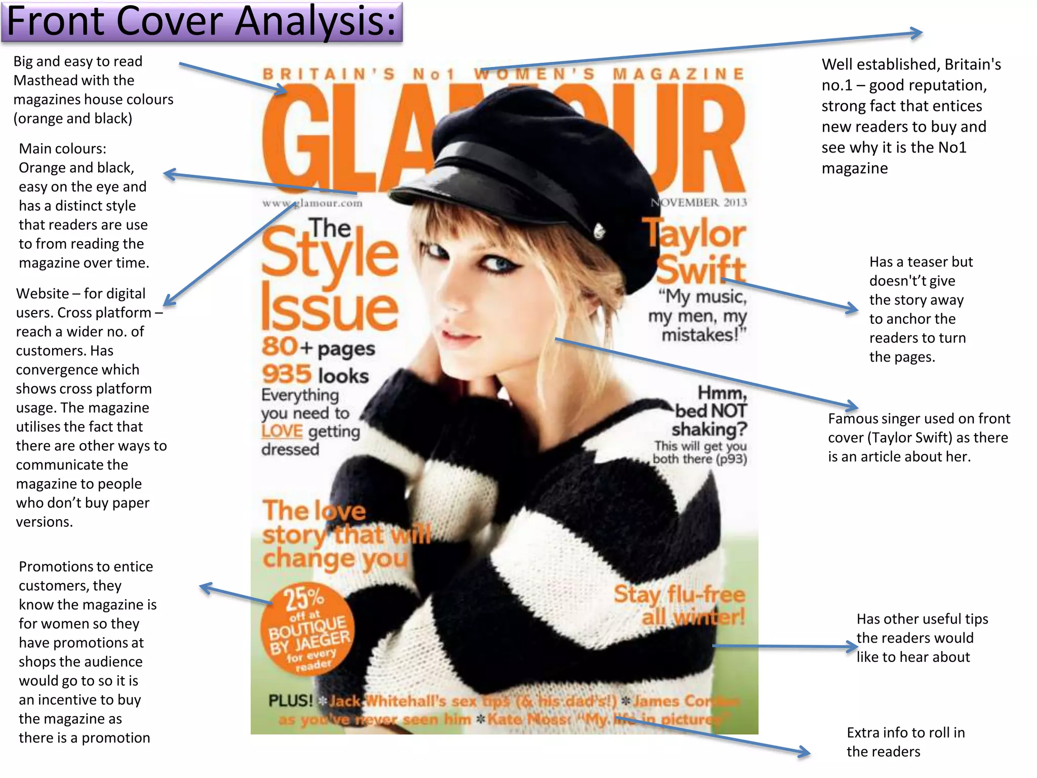
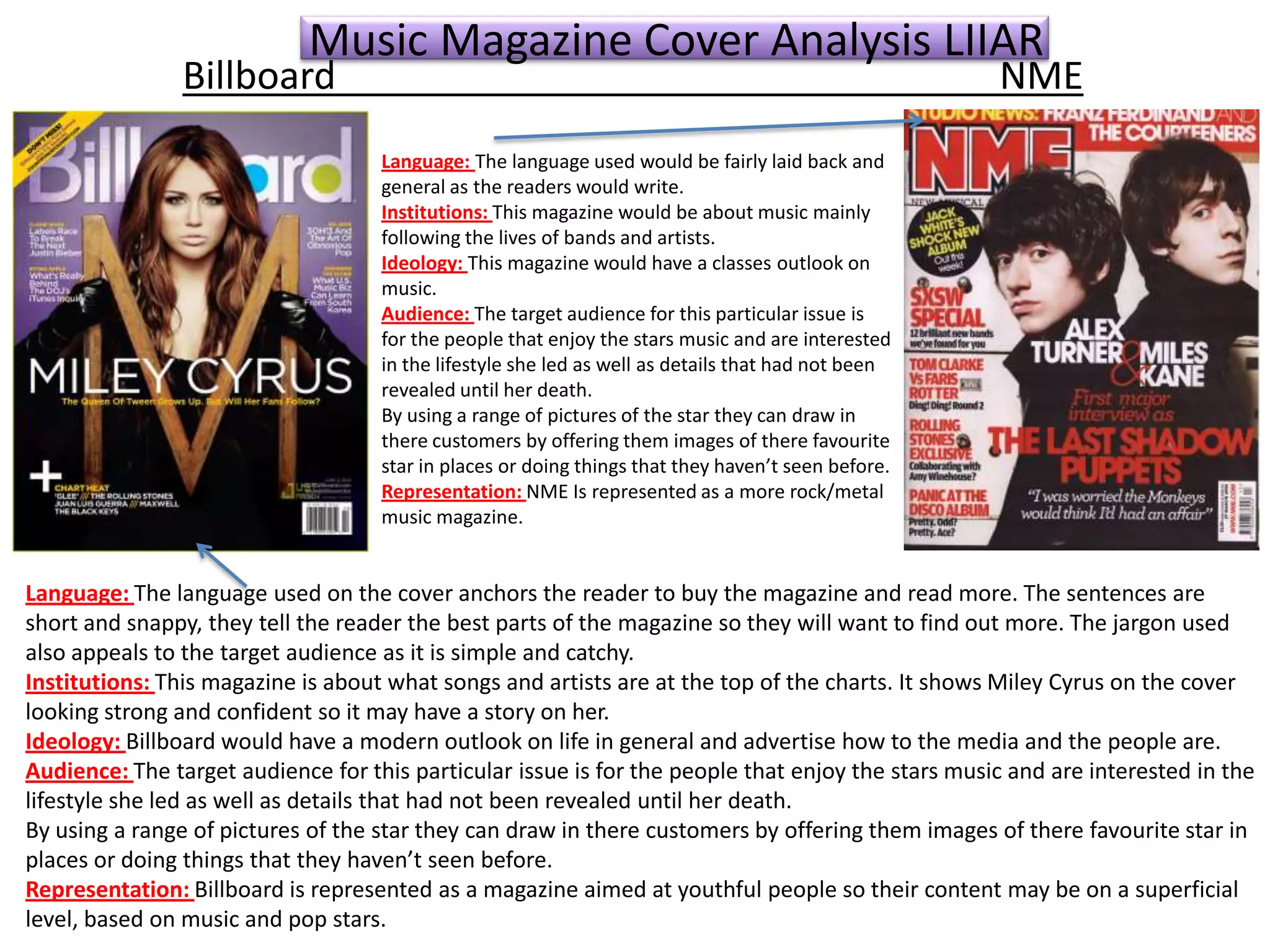
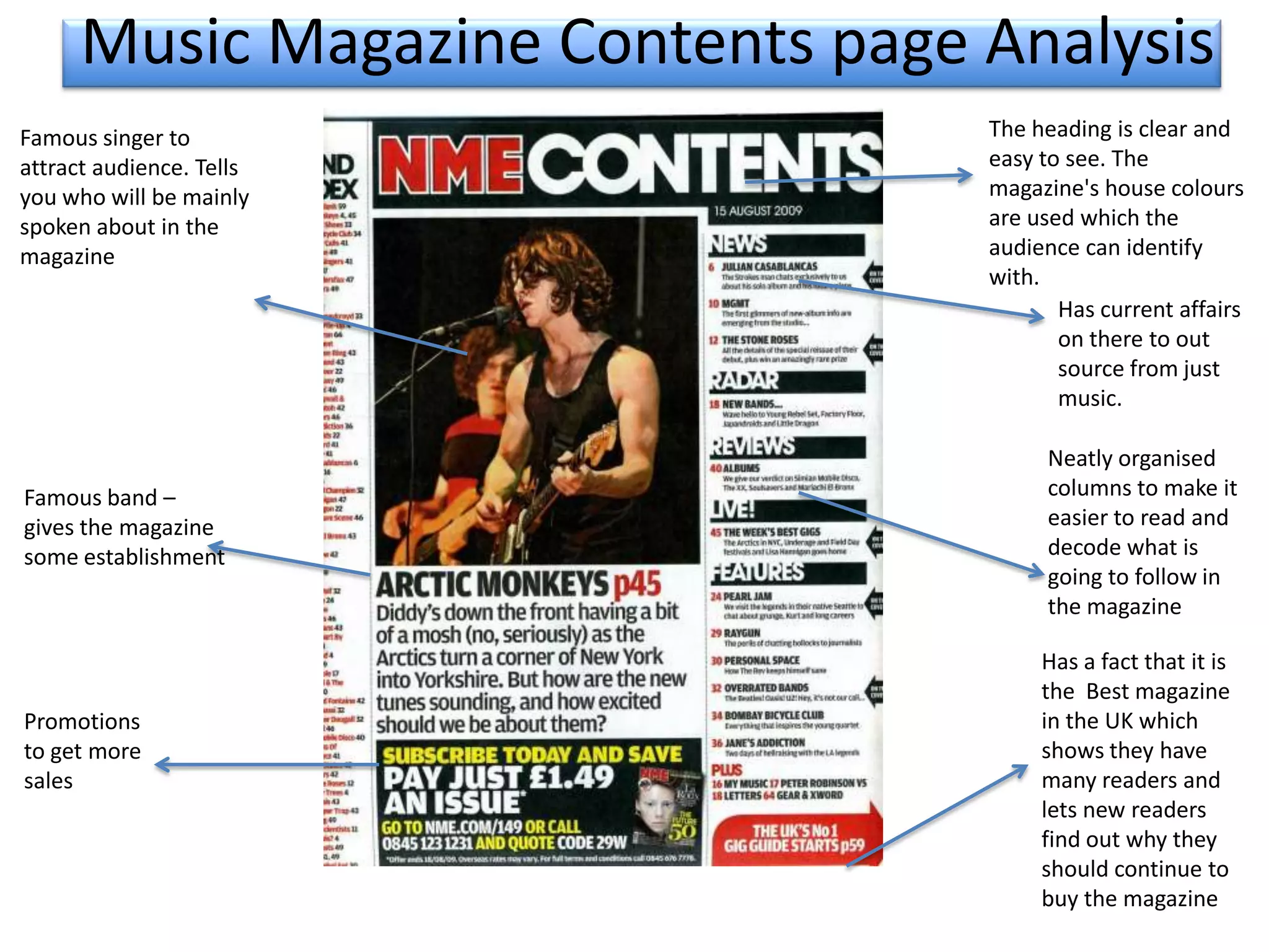
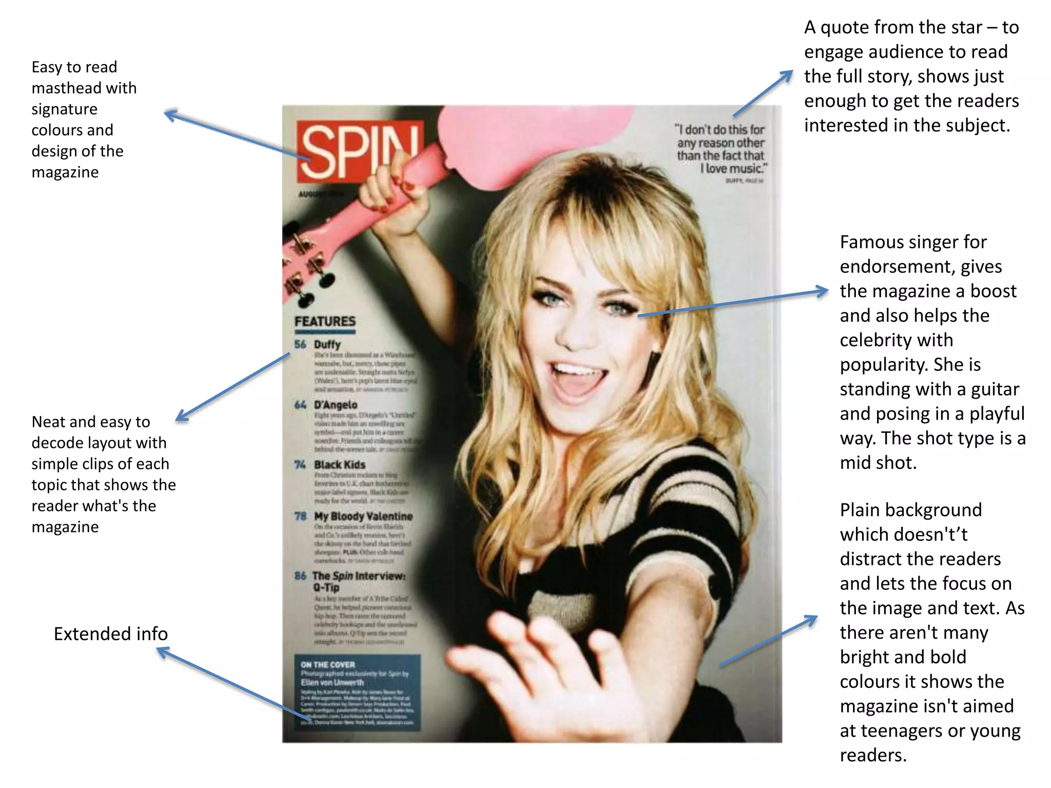
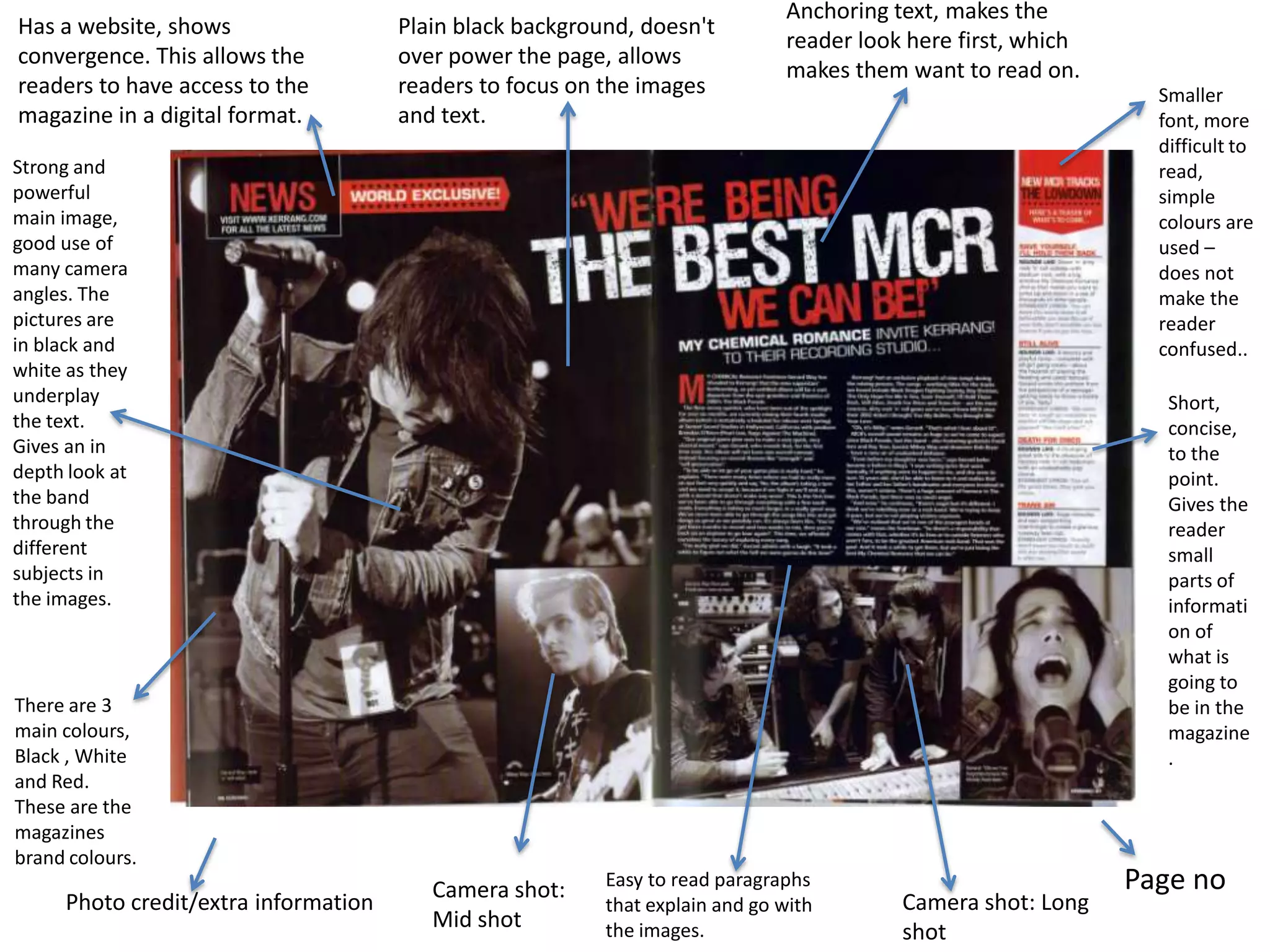
Market Research + Magazine Analysis
To find out what magazines do to anchor readers I researched music magazines to find
out which magazines are the best sellers and who their target audience is. I found
“NME” and “Billboard” to be the most popular and their target audiences are similar
to each other (teenagers and above) They use specific techniques that show that it is
aimed at teenagers such as the bright, bold colours and big text attract the attention
of younger audiences. Billboard is a more youthful magazine which doesn’t have one
specific genre as it writes about the main artists of the time, from pop to rap and
electronic. They mainly feature young artists around the same age as the readers.
I did a front cover analysis of 3 magazines and 2 contents pages and a double page
spread and found that all the magazines feature a famous singer/celebrity – this may
be to catch the audiences attention and to buy the magazine if they like the artist. The
use of bright colours is also a common feature. All the magazines have set brand
colours they use on the front cover that allows the readers to familiarise themselves
with the magazine.
I may not be able to get my own image of a famous artist but I plan to get my image in
central London of a street performer and make a page dedicated to him/her to tell
their story. I also asked a few people at school who were willing to pose as celebrities
to imitate a real celebrity.
Front Cover Analysis:
Big and easy to read
Masthead with the
magazines house colours
(orange and black)
Main colours:
Orange and black,
easy on the eye and
has a distinct style
that readers are use
to from reading the
magazine over time.
Website – for digital
users. Cross platform –
reach a wider no. of
customers. Has
convergence which
shows cross platform
usage. The magazine
utilises the fact that
there are other ways to
communicate the
magazine to people
who don’t buy paper
versions.
Promotions to entice
customers, they
know the magazine is
for women so they
have promotions at
shops the audience
would go to so it is
an incentive to buy
the magazine as
there is a promotion

Well established, Britain's
no.1 – good reputation,
strong fact that entices
new readers to buy and
see why it is the No1
magazine

Has a teaser but
doesn't’t give
the story away
to anchor the
readers to turn
the pages.

Famous singer used on front
cover (Taylor Swift) as there
is an article about her.

Has other useful tips
the readers would
like to hear about

Extra info to roll in
the readers
Music Magazine Cover Analysis LIIAR

Billboard

NME

Language: The language used would be fairly laid back and
general as the readers would write.
Institutions: This magazine would be about music mainly
following the lives of bands and artists.
Ideology: This magazine would have a classes outlook on
music.
Audience: The target audience for this particular issue is
for the people that enjoy the stars music and are interested
in the lifestyle she led as well as details that had not been
revealed until her death.
By using a range of pictures of the star they can draw in
there customers by offering them images of there favourite
star in places or doing things that they haven’t seen before.
Representation: NME Is represented as a more rock/metal
music magazine.

Language: The language used on the cover anchors the reader to buy the magazine and read more. The sentences are
short and snappy, they tell the reader the best parts of the magazine so they will want to find out more. The jargon used
also appeals to the target audience as it is simple and catchy.
Institutions: This magazine is about what songs and artists are at the top of the charts. It shows Miley Cyrus on the cover
looking strong and confident so it may have a story on her.
Ideology: Billboard would have a modern outlook on life in general and advertise how to the media and the people are.
Audience: The target audience for this particular issue is for the people that enjoy the stars music and are interested in the
lifestyle she led as well as details that had not been revealed until her death.
By using a range of pictures of the star they can draw in there customers by offering them images of there favourite star in
places or doing things that they haven’t seen before.
Representation: Billboard is represented as a magazine aimed at youthful people so their content may be on a superficial
level, based on music and pop stars.
Music Magazine Contents page Analysis
Famous singer to
attract audience. Tells
you who will be mainly
spoken about in the
magazine

Famous band –
gives the magazine
some establishment

Promotions
to get more
sales

The heading is clear and
easy to see. The
magazine's house colours
are used which the
audience can identify
with.
Has current affairs
on there to out
source from just
music.
Neatly organised
columns to make it
easier to read and
decode what is
going to follow in
the magazine
Has a fact that it is
the Best magazine
in the UK which
shows they have
many readers and
lets new readers
find out why they
should continue to
buy the magazine
Easy to read
masthead with
signature
colours and
design of the
magazine

Neat and easy to
decode layout with
simple clips of each
topic that shows the
reader what's the
magazine

Extended info

A quote from the star – to
engage audience to read
the full story, shows just
enough to get the readers
interested in the subject.

Famous singer for
endorsement, gives
the magazine a boost
and also helps the
celebrity with
popularity. She is
standing with a guitar
and posing in a playful
way. The shot type is a
mid shot.
Plain background
which doesn't’t
distract the readers
and lets the focus on
the image and text. As
there aren't many
bright and bold
colours it shows the
magazine isn't aimed
at teenagers or young
readers.
Has a website, shows
convergence. This allows the
readers to have access to the
magazine in a digital format.

Plain black background, doesn't
over power the page, allows
readers to focus on the images
and text.

Anchoring text, makes the
reader look here first, which
makes them want to read on.
Smaller
font, more
difficult to
read,
simple
colours are
used –
does not
make the
reader
confused..

Strong and
powerful
main image,
good use of
many camera
angles. The
pictures are
in black and
white as they
underplay
the text.
Gives an in
depth look at
the band
through the
different
subjects in
the images.

Short,
concise,
to the
point.
Gives the
reader
small
parts of
informati
on of
what is
going to
be in the
magazine
.

There are 3
main colours,
Black , White
and Red.
These are the
magazines
brand colours.

Photo credit/extra information

Camera shot:
Mid shot

Easy to read paragraphs
that explain and go with
the images.

Camera shot: Long
shot

Page no
This double page spread is well structured, There are no dividing lines, just images with anchoring text
followed by the backstory.
The main image on the double page spread is as the background as this brings a lot of detail to the double
page spread and makes it more eye-catching, as well as it doesn't over power the page so the readers
eyes aren’t strained. The fact that all the images are in black and white make the images look emotional
and in depth.
The use of different camera shots for each image makes the double page spread looks more effective, it
shows the facial expressions, body language and context. If all the images had the same shot, it wouldn’t
stand out as much, this is because readers like to see a variety, not just repetition. The use of instruments
and live performances shown through the images reveal the genre more and give us an idea of the
lifestyle the band is in - rock/metal.
The facial expressions and body language of the band shows hard work, dedication and love for what they
do, this may be linking with the heading on the double page - “Were the best MCR we can be!” All of the
band members look like they are fully concentrated and living for the music which shows the readers how
important it is for them to make music and share it with the world.
The colours are very dark which ties in with the genre of the music -(Rock) it also goes along with the
lyrics that may be produced by the band that are dark and sad. The use of Red through the font goes
along with the brand colours of the magazine and makes the whole page stand out but on the other hand
can connote blood or danger which may also be a big part to what the band are like and their style of
music.
The style of font used in the header is the same as the front cover and contents page; this shows the
uniformity within the magazine. We also see that the header uses capital letters, this captures the readers
attention and relates to the music that is very enthusiastic and loud.
After looking at the contents page of this magazine, I see that the magazine genre is clearly shown in all
different areas through the use of images, font, language and layout.

Magazine analysis

  • 1.
    Market Research +Magazine Analysis To find out what magazines do to anchor readers I researched music magazines to find out which magazines are the best sellers and who their target audience is. I found “NME” and “Billboard” to be the most popular and their target audiences are similar to each other (teenagers and above) They use specific techniques that show that it is aimed at teenagers such as the bright, bold colours and big text attract the attention of younger audiences. Billboard is a more youthful magazine which doesn’t have one specific genre as it writes about the main artists of the time, from pop to rap and electronic. They mainly feature young artists around the same age as the readers. I did a front cover analysis of 3 magazines and 2 contents pages and a double page spread and found that all the magazines feature a famous singer/celebrity – this may be to catch the audiences attention and to buy the magazine if they like the artist. The use of bright colours is also a common feature. All the magazines have set brand colours they use on the front cover that allows the readers to familiarise themselves with the magazine. I may not be able to get my own image of a famous artist but I plan to get my image in central London of a street performer and make a page dedicated to him/her to tell their story. I also asked a few people at school who were willing to pose as celebrities to imitate a real celebrity.
  • 2.
    Front Cover Analysis: Bigand easy to read Masthead with the magazines house colours (orange and black) Main colours: Orange and black, easy on the eye and has a distinct style that readers are use to from reading the magazine over time. Website – for digital users. Cross platform – reach a wider no. of customers. Has convergence which shows cross platform usage. The magazine utilises the fact that there are other ways to communicate the magazine to people who don’t buy paper versions. Promotions to entice customers, they know the magazine is for women so they have promotions at shops the audience would go to so it is an incentive to buy the magazine as there is a promotion Well established, Britain's no.1 – good reputation, strong fact that entices new readers to buy and see why it is the No1 magazine Has a teaser but doesn't’t give the story away to anchor the readers to turn the pages. Famous singer used on front cover (Taylor Swift) as there is an article about her. Has other useful tips the readers would like to hear about Extra info to roll in the readers
  • 3.
    Music Magazine CoverAnalysis LIIAR Billboard NME Language: The language used would be fairly laid back and general as the readers would write. Institutions: This magazine would be about music mainly following the lives of bands and artists. Ideology: This magazine would have a classes outlook on music. Audience: The target audience for this particular issue is for the people that enjoy the stars music and are interested in the lifestyle she led as well as details that had not been revealed until her death. By using a range of pictures of the star they can draw in there customers by offering them images of there favourite star in places or doing things that they haven’t seen before. Representation: NME Is represented as a more rock/metal music magazine. Language: The language used on the cover anchors the reader to buy the magazine and read more. The sentences are short and snappy, they tell the reader the best parts of the magazine so they will want to find out more. The jargon used also appeals to the target audience as it is simple and catchy. Institutions: This magazine is about what songs and artists are at the top of the charts. It shows Miley Cyrus on the cover looking strong and confident so it may have a story on her. Ideology: Billboard would have a modern outlook on life in general and advertise how to the media and the people are. Audience: The target audience for this particular issue is for the people that enjoy the stars music and are interested in the lifestyle she led as well as details that had not been revealed until her death. By using a range of pictures of the star they can draw in there customers by offering them images of there favourite star in places or doing things that they haven’t seen before. Representation: Billboard is represented as a magazine aimed at youthful people so their content may be on a superficial level, based on music and pop stars.
  • 4.
    Music Magazine Contentspage Analysis Famous singer to attract audience. Tells you who will be mainly spoken about in the magazine Famous band – gives the magazine some establishment Promotions to get more sales The heading is clear and easy to see. The magazine's house colours are used which the audience can identify with. Has current affairs on there to out source from just music. Neatly organised columns to make it easier to read and decode what is going to follow in the magazine Has a fact that it is the Best magazine in the UK which shows they have many readers and lets new readers find out why they should continue to buy the magazine
  • 5.
    Easy to read mastheadwith signature colours and design of the magazine Neat and easy to decode layout with simple clips of each topic that shows the reader what's the magazine Extended info A quote from the star – to engage audience to read the full story, shows just enough to get the readers interested in the subject. Famous singer for endorsement, gives the magazine a boost and also helps the celebrity with popularity. She is standing with a guitar and posing in a playful way. The shot type is a mid shot. Plain background which doesn't’t distract the readers and lets the focus on the image and text. As there aren't many bright and bold colours it shows the magazine isn't aimed at teenagers or young readers.
  • 6.
    Has a website,shows convergence. This allows the readers to have access to the magazine in a digital format. Plain black background, doesn't over power the page, allows readers to focus on the images and text. Anchoring text, makes the reader look here first, which makes them want to read on. Smaller font, more difficult to read, simple colours are used – does not make the reader confused.. Strong and powerful main image, good use of many camera angles. The pictures are in black and white as they underplay the text. Gives an in depth look at the band through the different subjects in the images. Short, concise, to the point. Gives the reader small parts of informati on of what is going to be in the magazine . There are 3 main colours, Black , White and Red. These are the magazines brand colours. Photo credit/extra information Camera shot: Mid shot Easy to read paragraphs that explain and go with the images. Camera shot: Long shot Page no
  • 7.
    This double pagespread is well structured, There are no dividing lines, just images with anchoring text followed by the backstory. The main image on the double page spread is as the background as this brings a lot of detail to the double page spread and makes it more eye-catching, as well as it doesn't over power the page so the readers eyes aren’t strained. The fact that all the images are in black and white make the images look emotional and in depth. The use of different camera shots for each image makes the double page spread looks more effective, it shows the facial expressions, body language and context. If all the images had the same shot, it wouldn’t stand out as much, this is because readers like to see a variety, not just repetition. The use of instruments and live performances shown through the images reveal the genre more and give us an idea of the lifestyle the band is in - rock/metal. The facial expressions and body language of the band shows hard work, dedication and love for what they do, this may be linking with the heading on the double page - “Were the best MCR we can be!” All of the band members look like they are fully concentrated and living for the music which shows the readers how important it is for them to make music and share it with the world. The colours are very dark which ties in with the genre of the music -(Rock) it also goes along with the lyrics that may be produced by the band that are dark and sad. The use of Red through the font goes along with the brand colours of the magazine and makes the whole page stand out but on the other hand can connote blood or danger which may also be a big part to what the band are like and their style of music. The style of font used in the header is the same as the front cover and contents page; this shows the uniformity within the magazine. We also see that the header uses capital letters, this captures the readers attention and relates to the music that is very enthusiastic and loud. After looking at the contents page of this magazine, I see that the magazine genre is clearly shown in all different areas through the use of images, font, language and layout.