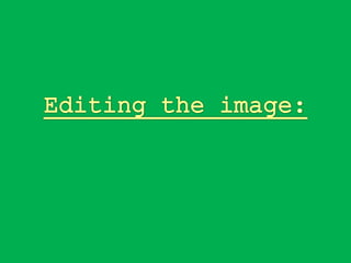
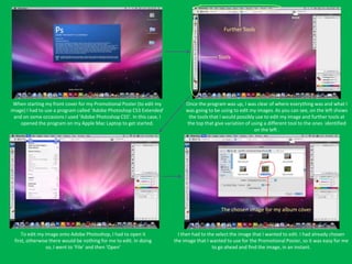
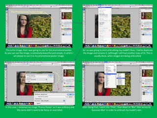
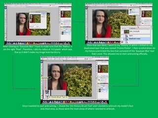
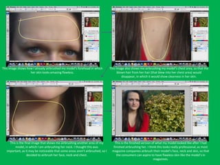
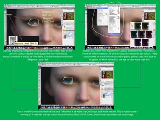
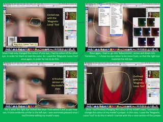
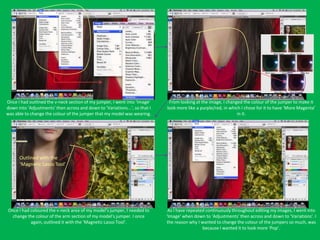
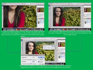
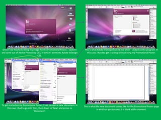
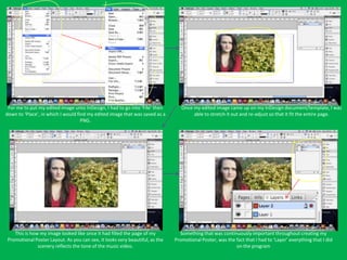
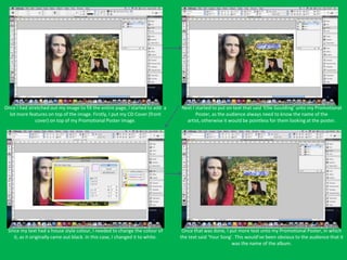
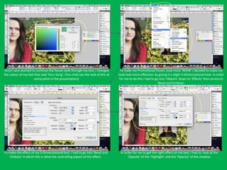
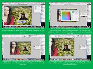
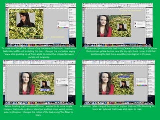
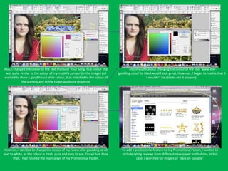
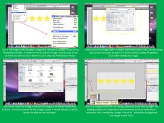
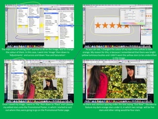
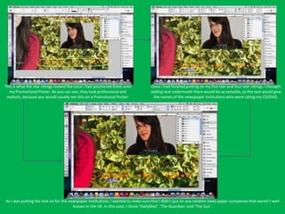
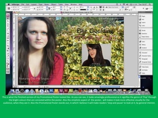
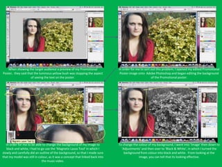
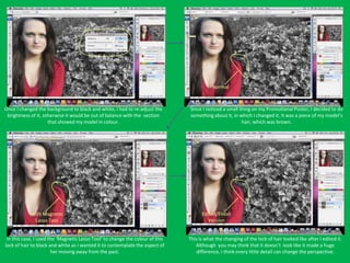
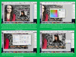
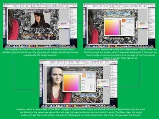
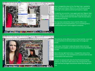
The document discusses editing a promotional poster image using Adobe Photoshop and InDesign. Key steps included opening the image in Photoshop, airbrushing the model's face and neck, changing the eye and jumper colors, and brightening the overall image. Once editing was complete, the image was saved and opened in InDesign to begin creating the promotional poster layout.
The process of developing the image to go on the front cover, contents page a...Laurie Brown
The document describes the process used to edit multiple photos for use in a music magazine. It involves cutting out the subject, smoothing edges, adjusting lighting, removing blemishes through airbrushing, enhancing eyes by making them brighter and adjusting makeup, editing lips to be brighter and stand out more, brightening teeth, changing hair and clothing colors, and enlarging lips to be equal in size. The same editing process is applied to multiple photos for use in a double page spread.
The document discusses manipulating photographs for use in a magazine. It describes editing images by flipping them, cropping out backgrounds, removing red eye and marks, adjusting lighting and colors, and adding black and white effects. The goal of manipulating the images was to make the subjects stand out equally, fit layouts, and add variety to the magazine spreads. Final manipulated images were used for the cover, contents page, and double page spreads.
The document summarizes what the author learned about technologies from creating a media music magazine. They used various tools like a digital camera, Adobe Photoshop, Adobe InDesign, and websites to create the magazine. They learned how to edit photos, work with layers, add effects like strokes and shadows, insert and extract images, and layout pages in InDesign. Creating the full magazine helped them improve skills like image extraction, color choice, use of effects, font variation, and overall layout compared to their preliminary task. The internet was also helpful for research and documenting the process through a blog.
The document summarizes what the author learned about technologies from creating a media music magazine. They used various technologies like a digital camera, Adobe Photoshop, Adobe InDesign, and websites. They learned how to use features in Photoshop and InDesign like layers, fonts, effects, and extracting images. They also discuss how their knowledge and skills improved from their preliminary magazine task to the final product, allowing them to create a more professional magazine with better layout, colors, and use of techniques.
The document summarizes the student's experimental photography project. They used scanography techniques and editing tools like dodge and burn to create images conveying fear. The student is happy with how the images turned out but wants to try new techniques like using objects instead of models or adding movement. They analyzed what elements worked best and discussed ways to improve areas like using more dramatic colors or focusing less on detail. The student felt their work fit the brief of experimental photography and clearly showed the theme of fear.
The document describes the process of creating a digipack for a CD. It includes:
1) Opening templates and images to add models jumping over amps on the CD. Pictures were edited and elements dragged onto the template and resized.
2) Creating the inside cover by opening photos, editing skin tones, and adding them to a document layout. Text was also added.
3) Designing the front cover by scanning a hand-drawn design, adding color, and incorporating a photo of an iPod displaying an album cover.
4) Setting up the overall digipack template and adding the front and back covers, with text and a barcode on the back.
Testing and Development for my Music Magazineita6kmu
The document discusses testing different designs for a magazine, including fonts, images, and layouts. It summarizes:
1) The author tests different fonts and layouts to choose the style that best fits their magazine's genre and audience. Extensive editing is done to the chosen cover image to make the model look more punk.
2) Several designs are tried for the magazine's cover, contents page, and articles before a final design is chosen for each that is eye-catching, clear to read, and appropriately stylized for a punk/rock magazine.
3) Through iteration and experimenting with visual elements like images, colors, fonts, and positioning, the author develops an engaging magazine design that
The document describes the process of creating a digipack for a CD. It involves opening templates, editing photos, placing elements like models and amps on the CD template, and adding design elements like lines and colors. The same process is followed for the inside cover, using photos edited with soft focus, color/tone adjustments, and filters. Text is then added. The front cover is a mashup created by scanning a hand-drawn design, outlining it, and adding color. An iPod is incorporated by selecting and pasting an album cover onto a photo. Finally, all elements are assembled into a digipack template.
The document discusses lessons learned from a preliminary magazine project to the final product. Key lessons included:
1) The importance of thoroughly researching the target audience rather than focusing on broad groups.
2) Leaving enough time to fully develop each magazine section rather than rushing.
3) Improving photography skills like camera quality, lighting, and photo editing tools.
4) Applying technical magazine conventions like layouts, cover designs, and contents pages.
5) Learning new software skills in InDesign and Photoshop that allowed for professional quality output.
The document discusses lessons learned from a preliminary magazine project to the final product. Key points include:
1) For the final project, more research was done on the target audience and ensuring equal focus on different elements like the cover, contents page, and spreads.
2) Better time management and planning was implemented to avoid rushing.
3) Photography, editing, and design skills improved through using better cameras, Photoshop tools, and InDesign.
4) There was increased awareness of targeting a specific social group within the audience and including relevant content.
The document is a development diary for a digipak. It summarizes the steps taken to design the digipak, including selecting photographs, editing the photos, laying out the design template, adding text and track listings, and other finishing touches. Photos were chosen and edited to match the theme and aesthetic of the project. Text was formatted and placed throughout the digipak to provide information to the audience in a clear and visually appealing manner.
The document summarizes the author's experimental photography project. They began with the intention of capturing bubbles and movement to represent fear and being "thrown in at the deep end." They were influenced by other artists' use of multiple mediums. Their process involved taking photos, editing them, and painting dots over images. They used watercolors and acrylic paint. While they achieved their theme, they felt the images could be improved with more dots or experimenting with food coloring. Overall they determined their work fulfilled the brief but could be developed further.
- The document describes an experimental photography project exploring multimedia techniques like painting dots on photographs.
- The artist analyzed their influences like Sebastiaan Bremer and Olga Guerra and how they have used techniques like dots of paint.
- Through practice with a camera, scanner, and Photoshop, the artist captured bubble photos and added dots of paint to enhance shapes while keeping the images clean and simple. Some technical challenges were addressed through multiple trials.
The document describes various image editing techniques used to edit a magazine cover design. The model and background images were separated using the Select and Inverse tools so they could be edited individually. Both layers had their brightness increased. The exposure and contrast were adjusted to make the model stand out more and appear paler. The blur tool was used to blur the edges of the model to focus on her face. The spot healing tool removed blemishes. An auto shape was added to promote a competition. Filters and adjustments were made to enhance the model's hair and return her skin tone to a more natural pale color. The background layer was blurred to focus on the model. In total, the layers, colors, exposures, and tools were manipulated while
1. The document discusses various image editing techniques used to manipulate images for a contents page, including removing backgrounds, using spot healing and blur tools, adjusting hue, color balance and brightness.
2. Specific techniques mentioned include using the quick selection tool to remove backgrounds, spot healing to blend gaps, auto tone to lighten images, adjusting hue to make colors stronger, and applying strokes and blur to draw attention to focal points.
3. The final manipulated images have brighter tones, striking colors and less distracting backgrounds to draw the target audience's attention to the main article for the contents page.
The document describes various editing tools and techniques used in Photoshop to design a magazine page. Key steps include:
1. Using the grid tool to align elements neatly on the page.
2. Pasting an image and resizing it using free transform to fit the page properly.
3. Changing the background color and adding a gradient to emphasize the main image.
4. Using selection tools to cut out the masthead and add shaped banners and boxes for text.
5. Editing blemishes on a model's photo and bloated lips for consistency across images.
Investigating Professional PhotographyFayeVictoria
The document discusses selecting and constructing photography for a music magazine. It examines several photos and explains what each could be used for, such as double page spreads or front covers. Attributes like the mood, colors, and composition of the photos are considered. A variety of professional photography sources and techniques like textures are also listed.
This document summarizes the development process of a magazine cover focused on the film "The Watched." Key steps included researching conventions from other film magazines, selecting an appropriate image, using Photoshop tools like the Magic Wand and Burn tools to edit the image, adding text elements like the title and details, and making revisions based on feedback to improve the design.
The document discusses the process of creating a school magazine cover and contents page. It describes using various software programs like Photoshop, InDesign, and Publisher to design and layout the pages. Specifically, it discusses taking photos with a digital camera and editing them in Photoshop. It also covers using InDesign to combine pages into one document and format the text and images on the contents page. The student learned skills like photo composition, editing images, laying out magazine pages, and collating documents using these programs.
The document discusses the process of creating a school magazine cover and contents page. It describes using various software programs like Photoshop, InDesign, and Publisher to design and layout the pages. Specifically, it discusses taking photos with a digital camera and editing them in Photoshop. It also covers using InDesign to combine pages into one document and organize text and images on the contents page. The purpose of the magazine and design choices are analyzed in comparison to an existing magazine.
The document describes the steps taken to edit a photo in Photoshop for use on an album panel. This includes opening Photoshop, creating a new document, importing an image, resizing and positioning the image, editing colors using selective color and brightness/contrast, selecting and adjusting specific elements like the subject's face and eyes, and finally saving the edited image.
The document discusses the creation of a music magazine aimed at teenagers. Key points:
- The magazine challenges conventions by including both established artists and originally created artists.
- The target audience is teenagers aged 14-17, aimed particularly at teenage girls. Bright colors and a teen pop/R&B genre were used to attract this audience.
- Photoshop and InDesign were used to edit images and layout the magazine professionally. Various tools were used to perfect images for the cover and articles.
- The magazine would be well-suited for distribution by BBC Magazines due to its similar genre and target audience to their existing magazines.
Alternative rock originated in the 1980s and became widely popular in the 1990s, featuring a softer sound than hard rock with less aggressive lyrics. It includes many subgenres and was mainly an underground phenomenon in the 1980s, becoming more commercially successful. Throughout the years, alternative rock has taken on a more punk rock influenced edgy sound.
The document discusses the process of editing a photo in Adobe Photoshop to create an album cover. Key steps included opening the photo in Photoshop, duplicating the layer and applying Gaussian blur, airbrushing the model's face, enhancing brightness and contrast, changing eye color using variations, and adding text with the album title and artist name. The finalized cover featured the edited photo with text over it in different colors to clearly display the album and artist names.
The document describes the process of editing a photo in Photoshop for a magazine mock cover design. It details using tools like the spot healing brush, Gaussian blur, and adjusting brightness/contrast to remove imperfections and achieve a "soft focus" look while still maintaining definition. Background layers were used with the Gaussian blur to selectively apply effects. Color balance, exposure, and cutting were also adjusted to create a "dark, edgy" aesthetic appropriate for a rock magazine genre. Creating a mock-up in Publisher helped experiment with overall design before the final piece.
The document discusses the process of editing a photo in Photoshop for use on a mock magazine cover. Some of the editing techniques used include spot healing to remove imperfections, adjusting brightness/contrast, adding Gaussian blur, editing color balance and exposure. Creating layers and using an eraser helped apply effects selectively. Aligning the image and choosing a masthead color were also important design decisions. Creating a mock-up in Publisher helped experiment with the overall layout.
1) The document describes editing a stock photo to create a magazine cover for a film genre. Key edits included precisely cutting out the background using selection and erasure tools to isolate the model, converting the image to black and white, and adjusting the brightness and contrast.
2) Blue eyes and red lips were added by using the lasso tool to select the areas and filling them with the appropriate colors on new layers.
3) The final result was a precisely edited black and white photo of just the model with enhanced features to suit the needs of the film magazine cover.
The document describes the process of editing a photo in Photoshop and experimenting with layouts in Publisher to create a mock magazine cover. It details steps taken to remove imperfections from the model's face, add blur and adjust colors, brightness and contrast. Placement of images and selection of masthead color are also discussed. The purpose was to experiment with software features, get an idea of how the layout might look, and identify techniques to use or avoid for the final cover design.
In constructing the magazine pages, the student learned to use Adobe Photoshop, Illustrator, and InDesign. With Photoshop, the student learned how to edit images by adjusting colors, adding shadows, and cropping backgrounds. Illustrator helped edit text by adding borders and fonts. InDesign allowed laying out pages with columns and positioning images and text. Overall, the process taught skills with industry-standard design software and planning tools like Prezi, Slideshare, and Wordpress.
The document discusses using various photo manipulation tools in Photoshop to edit a model's photograph. It describes using Levels to brighten colors, Magnetic Lasso Tool to selectively brighten hair, Curves to reduce eye bags and shadows, Spot Healing Brush to remove blemishes and hair, and Hue/Saturation to alter eye and lip colors. The goal is to catch the target audience's eye and make the photo look more professional and aesthetically appealing.
The document summarizes editing an image in Photoshop to enhance a magazine cover. Specifically, it details using selection tools to focus on the model, adjusting brightness/contrast and skin smoothing, emphasizing accessories through blurring and darkening other areas, and changing eye color with selection and hue/saturation tools to make the image more visually attractive.
The document discusses editing images using Adobe Photoshop. It describes adjusting brightness and contrast using the properties tab, making images brighter and colors more vibrant. It also details using the magic wand tool to remove green screen backgrounds and replace them with custom colors. Further editing included converting images to black and white using the adjustments tab and using the spot healing brush tool to fix creases in backgrounds and smooth skin blemishes.
The document describes the process taken to design the front cover of a music magazine in Photoshop. Key steps included:
1. Opening and editing a photo shoot image by adjusting levels, curves, and unsharp masking to make it look more professional.
2. Using spot healing and airbrushing tools to remove flaws and even out skin tone.
3. Cutting out the image and placing it on a new A4 document to act as the magazine cover.
4. Adding design elements like gradients, text, lines, and splatter effects to complete the cover design.
The document summarizes the steps taken to design a magazine cover in Photoshop, including:
Cropping an image to focus on the model's face, enhancing her eyes by adjusting hue/saturation and color balance. Contrast and brightness were also adjusted. The background was removed and layers were flattened. Text, graphics and cover lines were added to complete the design. Feedback was gathered from classmates to choose the best cover design.
1) The document provides details of the process of creating and revising the front cover design for a magazine in Photoshop. It describes opening Photoshop, setting up the page size, adding a cloud background effect, importing an image for the splash page, erasing the background, and positioning the image.
2) Additional revisions included adding lens flare effects to the splash image, creating the magazine title in text, and adding other design elements like quotes and barcodes.
3) Feedback was received on the initial draft, which led to further revisions like duplicating and rotating the splash image to show the model back-to-back, refining the erasing, and adding additional graphic elements and text to
This document provides steps for creating a poster. It describes removing blemishes from the subject's face, then removing part of their face to overlay with an image of "wiped away blood". Text is added and styled to look distressed. A wrench image is edited to appear dirty and blended onto the poster. Background images are edited and layers are arranged, styled, and blended together to complete the poster with an unsettling aesthetic.
The document summarizes Grace Crawford's process of editing a photograph in Photoshop and designing a magazine cover in InDesign for her media studies project. She began by removing imperfections from the raw photo in Photoshop. She then experimented with hue, saturation and tones to create a darker, eerie effect. In InDesign, she imported the edited photo and added text, logos, and other design elements to layout the magazine cover. While pleased overall, she notes areas for improvement like the color scheme, text readability, and positioning of elements.
The document describes the process of editing a magazine layout in Photoshop. It involves inserting an image, removing a yellow tone from the background, selecting the model's head to duplicate it on a new layer behind the masthead. It also describes editing the model's face by contouring, highlighting, changing eye and lip color, and adding eyelashes. Text is edited on PowerPoint by cropping and adding text to make the magazine unique. Various fonts are used and a barcode and issue details are added.
The document summarizes the production process for a print advertisement promoting a healthy lifestyle. It describes how the advertiser filmed themselves walking outdoors to portray an active lifestyle in a realistic way. Various shots were taken and editing was done in Photoshop to improve quality, add warmth to the image, and emphasize vibrancy. Text with an inspirational message was added and logos were included to brand the advertisement. Challenges in changing weather conditions were overcome to create a final advertisement portraying hope through a sunny image. Feedback was received and changes were made to improve readability.
The document describes the process of creating a music magazine in Photoshop and InDesign. It discusses editing photos of a model for the cover, including removing backgrounds and smoothing skin. It also covers designing magazine elements like the masthead, contents page, and double page spread through tools like variations, bevel and emboss, and adding transparent iPods to the background. The document provides details on photo and text editing as well as layout elements of the magazine.
The document describes the process of editing a magazine cover in Photoshop. Key steps include:
1) Brightening the background of the model's image using Auto Color.
2) Placing the magazine masthead behind the model's head by duplicating the head layer and positioning the masthead below.
3) Adding the sub-masthead "Women in Music" above the main masthead to emphasize the special edition theme.
4) Editing the model's face using tools like Dodge and Burn to contour and highlight, and changing eye and lip colors.
The key elements the student plans to include from their experiments in their final major project include fonts, colors, images, and skills with Photoshop and InDesign. Specifically, they aim to apply color schemes researched from similar existing products and techniques like airbrushing practiced in experiments. While some stock images proved useful, the student intends to primarily take their own photos in different lighting and with different makeup products and models. Overall, the experiments helped develop technical skills in photography, editing, layout, and an understanding of codes and conventions that the student believes will allow them to create a polished, professional final project.
The document describes image manipulation done on a front cover photo to make it look more professional for a magazine. Key edits included cropping the photo, using the Polygonal Lasso Tool to remove the background, adjusting colors of the eyes, lips, and watch to make them stand out more, and editing brightness, contrast, and skin tone to give a flawless look.
Camera shots are described by their framing (extreme long shot to extreme close-up), angle (bird's-eye view to low angle), and movement (pans, tilts, dolly shots, cranes, zooms, and aerial shots). Framing ranges from shots showing a broad landscape to tight close-ups of a face. Angles can make a subject seem imposing or insignificant. Movement follows or reveals the action through techniques like panning, tracking, or aerial views. Together these techniques shape the audience's perspective and understanding.
The document discusses the process of creating a music video with consideration of codes and conventions. It aimed to tell a simple narrative storyline about a young relationship that would engage the target audience of older teenagers. Elements like costumes, locations, lighting, actors, and editing were used purposefully according to conventions of the genre and to portray the artist and storyline professionally. Sound was also an important convention, using mostly non-diegetic music but with diegetic piano playing at the beginning and end to set the scene. Overall the document emphasizes using research of conventions to thoughtfully include various technical and artistic elements into the music video.
Final Cut Express is a professional video editing program that the document's author used to edit their music video. They had to import their video footage and song files into Final Cut Express to begin editing. They found an easier way to access their footage was to import the entire folder containing the files rather than individual files. Throughout the editing process, the author used various tools and effects in Final Cut Express like transitions, color adjustments, and keyframing to enhance the video and tell the story. The finished music video featured the main artist in different scenes and camera angles to make the video more diverse while reflecting the autumn season theme.
The document provides summaries of images of various musical artists including Adele, Usher, Ellie Goulding, Justin Bieber, and Beyoncé. For each artist, it describes what can be seen in their image, how they are portrayed, and notes about their typical dress sense and style.
The document discusses album covers for Adele's "21", Ne-Yo's "Year of the Gentleman", and Susan Boyle's "I Dreamed a Dream". The Adele cover features a simple black and white image showing her natural beauty. The Ne-Yo cover uses colors to create a palette and shows him in a suit. The Susan Boyle cover title represents her dream to succeed in music and features her transformed glamorous image.
The document summarizes the results of a music video questionnaire given to 20 individuals ranging from ages 15-30, including 9 males and 11 females. Key findings include that most respondents preferred music videos with a narrative storyline or dance routines. A majority also indicated they sometimes like animation and special effects. When asked about pop music videos, most expected to see a performance. Fast-paced music videos were generally preferred over slow ones. The most popular music genres were pop and R&B. Younger respondents tended to have more similar answers than older respondents or adults.
A music video summarizes in 3 sentences or less:
The music video for Lady Gaga's "Bad Romance" uses various filmmaking techniques to depict Gaga emerging from a coffin into a world of monsters and mafias. Scenes show Gaga seducing and dancing for the mafias, being auctioned off, and engaging in provocative dances. The cinematography and imagery advance the dark storyline while promoting products through endorsement deals.
The document discusses equipment being used for an A2 Media task, including a Canon camera to take photos for promotional materials, a tripod for video recording though some were unsuitable, a camcorder for filming footage despite low quality, a Mac laptop for editing using Final Cut Express and Photoshop, and a voice recorder for audio recording.
Video editing involves both artistic and technical processes to compile and alter video footage into a new version. The artistic process decides what elements to retain, delete, or combine to create an organized and visually pleasing end result. The technical process involves copying the various elements onto a single medium for viewing or distribution. There are two main types of video editing: linear editing which uses equipment like VCRs and edit controllers in a mechanical step-by-step process, and non-linear editing which utilizes computer software for a digital cut-and-paste approach. Both techniques can be combined in a video production process.
The document summarizes the design choices made for a student-created music magazine aimed at teenagers. Key points include:
1) The magazine targets teenagers aged 14-17, featuring a teenage pop star on the cover to appeal to younger readers' aspirations.
2) Research informed the target demographic and conventions used, though not every standard element was included.
3) A questionnaire determined readers preferred a female solo artist as the cover story, further focusing the magazine at teenage girls.
4) Representation of social groups and trends was considered through the cover star's pacifier accessory and inclusion of both emerging and established artists.
The document describes the process of creating and editing a music magazine in Photoshop and InDesign. Key steps include taking photos of a model for the cover, editing the photos by removing backgrounds and smoothing skin, designing the magazine layout in InDesign, and refining the design by changing fonts, colors, and positioning of elements. The goal is to make the magazine look professional and appealing to readers.
Music video institutions help produce and fund music videos for their signed artists. This document provides case studies of four major music video institutions: EMI Music, Sony Music, Universal Music Group, and Warner Music Group. It describes their record labels, featured artists, global distribution networks, and roles in discovering, marketing and promoting artists worldwide.
The document discusses images taken by a student for their school magazine. It describes 11 images, evaluating each one's suitability for different elements of the magazine like the cover, contents page, and features. The student selected varied images, including portraits of students, photographs of technology and nature, and abstract light bulb shots to create an engaging magazine.
The document discusses images taken by a student for their school magazine. It describes 11 images, evaluating each one's suitability for different elements of the magazine like the cover, contents page, and features. The student selected varied images, including portraits of students, photos taken in the photography studio and computer lab, and abstract light bulb images, to create an engaging magazine.
The document describes the process of creating a music magazine cover and contents page in Photoshop and InDesign. Key steps included editing photos of a model, designing the background, adding text effects like bevel and emboss, and experimenting with layouts to refine the design. Images were edited to remove spots, whiten teeth, and enhance eyes before being integrated into the magazine template.
Robert Downey Jr. Net Worth: A Comprehensive Analysisgreendigital
Introduction
Robert Downey Jr., synonymous with Hollywood success. has had a career marked by dramatic ups and downs. Downey's journey is remarkable, from his early days as a promising young actor to his well-documented struggles with addiction and his triumphant comeback in Iron Man. Central to this narrative is his financial success. This article delves into Robert Downey Jr. net worth, exploring how he amassed his fortune. the various income streams contributing to his wealth, and his financial management strategies.
Follow us on: Pinterest
Early Life and Career Beginnings
Childhood and Family Background
Robert Downey Jr. was born on April 4, 1965, in Manhattan, New York City. His father, Robert Downey Sr., was an influential filmmaker and actor. while his mother, Elsie Ann, was an actress. Growing up in a creative environment, Downey was exposed to the entertainment industry at a very young age, appearing in his father's films as early as age five.
Breakthrough in the 1980s
Downey's career began in earnest in the 1980s when he joined the cast of Saturday Night Live. His early film roles in movies like Weird Science (1985) and Less Than Zero (1987) showcased his talent and potential. Despite his initial success, these early years were also marked by personal challenges. Particularly his struggles with substance abuse.
The Downfall and Recovery
Struggles with Addiction
The 1990s were a tumultuous period for Downey. Despite critical acclaim for roles in films such as "Chaplin" (1992), for which he received an Academy Award nomination, his career was derailed by legal troubles related to his drug addiction. Frequent arrests and stints in rehab created an image of an actor whose potential was being overshadowed by his demons.
Comeback and Redemption
The early 2000s marked the beginning of Downey's remarkable comeback. With the support of friends and family and a strong will to overcome his addictions. he gradually rebuilt his career. Key to this resurgence was his role in the TV series Ally McBeal, which not only earned him a Golden Globe but also proved that he still had the talent and appeal needed for Hollywood stardom.
The Marvel Era and Explosive Financial Growth
Casting as Iron Man
2008 was a pivotal year for Downey, as he was cast as Tony Stark/Iron Man in the Marvel Cinematic Universe (MCU). This role would redefine his career and boost Robert Downey Jr. net worth. Marvel Studios took a risk by casting him, but it paid off as "Iron Man" (2008) became a critical and commercial success.
Earnings from the Marvel Cinematic Universe
Downey's portrayal of Iron Man became iconic. Leading to roles in many MCU films, including the "Avengers" series. His compensation for these films varied significantly, starting with a modest (by Hollywood standards) $500,000 for the first "Iron Man" movie. But, his earnings skyrocketed as the MCU grew and his role expanded. For example, Downey reportedly earned $50 million for "The Avengers" (2012) a
A Comprehensive Guide to Setting Up A1 IPTV for Your Home Entertainment.pdfXtreame HDTV
The digital age has revolutionized the way we consume content, and IPTV (Internet Protocol Television) stands at the forefront of this transformation. A1 IPTV is one of the leading services in this space, offering a wide range of channels and features that cater to the needs of modern viewers. This comprehensive guide will delve into everything you need to know about A1 IPTV, from its features and benefits to how it compares to traditional TV services.
HD Video Player All Format - 4k & live streamHD Video Player
Discover the best video playback experience with HD Video Player. Our powerful, user-friendly app supports all popular video formats and codecs, ensuring seamless playback of your favorite videos in stunning HD and 4K quality. Whether you're watching movies, TV shows, or personal videos, HD Video Player provides the ultimate viewing experience on your device. 🚀
The cats, Sunny and Rishi, are brothers who live with their sister, Jessica, and their grandmother, Susie. They work as cleaners but wish to seek other kinds of employment that are better than their current jobs. New career adventures await Sunny and Rishi!
Explore Treydora's VR economy, where users can trade virtual assets, earn rewards, and build digital wealth within immersive game environments. Learn more!
How Many Universal Studios Are There in the World_.pdfTrending Blogers
Discover the world of Universal Studios with theme parks in five locations globally: Hollywood (USA), Florida (USA), Japan, Singapore, and Beijing (China). Each park offers unique attractions and immersive experiences based on popular films and TV shows. From the magical world of Harry Potter to thrilling rides like Transformers and Jurassic Park, Universal Studios parks provide unforgettable adventures for visitors of all ages.
3. Further Tools
Tools
When starting my front cover for my Promotional Poster (to edit my Once the program was up, I was clear of where everything was and what I
image) I had to use a program called ‘Adobe Photoshop CS3 Extended’ was going to be using to edit my images. As you can see, on the left shows
and on some occasions I used ‘Adobe Photoshop CS5’. In this case, I the tools that I would possibly use to edit my image and further tools at
opened the program on my Apple Mac Laptop to get started. the top that give variation of using a different tool to the ones identified
on the left .
The chosen image for my album cover
To edit my image onto Adobe Photoshop, I had to open it I then had to the select the image that I wanted to edit. I had already chosen
first, otherwise there would be nothing for me to edit. In doing the image that I wanted to use for the Promotional Poster, so it was easy for me
so, I went to ‘File’ and then ‘Open’ to go ahead and find the image, in an instant.
4. The Promotional Poster Image
This is the image, that I was going to use for the promotional poster. As I as was going to start airbrushing my model’s face, I had to duplicate
As you can see the image, is extremely beautiful and simple, in which I the image and rename it, (although I still had another copy of it). This is
am please to use it as my promotional poster image. usually done, when images are being airbrushed.
In this case, I renamed my image ‘Promo Poster’ as it was ordinary and After doing that, I went into ‘Filter’, then down to ‘Blur’ then across to
the name didn’t need to be fancy or overrated. ‘Gaussian Blur’ in order to airbrush my model’s skin.
5. Once that was done, I went to my ‘History’ in which I clicked on my
After clicking on ‘Gaussian Blur’ I have to make sure that the ‘Radius’ is
duplicated layer that was named ‘Promo Poster’. I then scrolled down on
set the right ‘Pixel’. Therefore, I did my radius at ‘4.0 pixels’ which was
my history and ticked the box that consisted of the ‘Gaussian Blur’ tool
fine as it didn’t make my image look too blurry.
that I used. This allowed me to start airbrushing officially.
Since I wanted to start airbrushing, I clicked the ‘Art History Brush Tool’ and I started to airbrush my model’s face
and chest area, as those were the main areas of where I wanted to airbrush.
6. This image shows how I already airbrushed my model’s forehead in which This image also shows me airbrushing my model’s chest area, so that the
her skin looks amazing flawless. blown hair from her hair (that blew into her chest area) would
disappear, in which it would show clearness in her skin.
This is the final image that shows me airbrushing another area of my This is the finished version of what my model looked like after I had
model, in which I am airbrushing her neck. I thought this was finished airbrushing her. I think this looks really professional, as most
important, as it may be noticeable that some areas aren’t airbrushed, so I magazine companies airbrush their model’s face, neck and skin, so that
decided to airbrush her face, neck and chest. the consumers can aspire to have flawless skin like the model’s in
magazines.
7. Circled eye
with the
‘Magnetic
Lasso’ Tool
As I had previously changed the eye colour of my model’s eyes on the In this case, I went into ‘Adjustments’, across and down into ‘Variations...’.
CD/DVD Cover, I needed to do it again for the Promotional There we different colours of what I’ve could’ve made my eye colour. These
Poster, otherwise it would be noticeable. I circled the left eye with the colours were to make the eye look more green, yellow, cyan, red, blue or
‘Magnetic Lasso Tool’ magenta, in which I chose for the eye to have more cyan in it.
This is want the eye colour looked like once I chose for it be more cyan, making it look more natural. This is exactly what I
wanted, as it matches the eye colour that is shown on the CD/DVD Cover, which shows consistency of my concept.
8. Circled eye
with the
‘Magnetic
Lasso’ Tool
Since I had only changed the colour of one eye, I had to colour of the other Once again, I had to go into ‘Adjustments’, across and down into
eye, in order for them to look the same. So I used the ‘Magnetic Lasso Tool’ ‘Variations...’. I chose my eye colour to be more Cyan, so that the right eye
once again, in order for me to do this. matched the left eye.
Outlined
A finished with the
version of ‘Magnetic
my model’s Lasso Tool’
eyes
This is what the right eye looked like once I had edited it and as you may Once I had finished changing the colour of my model’s eyes, I wanted to
see, it looks evidently similar to the left eye. I was extremely pleased once I change the colour of my model’s jumper. In this case, I used the ‘Magnetic
had finished editing my model’s eyes. Lasso Tool’ to do this in which I started with the v-neck section of the jumper.
9. Once I had outlined the v-neck section of my jumper, I went into ‘Image’ From looking at the image, I changed the colour of the jumper to make it
down into ‘Adjustments’ then across and down to ‘Variations...’, so that I look more like a purple/red, in which I chose for it to have ‘More Magenta’
was able to change the colour of the jumper that my model was wearing. in it.
Outlined with the
‘Magnetic Lasso Tool’
Once I had coloured the v-neck area of my model’s jumper, I needed to As I have repeated continuously throughout editing my images, I went into
change the colour of the arm section of my model’s jumper. I once ‘Image’ when down to ‘Adjustments’ then across and down to ‘Variations’. I
again, outlined it with the ‘Magnetic Lasso Tool’. the reason why I wanted to change the colour of the jumpers so much, was
because I wanted it to look more ‘Pop’.
10. As I chose to change the colour of the arm section of my model’s jumper by This is what the image looked like overall, after I had finished airbrushing
making it have ‘More Magenta’ in it, this is what it looked like after I did my model, changing the colour of my model’s eyes and changing the colour
that, in which you can tell that it matches the v-neck section of my model’s of my model’s jumper.
jumper.
Since I wanted to brighten up the image to give it more life, I brightened it up through the
‘Brightness/Contrast’ bar, in which this is how the overall image turned out in the end.
11.
12. Once I had finished editing my image for the Promotional Poster, I saved it This is what Adobe InDesign looked like when I clicked on the program. In
and came out of Adobe Photoshop CS3, in which I went into Adobe InDesign this case, I hard to get cracking with creating my Promotional Poster.
CS3.
To get started on my Promotional Poster, I had to open a new document. In
This is what the new document looked like for the Promotional Poster page
this case, I had to go into ‘File’, then down to ‘New’ and across to
in which as you can see, it is blank at the moment.
‘Document’.
13. For me to put my edited image unto InDesign, I had to go into ‘File’ then Once my edited image came up on my InDesign document/template, I was
down to ‘Place’, in which I would find my edited image that was saved as a able to stretch it out and re-adjust so that it fit the entire page.
PNG.
This is how my image looked like once it had filled the page of my Something that was continuously important throughout creating my
Promotional Poster Layout. As you can see, it looks very beautiful, as the Promotional Poster, was the fact that I had to ‘Layer’ everything that I did
scenery reflects the tone of the music video. on the program
14. Once I had stretched out my image to fill the entire page, I started to add a Next I started to put on text that said ‘Ellie Goulding’ unto my Promotional
lot more features on top of the image. Firstly, I put my CD Cover (front Poster, as the audience always need to know the name of the
cover) on top of my Promotional Poster image. artist, otherwise it would be pointless for them looking at the poster.
Since my text had a house style colour, I needed to change the colour of Once that was done, I put more text unto my Promotional Poster, in which
it, as it originally came out black. In this case, I changed it to white. the text said ‘Your Song’. This would’ve been obvious to the audience that it
was the name of the album.
15. Since I also wanted to continue the house style through my text, I changed To make my Promotional Poster, look more ‘WOW’ I decided to make my
the colour of my text that said ‘Your Song’. (You shall see the look of this at took look more effective, by giving it a slight 3-Dimensational look. In order
some point in the presentation). for me to do this I had to go into ‘Objects’ down to ‘Effects’ then across to
‘Bevel and Emboss’.
To make the effect of my 3-Dimensational text, I had to go into ‘Bevel and In order for me to get the right effect on my text, I had to look at the
Emboss’ in which this is what the controlling aspect of the effect. ‘Opacity’ of the ‘Highlight’ and the ‘Opacity’ of the shadow.
16. Once again, I decided to put more text unto my Promotional Poster, as the Also for the text to match the house style of the other texts on the
different aspects of the words within the text, would make sense for the Promotional Poster, I had to change the colour of it. In this case, I also
audience. added more text in the bottom left hand corner, in which I also changed the
colour of it.
This is what my Promotional Poster was starting to look like. As you can To make my Promotional Poster, a little more satisfying I added a little bit
see, it looks quite nice and professional, in which at the moment I am quite more text that said ‘www.ellie-goulding.co.uk’, which I thought would be
proud of it. useful for the audience.
17. The text re-positioned
Coloured text
To make sure that all the colours of my text weren’t the same, I made some Afterwards, I positioned the text saying ‘www.ellie-goulding.co.uk’ above
text colours different, including this one. I changed the text colour saying the luminous yellow bushes, near the top right hand corner. I felt that
‘www.ellie-goulding.co.uk’ from white to colour that crossed between positioning the text there would be more logical, in this case.
purple and burgundy.
Before finishing my Promotional Poster, I wanted to do some simple In addition, I also changed the colour of my text that said ‘Ellie Goulding’ to
changes, that made my Poster stand out and look more varied, colour- black, as I believed that it was a lot easier to read.
wise. In this case, I changed the colour of the text saying ‘Out Now’ to
black.
18. The
text
Also, I changed the colour of the text that said ‘Your Song’ to a colour that I also thought about changing the colour of the text ‘www.elle-
was quite similar to the colour of my model’s jumper (in the image) as I goulding.co.uk’ to black would look great. However, I began to realise that it
wanted to show a good house style colour, that matched to the colour of I wouldn’t be able to see it properly.
the scenery and to the target audience response.
However, I decided to change the colour of my ‘www.ellie-goulding.co.uk’ To add a professional feature to my Promotional Poster, I wanted to
text to white, as the colour is fresh, pure and easy to see. Once I had done include rating reviews from different newspaper institutions. In this
that, I had finished the main areas of my Promotional Poster. case, I searched for images of stars on ‘Google’.
19. This is the image of the five star ratings that I chose off Google, to use in my I had to save my image within a folder, and it had to be a JPEG, reason being
Promotional Poster. In order for me to use this image, I had to save it first was so that I was able to open in it successfully in Adobe Photoshop
so that I was able to edit it before I put it onto my Promotional Poster. CS3, when editing the image.
Once I had saved my image, I opened the program of Adobe Photoshop Once my image of the five star ratings uploaded, I was able to begin the
CS3 and I started to search for my image, so that it would upload, in which editing process of it, however it was extremely quick as there wasn’t
I would be able to start editing it. any major that I needed to change. First of all I erased the background
the ‘Magic Eraser Tool’.
20. The main area of editing that I wanted to do on the image, was to change As you can see, I changed the colour of my stars from yellow to dark
the colour of them. In this case, I went into ‘Image’ then down to orange. My reason for this, is because I remembered that there was bright
‘Adjustments’ and across and down ‘Hue and Saturation’. yellow luminous bushes and I didn’t want the yellow stars to be unidentified
in the image.
Once I saved my image, I went to ‘File’ then down to ‘Place’ and I placed As there was obvious spacing under the text saying “Out Now” I decided to
my edited stars onto the Promotional Poster, in which I started to sort feature my dark orange stars under it, in which two ratings will be five
out where they were going to go on the Promotional Poster page. stars and other rating would be four stars.
21. This is what the star ratings looked like once I had positioned them onto Once I had finished putting on my five star and four star ratings, I thought
my Promotional Poster. As you can see, they look professional and adding text underneath them would be se sensible, as the text would give
realistic, because you would usually see this on a Promotional Poster. the names of the newspaper institutions who were rating my CD/DVD.
As I was putting the text on for the newspaper institutions, I wanted to make sure that I didn’t put on any random news paper companies that weren’t well
known in the UK. In this case, I chose ‘DailyMail’, ‘The Guardian’ and ‘The Sun’.
22. This is what the finished version of my Promotional Poster looked like. As you can see, it looks amazingly professional as it signifies the genre of ‘Pop’ through
the bright colours that are consisted within the poster. Also the simplistic aspect of the poster, will makes it look more effective visually for the
audience, when they see it. Also the Promotional Poster stands out, in which I believe it will make readers ‘stop and pause’ to look at it, by general interest.
23.
24. When showing the target audience a preview of my Promotional In order for me to sort out this problem, I opened my edited Promotional
Poster, they said that the luminous yellow bush was stopping the aspect Poster image onto Adobe Photoshop and began editing the background
of seeing the text on the poster. of the Promotional poster.
In order for me to be able to change the background of my image to To change the colour of my background, I went into ‘Image’ then down to
black and white, I had to go use the ‘Magnetic Lasso Tool’ in which I ‘Adjustments’ and then over to ‘Black & White’, in which I turned the
slowly and carefully did an outline of the background, so that I made sure background from colour into black and white. From looking at the
that my model was still in colour, as it was a concept that linked back into image, you can tell that its looking effective.
the music video.
25. Normal
Once I changed the background to black and white, I had to re-adjust the Since I noticed a small thing on my Promotional Poster, I decided to do
brightness of it, otherwise it would be out of balance with the section something about it, in which I changed it. It was a piece of my model’s
that showed my model in colour. hair, which was brown.
With Magnetic Edited/Finish
Lasso Tool Version
In this case, I used the ‘Magnetic Lasso Tool’ to change the colour of this This is what the changing of the lock of hair looked like after I edited it.
lock of hair to black and white as I wanted it to contemplate the aspect of Although you may think that it doesn’t look like it made a huge
her moving away from the past. difference, I think every little detail can change the perspective.
26. Once I had finished editing my image, I re-adjusted it on InDesign and as you In this case, I was going to change a lot of the main areas of the house
can see, it looks more effective and the text is a lot clearer to see. However, I style/colour palette so that it looked more effective due to the fact that I
decided to go back to what the target audience recommended in which I changed the background to black and white, meaning that the text needed
went with there ideas for the house style/colour palette of my Promotional to stand out a lot more.
Poster instead.
When changing the colours and adding the effects to make my text more As you can see, I started to do this with the texts that were featured under
‘WOW’ I had make to sure that they were exactly the same, otherwise it my dark orange stars, making the text stand out and have more life.
would be noticeable.
27. By changing the colour of my featured text to a reddish purple colour, I To continue this orange and purple house style colour, I had to make sure
decided to go with the house style of purple and orange. Something that was that the orange and purple colour change was balanced as if there was too
requested by the target audience. much orange or too much purple in a certain area of the Promotional
Poster, it wouldn’t look right at all.
However, when it came to text of ‘Out Now’ I hanged it a peach/cream colour as I wanted to show a differentiation from the artist
and album, to the persuasive phrase that will urge the target audience to by the record, in which ‘Out Now’ urges the target
audience to get the record as there is evidence of how good it is, which shown from the ratings of newspaper institutions.
28. Once I changed the colour of my ‘Out Now’ text, I wanted to
add a ‘Bevel and Emboss’ effect to it, so that the phrase was
‘alarming’ to the audience (almost portrayed as a signal).
In order for me to do this, I once again went into ‘Objects’ then
down to ‘Effects’ across and down to ‘Bevel and Emboss’ and I
put it to an appropriate level that didn’t make the text look to
dramatic/over the top.
You may have noticed that I have used this effect a lot
throughout my Promotional Poster, as it is something that is
professionally used in some magazine companies.
This what the all the different pieces of text look like, once I had
re-coloured them to the house style colour of orange and
purple.
In this case, I think that it makes the poster look a lot more
attractive and readable, as the text seems to more identifiable
to read.
Also in the top right hand colour, I changed the colour of my
text to turquoise, as I also wanted to be consistent with the text
on the bottom left hand corner.
Overall I am pleased with what the final Promotional Poster
product, as I like that it refers back to the concept of the music
video and how the bright coloured text shows that the genre is
Pop.