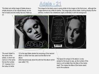
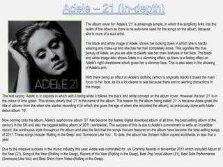
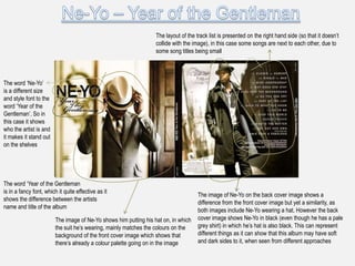
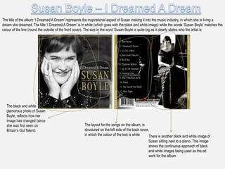
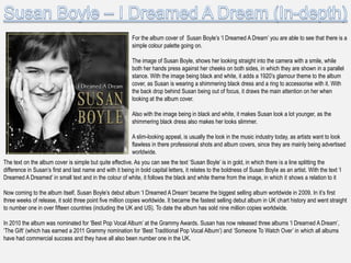
Enterprise Excellence is Inclusive Excellence.pdfKaiNexus
Enterprise excellence and inclusive excellence are closely linked, and real-world challenges have shown that both are essential to the success of any organization. To achieve enterprise excellence, organizations must focus on improving their operations and processes while creating an inclusive environment that engages everyone. In this interactive session, the facilitator will highlight commonly established business practices and how they limit our ability to engage everyone every day. More importantly, though, participants will likely gain increased awareness of what we can do differently to maximize enterprise excellence through deliberate inclusion.
What is Enterprise Excellence?
Enterprise Excellence is a holistic approach that's aimed at achieving world-class performance across all aspects of the organization.
What might I learn?
A way to engage all in creating Inclusive Excellence. Lessons from the US military and their parallels to the story of Harry Potter. How belt systems and CI teams can destroy inclusive practices. How leadership language invites people to the party. There are three things leaders can do to engage everyone every day: maximizing psychological safety to create environments where folks learn, contribute, and challenge the status quo.
Who might benefit? Anyone and everyone leading folks from the shop floor to top floor.
Dr. William Harvey is a seasoned Operations Leader with extensive experience in chemical processing, manufacturing, and operations management. At Michelman, he currently oversees multiple sites, leading teams in strategic planning and coaching/practicing continuous improvement. William is set to start his eighth year of teaching at the University of Cincinnati where he teaches marketing, finance, and management. William holds various certifications in change management, quality, leadership, operational excellence, team building, and DiSC, among others.
3.0 Project 2_ Developing My Brand Identity Kit.pptxtanyjahb
A personal brand exploration presentation summarizes an individual's unique qualities and goals, covering strengths, values, passions, and target audience. It helps individuals understand what makes them stand out, their desired image, and how they aim to achieve it.
Cracking the Workplace Discipline Code Main.pptxWorkforce Group
Cultivating and maintaining discipline within teams is a critical differentiator for successful organisations.
Forward-thinking leaders and business managers understand the impact that discipline has on organisational success. A disciplined workforce operates with clarity, focus, and a shared understanding of expectations, ultimately driving better results, optimising productivity, and facilitating seamless collaboration.
Although discipline is not a one-size-fits-all approach, it can help create a work environment that encourages personal growth and accountability rather than solely relying on punitive measures.
In this deck, you will learn the significance of workplace discipline for organisational success. You’ll also learn
• Four (4) workplace discipline methods you should consider
• The best and most practical approach to implementing workplace discipline.
• Three (3) key tips to maintain a disciplined workplace.
Business Valuation Principles for EntrepreneursBen Wann
This insightful presentation is designed to equip entrepreneurs with the essential knowledge and tools needed to accurately value their businesses. Understanding business valuation is crucial for making informed decisions, whether you're seeking investment, planning to sell, or simply want to gauge your company's worth.
Personal Brand Statement:
As an Army veteran dedicated to lifelong learning, I bring a disciplined, strategic mindset to my pursuits. I am constantly expanding my knowledge to innovate and lead effectively. My journey is driven by a commitment to excellence, and to make a meaningful impact in the world.
"𝑩𝑬𝑮𝑼𝑵 𝑾𝑰𝑻𝑯 𝑻𝑱 𝑰𝑺 𝑯𝑨𝑳𝑭 𝑫𝑶𝑵𝑬"
𝐓𝐉 𝐂𝐨𝐦𝐬 (𝐓𝐉 𝐂𝐨𝐦𝐦𝐮𝐧𝐢𝐜𝐚𝐭𝐢𝐨𝐧𝐬) is a professional event agency that includes experts in the event-organizing market in Vietnam, Korea, and ASEAN countries. We provide unlimited types of events from Music concerts, Fan meetings, and Culture festivals to Corporate events, Internal company events, Golf tournaments, MICE events, and Exhibitions.
𝐓𝐉 𝐂𝐨𝐦𝐬 provides unlimited package services including such as Event organizing, Event planning, Event production, Manpower, PR marketing, Design 2D/3D, VIP protocols, Interpreter agency, etc.
Sports events - Golf competitions/billiards competitions/company sports events: dynamic and challenging
⭐ 𝐅𝐞𝐚𝐭𝐮𝐫𝐞𝐝 𝐩𝐫𝐨𝐣𝐞𝐜𝐭𝐬:
➢ 2024 BAEKHYUN [Lonsdaleite] IN HO CHI MINH
➢ SUPER JUNIOR-L.S.S. THE SHOW : Th3ee Guys in HO CHI MINH
➢FreenBecky 1st Fan Meeting in Vietnam
➢CHILDREN ART EXHIBITION 2024: BEYOND BARRIERS
➢ WOW K-Music Festival 2023
➢ Winner [CROSS] Tour in HCM
➢ Super Show 9 in HCM with Super Junior
➢ HCMC - Gyeongsangbuk-do Culture and Tourism Festival
➢ Korean Vietnam Partnership - Fair with LG
➢ Korean President visits Samsung Electronics R&D Center
➢ Vietnam Food Expo with Lotte Wellfood
"𝐄𝐯𝐞𝐫𝐲 𝐞𝐯𝐞𝐧𝐭 𝐢𝐬 𝐚 𝐬𝐭𝐨𝐫𝐲, 𝐚 𝐬𝐩𝐞𝐜𝐢𝐚𝐥 𝐣𝐨𝐮𝐫𝐧𝐞𝐲. 𝐖𝐞 𝐚𝐥𝐰𝐚𝐲𝐬 𝐛𝐞𝐥𝐢𝐞𝐯𝐞 𝐭𝐡𝐚𝐭 𝐬𝐡𝐨𝐫𝐭𝐥𝐲 𝐲𝐨𝐮 𝐰𝐢𝐥𝐥 𝐛𝐞 𝐚 𝐩𝐚𝐫𝐭 𝐨𝐟 𝐨𝐮𝐫 𝐬𝐭𝐨𝐫𝐢𝐞𝐬."
Affordable Stationery Printing Services in Jaipur | Navpack n PrintNavpack & Print
Looking for professional printing services in Jaipur? Navpack n Print offers high-quality and affordable stationery printing for all your business needs. Stand out with custom stationery designs and fast turnaround times. Contact us today for a quote!
India Orthopedic Devices Market: Unlocking Growth Secrets, Trends and Develop...Kumar Satyam
According to TechSci Research report, “India Orthopedic Devices Market -Industry Size, Share, Trends, Competition Forecast & Opportunities, 2030”, the India Orthopedic Devices Market stood at USD 1,280.54 Million in 2024 and is anticipated to grow with a CAGR of 7.84% in the forecast period, 2026-2030F. The India Orthopedic Devices Market is being driven by several factors. The most prominent ones include an increase in the elderly population, who are more prone to orthopedic conditions such as osteoporosis and arthritis. Moreover, the rise in sports injuries and road accidents are also contributing to the demand for orthopedic devices. Advances in technology and the introduction of innovative implants and prosthetics have further propelled the market growth. Additionally, government initiatives aimed at improving healthcare infrastructure and the increasing prevalence of lifestyle diseases have led to an upward trend in orthopedic surgeries, thereby fueling the market demand for these devices.
Explore our most comprehensive guide on lookback analysis at SafePaaS, covering access governance and how it can transform modern ERP audits. Browse now!
Putting the SPARK into Virtual Training.pptxCynthia Clay
This 60-minute webinar, sponsored by Adobe, was delivered for the Training Mag Network. It explored the five elements of SPARK: Storytelling, Purpose, Action, Relationships, and Kudos. Knowing how to tell a well-structured story is key to building long-term memory. Stating a clear purpose that doesn't take away from the discovery learning process is critical. Ensuring that people move from theory to practical application is imperative. Creating strong social learning is the key to commitment and engagement. Validating and affirming participants' comments is the way to create a positive learning environment.
Discover the innovative and creative projects that highlight my journey throu...dylandmeas
Discover the innovative and creative projects that highlight my journey through Full Sail University. Below, you’ll find a collection of my work showcasing my skills and expertise in digital marketing, event planning, and media production.
Discover the innovative and creative projects that highlight my journey throu...
Album Cover Analysis
1.
2. The black and white image of Adele shows a The image for the back cover is quite similar to the image on the front cover , although the
simple structure of her natural beauty, as her image seems to be a little bit darker. The image also shows Adele, looking directly into the
hair is loose and she hardly has any make-up camera, in which it her cheekbone (right) is blended in with the background
on
The word „Adele‟ is „21‟is the age Adele started the recording of her second
the name of the album, in which she has used it as the title for her
artists, in which her album.
The layout for songs on the album, is very
name is in the same (She had previously done this with her first album which
simple for the buyer to see, as the number of the
font as the number was called „19‟)
track is a lot smaller than the titles of the tracks
„21‟, however it‟s in
itself. This makes the titles of the tracks stand
the colour of white
out to the audience
3. The album cover for Adele‟s „21‟ is amazingly simple, in which this simplicity links into the
outlet of the album as there is no auto-tune used for the songs on the album, because
she is more of a soul artist.
The black and white image of Adele, shows her looking down in which she is hardly
wearing any make-up and she has her hair completely loose. This signifies the true
beauty of Adele, as you are able to clearly see her main features in her face. The black
and white image also shows Adele in a slimming effect, as there is a fading effect on
Adele‟s right cheekbone which gives her a slimmer face. This is also seen in the showing
of Adele‟s arm.
With there being an effect on Adele‟s clothing (which is originally black) it draws the main
focus to her face, as it‟s a lot clearer to see because there are no alerting distractions in
the image.
The text saying „Adele‟ is in capitals in which with it being white it follows the black and white concept on the album cover. However the text „21‟ is in
the colour of lime green. This shows clearly that „21‟ is the name of the album. The reason for the album being called „21‟ is because Adele gives the
title of albums from the when she started recording it (in which she gives the age of when she recorded the album), as previously done with Adele
debut album „19‟.
Now coming onto the album, Adele‟s sophomore album „21‟ has become the fastest digital download album of all time, the best selling album of the
century in the UK and also the biggest selling album of 2011 (worldwide). The success of this is due to Adele‟s commitment to write an incredible
record, the continuous style throughout the album and also the fact that the songs that are featured on the album have become the best selling songs
of 2011. These songs include „Rolling in the Deep‟ and „Someone Like You‟ . To date, the album has thirteen million copies worldwide, in less that a
year.
Due to the massive success in the music industry this year, Adele was nominated for six Grammy Awards in November 2011 which included Album of
the Year (21), Song of the Year (Rolling in the Deep), Record of the Year (Rolling in the Deep), Best Pop Vocal Album (21), Best Solo Performance
(Someone Like You) and Best Short Form Video (Rolling in the Deep)
4. The layout of the track list is presented on the right hand side (so that it doesn‟t
collide with the image), in this case some songs are next to each other, due to
some song titles being small
The word „Ne-Yo‟
is a different size
and style font to the
word „Year of the
Gentleman‟. So in
this case it shows
who the artist is and
it makes it stand out
on the shelves
The word „Year of the Gentleman
is in a fancy font, which it quite effective as it
The image of Ne-Yo on the back cover image shows a
shows the difference between the artists
difference from the front cover image but yet a similarity, as
name and title of the album
both images include Ne-Yo wearing a hat. However the back
The image of Ne-Yo shows him putting his hat on, in which cover image shows Ne-Yo in black (even though he has a pale
the suit he‟s wearing, mainly matches the colours on the grey shirt) in which he‟s hat is also black. This can represent
background of the front cover image which shows that different things as it can show that this album may have soft
there‟s already a colour palette going on in the image and dark sides to it, when seen from different approaches
5. For the album cover of Ne-Yo‟s „Year of the Gentlemen‟ you are able to identify that there
is a colour palette being portrayed in the image.
The image of Ne-Yo, shows him looking downwards from the camera in which he has a
beige hat covering his face ( which also shows the parallel stance between both his
arms). In the image Ne-Yo is also wearing a suit that features the colours of beige,
cream, brown and light brown. The setting behind Ne-Yo also features the colour of
brown, light cream. There is also a bar that masks Ne-Yo‟s left arm which seems to be in
the colour of caramel brown in which the bar next to it, seems to be in the colour of dark
cream. With the text also being in black, it matches the colour of the black band that
circulates round Ne-Yo‟s hat.
This easily generates a colour palette for the album cover, in which this is continued at
the back of the album cover (also known as the back cover).
The text „Ne-Yo‟ are in big bold capitals which shows clear identification of who the artist in which the artist of the album is Ne-Yo. However the text
„Year of the Gentlemen‟ is in a fancy italic font and shows powerful dominance from the bolder text „Ne-Yo‟ as the text size for „Year of the Gentlemen‟
is a lot smaller. This shows the clear differentiation between the artists name and the name of the album.
Now coming onto the album, Ne-Yo‟s „Year of the Gentlemen‟ became one his most successful album‟s to date, as it reached number 2 in the US and
UK and went to become one of the most anticipated album‟s of 2008. The hit singles included „Closer‟ (which went number one in the UK), „Miss
Independent‟ and „Mad‟. Making all three songs go Platinum (selling over one million copies) in the U.S.
In 2009, Ne-Yo was nominated for five Grammy Awards for his album. He won two awards which were Best Male R&B Vocal Performance and Best
R&B Song (both for Miss Independent). All together Ne-Yo has been nominated for nine Grammy Awards and has gotten three awards in total.
Ne-Yo is one of the most successful male R&B artists today, as well as being an ultimately talented songwriter and producer.
6. The title of the album „I Dreamed A Dream‟ represents the inspirational aspect of Susan making it into the music industry, in which she is living a
dream she dreamed. The title „I Dreamed A Dream‟ is in white (which goes with the black and white image) while the words „Susan Boyle‟ matches the
colour of the line (round the outside of the front cover). The size in the word „Susan Boyle is quite big as it clearly states who the artist is
The black and white
glamorous photo of Susan
Boyle, reflects how her
image has changed (since
she was first seen on The layout for the songs on the album, is
Britain‟s Got Talent) structured on the left side of the back cover,
in which the colour of the text is white There is another black and white image of
Susan sitting next to a piano. This image
shows the continuous approach of black
and white images being used as the art
work for the album
7. For the album cover of Susan Boyle‟s „I Dreamed A Dream‟ you are able to see that there is a
simple colour palette going on.
The image of Susan Boyle, shows her looking straight into the camera with a smile, while
both her hands press against her cheeks on both sides, in which they are shown in a parallel
stance. With the image being black and white, it adds a 1920‟s glamour theme to the album
cover, as Susan is wearing a shimmering black dress and a ring to accessorise with it. With
the back drop behind Susan being out of focus, it draws the main attention on her when
looking at the album cover.
Also with the image being in black and white, it makes Susan look a lot younger, as the
shimmering black dress also makes her looks slimmer.
A slim-looking appeal, is usually the look in the music industry today, as artists want to look
flawless in there professional shots and album covers, since they are mainly being advertised
worldwide.
The text on the album cover is simple but quite effective. As you can see the text „Susan Boyle‟ is in gold, in which there is a line splitting the
difference in Susan‟s first and last name and with it being in bold capital letters, it relates to the boldness of Susan Boyle as an artist. With the text „I
Dreamed A Dreamed‟ in small text and in the colour of white, it follows the black and white theme from the image, in which it shows a relation to it
Now coming to the album itself, Susan Boyle‟s debut album „I Dreamed A Dream‟ became the biggest selling album worldwide in 2009. In it‟s first
three weeks of release, it sold three point five million copies worldwide. It became the fastest selling debut album in UK chart history and went straight
to number one in over fifteen countries (including the UK and US). To date the album has sold nine million copies worldwide.
In 2010 the album was nominated for „Best Pop Vocal Album‟ at the Grammy Awards. Susan has now released three albums „I Dreamed A Dream‟,
„The Gift‟ (which has earned a 2011 Grammy nomination for „Best Traditional Pop Vocal Album‟) and „Someone To Watch Over‟ in which all albums
have had commercial success and they have all also been number one in the UK.
8. The bold black text that says „Tony Bennett‟ evidently shows that he The background image shows the continuity of theme palette of blue,
is the artist of the album as you are able to see a studio microphones in front of blue velvet
curtains
The text „Duets
ll‟ is in a blue
italic font, in
which it shows
the difference
between the
name of the
artists and the
name of the
album, as the
size of the text
is a lot smaller
This text, shows the artists that Tony did a
collaboration with on the album, in which the The track list shows the duet with the artist that Tony has
audience are quite aware what collaborated with, in which the artists‟ name is in a
The amazing picture of Tony Bennett is different font and colour and the title of the track is in
built up from small individual photos, that different font and colour. This shows the difference
have been structured in order to produce a between the song and the artist, as with the text of the
big image of himself (which is incredibly artists‟ name being in bold, it makes them seem more
creative) powerful
9. For the album cover of Tony Bennett‟s „Duets ll‟ you are able to see that the cover itself is
amazingly unique.
As you can easily identify from the image of Tony, the whole image is made up of tiny images
but together, that makes one whole image of Tony himself.
This is incredibly unique, as not a lot of artists do this on their album covers, as they like to show
off their facial features, or their body and flawless appearance. In this case it‟s a lot different,
each tiny image features Tony by himself, with someone or doing something.
To make the whole image look like Tony, each tiny individual image has been edited, in which
the original colour of it has changed. This has been done so that the edited colour of the image,
makes up Tony‟s facial features through the different tones of shade of his face, making a lot of
the colours darker and lighter than others.
For the text of the album cover, it is very different and well organised. As you can see from looking above, the text saying „Tony Bennett‟ is in big, bold
letters in which the font of it is in black. This shows a differ between the album cover and the features on the album, as the album cover name is
„Duets ll‟ it looks like the word „Duets‟ is in which light blue italics. This definitely identifies a difference between the name of the artist and the name of
the album. Also seen on the album that‟s not usually seen, are the featured artists who are doing a duet with Bennett, in which the list is shown on the
left hand side. The font seems to be a similar font to the one used for the artists‟ name, however the sizes of the text is a lot smaller, so that it‟s not
drawing attention away from the bold text and unique image.
Now coming onto the album itself, Tony Bennett‟s album “Duets ll” went straight to number one in the U.S charts, in which it has made him the oldest
artist to have a number one album.
The album has been nominated for two Grammy Awards, in which they are for Best Traditional Pop Vocal Album (for Duets ll) and Best Pop
Duo/Group Performance (for „Body and Soul‟ which is performed by Tony Bennett and Amy Winehouse).
10. The text saying „Carrie Underwood‟ is in a fancy font ( showing in The back cover is a lot different to the front cover, as it seems that it has
italics), in which it is in the colour of black, plus it is also next to the been drawn or created through technology. However, the back cover still
image, which shows an obvious viewing of who the artist is continues with the colour palette of pale golden yellow and burgundy
The text
saying
„Some Hearts‟
is in the same
fancy font
(showing in
italics) that is
used for the
artists‟ name;
however, to
show diversity,
the text is
smaller which
it is in the
colour of
burgundy
The songs are listed in an ordinary fashion, in
The white stem leaves that have been The image of Carrie shows her looking into the which you are able to identify that there are no
evidently drawn or created through camera and smiling, while she‟s holding a numbers next to them, which shows the simplicity
technology, presents the feminine daisy. This image shows Carrie turning around of the album and artist.
character that is seen in Carrie to look at the camera, in which there is the
Underwood setting of a field of wheat behind her. With the
sun glistening the left side of her hair, it makes
the shot look elegant, stunning and feminine
11. For the album cover of Carrie Underwood‟s „Some Hearts‟ you are able to identify a feminine
approach to the cover.
The image of Carrie, is extremely elegant, stunning and feminine in which she shows the
characteristic of being „the girl next door‟ in her debut album. As you can see, it shows Carrie
looking quite glamorous, as she is wearing a black dress, in which her hair has also been done
to look quite curly. To go with this, Carrie is wearing a subtle amount of make-up which makes
her naturally beauty. With Carrie‟s head in front of the sun (as it makes her hair glisten on the
left side of her face) her smile brings positivity to the image and the album, in which this sort of
positivity can help the album succeed in sales.
This image can be classed as an „idolised‟ image, as by seeing the image girls/women may
want to look like Carrie (e.g. The may want to have the same make-up and hair as her, plus the
same dress/style as her), while boys/men may find Carrie as an incredibly attractive girl, as
she has a nice figure, smile and face.
For the text of the album cover, it is very simple as the text saying „Carrie Underwood‟ is in a fancy font ( showing in italics), in which it is in the colour
of black, while the text saying „Some Hearts‟ is in the same fancy font (showing in italics), however the text is smaller in which it is in the colour of
burgundy. This shows the difference between the name of the artist and the name of the album, as the artists‟ name is a lot bigger and bolder which
shows power.
Now coming onto the album itself, Carrie Underwood‟s „Some Hearts‟ was her debut album after winning the fourth series of „American Idol‟. Although
the album did not go to number one in the U.S it became the biggest /fastest selling debut album from a country artist and from an American Idol
winner, in which it sold over seven million copies. This earned Carrie her first Grammy Award for Best New Artist. The album icluded her biggest
selling single to date which is „Before He Cheats‟ (in which the song also earned her two Grammy Awards for „Country Song of the Year‟ and „Best
Female Country Vocal Performance‟.
Since then, Carrie has become one of the biggest stars in country music as she has had two one albums „Carnival Ride‟ and „Play On‟ and with the
success of those albums it has made her the most successful American Idol contestant in the U.S. in terms of album sales.