TESTING!
   I have tested different fonts and house styles to
      see which would work better for the kind of
    magazine I am trying to create and the kind of
          audience I am trying to appeal to.
CHOOSING THE MAIN IMAGE
       I took several photos which could be used for my front cover to
         see which would look better. I tested on a couple of images I
              liked best and then decided which would be used.
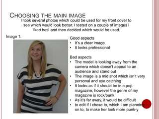
Image 1:                          Good aspects
                                  • It’s a clear image
                                  • It looks professional

                                  Bad aspects
                                  • The model is looking away from the
                                    camera which doesn’t appeal to an
                                    audience and stand out
                                  • The image is a mid shot which isn’t very
                                    personal and eye catching
                                  • It looks as if it should be in a pop
                                    magazine, however the genre of my
                                    magazine is rock/punk
                                  • As it’s far away, it would be difficult
                                  • to edit if I chose to, which I am planning
                                    on to, to make her look more punk-y
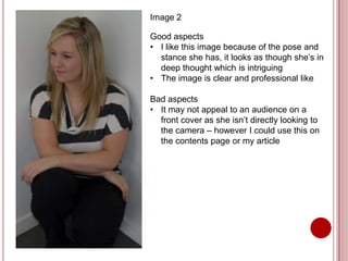
Image 2

Good aspects
• I like this image because of the pose and
  stance she has, it looks as though she’s in
  deep thought which is intriguing
• The image is clear and professional like

Bad aspects
• It may not appeal to an audience on a
  front cover as she isn’t directly looking to
  the camera – however I could use this on
  the contents page or my article
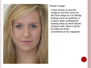
Chosen Image!
 I have chosen to use this
 image on the front cover as
 the main image as it is directly
 looking out to an audience, it
 is also a clear, professional
 looking close-up which leaves
 it easy to edit, which I will do
 to make her fit the
 conventions of my magazine.
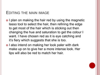
EDITING THE MAIN IMAGE
 I plan on making the hair red by using the magnetic
  lasso tool to select the hair, then refining the edge
  to get most of the hair which is sticking out then
  changing the hue and saturation to get the colour I
  want. I have chosen red as it is eye catching and
  it’s fiery which suggests that she is too.
 I also intend on making her look paler with dark
  make up on to give her a more intense look. Her
  lips will also be red to match her hair.
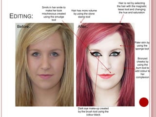
Hair is red by selecting
             Smirk in her smile to                                      the hair with the magnetic
                make her look        Hair has more volume                lasso tool and changing
             mischievous created      by using the clone                  the hue and saturation
EDITING:      using the smudge
                     tool
                                           stamp tool


  Before..                                After..


                                                                                       Paler skin by
                                                                                        using the
                                                                                       sponge tool


                                                                                          Bronzed
                                                                                         cheeks by
                                                                                         using the
                                                                                        burn tool to
                                                                                       add colour to
                                                                                            her
                                                                                        complexion


                                          Dark eye make-up created
                                          by the brush tool using the
                                                 colour black
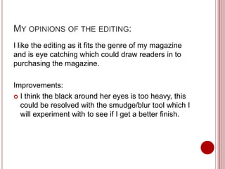
MY OPINIONS OF THE EDITING:
I like the editing as it fits the genre of my magazine
and is eye catching which could draw readers in to
purchasing the magazine.

Improvements:
 I think the black around her eyes is too heavy, this
  could be resolved with the smudge/blur tool which I
  will experiment with to see if I get a better finish.
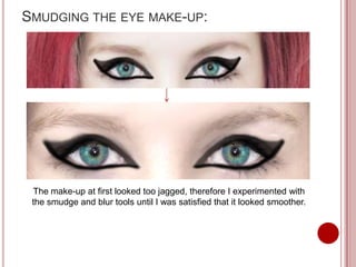
SMUDGING THE EYE MAKE-UP:


 The make-up at first looked too jagged, therefore I experimented with
 the smudge and blur tools until I was satisfied that it looked smoother.
CHOOSING THE RIGHT FONTS
The genre of my music magazine is punk/rock, in
order to give off the right vibe of magazine, font is a
crucial part of the front cover to set the tone of the
magazine, therefore I need to experiment different
fonts, especially for the masthead on the magazine
(Pulse).
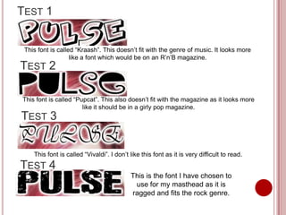
TEST 1


 This font is called “Kraash”. This doesn’t fit with the genre of music. It looks more
                   like a font which would be on an R’n’B magazine.
TEST 2

This font is called “Pupcat”. This also doesn’t fit with the magazine as it looks more
                       like it should be in a girly pop magazine.
TEST 3


    This font is called “Vivaldi”. I don’t like this font as it is very difficult to read.
TEST 4
                                           This is the font I have chosen to
                                            use for my masthead as it is
                                           ragged and fits the rock genre.
THE FRONT COVER
            Development
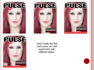
I don’t really like this
 front cover, so I will
   experiment with
   different styles.
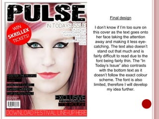
Final design

  I don’t know if I’m too sure on
this cover as the text goes onto
   her face taking the attention
  away and making it less eye-
 catching. The text also doesn’t
    stand out that much and is
fairly difficult to read due to the
   font being fairly thin. The “In
  Today’s Issue” also contrasts
     with the bottom text as it
 doesn’t follow the exact colour
     scheme. The font is also
 limited, therefore I will develop
          my idea further.
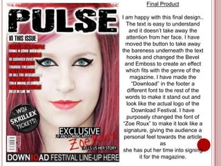
Final Product

I am happy with this final design..
  The text is easy to understand
    and it doesn’t take away the
  attention from her face. I have
  moved the button to take away
the bareness underneath the text
   hooks and changed the Bevel
  and Emboss to create an effect
  which fits with the genre of the
     magazine. I have made the
     “Download” in the footer a
   different font to the rest of the
  words to make it stand out and
   look like the actual logo of the
     Download Festival. I have
   purposely changed the font of
 “Zoe Roux” to make it look like a
 signature, giving the audience a
 personal feel towards the article
                   as
 she has put her time into signing
         it for the magazine.
CONTENTS PAGE
          Development
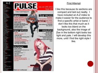
First Attempt

I like this because its sections are
    compact and laid out neatly. I
    have included an A-Z index to
make it easier for the audience to
    find a specific artist or band. I
     don’t like this that much as it
        looks too bland on the
    background, also the image of
 Zoe in the bottom right looks too
  light and pale. I will develop this
  more, until I find the right style I
                   like.
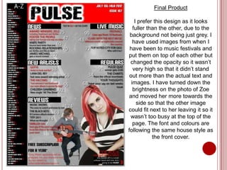
Final Product

    I prefer this design as it looks
   fuller than the other, due to the
 background not being just grey. I
   have used images from when I
 have been to music festivals and
put them on top of each other but
 changed the opacity so it wasn’t
   very high so that it didn’t stand
 out more than the actual text and
  images. I have turned down the
   brightness on the photo of Zoe
and moved her more towards the
     side so that the other image
could fit next to her leaving it so it
 wasn’t too busy at the top of the
   page. The font and colours are
following the same house style as
            the front cover.
ARTICLE
          Development
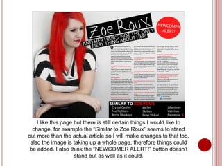
I like this page but there is still certain things I would like to
  change, for example the “Similar to Zoe Roux” seems to stand
out more than the actual article so I will make changes to that too,
 also the image is taking up a whole page, therefore things could
 be added. I also think the “NEWCOMER ALERT!” button doesn’t
                     stand out as well as it could.
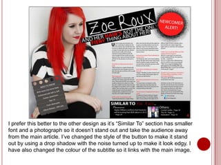
I prefer this better to the other design as it’s “Similar To” section has smaller
font and a photograph so it doesn’t stand out and take the audience away
from the main article. I’ve changed the style of the button to make it stand
out by using a drop shadow with the noise turned up to make it look edgy. I
have also changed the colour of the subtitle so it links with the main image.

Testing and Development for my Music Magazine

  • 1.
    TESTING! I have tested different fonts and house styles to see which would work better for the kind of magazine I am trying to create and the kind of audience I am trying to appeal to.
  • 2.
    CHOOSING THE MAINIMAGE I took several photos which could be used for my front cover to see which would look better. I tested on a couple of images I liked best and then decided which would be used. Image 1: Good aspects • It’s a clear image • It looks professional Bad aspects • The model is looking away from the camera which doesn’t appeal to an audience and stand out • The image is a mid shot which isn’t very personal and eye catching • It looks as if it should be in a pop magazine, however the genre of my magazine is rock/punk • As it’s far away, it would be difficult • to edit if I chose to, which I am planning on to, to make her look more punk-y
  • 3.
    Image 2 Good aspects •I like this image because of the pose and stance she has, it looks as though she’s in deep thought which is intriguing • The image is clear and professional like Bad aspects • It may not appeal to an audience on a front cover as she isn’t directly looking to the camera – however I could use this on the contents page or my article
  • 4.
    Chosen Image! Ihave chosen to use this image on the front cover as the main image as it is directly looking out to an audience, it is also a clear, professional looking close-up which leaves it easy to edit, which I will do to make her fit the conventions of my magazine.
  • 5.
    EDITING THE MAINIMAGE  I plan on making the hair red by using the magnetic lasso tool to select the hair, then refining the edge to get most of the hair which is sticking out then changing the hue and saturation to get the colour I want. I have chosen red as it is eye catching and it’s fiery which suggests that she is too.  I also intend on making her look paler with dark make up on to give her a more intense look. Her lips will also be red to match her hair.
  • 6.
    Hair is redby selecting Smirk in her smile to the hair with the magnetic make her look Hair has more volume lasso tool and changing mischievous created by using the clone the hue and saturation EDITING: using the smudge tool stamp tool Before.. After.. Paler skin by using the sponge tool Bronzed cheeks by using the burn tool to add colour to her complexion Dark eye make-up created by the brush tool using the colour black
  • 7.
    MY OPINIONS OFTHE EDITING: I like the editing as it fits the genre of my magazine and is eye catching which could draw readers in to purchasing the magazine. Improvements:  I think the black around her eyes is too heavy, this could be resolved with the smudge/blur tool which I will experiment with to see if I get a better finish.
  • 8.
    SMUDGING THE EYEMAKE-UP: The make-up at first looked too jagged, therefore I experimented with the smudge and blur tools until I was satisfied that it looked smoother.
  • 9.
    CHOOSING THE RIGHTFONTS The genre of my music magazine is punk/rock, in order to give off the right vibe of magazine, font is a crucial part of the front cover to set the tone of the magazine, therefore I need to experiment different fonts, especially for the masthead on the magazine (Pulse).
  • 10.
    TEST 1 Thisfont is called “Kraash”. This doesn’t fit with the genre of music. It looks more like a font which would be on an R’n’B magazine. TEST 2 This font is called “Pupcat”. This also doesn’t fit with the magazine as it looks more like it should be in a girly pop magazine. TEST 3 This font is called “Vivaldi”. I don’t like this font as it is very difficult to read. TEST 4 This is the font I have chosen to use for my masthead as it is ragged and fits the rock genre.
  • 11.
    THE FRONT COVER Development
  • 12.
    I don’t reallylike this front cover, so I will experiment with different styles.
  • 13.
    Final design I don’t know if I’m too sure on this cover as the text goes onto her face taking the attention away and making it less eye- catching. The text also doesn’t stand out that much and is fairly difficult to read due to the font being fairly thin. The “In Today’s Issue” also contrasts with the bottom text as it doesn’t follow the exact colour scheme. The font is also limited, therefore I will develop my idea further.
  • 14.
    Final Product I amhappy with this final design.. The text is easy to understand and it doesn’t take away the attention from her face. I have moved the button to take away the bareness underneath the text hooks and changed the Bevel and Emboss to create an effect which fits with the genre of the magazine. I have made the “Download” in the footer a different font to the rest of the words to make it stand out and look like the actual logo of the Download Festival. I have purposely changed the font of “Zoe Roux” to make it look like a signature, giving the audience a personal feel towards the article as she has put her time into signing it for the magazine.
  • 15.
    CONTENTS PAGE Development
  • 16.
    First Attempt I likethis because its sections are compact and laid out neatly. I have included an A-Z index to make it easier for the audience to find a specific artist or band. I don’t like this that much as it looks too bland on the background, also the image of Zoe in the bottom right looks too light and pale. I will develop this more, until I find the right style I like.
  • 17.
    Final Product I prefer this design as it looks fuller than the other, due to the background not being just grey. I have used images from when I have been to music festivals and put them on top of each other but changed the opacity so it wasn’t very high so that it didn’t stand out more than the actual text and images. I have turned down the brightness on the photo of Zoe and moved her more towards the side so that the other image could fit next to her leaving it so it wasn’t too busy at the top of the page. The font and colours are following the same house style as the front cover.
  • 18.
    ARTICLE Development
  • 19.
    I like thispage but there is still certain things I would like to change, for example the “Similar to Zoe Roux” seems to stand out more than the actual article so I will make changes to that too, also the image is taking up a whole page, therefore things could be added. I also think the “NEWCOMER ALERT!” button doesn’t stand out as well as it could.
  • 20.
    I prefer thisbetter to the other design as it’s “Similar To” section has smaller font and a photograph so it doesn’t stand out and take the audience away from the main article. I’ve changed the style of the button to make it stand out by using a drop shadow with the noise turned up to make it look edgy. I have also changed the colour of the subtitle so it links with the main image.