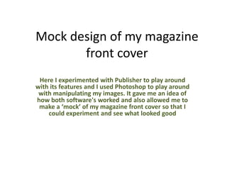
1. Mock design of my magazine
front cover
Here I experimented with Publisher to play around
with its features and I used Photoshop to play around
with manipulating my images. It gave me an idea of
how both software's worked and also allowed me to
make a ‘mock’ of my magazine front cover so that I
could experiment and see what looked good
2. Here I was zooming in to use the Spot Healing tool to remove some of spots and
imperfection on my models, Dan's, face here. I used the navigator tool bar so that I could
zoom in and get closer to the image so that I could be more accurate with removing
imperfections.
I concentrated around the mouth as this is where a lot of the red imperfections where. I
wanted to remove this in order to make my images look more professional and also
more appealing. It is true to say that more images seen on magazine now have been
photoshoped to look more ‘perfect’ and ‘airbrushed’ I felt it was important to stick to
this rule as it is a key convention of general magazine therefore would also apply to my
genre, rock magazines
3. Gaussian blur
Although I used the Spot Healing Tool to remove more prominent imperfections. The
Gaussian blur effect helped me to make my image have a ‘soft focus’ look to it. This could
make the image less ‘defined’ so I didn’t use a high level of the Gaussian blur as I wanted it
to not look too ‘pretty’ with the soft focus look.
Here I made a
background copy so
the I would have two
layers of the same
image. This is
important when using
the Gaussian Blur
effect so that I could
add this effect to the
top layer, and then
use the erased to rub
away some of the
blurred effect.
However this helped greatly to remove any excess red tones to my
models skins and therefore make it look more appealing and attractive.
I erased a lot of the Blue effect around my models hair, clothes and
jawline so that they would be more defined and stand out as key
features to my image here.
4. Here as you can see, I
altered the brightness
and contrast to my
image. I lowered the
brightness a little as
thought this would fit
in with my magazine
much more being
‘dark’ and ‘grunge’
looking as it is a rock
magazine. I also made
the contrast higher as
I felt this made
features of my models
face stand out a lot
more and be more
prominent.
Here is come evidence of
me using the eraser to
remove some Gaussian
blur.
Here is some evidence that I used the
spot healing brush to edit out
imperfections and the red eye removal
tool to darken Dan’s eyes
5. Here I edited the colour balance in order to level out the colours in the main image. I
wanted to make it less red in order to make sure the skin was not too red. I added a
more ‘blue’ colour level to make the image look a bit more ‘cold’ than ‘warm’ as this
would give a dark, edgy look to it rather than a bright, poppy look to it
6. Here I edited the exposure and I found that too much exposure really did not look appealing.
The brightness of his face would not look good in my genre of magazine as generally rock
magazine have this persona of ‘dark’ and ‘grunge’ to give a ‘rock star’ look. And this image
with a higher level of exposure would not suit my magazine therefore I will not use too much
exposure when I edit my final pieces for my magazine.
7. Here is a cut out of the image
I chose to experiment with.
On a white background it
looks good and quite clear
around the edges
Here I put my cut out image on a
black background and here it did
not look very good and you can
see my cutting out isn’t as good as
you can see the grey in-between
the hair from the background I cut
it out from previously. I have
learnt from this that I should be
more careful with my cutting out
8. Here I has to align my image
to the left hand side as the
photograph I took did not
have all of Dan's left shoulder
in it therefore I had to align it
to the left edge of my
magazine. This also gave a
good effects I thought as it
made the image look 3D
Here is where I chose the
colour fro my masthead. It
was an important thing to
as the colour of the
masthead is almost a
distinctive thing to
magazine and is
associated with certain
magazines. For example
the colour red is
associated with NME
magazine as it is the
colour of their masthead
9. Here is a mock-up of what I would like my front page to look like. I have not included
all the key features here and am aware that I need to put those in my final design (like
the barcode, a sub-image and text on the bottom) doing a mock plan of what my front
page will look like has helped me a lot as I can see it done properly instead of just a
drawing. From this I have found some methods I should not do. I will write these in my
conclusion. But this also allowed me to experiment with the Publisher software and
get used to it.