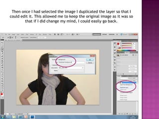
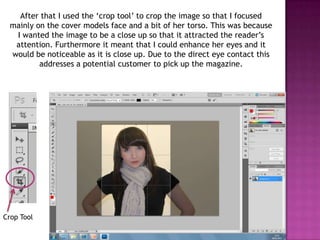
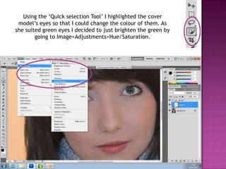
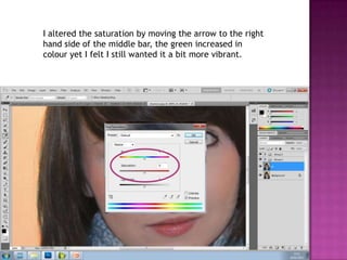
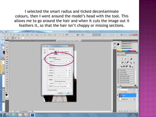
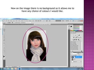
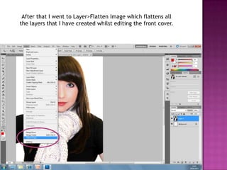
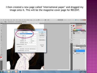
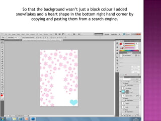
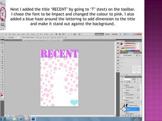
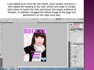
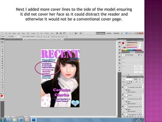
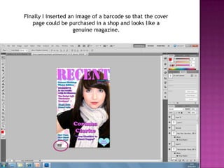
The document summarizes the steps taken to design a magazine cover in Photoshop, including:
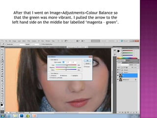
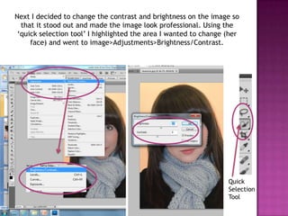
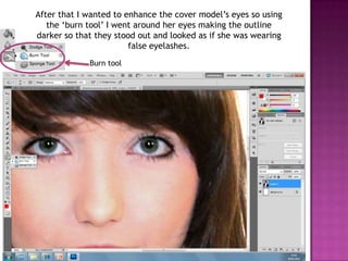
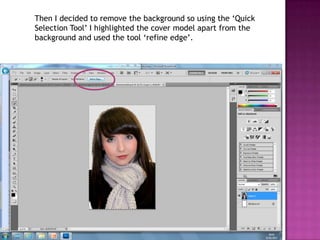
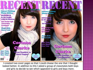
Cropping an image to focus on the model's face, enhancing her eyes by adjusting hue/saturation and color balance. Contrast and brightness were also adjusted. The background was removed and layers were flattened. Text, graphics and cover lines were added to complete the design. Feedback was gathered from classmates to choose the best cover design.