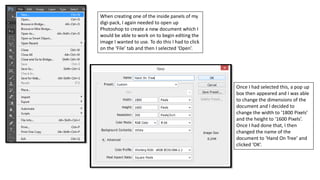
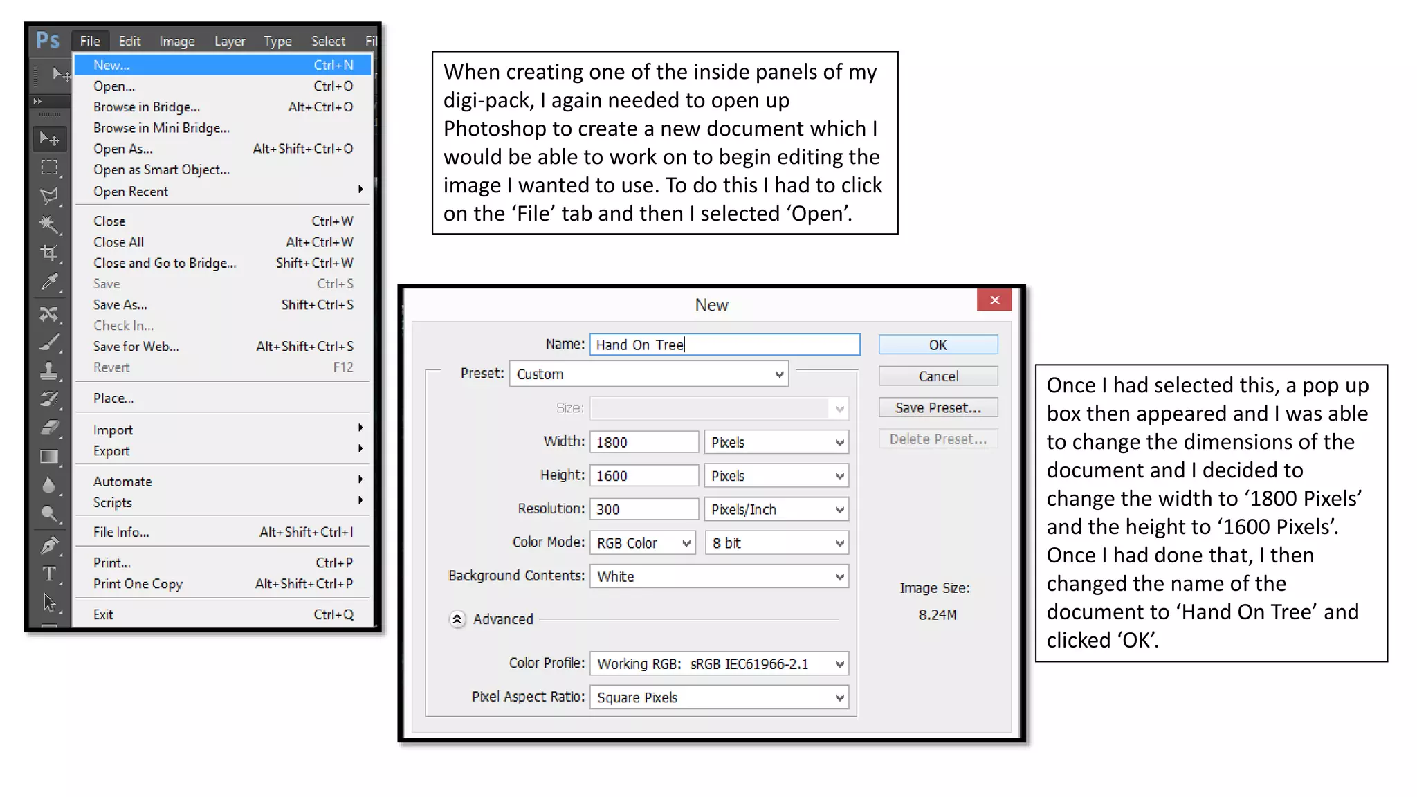
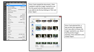
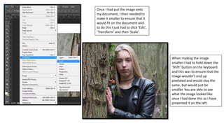
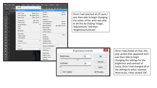
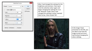
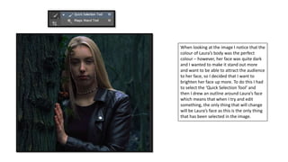
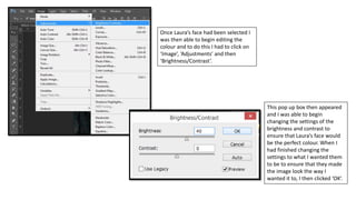
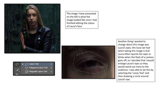
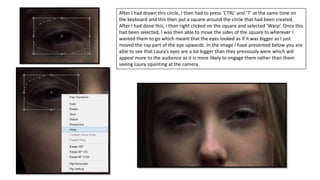
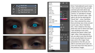
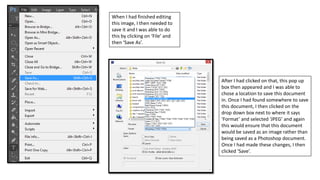
1. When creating one of the inside panels of my
digi-pack, I again needed to open up
Photoshop to create a new document which I
would be able to work on to begin editing the
image I wanted to use. To do this I had to click
on the ‘File’ tab and then I selected ‘Open’.
Once I had selected this, a pop up
box then appeared and I was able
to change the dimensions of the
document and I decided to
change the width to ‘1800 Pixels’
and the height to ‘1600 Pixels’.
Once I had done that, I then
changed the name of the
document to ‘Hand On Tree’ and
clicked ‘OK’.
2. Once I had created the document, I then
needed to add the image I wanted to use
for this panel onto the document and I
was able to do this by clicking on ‘File’ and
then ‘Open’.
Once I had selected this, a
pop up box then appeared
and I was able to choose the
image I wanted to use. Once I
had found the image I
wanted, I then selected it and
clicked ‘Open’.
3. Once I had put the image onto
my document, I then needed to
make it smaller to ensure that it
would fit on the document and
to do this I just had to click ‘Edit’,
‘Transform’ and then ‘Scale’.
When making the image
smaller I had to hold down the
‘Shift’ button on the keyboard
and this was to ensure that the
image wouldn’t end up
pixelated and would stay the
same, but would just be
smaller. You are able to see
what the image looked like
once I had done this as I have
presented it on the left.
4. Once the image was placed in the position I wanted it
to be in, I then wanted to begin editing the colour of it
to ensure that it conformed to the Pop Punk genre, but
also to ensure that continuity would be created across
all of the panels in the digi-pack. To begin editing the
colour of the image I had to click on ‘Image’,
‘Adjustments’ and then ‘Selective Colour’.
Once this pop up box appeared, I
then clicked on the drop down
box next to where it says
‘Colours’ and I selected ‘Neutral’
and this would mean that when I
change the settings, all of the
neutral colours in the image will
then change. Once I had done
this, I then changed the settings
to what I wanted them to be to
ensure that the image looked the
way I wanted it.
5. After I had changed the settings on the
neutral setting, I then clicked on the drop
down box next to where it says ‘Colours’
again and this time I selected ‘Reds’. Once I
had done this, I then changed the settings to
ensure I got the outcome I wanted for the
image and once all the settings were the way
I wanted them, I then clicked ‘OK’.
In the image I have presented
on the left you are able to see
how the image turned out
once I had changed all of the
colour settings.
6. I then wanted to continue editing
the colour of this image and
again I was able to do this by
clicking on ‘Image’, ‘Adjustments’
and then ‘Brightness/Contrast’.
After I had done this, this
pop up box then appeared
and I was able to change the
brightness and contrast of
the image. Once I had
changed the settings to
what I wanted them to be, I
then clicked ‘OK’.
7. The image I have presented
on the left is what the image
looked like once I had edited
the colour of the image.
Again, the background of the
image was the perfect colour
– however, Laura herself was
very dark and I needed to
make her brighter and stand
out more. So to do this I had
to select the ‘Quick Selection
Tool’ and then I drew an
outline around Laura which
you are able to see in the
image I have presented on
the left.
8. Once I had selected all of Laura, I
was then able to begin changing
the colour of her and I was able
to do this by clicking ‘Image’,
‘Adjustments’ and then
‘Brightness/Contrast’.
Once I had clicked on that, this
pop up box then appeared and I
was then able to begin
changing the settings for the
brightness and contrast of
Laura. Once I had changed all of
the settings to what I wanted
them to be, I then clicked ‘OK’.
9. After I had changed the settings for the
brightness and contrast, I then went
onto the selective colour again and
began changing the settings for it on
the ‘Neutrals’ mode. Once I had
changed the settings to what I wanted
them to be, I then clicked ‘OK’.
In the image I have
presented on the left, you
are able to see how the
image turned out once I
had finished changing the
colour settings.
10. When looking at the image I notice that the
colour of Laura’s body was the perfect
colour – however, her face was quite dark
and I wanted to make it stand out more
and want to be able to attract the audience
to her face, so I decided that I want to
brighten her face up more. To do this I had
to select the ‘Quick Selection Tool’ and
then I drew an outline around Laura’s face
which means that when I try and edit
something, the only thing that will change
will be Laura’s face as this is the only thing
that has been selected in the image.
11. Once Laura’s face had been selected I
was then able to begin editing the
colour and to do this I had to click on
‘Image’, ‘Adjustments’ and then
‘Brightness/Contrast’.
This pop up box then appeared
and I was able to begin
changing the settings of the
brightness and contrast to
ensure that Laura’s face would
be the perfect colour. When I
had finished changing the
settings to what I wanted them
to be to ensure that they made
the image look the way I
wanted it to, I then clicked ‘OK’.
12. The image I have presented
on the left is what the
image looked like once I had
finished editing the colour
of Laura’s face.
Another thing I wanted to
change about this image was
Laura’s eyes, the issue we had
when taking this image is that
Laura often squints her eyes or
blinks when the flash of a camera
goes off, so I decided that I would
enlarge Laura’s eyes so they
would stand out more to the
audience. I was able to do this by
selecting the ‘Lasso Tool’ and
then drawing a circle around
Laura’s eye.
13. After I had drawn this circle, I then had to press ‘CTRL’ and ‘T’ at the same time on
the keyboard and this then put a square around the circle that had been created.
After I had done this, I then right clicked on the square and selected ‘Warp’. Once this
had been selected, I was then able to move the sides of the square to wherever I
wanted them to go which meant that the eyes looked as if it was bigger as I just
moved the top part of the eye upwards. In the image I have presented below you are
able to see that Laura’s eyes are a lot bigger than they previously were which will
appeal more to the audience as it is more likely to engage them rather than them
seeing Laura squinting at the camera.
14. Once I had widened Laura’s eyes,
I then noticed that they actually
seemed quite dark which was
probably due to the flash of the
camera, so I decided to change
the colour of Laura’s eyes. I was
able to do this by selecting the
‘Brush Tool’ – once I had done
this, I then selected the colour
blue and drew two circles around
Laura’s eyes. Once I had done
this, I then clicked on the drop
down box next to where this layer
I was working on was and I
selected the option called ‘Soft
Light’. After I had selected this,
you are able to see that the blue
circle actually faded into Laura’s
eyes and in the image I have
presented on the left, you are
able to see that Laura’s eyes are
now more blue than they were in
the previous images.
15. When I had finished editing
this image, I then needed to
save it and I was able to do
this by clicking on ‘File’ and
then ‘Save As’.
After I had clicked on that, this pop up
box then appeared and I was able to
chose a location to save this document
in. Once I had found somewhere to save
this document, I then clicked on the
drop down box next to where it says
‘Format’ and selected ‘JPEG’ and again
this would ensure that this document
would be saved as an image rather than
being saved as a Photoshop document.
Once I had made these changes, I then
clicked ‘Save’.