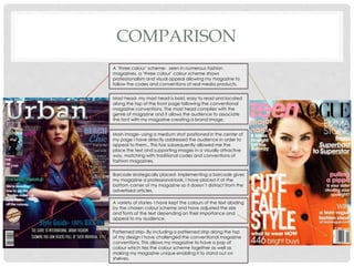
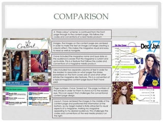
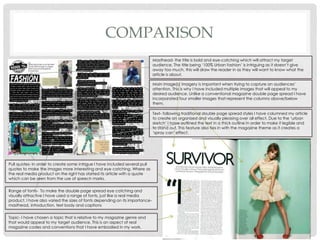
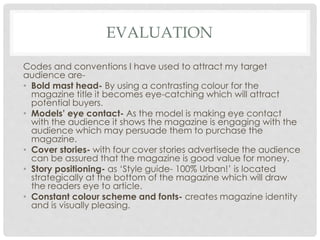
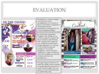
EVALUATION
B Y G E O R G I N A M A L P A S S
IN WHAT WAYS DOES MY MEDIA PRODUCT
USE, DEVELOP OR CHALLENGE FORMS AND
CONVENTIONS OF REAL MEDIA PRODUCTS?
E V A L U A T I O N
COMPARISON
Mast head- my mast head is bold, easy to read and located
along the top of the front page following the conventional
magazine conventions. The mast head complies with the
genre of magazine and it allows the audience to associate
the font with my magazine creating a brand image.
Main image- using a medium shot positioned in the center of
my page I have directly addressed the audience in order to
appeal to them.. This has subsequently allowed me the
place the text and supporting images in a visually attractive
way, matching with traditional codes and conventions of
fashion magazines.
Barcode strategically placed- implementing a barcode gives
my magazine a professional look. I have placed it at the
bottom corner of my magazine so it doesn’t distract from the
advertised articles.
A variety of stories- I have kept the colours of the text abiding
by the chosen colour scheme and have adjusted the size
and fonts of the text depending on their importance and
appeal to my audience.
Patterned strip- By including a patterned strip along the top
of my design I have challenged the conventional magazine
conventions. This allows my magazine to have a pop of
colour which ties the colour scheme together as well as
making my magazine unique enabling it to stand out on
shelves.
A ‘three colour’ scheme- seen in numerous fashion
magazines, a ‘three colour’ colour scheme shows
professionalism and visual appeal allowing my magazine to
follow the codes and conventions of real media products.
COMPARISON
A ‘three colour’ scheme- is continued from the front
page through to the content page, this follows the
codes and conventions of a real media product.
Images- the images on the content page are centered
in order to make the text an image converge creating a
column effect. This makes the magazine visual and easy
to read as well as navigate.
I have included the magazine name and issue date so
the audience is aware that this magazine is current and
up-to-date. This is a feature that follows the codes and
conventions of a magazine media product.
I also included two separate columns of text in order for
the readers to associate on what pages the stories
(advertised on the front cover) are on and what other
articles the magazine also features. This is a convention of
a typical magazine content page layout that I have
used.
Page numbers- I have ‘boxed out’ the page numbers of
the articles in order for them to stand out to the readers
eye. This is an aspect that challenges the conventional
content page design.
Layout- I have centered the images in the middle of the
content page and positioned the information at the
bottom, as my target market is firstly attracted to visual
aspects of a magazine, making my magazine
appealing to my desired audience. This challenges the
codes and conventions of the real media product on
the right.
COMPARISON
Masthead- the title is bold and eye-catching which will attract my target
audience. The title being ‘100% Urban fashion’ is intriguing as it doesn’t give
away too much, this will draw the reader in as they will want to know what the
article is about.
Main image(s) imagery is important when trying to capture an audiences’
attention. This is why I have included multiple images that will appeal to my
desired audience. Unlike a conventional magazine double page spread I have
incorporated four smaller images that represent the columns above/below
them.
Text- following traditional double page spread styles I have columned my article
to create an organised and visually pleasing over all effect. Due to the ‘urban
sketch’ I have outlined the text in a thick outline in order to make it legible and
to stand out. This feature also ties in with the magazine theme as it creates a
‘spray can’ effect.
Pull quotes- In order to create some intrigue I have included several pull
quotes to make the images more interesting and eye catching. Where as
the real media product on the right has started its article with a quote
which can be seen from the use of speech marks.
Range of fonts- To make the double page spread eye catching and
visually attractive I have used a range of fonts, just like a real media
product. I have also varied the sizes of fonts depending on its importance-
masthead, introduction, text body and captions
Topic- I have chosen a topic that is relative to my magazine genre and
that would appeal to my target audience. This is an aspect of real
magazine codes and conventions that I have embodied in my work.
HOW DOES MY MEDIA PRODUCT
REPRESENT A SOCIAL GROUP?
E V A L U A T I O N
REPRESENTATION OF A SOCIAL GROUP
By using imperative
language in the
advertised articles I
have made my
magazine friendly
and attractive to
teens. It also suggests
that this magazine is
informal and the
variety of fonts makes
the magazine
interesting and eye
catching, these are
all aspects that will
attract the correct
target audience due
to the representation
of teenagers.
Through choosing a title that is contemporary and current I
was able to create a media product that represented a
teen social group. Fashion interested teens between the
age of 14- 19 are targeted through the creation of my
magazine.
A normal teenage model was chosen for the front over to
communicate with the readers. Everything down to hair styling
and wardrobe chosen will attract the target audience as it is
relatable and inspiring. Even though other magazines try to sell
themselves through the use of celebrity endorsement, ‘Urban’
goes for an engaging selling method by choosing a face that
represents the audience in order to level with them.
AUDIENCE FEED BACK
My magazine ‘Urban’ is aimed at teenage girls between the age
of 14- 19 years old due to the audience research I have previously
carried out. This is due to a larger percentage of
females purchase fashion magazines compared
to males. Yet males on average buy 13% of
fashion magazines. That is why I chose a unisex
colour scheme in order to cater for both genders.
After asking 20 teenage girls (my majority target audience), what
they thought of my magazine designs I collected the information
and presented it in a bar chart.
femsle
readers
male
readers
AUDIENCE FEEDBACK
• I asked the audience a number of questions.
0
5
10
15
20
yes no
numberofparticipants
Is the name magazine name 'Urban'
attractive?
0
5
10
15
20
yes no
Do you like the colour scheme?
0
5
10
15
20
yes no
Are the fonts eye catching?
0
5
10
15
20
yes no
Is the main image intriguing?
AUDIENCE FEED BACK
From the data I collected from the target audience it is clear
that I have-
• Chosen a suitable magazine name
• Included an eye catching colour scheme
• incorporated appropriate font styles
• Selected an attractive image for the front cover
On the other hand if I was to develop on any aspect it would
be the font styles. This is due to a proportion of the target
audience not finding the font styles eye catching enough.
Yet over all I believe I have achieved a suitable media
product that represents a teen social group and that has a
positive target audience response.
WHAT KIND OF MEDIA INSTITUTIONS
MIGHT DISTRIBUTE MY MEDIA
PRODUCT?
E V A L U A T I O N
MEDIA INSTITUTION
Through doing previous research into existing media publications- I have evaluated Advance
Publications and Hearst Corporation as two businesses that could potentially distribute my media
product.
Hearst corporation have had more experience producing teen magazines as they have been
selling Seventeen magazine world wide since 1944. This would come in handy when marketing my
magazine. Hearst Corporation produces mainly women magazines such as- Cosmopolitan, Elle
and Harper’s Bazaar. They however do produce Seventeen magazine that is a cheerful and young
teen fashion magazine. In contrast, the magazine I wish to create will be an editorial, high street
fashion magazine aimed and older teens.
Which concludes that Hearst Corporation would be the most appropriate publishing company to
produce and market my magazine with.
Advance Corporation is the 44th biggest privately owned company in the world, they produced
the most successful magazines on today’s market- such as Vogue and GQ. Advanced
Corporation magazines are popular, current and in high demand showcasing that they clearly
know how to attract the readers eye. On one hand I would like to publish my magazine with
Advanced Publications, yet with my magazine design being similar to Teen Vogue, working in
close proximity my main competitor could prove fatal for my magazine’s success.
WHO WOULD BE THE AUDIENCE FOR MY
MEDIA PRODUCT?
E V A L U A T I O N
AUDIENCE
Likes to read about
designers.
Goes to school or
college.
Aged 14-17.
Likes to shop at well
known brands.
Keeps up to date
with the latest
fashion.
Likes to read about
fashion shows.
Typical teenage girl.
Is influenced by
social media.
HOW I ATTRACTED AND ADDRESSED MY
AUDIENCE?
E V A L U A T I O N
EVALUATION
Codes and conventions I have used to attract my target
audience are-
• Bold mast head- By using a contrasting colour for the
magazine title it becomes eye-catching which will attract
potential buyers.
• Models’ eye contact- As the model is making eye contact
with the audience it shows the magazine is engaging with the
audience which may persuade them to purchase the
magazine.
• Cover stories- with four cover stories advertisede the audience
can be assured that the magazine is good value for money.
• Story positioning- as ‘Style guide- 100% Urban!’ is located
strategically at the bottom of the magazine which will draw
the readers eye to article.
• Constant colour scheme and fonts- creates magazine identity
and is visually pleasing.
EVALUATION
To address my target audience-
• I used a feminine colour scheme consisting of pink,
turquoise and blue to appeal to a ‘fashion
conscious’ teen audience.
• I have included informal language to appeal to the
teen market, this will allow my magazine to level
with the reader which will make the magazine fun
and easy to read.
• I have also chosen a normal teenage model for the
front over to communicate with the readers and to
represent the audience, in order to appeal to them.
WHAT HAVE I LEARNED ABOUT TECHNOLOGIES
FROM THE PROCESS OF CONSTRUCTING THIS
PRODUCT?
E V A L U A T I O N
EVALUATION
Through using Adobe Photoshop I was able to design
and develop my fashion magazine. I learnt how to
enhance images in regards to contrast and vibrancy
with the use of HDR toning option tool. By editing text
with- stroke, Bevel and Emboss I also learnt how to
make the mast head 3D in order to stand out from
the background. I was even able to test my
magazine front cover in a variety of colour schemes
with different fonts and textual positioning.
HOW I CREATED THE FRONT COVER
Draft 1 Draft 2
Draft 3 Final
LOOKING BACK AT MY PRELIMINARY TASK, WHAT DO
I FEEL I HAVE LEARNT IN THE PROGRESSION FROM IT
NOW TO THE FULL PRODUCT?
E V A L U A T I O N
PERSONAL DEVELOPMENT
Looking back on my preliminary task I
would say I have developed on many
aspects needed to make a successful
magazine front cover.
Firstly, it can be seen that I have
developed in my photography. The pose
and positioning of the model makes my
magazine look more professional. I have
expanded my knowledge of shot types,
which has aided me to chose a medium
close up shot in order to conforms with real
media codes and conventions. The
wardrobe and styling has also improved
and is relevant to the magazine genre.
I have also made progress on my choice of
fonts, I have stuck to the rule of three and
have conformed with the traditional use of
three fonts on the page, as to not make
the page look too busy like my original
design on the left. My choice of colour
scheme has improved, this can be
exabited through my development, from a
multi-coloured colour scheme to a
proffessional ‘three colour’ colour scheme.
The text placement on the right frames the
image and compliments the image
compared to my previous work. I have
used less images on my ‘Urban’ front cover
as to not distract from the main image. My
fashion magazine layout looks structured
and professional compared to my initial
school magazine cover.
EVALUATION
Analyzing my content pages I
can see how I have
developed on my choice of
layout. My fashion magazine is
more planned and
professional compared to my
school magazine design.
By using three organised
images in the middle of my
content page the reader will
know where to look first also
with captions the audience
can understand what each
image represents. In contrast
to the randomly placed
images on my school
magazine. I have included
‘boxed out’ page numbers to
catch the audiences eye and
to stand out from the
background.
Through using a maximum of
three font styles I have created
a visually pleasing and easy to
read content page. This is an
aspect I have connoted from
my preliminary task.

Media Studies Magazine Evaluation

  • 1.
    EVALUATION B Y GE O R G I N A M A L P A S S
  • 2.
    IN WHAT WAYSDOES MY MEDIA PRODUCT USE, DEVELOP OR CHALLENGE FORMS AND CONVENTIONS OF REAL MEDIA PRODUCTS? E V A L U A T I O N
  • 3.
    COMPARISON Mast head- mymast head is bold, easy to read and located along the top of the front page following the conventional magazine conventions. The mast head complies with the genre of magazine and it allows the audience to associate the font with my magazine creating a brand image. Main image- using a medium shot positioned in the center of my page I have directly addressed the audience in order to appeal to them.. This has subsequently allowed me the place the text and supporting images in a visually attractive way, matching with traditional codes and conventions of fashion magazines. Barcode strategically placed- implementing a barcode gives my magazine a professional look. I have placed it at the bottom corner of my magazine so it doesn’t distract from the advertised articles. A variety of stories- I have kept the colours of the text abiding by the chosen colour scheme and have adjusted the size and fonts of the text depending on their importance and appeal to my audience. Patterned strip- By including a patterned strip along the top of my design I have challenged the conventional magazine conventions. This allows my magazine to have a pop of colour which ties the colour scheme together as well as making my magazine unique enabling it to stand out on shelves. A ‘three colour’ scheme- seen in numerous fashion magazines, a ‘three colour’ colour scheme shows professionalism and visual appeal allowing my magazine to follow the codes and conventions of real media products.
  • 4.
    COMPARISON A ‘three colour’scheme- is continued from the front page through to the content page, this follows the codes and conventions of a real media product. Images- the images on the content page are centered in order to make the text an image converge creating a column effect. This makes the magazine visual and easy to read as well as navigate. I have included the magazine name and issue date so the audience is aware that this magazine is current and up-to-date. This is a feature that follows the codes and conventions of a magazine media product. I also included two separate columns of text in order for the readers to associate on what pages the stories (advertised on the front cover) are on and what other articles the magazine also features. This is a convention of a typical magazine content page layout that I have used. Page numbers- I have ‘boxed out’ the page numbers of the articles in order for them to stand out to the readers eye. This is an aspect that challenges the conventional content page design. Layout- I have centered the images in the middle of the content page and positioned the information at the bottom, as my target market is firstly attracted to visual aspects of a magazine, making my magazine appealing to my desired audience. This challenges the codes and conventions of the real media product on the right.
  • 5.
    COMPARISON Masthead- the titleis bold and eye-catching which will attract my target audience. The title being ‘100% Urban fashion’ is intriguing as it doesn’t give away too much, this will draw the reader in as they will want to know what the article is about. Main image(s) imagery is important when trying to capture an audiences’ attention. This is why I have included multiple images that will appeal to my desired audience. Unlike a conventional magazine double page spread I have incorporated four smaller images that represent the columns above/below them. Text- following traditional double page spread styles I have columned my article to create an organised and visually pleasing over all effect. Due to the ‘urban sketch’ I have outlined the text in a thick outline in order to make it legible and to stand out. This feature also ties in with the magazine theme as it creates a ‘spray can’ effect. Pull quotes- In order to create some intrigue I have included several pull quotes to make the images more interesting and eye catching. Where as the real media product on the right has started its article with a quote which can be seen from the use of speech marks. Range of fonts- To make the double page spread eye catching and visually attractive I have used a range of fonts, just like a real media product. I have also varied the sizes of fonts depending on its importance- masthead, introduction, text body and captions Topic- I have chosen a topic that is relative to my magazine genre and that would appeal to my target audience. This is an aspect of real magazine codes and conventions that I have embodied in my work.
  • 6.
    HOW DOES MYMEDIA PRODUCT REPRESENT A SOCIAL GROUP? E V A L U A T I O N
  • 7.
    REPRESENTATION OF ASOCIAL GROUP By using imperative language in the advertised articles I have made my magazine friendly and attractive to teens. It also suggests that this magazine is informal and the variety of fonts makes the magazine interesting and eye catching, these are all aspects that will attract the correct target audience due to the representation of teenagers. Through choosing a title that is contemporary and current I was able to create a media product that represented a teen social group. Fashion interested teens between the age of 14- 19 are targeted through the creation of my magazine. A normal teenage model was chosen for the front over to communicate with the readers. Everything down to hair styling and wardrobe chosen will attract the target audience as it is relatable and inspiring. Even though other magazines try to sell themselves through the use of celebrity endorsement, ‘Urban’ goes for an engaging selling method by choosing a face that represents the audience in order to level with them.
  • 8.
    AUDIENCE FEED BACK Mymagazine ‘Urban’ is aimed at teenage girls between the age of 14- 19 years old due to the audience research I have previously carried out. This is due to a larger percentage of females purchase fashion magazines compared to males. Yet males on average buy 13% of fashion magazines. That is why I chose a unisex colour scheme in order to cater for both genders. After asking 20 teenage girls (my majority target audience), what they thought of my magazine designs I collected the information and presented it in a bar chart. femsle readers male readers
  • 9.
    AUDIENCE FEEDBACK • Iasked the audience a number of questions. 0 5 10 15 20 yes no numberofparticipants Is the name magazine name 'Urban' attractive? 0 5 10 15 20 yes no Do you like the colour scheme? 0 5 10 15 20 yes no Are the fonts eye catching? 0 5 10 15 20 yes no Is the main image intriguing?
  • 10.
    AUDIENCE FEED BACK Fromthe data I collected from the target audience it is clear that I have- • Chosen a suitable magazine name • Included an eye catching colour scheme • incorporated appropriate font styles • Selected an attractive image for the front cover On the other hand if I was to develop on any aspect it would be the font styles. This is due to a proportion of the target audience not finding the font styles eye catching enough. Yet over all I believe I have achieved a suitable media product that represents a teen social group and that has a positive target audience response.
  • 11.
    WHAT KIND OFMEDIA INSTITUTIONS MIGHT DISTRIBUTE MY MEDIA PRODUCT? E V A L U A T I O N
  • 12.
    MEDIA INSTITUTION Through doingprevious research into existing media publications- I have evaluated Advance Publications and Hearst Corporation as two businesses that could potentially distribute my media product. Hearst corporation have had more experience producing teen magazines as they have been selling Seventeen magazine world wide since 1944. This would come in handy when marketing my magazine. Hearst Corporation produces mainly women magazines such as- Cosmopolitan, Elle and Harper’s Bazaar. They however do produce Seventeen magazine that is a cheerful and young teen fashion magazine. In contrast, the magazine I wish to create will be an editorial, high street fashion magazine aimed and older teens. Which concludes that Hearst Corporation would be the most appropriate publishing company to produce and market my magazine with. Advance Corporation is the 44th biggest privately owned company in the world, they produced the most successful magazines on today’s market- such as Vogue and GQ. Advanced Corporation magazines are popular, current and in high demand showcasing that they clearly know how to attract the readers eye. On one hand I would like to publish my magazine with Advanced Publications, yet with my magazine design being similar to Teen Vogue, working in close proximity my main competitor could prove fatal for my magazine’s success.
  • 13.
    WHO WOULD BETHE AUDIENCE FOR MY MEDIA PRODUCT? E V A L U A T I O N
  • 14.
    AUDIENCE Likes to readabout designers. Goes to school or college. Aged 14-17. Likes to shop at well known brands. Keeps up to date with the latest fashion. Likes to read about fashion shows. Typical teenage girl. Is influenced by social media.
  • 15.
    HOW I ATTRACTEDAND ADDRESSED MY AUDIENCE? E V A L U A T I O N
  • 16.
    EVALUATION Codes and conventionsI have used to attract my target audience are- • Bold mast head- By using a contrasting colour for the magazine title it becomes eye-catching which will attract potential buyers. • Models’ eye contact- As the model is making eye contact with the audience it shows the magazine is engaging with the audience which may persuade them to purchase the magazine. • Cover stories- with four cover stories advertisede the audience can be assured that the magazine is good value for money. • Story positioning- as ‘Style guide- 100% Urban!’ is located strategically at the bottom of the magazine which will draw the readers eye to article. • Constant colour scheme and fonts- creates magazine identity and is visually pleasing.
  • 17.
    EVALUATION To address mytarget audience- • I used a feminine colour scheme consisting of pink, turquoise and blue to appeal to a ‘fashion conscious’ teen audience. • I have included informal language to appeal to the teen market, this will allow my magazine to level with the reader which will make the magazine fun and easy to read. • I have also chosen a normal teenage model for the front over to communicate with the readers and to represent the audience, in order to appeal to them.
  • 18.
    WHAT HAVE ILEARNED ABOUT TECHNOLOGIES FROM THE PROCESS OF CONSTRUCTING THIS PRODUCT? E V A L U A T I O N
  • 19.
    EVALUATION Through using AdobePhotoshop I was able to design and develop my fashion magazine. I learnt how to enhance images in regards to contrast and vibrancy with the use of HDR toning option tool. By editing text with- stroke, Bevel and Emboss I also learnt how to make the mast head 3D in order to stand out from the background. I was even able to test my magazine front cover in a variety of colour schemes with different fonts and textual positioning.
  • 20.
    HOW I CREATEDTHE FRONT COVER
  • 21.
  • 22.
  • 23.
    LOOKING BACK ATMY PRELIMINARY TASK, WHAT DO I FEEL I HAVE LEARNT IN THE PROGRESSION FROM IT NOW TO THE FULL PRODUCT? E V A L U A T I O N
  • 24.
    PERSONAL DEVELOPMENT Looking backon my preliminary task I would say I have developed on many aspects needed to make a successful magazine front cover. Firstly, it can be seen that I have developed in my photography. The pose and positioning of the model makes my magazine look more professional. I have expanded my knowledge of shot types, which has aided me to chose a medium close up shot in order to conforms with real media codes and conventions. The wardrobe and styling has also improved and is relevant to the magazine genre. I have also made progress on my choice of fonts, I have stuck to the rule of three and have conformed with the traditional use of three fonts on the page, as to not make the page look too busy like my original design on the left. My choice of colour scheme has improved, this can be exabited through my development, from a multi-coloured colour scheme to a proffessional ‘three colour’ colour scheme. The text placement on the right frames the image and compliments the image compared to my previous work. I have used less images on my ‘Urban’ front cover as to not distract from the main image. My fashion magazine layout looks structured and professional compared to my initial school magazine cover.
  • 25.
    EVALUATION Analyzing my contentpages I can see how I have developed on my choice of layout. My fashion magazine is more planned and professional compared to my school magazine design. By using three organised images in the middle of my content page the reader will know where to look first also with captions the audience can understand what each image represents. In contrast to the randomly placed images on my school magazine. I have included ‘boxed out’ page numbers to catch the audiences eye and to stand out from the background. Through using a maximum of three font styles I have created a visually pleasing and easy to read content page. This is an aspect I have connoted from my preliminary task.