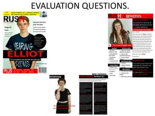
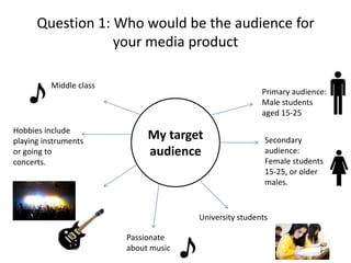
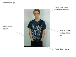
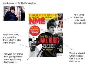
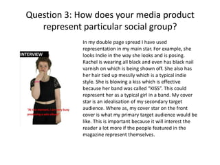
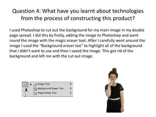
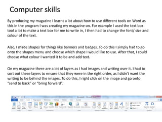
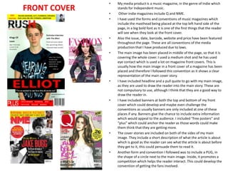
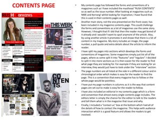
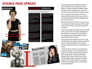
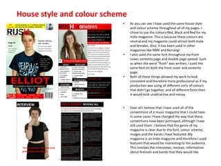
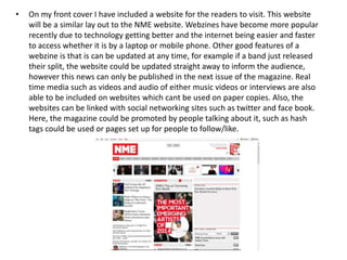
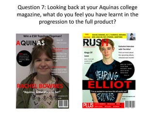
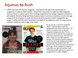
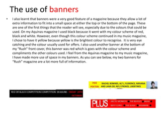
This document contains information about Emma Foley's media studies portfolio project on constructing a music magazine called "Rush". It includes details of her target audience for the magazine, which is primarily male students aged 15-25 who enjoy indie music. It also discusses how she addressed this audience through the visuals and content of the magazine, such as featuring a young male musician on the cover. The document outlines how Emma used technologies like Photoshop and page layout tools in Microsoft Word to design the magazine pages. It analyzes how the magazine represents the indie music genre and audience. Overall, the document evaluates how Emma's magazine uses conventions of real media formats and how she has developed her skills in media design and targeting audiences.
Comprehensive program for Agricultural Finance, the Automotive Sector, and Empowerment . We will define the full scope and provide a detailed two-week plan for identifying strategic partners in each area within Limpopo, including target areas.:
1. Agricultural : Supporting Primary and Secondary Agriculture
• Scope: Provide support solutions to enhance agricultural productivity and sustainability.
• Target Areas: Polokwane, Tzaneen, Thohoyandou, Makhado, and Giyani.
2. Automotive Sector: Partnerships with Mechanics and Panel Beater Shops
• Scope: Develop collaborations with automotive service providers to improve service quality and business operations.
• Target Areas: Polokwane, Lephalale, Mokopane, Phalaborwa, and Bela-Bela.
3. Empowerment : Focusing on Women Empowerment
• Scope: Provide business support support and training to women-owned businesses, promoting economic inclusion.
• Target Areas: Polokwane, Thohoyandou, Musina, Burgersfort, and Louis Trichardt.
We will also prioritize Industrial Economic Zone areas and their priorities.
Sign up on https://profilesmes.online/welcome/
To be eligible:
1. You must have a registered business and operate in Limpopo
2. Generate revenue
3. Sectors : Agriculture ( primary and secondary) and Automative
Women and Youth are encouraged to apply even if you don't fall in those sectors.
Symptoms like intermittent starting and key recognition errors signal potential problems with your Mercedes’ EIS. Use diagnostic steps like error code checks and spare key tests. Professional diagnosis and solutions like EIS replacement ensure safe driving. Consult a qualified technician for accurate diagnosis and repair.
𝘼𝙣𝙩𝙞𝙦𝙪𝙚 𝙋𝙡𝙖𝙨𝙩𝙞𝙘 𝙏𝙧𝙖𝙙𝙚𝙧𝙨 𝙞𝙨 𝙫𝙚𝙧𝙮 𝙛𝙖𝙢𝙤𝙪𝙨 𝙛𝙤𝙧 𝙢𝙖𝙣𝙪𝙛𝙖𝙘𝙩𝙪𝙧𝙞𝙣𝙜 𝙩𝙝𝙚𝙞𝙧 𝙥𝙧𝙤𝙙𝙪𝙘𝙩𝙨. 𝙒𝙚 𝙝𝙖𝙫𝙚 𝙖𝙡𝙡 𝙩𝙝𝙚 𝙥𝙡𝙖𝙨𝙩𝙞𝙘 𝙜𝙧𝙖𝙣𝙪𝙡𝙚𝙨 𝙪𝙨𝙚𝙙 𝙞𝙣 𝙖𝙪𝙩𝙤𝙢𝙤𝙩𝙞𝙫𝙚 𝙖𝙣𝙙 𝙖𝙪𝙩𝙤 𝙥𝙖𝙧𝙩𝙨 𝙖𝙣𝙙 𝙖𝙡𝙡 𝙩𝙝𝙚 𝙛𝙖𝙢𝙤𝙪𝙨 𝙘𝙤𝙢𝙥𝙖𝙣𝙞𝙚𝙨 𝙗𝙪𝙮 𝙩𝙝𝙚 𝙜𝙧𝙖𝙣𝙪𝙡𝙚𝙨 𝙛𝙧𝙤𝙢 𝙪𝙨.
Over the 10 years, we have gained a strong foothold in the market due to our range's high quality, competitive prices, and time-lined delivery schedules.
What Exactly Is The Common Rail Direct Injection System & How Does It WorkMotor Cars International
Learn about Common Rail Direct Injection (CRDi) - the revolutionary technology that has made diesel engines more efficient. Explore its workings, advantages like enhanced fuel efficiency and increased power output, along with drawbacks such as complexity and higher initial cost. Compare CRDi with traditional diesel engines and discover why it's the preferred choice for modern engines.
What Does the Active Steering Malfunction Warning Mean for Your BMWTanner Motors
Discover the reasons why your BMW’s Active Steering malfunction warning might come on. From electrical glitches to mechanical failures and software anomalies, addressing these promptly with professional inspection and maintenance ensures continued safety and performance on the road, maintaining the integrity of your driving experience.
Things to remember while upgrading the brakes of your carjennifermiller8137
Upgrading the brakes of your car? Keep these things in mind before doing so. Additionally, start using an OBD 2 GPS tracker so that you never miss a vehicle maintenance appointment. On top of this, a car GPS tracker will also let you master good driving habits that will let you increase the operational life of your car’s brakes.
What Does the PARKTRONIC Inoperative, See Owner's Manual Message Mean for You...Autohaus Service and Sales
Learn what "PARKTRONIC Inoperative, See Owner's Manual" means for your Mercedes-Benz. This message indicates a malfunction in the parking assistance system, potentially due to sensor issues or electrical faults. Prompt attention is crucial to ensure safety and functionality. Follow steps outlined for diagnosis and repair in the owner's manual.
Why Is Your BMW X3 Hood Not Responding To Release CommandsDart Auto
Experiencing difficulty opening your BMW X3's hood? This guide explores potential issues like mechanical obstruction, hood release mechanism failure, electrical problems, and emergency release malfunctions. Troubleshooting tips include basic checks, clearing obstructions, applying pressure, and using the emergency release.
In this presentation, we have discussed a very important feature of BMW X5 cars… the Comfort Access. Things that can significantly limit its functionality. And things that you can try to restore the functionality of such a convenient feature of your vehicle.
"Trans Failsafe Prog" on your BMW X5 indicates potential transmission issues requiring immediate action. This safety feature activates in response to abnormalities like low fluid levels, leaks, faulty sensors, electrical or mechanical failures, and overheating.
Core technology of Hyundai Motor Group's EV platform 'E-GMP'Hyundai Motor Group
What’s the force behind Hyundai Motor Group's EV performance and quality?
Maximized driving performance and quick charging time through high-density battery pack and fast charging technology and applicable to various vehicle types!
Discover more about Hyundai Motor Group’s EV platform ‘E-GMP’!
5 Warning Signs Your BMW's Intelligent Battery Sensor Needs AttentionBertini's German Motors
IBS monitors and manages your BMW’s battery performance. If it malfunctions, you will have to deal with an array of electrical issues in your vehicle. Recognize warning signs like dimming headlights, frequent battery replacements, and electrical malfunctions to address potential IBS issues promptly.
3. Question 1: Who would be the audience for
your media product
Middle class
Hobbies include
playing instruments
or going to
concerts.
Primary audience:
Male students
aged 15-25
My target
audience
Secondary
audience:
Female students
15-25, or older
males.
University students
Passionate
about music
4. My Target Audience
Primary audience: The primary audience for my magazine “Rush” would be predominantly male due to the
genre being Indie as it appeals to more males. The male audience would be aged 15-25 which could include
college and university students who are passionate about music and enjoy going to gigs and festivals. This is
because I believe that people of this age listen to indie music the most. My target audience are of any ethnicity,
and middle class who like to socialise with friends or may even play an instrument themselves. I believe that
this audience would enjoy the features in my magazine if they are passionate about it. These features include
the reviews, interviews and articles.
Secondary audience: The secondary audience would include women aged 15-25 because they may also have
an interest in Indie music. This audience could also include the people who would read the magazine after
being given it by a friend or family member, which is the magazines readership value. They could be interested
in reading the magazine but would not actually go out and buy it themselves. My magazine is for both male
and female readers as shown by the colour scheme as blue, black and red are unisex colours. Where as a pop
magazine that is aimed at teenage girls would be pink and that colour appeals to them. Also, older males could
be included in the secondary audience because they may still enjoy listening to indie music and would
therefore buy the magazine.
5. Questionnaire results
After creating a questionnaire and finding out about teenagers aged 16-17, I have found that in their spare
time, half of the people asked enjoy to go out with their friends. Other popular things to do include going
shopping or just staying in. I found that the most favourite shops for these people to shop in are topshop and
topman. From this questionnaire I have been able to see what sort of bands my audience like so that they
could be included in my magazine. Also, knowing what they like allows me to get an idea of what prizes could
be available.
I asked what their favourite genre of music
was and received a number of different
answers. This suggests that young peoples
music taste differs and that some people
have an interest in all genres. From these
results I decided that “Indie” music would be
a good genre for my magazine as that was
the answer for all of the students who chose
“other” which was a large proportion. Also,
Indie music can be merged into other genres
such as “Rock” which I found was the most
popular genre.
6. In my questionnaire I asked what the students do in their
spare time. As you can see by the pie chart, the most
popular answers were to “go out with friends” and go
“shopping”. From this I think that it shows that my
magazine is important because it will give the students
more things to do in their spare time. For example, some of
the students say that they “stay in” and my magazine
“Rush” will give them something to do when they are at
home. Also, reading magazines helps with the students
school/college/university work because it is good for them
to be reading in their spare time. Also, if the students like to
spend time with their friends
7. Question 2: How did you
attract/address your audience?
The star on my main image represents my audience because he is presented like a
stereotypical Indie musician. For example he is using direct eye contact with the
audience, and has a very serious facial expression. He has his hands in his pockets
which shows that he is casual, along with his jeans and t-shirt. Elliot is young and the
same age as some of the target audience and therefore it is easier for them to relate.
8. The main image
Direct eye contact
with the audience
Hands in his
pocket
Casual t-shirt
with writing
on
Black skinny jeans
9. Jake Bugg cover for NME magazine.
He is using
direct eye
contact with
the audience
Very casual pose,
at a bar with a
drink, which relates
to the article
“18 year old” shows
he is young and the
same age as many
NME readers
Wearing a jacket
which suggests
he has a casual
dress sense
10. Question 3: How does your media product
represent particular social group?
In my double page spread I have used
representation in my main star. For example, she
looks Indie in the way she looks and is posing.
Rachel is wearing all black and even has black nail
varnish on which is being shown off. She also has
her hair tied up messily which is a typical indie
style. She is blowing a kiss which is effective
because her band was called “KISS”. This could
represent her as a typical girl in a band. My cover
star is an idealisation of my secondary target
audience. Where as, my cover star on the front
cover is what my primary target audience would be
like. This is important because it will interest the
reader a lot more if the people featured in the
magazine represent themselves.
11.
12.
13. Question 4: What have you learnt about technologies
from the process of constructing this product?
I used Photoshop to cut out the background for my main image in my double
page spread. I did this by firstly, adding the image to Photoshop and went
round the image with the magic eraser tool. After I carefully went around the
image I used the “Background eraser too” to highlight all of the background
that I didn’t want to use and then I saved the image. This got rid of the
background and left me with the cut out image.
14. Computer skills
By producing my magazine I learnt a lot about how to use different tools on Word as
this in the program I was creating my magazine on. For example I used the text box
tool a lot to make a text box for me to write in, I then had to change the font/ size and
colour of the text.
Also, I made shapes for things like banners and badges. To do this I simply had to go
onto the shapes menu and choose which shape I would like to use. After that, I could
choose what colour I wanted it to be and add text.
On my magazine there are a lot of layers as I had images and writing over it. I had to
sort out these layers to ensure that they were in the right order, as I didn’t want the
writing to be behind the images. To do this, I right click on the image and go onto
“send to back” or “bring forward”.
15. Question 5: In what ways does your media
product use, develop or challenge forms
and conventions of real media products.
16. FRONT COVER
•
•
•
•
•
•
•
•
•
My media product is a music magazine, in the genre of Indie which
stands for Independent music.
Other Indie magazines include Q and NME.
I have used the forms and conventions of music magazines which
include the masthead being placed at the top left hand side of the
page, in a big bold font as it is one of the first things that the reader
will see when they look at the front cover.
Also the issue, date, barcode, website and price have been featured
throughout the page. These are all conventions of the media
production that I have produced due to laws.
The main image has been placed in middle of the page, so that it is
covering the whole cover. I used a medium shot and he has used
eye contact which is used a lot on magazine front covers. This is
usually how the main image in a front cover of a magazine has been
placed and therefore I followed this convention as it shows a clear
representation of the main cover story.
I have included headline and a pull quote to go with my main image,
as they are used to draw the reader into the main story. These are
not compulsory to use, although I think that they are a good way to
draw the reader in.
I have included banners at both the top and bottom of my front
cover which could develop and maybe even challenge the
conventions as usually banners are only included at one of these
places if any. Banners give the chance to include extra information
which would appeal to the audience. I included “free posters” and
“plus” which could anchor the reader as those words could make
them think that they are getting more.
The cover stories are included on both of the sides of my main
image. They include a short description of what the article is about
which is good as the reader can see what the article is about before
they get to it, this could persuade them to read it.
Another form and convention I followed was to include a PUG, in
the shape of a circle next to the main image. Inside, it promotes a
competition which helps the reader interact. This could develop the
convention of getting the fans involved.
17. CONTENTS PAGE
•
•
•
•
•
•
•
My contents page has followed the forms and conventions of a
magazines such as I have included the masthead “RUSH CONTENTS”
so as well as the issue number. After looking at magazines such as
NME and Kerrang! whilst looking for inspiration, I have found that
this is used in their contents pages as well.
Another main story, not the one presented on the front cover, has
been included in my magazine contents page. This could challenge
the forms and conventions as a lot of magazines use the same story.
However, I thought that if I did that then the reader may get bored of
it already and I wouldn’t want to spoil anymore of the article. Also,
by using another article it promotes it and shows that there is a lot of
content in my magazine. My story includes an image, the page
number, a pull quote and extra details about the article to inform the
reader.
I have split my pages into sections which develops the forms and
conventions of magazines. Some magazines simply just list all of the
pages, where as some split it into “features” and “regulars”. I decided
to split it into more sections as it is then easier for the reader to find
what page they are looking for. For example if they are looking for an
interview, they would just have to look under the “interview” section.
The page numbers are all listed at the side in a different colour and in
chronological order which makes is easy for the reader to find the
page. This is a convention that every magazine has to follow or the
whole page would be pointless.
I have put my page numbers in columns as it is the way that content
pages are set out to make is easy for the reader to follow.
I have also included an editorial in my contents page which is a form
and convention that almost every single contents page includes. The
editors letter is simply the chance for the editor to talk to the readers
and tell them what is in the magazine that issue and why.
Finally, I included a “contact us” box at the bottom which had all of
the details of how to contact the magazine. This helps with audience
interaction which is a good feature and allows the readers to get
involved.
18. DOUBLE PAGE SPREAD
•
•
•
•
•
•
My double page spread follows the forms
and conventions as it includes the main
features. These include the headline which
includes the title and grey box. This is the
first bit of the article that the reader will see.
Also I included a dropped cap, which is a
convention that every article uses, which is
just simple the first letter being bigger than
the rest of the font.
My article has been written in columns. This
is a major form and convention and if I didn’t
write it like that then it would not look like
an article.
I took up one page to include my main image
with a pull quote. This could challenge the
conventions as not all articles are like this.
For example, some double page spreads
include lots of little pictures.
The pull quote was picked out of the article
and therefore the reader would see that first
and it would persuade them to read the
article as they would want to know what it is
about.
I chose to do my article as a question and
answer interview. This is because then it is
clear to the reader exactly what questions
were being asked, and they could even
choose which ones to read or not. Other
double page spreads could either include
question and answers like this, or articles
written by somebody which includes pull
quotes throughout.
19. House style and colour scheme
•
•
•
•
As you can see I have used the same house style
and colour scheme throughout all of my pages. I
chose to use the colours Red, Black and Red for my
Indie magazine. This is because these colours are
neutral and my magazine could attract both male
and females. Also, it has been used in other
magazines like NME and Kerrang!
I also used the same font throughout my front
cover, contents page and double page spread. Such
as when the word “Rush” was written, I used the
same font on both the front cover and contents
page.
Both of these things allowed my work to look
consistent and therefore more professional as if my
production was using all different sorts of colours
that didn’t go together, and all different fonts then
it would look unattractive and messy.
Over all I believe that I have used all of the
conventions of a music magazine that I could have.
In some cases I have changed the way that these
conventions have been portrayed, although I have
still used them. I believe that the genre of my
magazine is clear due to the font, colour scheme,
images and the bands I have featured. My
magazine is an Indie magazine and therefore I used
features that would be interesting to the audience.
This involves the interviews, reviews, information
about festivals and bands that they would like.
20. Question 6: What kind of media institution might
distribute your product and why?
I have decided that IPC Media will be the institution to work with my
magazine “Rush” because it also works with NME. I believe that because
the magazines are quite similar it would be easier for them to be under the
same institution as they could help promote each others magazines rather
than being rivals.
“IPC Media is the
UK's leading
consumer
magazine and
digital publisher”
21. DISTRIBUTION
My magazine is going to be published fortnightly, where as NME is published weekly, this may
persuade other readers to buy Rush because my target audience are of age where they might not
have a huge disposable income to be spending on magazines. Therefore, the price of my
magazine will be £2.50, which is not a huge amount considering the quantity of every issue will
be of a high standard.
“Rush” will be distributed through many different things to make sure that it is well recognised
and successful. For example, social networking sites are a really good way to do this, as most of
my target audience will be on these and be able to access pages. This means that they can gain
extra information and know what will be coming up in the next issue which would encourage
them to buy it.
Another feature is the opportunity for readers to have subscriptions. This means that they don’t
even have to leave the house to go to the shop and buy the magazine, they can get it delivered
straight to their house on the date the issue is released. This would persuade many readers to
buy “Rush” as it is a feature included in all different magazines which is very useful.
22. •
On my front cover I have included a website for the readers to visit. This website
will be a similar lay out to the NME website. Webzines have become more popular
recently due to technology getting better and the internet being easier and faster
to access whether it is by a laptop or mobile phone. Other good features of a
webzine is that is can be updated at any time, for example if a band just released
their split, the website could be updated straight away to inform the audience,
however this news can only be published in the next issue of the magazine. Real
time media such as videos and audio of either music videos or interviews are also
able to be included on websites which cant be used on paper copies. Also, the
websites can be linked with social networking sites such as twitter and face book.
Here, the magazine could be promoted by people talking about it, such as hash
tags could be used or pages set up for people to follow/like.
23. Question 7: Looking back at your Aquinas college
magazine, what do you feel you have learnt in the
progression to the full product?
24. Aquinas to Rush
•
I think that from the Aquinas magazine, I have learnt a lot about the conventions of
magazines in order to make it better. I think that it was easier to make my Indie magazine,
because there is a clearer genre than a college magazine as the college magazine is aimed at
all students. The only thing that these students have in common is that they are all in the age
range of 16-19. However, it could also be aimed at the teachers which changed the age
range. I mostly used the same conventions for both of my magazines, such as using a colour
scheme, masthead, main image, cover lines.
As you can see, in my music magazine
“Rush” I have decided to make the
background white which I think looks a lot
better in comparison to my Aquinas
magazines background colour. This is
because it means that the main image and
cover lines stand out more. I feel that I got
better images for my Indie magazine
because from doing my Aquinas magazine I
learnt how the image backgrounds looked
and how big they needed to be. This
allowed me to know how close I should take
the image. I firstly cropped my images to
make them the right size and then used
Photoshop to edit anything out such as the
background or to make it brighter.
25. The use of banners
•
I also learnt that banners were a very good feature of a magazine because they allow a lot of
extra information to fit into a small space at either the top or the bottom of the page. These
are one of the first things that the reader will see, especially due to the colours that could be
used. On my Aquinas magazine I used black because it went with my colour scheme of red,
black and white. However, even though this colour scheme continued in my music magazine,
I chose to have it yellow because yellow is the brightest colour to recognise. It is very eye
catching and the colour usually used for offers. I also used another banner at the bottom of
my “Rush” front cover, this banner was red which is goes with the colour scheme and
compliments the other colours used. I feel from the Aquinas magazine to my music magazine,
I have made more use of space in my banners. As you can see below, my two banners for
“Rush” magazine are a lot more full of information.
26. Contents page
In terms of contents page, I think that for both the Aquinas magazine and Rush magazine, they
are both very similar. I have mostly used the same layout because I believe that it looks very neat
and readable. However, improvements from my Aquinas magazine to Rush include the articles
being split up into sections. I think this is a good feature in a contents page because it allows the
audience to find what they are looking for easily where as my Aquinas contents is just split into
“feature” and “regular”. In my music magazine I haven’t used a banner although I think it looks
good in my Aquinas magazine. This is because I focused on putting as many page numbers on as
possible. I decided to include a bit about the main article as well, next the image. I think this is
effective because it may interest the reader and make them want to read it when they are
looking for what articles to read.