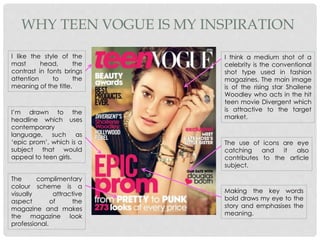
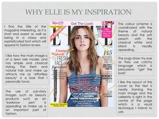
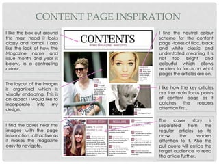
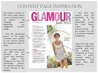
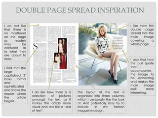
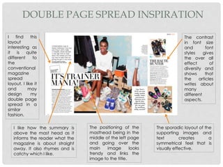
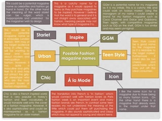
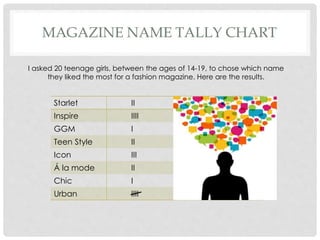
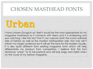
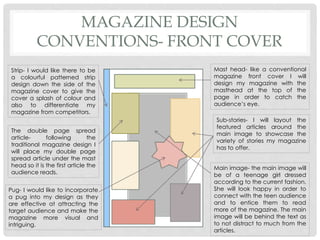
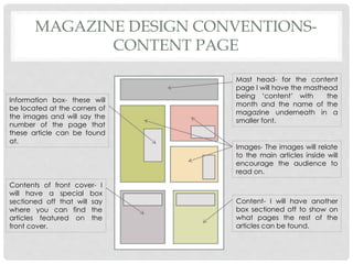
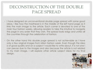
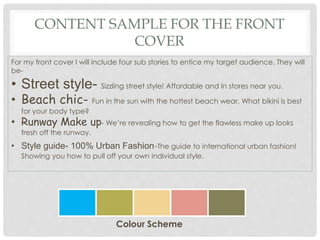
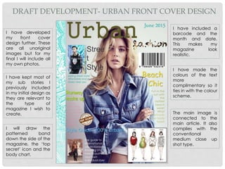
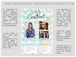
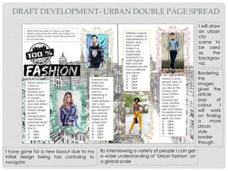
P L A N N I N G O F F A S H I O N M A G A Z I N E
B Y G E O R G I N A M A L P A S S
FASHION MAGAZINE
PRODUCTION TREATMENT
INTRODUCTION
• Planning of the Magazine
INTRODUCTION
For my preproduction Media Studies Foundation
Portfolio Task I carried out research into how existing
magazines present their information through- front
covers, content pages and double page spreads. I
have analyzed the font styles, photo types and
celebrity styling that combine in order to create a
successful magazine. I have worked towards
designing and developing my magazine in order to
appeal to the precise target audience.
EXISTING MAGAZINES THAT
INSPIRE ME
• Break down of Magazines I’m inspired by
WHY TEEN VOGUE IS MY INSPIRATION
I like the style of the
mast head, the
contrast in fonts brings
attention to the
meaning of the title.
I’m drawn to the
headline which uses
contemporary
language, such as
‘epic prom’, which is a
subject that would
appeal to teen girls.
I think a medium shot of a
celebrity is the conventional
shot type used in fashion
magazines. The main image
is of the rising star Shailene
Woodley who acts in the hit
teen movie Divergent which
is attractive to the target
market.
The use of icons are eye
catching and it also
contributes to the article
subject.
Making the key words
bold draws my eye to the
story and emphasises the
meaning.
The complimentary
colour scheme is a
visually attractive
aspect of the
magazine and makes
the magazine look
professional.
WHY ELLE IS MY INSPIRATION
I find the title of the
magazine interesting, as it is
short and sweet as well as
being in a classy and
sophisticated font which will
appeal to fashion lovers.
I like how the main image is
of a teen role model, and
has simple and classical
styling. The fresh and
natural hair and make up
attracts me as ‘effortless
beauty’ is a look that I
personally favor.
The use of sub-story
images such as beauty
products such as an
‘eyebrow pen’ is
appealing as make up is
an important part of
fashion.
The colour scheme is
coordinated with the
theme of natural
beauty and the soft
peach with the
classical white and
black is visually
appealing.
The pugs draw my eye
as they use catchy
language which is
persuasive- “get the
look!’
I like the layout of this
cover as the text is
neatly framing the
main image and the
celebrity is right in the
centre of the page
which is a visual
technique I intend to
use.
EXISTING MAGAZINES THAT
INSPIRE ME
• Break down of Magazines content pages I'm inspired by
CONTENT PAGE INSPIRATION
I like the box out around
the mast head it looks
classy and formal. I also
like the look of how the
Magazine name and
issue month and year is
below, in a contrasting
colour.
The layout of the images
is organised which is
visually endearing. This is
an aspect I would like to
incorporate into my
design.
I find the boxes near the
images- with the page
information, attractive as
it makes the magazine
easy to navigate.
I find the neutral colour
scheme for the content
page -tones of lilac, black
and white classic and
understated meaning it is
not too bright and
colourful which allows
readers to focus on what
pages the articles are on.
I like how the key articles
are the main focus points
of content page as it
catches the readers
attention first.
The cover story is
separated from the
regular articles so to
draw the readers
attention to it. Also the
pull quote will entice the
target audience to read
the article further.
CONTENT PAGE INSPIRATION
The colour contrast of
the mast head letters
is eye catching and is
an aspect I will
consider when
designing my
magazine content
page.
I find the organised
layout of the page
numbers and articles
in one column makes
the magazine easy to
read.
I like that the main
image is styled for
summer and how
the caption is
intriguing as it says
‘have a pretty
summer' which is
something that
many teen girls
aspire to.
I find that the
season must be
important to the
issue, as it is
advertised under
the mast head,
which will
communicate to
the reader that this
is a summer inspired
magazine.
I like how the articles
are split into two
sections- ‘on the
cover’ and ‘features’
this helps the
audience to find the
advertised articles.
This will be a feature I
could include in my
designs.
EXISTING MAGAZINES THAT
INSPIRE ME
• A Break down of Magazines’ double page spreads I am inspired by
DOUBLE PAGE SPREAD INSPIRATION
I like how this
double page
spread has the
main image
covering a
whole page.
I also find how
the pull quote
that
accompanies
the image to
be endearing
and makes the
main image
look more
interesting.The layout of the text is
organised into three columns
which I personally like the look
of. And potentially may try to
include in my fashion
magazine design.
I find that the
large
capitalised ‘S’
looks formal
and
sophisticated
and shows the
reader where
the article
begins.
I do not like
that there is
no masthead
on the page
as readers
may be
confused as
to what they
are about to
read.
I do like how there is a
selection of pictures
amongst the text, as it
makes the article more
visual and less like a ‘sea
of text’.
DOUBLE PAGE SPREAD INSPIRATION
I find this
layout
interesting as
it is quite
different to
the
conventional
magazine
spread
layout. I like it
and may
design my
double page
spread in a
similar
fashion.
I like how the summary is
above the mast head as it
informs the reader what the
magazine is about straight
away. It also rhymes and is
catchy which I like.
The positioning of the
masthead being in the
middle of the left page
and going over the
main image looks
trendy and links the
image to the title.
The sporadic layout of the
supporting images and
text creates a
symmetrical feel that is
visually effective.
The contrast
in font size
and font
styles gives
the over all
effect of
diversity and
shows that
the articles
writes about
many
different
aspects.
POTENTIAL MAGAZINE NAMES
• Spider Diagram of potential magazine names.
Possible Fashion
magazine names
GGMInspire
Teen Style
Starlet
Urban
Chic
Á la Mode
Icon
This is a catchy name for a
magazine as it would appeal to
teens as they purchase magazines
to be inspired. However I believe
that the word is to general and it is
not straight away associated with
fashion, meaning people may not
know what type of magazine it is.
GGM is a potential name for my magazine
as it is my initials. This is a catchy title and
could work on todays market. Using the
monogram of my name I could create a
brand for my fashion magazine such as
Coco Channel and Dolce and Gabbana.
Then again, with competitive magazines
such as GQ on the shelf, GGM is too similar
and may seem unoriginal.
Teen Style could
be a good name
for the magazine
as it is relatable to
the target market.
Furthermore it
could also be too
cheesy and
predictable which
may put off the
ideal consumers.
I like the name Icon for a
magazine due to there being
so many fashion icons. On
the other hand there is a
magazine that already exists
in the market under that
name.
The translation into French is ‘in fashion’ which
would connect well with fashion lovers as Paris
fashion week is an important event and many
fashion brands are French. In contrast some teen
readers my not understand the meaning of the
tittle which could put them off purchasing the
magazine. It also sounds sophisticated and classy
which may not appeal to young and vibrant teens
Chic is also a French inspired world
that is very popular in today’s
fashion and teen vocabulary. It
would translate well onto the cover
of a fashion magazine. However, It
is also sophisticated and could be
misinterpreted as a fashion
magazine for an older market.
This would be a
good potential
magazine name as
it embodies London
fashion. With may of
my target audience
living in cities, they
will be wanting to
wear and read
about modern and
metropolitan
fashion. However, it
has quite a
masculine and gritty
feel to it and may
not attract the girly-
girl stereotype who
who are the most
frequent buyers of
fashion magazines.
This could be a potential magazine
name as celebrities and fashion go
hand in hand. On the other hand
the meaning of the word starlet
can be vulgar, which is
inappropriate and unrelated for
the magazine I wish to design
MAGAZINE NAME TALLY CHART
Starlet II
Inspire IIII
GGM I
Teen Style II
Icon III
Á la mode II
Chic I
Urban IIII
I asked 20 teenage girls, between the ages of 14-19, to chose which name
they liked the most for a fashion magazine. Here are the results.
MAGAZINE NAME
• Chosen magazine name based on tally chart results.
CHOSEN NAME FOR MY MAGAZINE
Urban
This magazine name seems the most popular with my
target audience as it represents nowadays’ city fashion.
My personal favorite name was ‘À la Mode’ as Paris
fashion week is so popular in today’s market and there is
so much French influence in modern fashion.
Yet the audience I interviewed saw it as too sophisticated
and old for a teen fashion magazine, some didn’t even
know what it meant.
This is why I believe the name ‘Urban’ is the most suitable
for my magazine as it appeals to teens and embodies
edge and high fashion.
FONT RESEARCH
• Existing magazine masthead fonts.
FONT INSPIRATION
Glamour magazine uses an outlines capitalised font. This use of
font is attractive to the reader and will entice them. Due to it
being covered by the main image it can be assumed that the
magazine brand is well known and has already firmly established
a consistent target market. Also by only revealing the ‘GL’ and
the ‘UR’ the target audience can recognize that the magazine is-
Glamour.
Company magazine has a bold capitalised masthead. This font is
in a contrasting colour to the background in order for it to stand
out and catch the audience’s eye. The stripe along the side and
the main image is over lapping the title, this shows that they're the
main selling points are the main image rather then the magazine
brand.
Teen vogue has a mixture of fonts to reinforce the meaning of the
title. Teen is in a non capitalised yet distinctive font that represents
teens as they are young and relaxed. However , Vogue is in a
capitalised sophisticated font which embodies the ‘well known’
formality and editorial content of the famous magazine Vogue.
Through this the magazine communicated to the reader that this
is a high quality teen style fashion magazine.
Cosmopolitan uses a slim font due to the name being so long. As
the main image is also slightly covering the masthead it shows
that target audience is already familiar with the magazine name,
meaning the target audience can identify it as ‘Cosmopolitan’.
The colour contrast between the pink and the yellow is bright and
eye catching which will appeal to their readers.
FONT RESEARCH
• Evaluation of potential masthead fonts.
FONT RESEARCH
• Chosen font for my magazine.
Urban
I have chosen-Gungsuh as I feel it would be the most appropriate for my
magazine masthead as it connects with teens and it is endearing and
eye catching. I like the fact that it can capture both the iconic editorial
side of fashion as well as the modern metropolitan side. Not only will it
attract my target audience but it will set the tone for the readers visually.
It is also quite different from existing magazine fonts which will help
differentiate my product from competitors. I believe that this font
reinforces ‘urban’ to its full poetical and will look edgy and stylish when
on the cover of my fashion magazine.
CHOSEN MASTHEAD FONTS
IMAGE RESEARCH
• Research into existing magazine front cover images.
MAIN IMAGE RESEARCH
Hair and Make up- I like the
ruffled hair as it looks
‘effortless’ and the simplistic
make up is effective and
emphasises the celebrity’s
natural beauty. This is a style
that main teen girls wan to
achieve.
Styling- the wardrobe choice
is modern and memorable. It
has an eye catching print
but does not detract for the
celebrity herself. It is simplistic
and contemporary which
embraces today’s fashion.
Pose- The celebrity is facing
the camera head on,
embodying female
empowerment. The body
position allows the readers
to take notice of the
garment.
Shot type- Elle has gone for a
medium shot which allows
readers to notice the aspects the
magazine is selling: beauty tips,
hair styles, fashion styling and the
celebrity Emma Watson her self.
The blank corners of the photo
allow the text to fit neatly around
the subject.
Set- The background for this
photo is completely white which
indicates to the audience to
focus on the celebrity and also
shows that simplicity can be
effective.
Subject- the subject of the main
image is Emma Watson who is a
child actress turned UN Activist.
She is beautiful and intellectual
making her the ultimate
inspiration for teenage girls.
MAIN IMAGE RESEARCH
Hair and Make up-The look
this magazine is going for is
‘island girl’ so the sea salted
hair and the sandy bronze
make up ties in with the
magazine theme and
appeals to beach lover teens.
Styling- The clothing choice is
a denim cover up which is in
fashion when it comes to
beach wear. The palm leaf
bracelet is a statement piece
and ties in with the exotic
theme.
Pose- The model is relaxed as
she has her arm behind her
head which is a classic beach
pose, this will invite the
readers in. As she is facing the
camera the audience can
see the model’s outfit and
accessories which are selling
points for the magazine.
Shot type- Guess, like
most magazines I have
analysed, has used a
medium shot. This allows
the reader to see the Bora
Bora background and the
models beach-ready
styling which all ties in with
the summer holiday
theme. This is a key selling
point for the magazine
and will make it more
desirable to the
consumer’s eye.
Subject- the focus of the
main image is Gigi Hadid
who is a rising model and
Hollywood's new ‘it’ girl.
She has natural beauty
and is all about fitness
and eating healthy,
making her the perfect
model to sport the cover
of the summer issue of
Guess fashion magazine.
MAGAZINE LAYOUT
• Codes and conventions of magazine layouts.
MAGAZINE DESIGN
CONVENTIONS- FRONT COVER
Mast head- like a conventional
magazine front cover I will
design my magazine with the
masthead at the top of the
page in order to catch the
audience’s eye.
Sub-stories- I will layout the
featured articles around the
main image to showcase the
variety of stories my magazine
has to offer.
Strip- I would like there to be
a colourful patterned strip
design down the side of the
magazine cover to give the
cover a splash of colour and
also to differentiate my
magazine from competitors.
The double page spread
article- following the
traditional magazine design I
will place my double page
spread article under the mast
head so it is the first article the
audience reads.
Pug- I would like to incorporate
a pug into my design as they
are effective at attracting the
target audience and make the
magazine more visual and
intriguing.
Main image- the main image will
be of a teenage girl dressed
according to the current fashion.
She will look happy in order to
connect with the teen audience
and to entice them to read
more of the magazine. The main
image will be behind the text as
to not distract to much from the
articles.
MAGAZINE DESIGN CONVENTIONS-
CONTENT PAGE
Mast head- for the content
page I will have the masthead
being ‘content’ with the
month and the name of the
magazine underneath in a
smaller font.
Images- The images will relate
to the main articles inside will
encourage the audience to
read on.
Information box- these will
be located at the corners of
the images and will say the
number of the page that
these article can be found
at.
Contents of front cover- I
will have a special box
sectioned off that will say
where you can find the
articles featured on the
front cover.
Content- I will have another
box sectioned off to show on
what pages the rest of the
articles can be found.
MAGAZINE DESIGN CONVENTIONS-
DOUBLE PAGE SPREAD
Introduction- I want
to break away from
the stereotypical
design of a double
page spread and
place the
introduction above
the title.
Masthead- the
masthead will
overlap the main
image to give the
page a unique
design.
Subtitle- will be
under the title in a
smaller and
different font. It will
entail what the
article will be
about.
Images- I will
include many
images in my article
as my market
research
questionnaire
revealed that visual
articles are more
attractive to teens.
Main image- the
main image will be
in the center of the
page with all the
text laid out around
it.
Article- The article
will be divided into
paragraphs and
positioned next to
images as I have
many aspects I
want to include in
my article this will
allow me to do so.
MIND MAP FOR THE MAIN
ARTICLE TOPIC
• Exploring what I should base my magazines double page spread on.
MAIN ARTICLE IDEAS
Potential Article
Subjects
Life as a Fashion
Blogger Urban Girl
Fashion week
Cosmo trends
Street chic
gone cyber
Style guide
This would be a relevant title that I could base my article on
as it would tie in with the main image of my magazine. I
could write about how each girl has her own style and
definition of urban fashion. How ever it is quite predictable
and is quite sexist as guys have good urban style as well.
I personally find
this subject very
interesting and I
could explain the
styles of each
fashion week and
how the readers
can achieve the
latest looks.
However it is quite
a detailed subject
with many aspects
that is not related
to my main image.
This is a potential article that I could write about as I could
describe how a variety of individuals from different cultures
wear urban fashion. I can also include how you can achieve
the hottest fashion looks. How ever I’m not sure how my
teens may react to an article based on normal people
rather then celebrities .
This is short for cosmopolitan trends, I would right about
the latest looks off the city streets of Belgrade. I could
take original images from the city yet with the language
barrier I'm not sure if fashionable Serbian people will
speak English meaning they cant answer any questions
about their style.
I could write an article based on the best known
fashion blogger. There is a popular TV show on the “E”
channel about fashion bloggers that has many
viewers, meaning my target audience may have an
interest in this subject. Then again I wouldn’t be able
to take original images of the bloggers.
Online shopping is very
popular nowadays, with
many teens wanting to
know where to get the
latest style. I would write
about which shop
websites have the best
prices in order to create
the hottest looks. Yet I
don’t have the
copyrights to use well
known brand’s website
names.
INITIAL DOUBLE PAGE SPREAD TOPIC
Fashion week
I have decided to choose Fashion week as it is an edgy
and interesting subject that my target audience would like
to read about. Not only is it a subject I already know
about but it also has aspects of urban fashion like in
London Fashion week. I will write about the four main
fashion weeks such as- New York, Paris, Milan and London.
Each city embraces its own style of fashion and I can
describe how each signature look can be achieved from
makeup to clothing. I believe this is a good subject to
write about for my magazine as Fashion weeks inspire the
very essence of high street style and are the fashion
highlights of the year.
INITIAL MAGAZINE DESIGN
IDEAS
• Urban magazine front cover; content, design and deconstruction.
DECONSTRUCTION OF FRONT COVER
• The digital front cover design has some good aspects to it- the masthead
is bold and is styled in a memorable and unusual font which will attract
my target audience. I like the conventional central positioning of the
main image with the different fonts representing various articles. It
embodies professionalism and organization for my magazine. The
supporting images are positioned well, as they do not obstruct the main
image or title. To conclude the patterned band down the side of my
magazine looks intriguing and gives the magazine a pop of colour which
is visually pleasing to readers.
• However, this is only a draft and I need to include features like- a bar
code and issue number and date. The star icon also looks too cheesy
which could put off my target audience. Also some font styles I have
chosen are difficult to read and some of the font colours contrast making
them look out of place. I also need to have my main image represent
my main article, which is feature I will incorporate in my next design.
These are all aspects I will improve on in my final front cover.
INITIAL MAGAZINE DESIGN
IDEAS
• Urban magazine content page; content, design and
deconstruction.
CONTENT SAMPLE FOR THE CONTENT
PAGE
For my content page I will include-
• three original photos
• And two columns that will divide the ‘articles advertised on the cover’
and the ‘articles also featured in the magazine’.
• ‘Articles advertised’ on the cover will include-
• P.12- beach chic
• P.27- Street style
• P.3- Models 101
• P.14- Runway make up.
• ‘Also featured’ will include-
• P.4- Hottest trend
• P.27- Fashion Music ‘must haves’!
• And P.3- Holiday like a designer!
IDEA DRAFT- URBAN CONTENT PAGE
DESIGN
Urban fashion magazine- June 2015
On the Front cover…
P 12- beach chic
P 27- Street style
P 3- Models 101
P 14- Runway make up
looks?
Also featured…
P 4- Hottest trend
P 27- Fashion Music
must haves
P 3- Holiday like a
designer!
Behind
the
scenes! P
7
I want the mast head to
be in a handwritten style
of font in order to be
inviting to teen readers.
The name of the
magazine will be in the
Gungsuh font so it is
comparable with the
front cover, therefore
creating brand
familiarity.
The way the layout of
the images is organised
will be visually appealing
to my target audience. It
makes the magazine
easy to navigate.
I will put the page
number of each article
next to the title or image
in order to make the
content page easy to
read.
I find a neutral color
scheme for a content page
relaxing and easy to read
from. I have chosen tones
of- grey, white, black and
powder blue which will be
easy on the eye and allow
the readers to focus on the
article page numbers.
I have designed the key
articles in the middle of
the content page and
with images in order to
catch the audiences
attention first.
The cover stories are
separated from the regular
articles so to make the
magazine easy to traverse.
And the funky background
makes the content page
look less boring.
P. 3
DECONSTRUCTION OF CONTENT PAGE
• The content page is designed with features that are attractive- the
masthead is in a unique font and is visually appealing. The images
arranged in the middle of the page gives the content page structure and
informs readers that they are the main articles in the magazine. The division
between ‘what is advertised on the front cover’ and ‘what is also featured
in the magazine’ is a good idea as it makes the magazine easy to
navigate and it organises the articles for the reader.
• Then again there are some aspects I wish to change- I find the
background needs to be more subtle, so it doesn’t distract readers from
the page numbers. Also, I think the front cover should be reflected through
the content page so I will need to include a similar colour scheme as the
one I have included in my design is too bland.
INITIAL MAGAZINE DESIGN
IDEAS
• Urban magazine double page spread; content, design and
deconstruction.
SAMPLE OF THE ‘FASHION WEEK’
ARTICLE
For my double page spread I will include-
Information on London fashion week
London fashion week is the prestigious event that has been inspiring our wardrobes
since 1984. London fashion week shines an international spotlight on the best of
British designers. The UK is riding the crest of the fashion wave when it comes to
innovation and creativity of the latest trends. Burberry Prorsum was one of the
favorite shows, where soft eggplant shades and a warm foundation base kept the
look romantic and relaxed. To get the Burberry look- a ‘must have’ accessory is the
signature plaid scarf which can be purchased at SHEINSIDE.COM for 9.72.
London fashion
week photos
SAMPLE OF THE ‘FASHION WEEK’
ARTICLE
For my double page spread I will include-
Information on Milan fashion week-
Milan fashion week is in all the celebrity calendars “In Milan!”, the style is all about
elegance and sophistication. It’s Dolce vs. Prada – Italian designers are all about
merging clothing from high fashion runway to high street pavement. Milan fashion
week incorporates more masculine tailoring, while giving a contemporary edge to
the normal girly garments.
At Fendi, models such as Kendall rocked a striking smoky eye with a feathered, cat
eye application. Her lips were a shiny baby pink shade and her face lightly
bronzed. Another Runway make up technique, was the Max Mara look on models
such as Gigi Hadid, the slightly glossed foundation was matched with a matte
berry lip and minimal eye makeup to create a fresh faced complexion.
Milan fashion
week photos
IDEA DRAFT- URBAN DOUBLE PAGE
SPREAD DESIGN
Milan fashion week Milan
fashion week Milan fashion
week Milan fashion Milan
style Milan town.
Paris fashion week
Paris style Eiffel tower
Paris show runway
fashion urban chic
conversion from
runway to high street
Paris chic Paris
fashion week
New york fashion week new your
street style new york girl new york
fashion week Kendal Jenner.
How fashion
weeks around the
work converse to
high street fashion
London fashion week
London fashion street
London fashion London
style
Milan
fashion
week Milan
fashion
week Milan
fashion
week Milan
fashion
week Milan
The layout
for my
double
page
spread is not
the
conventiona
l style. I want
to have
each corner
dedicated
to each
fashion
week-
London,
Milan, Paris
and New
York.
The original images I will use will be ones I have acquired from my friends who
have been to two of these fashion shows and I will include some I have taken
myself. The background is of a map to tie in the fashion world theme.
The text will
explain the
background
for each
fashion week
and then I will
write about
how each
cities style
transverses to
high street
fashion.
I will draw the
logos for each
fashion week
and scan them
in to be
included in my
article so they
are original
images.
DECONSTRUCTION OF THE DOUBLE
PAGE SPREAD
• I have designed an unconventional double page spread with some good
ideas, I like how the masthead is in the middle of the left hand page as it
links the main image to the article. Each corner is devoted to one of the
main four fashion weeks, allowing readers to take the intuitive to navigate
the page in any order that they wish. The spread looks edgy and unites all
the countries through the celebration of fashion.
• On the other hand this double page spread is not achievable as I have
only a few original images from Milan fashion week. Even though the idea
is of good quality and on a subject I would like to write about, it is not one I
can peruse due to the images and also because the article is not related
to my main image. I will explore other article subject ideas for my final
design.
MAGAZINE DESIGN
DEVELOPMENT
• How I have developed my magazine design.
DEVELOPMENT
From my initial designs I have evaluated the good aspects and the
negative. I have developed my existing decent ideas and I have
excluded the ideas that would not work.
I have created a new complimentary colour scheme and reworded the
sub stories advertised on my cover in a more persuasive way. Another
aspect I have included is a barcode and the month and year of the
magazine issue.
On the content page I have kept the layout the same but I have
incorporated a new background that complies with the colour scheme.
After seeing that the ‘fashion week’ article, in my previous design, was
impracticable I have created a whole new double page spread that is
about a new innovative subject (Urban Style Guide), an sketched
background and a different layout, all completed with my own original
images.
MAGAZINE DESIGN
DEVELOPMENT
• Urban magazine front cover; content, design and deconstruction.
On the Front cover…
P 12- beach chic
P 27- Street style
P 14- Runway make
up looks?
P 4- Hottest trend
P 27- Fashion Music
must haves
P 3- Holiday like a
designer!
Also featured…
Behind the
scenes! P 7
P. 3
Back stage! P 10
By analyzing my
content page I
have evaluated
the good and the
bad. Again these
are unoriginal
images but for my
final I will
incorporate all my
own photography.
DRAFT DEVELOPMENT- URBAN FRONT CONTENT PAGE
I like the layout of
my initial design so I
will continue to use
it for my content
page.
I have chosen a
new less eye
straining
background for my
content page. I
have gone for a
soft blue pattern
that reflects the
front cover.
I am debating to
use the ‘hand
written’ style font
for the mast head
as I feel it is too girly
and not Urban
enough. This will be
an feature I will
change when I
design my final.
I feel this content
page is colourful
and visually
pleasing making it
easy for readers to
navigate.
Urban style has been on the on our high
streets scene since the 1970s and today it is a
popular fashion choice across the world and
for all ethnicities.
Everyone has
there own
individual
fashion sense
and it is
interesting to
see how it
varies globally. I
met a very
trendy Chinese
guy named Yi
Zhou and he
shared what
makes up his
unique style-
1) Q &A
2) Q&A
3) Q&A
4) Q&A
5) Q&A
Different cultures
show a variety of
interpretations of
fashion, and
that’s what
makes it so
diverse and
celebrated.
Amarachii is a
stylish Nigerian
teen and she
revealed why she
has a wallflower
dress sense-
1) Q&A
2) Q&A
3) Q&A
4) Q&A
5) Q&A
Fashion is what
people wear, its
not only what
you see on the
runway. And
urban fashion
could not
embody that
more. Another
street styler is
Alan from Serbia,
he explains how
he achieves the
geek chic look-
1) Q&A
2) Q&A
3) Q&A
4) Q&A
5) Q&A
Urban Fashion is
a form of
expression,
whether your
look is vintage
or modern,
gothic or glam
your style reflect
who you are.
Fashion design
student
Georgina from
Manchester
preaches about
‘Denim Dos &
Don’ts’-
1) Q&A
2) Q&A
3) Q&A
DRAFT DEVELOPMENT- URBAN DOUBLE PAGE SPREAD
I have gone for a new layout due to my
initial design being too confusing to
navigate
I will draw
an urban
city
scene to
be used
as the
backgrou
nd.
By interviewing a variety of people I can get
a wider understanding of ‘Urban fashion’ on
a global scale
Bordering
the
images
gives the
article
pop of
colour. I
will work
on finding
a more
Urban
style
border
though.
SAMPLE OF THE ‘100% URBAN
FASHION’ ARTICLE
For my double page spread I will include-
Introduction
Urban style has been on the on our high streets scene since the 1970s and today it is a
popular fashion choice around the globe and for all ethnicities.
Urban Fashion is a form of expression, whether your look is vintage or modern, gothic
or glam your style reflect who you are. Fashion design student Georgina from
Manchester preaches about ‘Denim Do’s & Don’ts’-
1) Q: what does urban fashion mean to you?
A: To me Urban fashion stands for the edgy everyday city wear. It can be -casual or
formal, colourful or neutral. It’s defined by you, and that’s why I think I love it so much.
It’s a chameleon of a fashion style!
2) Q: What is your favorite piece of clothing?
A: Oh that’s a tough one, I’d have to say it would be my denim shirt. You can ‘t go
wrong with classic denim.
3) Q: What are your denim Do’s and Don’ts?
A: Well for Denim Don’ts Justin Timberlake and Britney Spears springs to mind! For
my Denim Do’s I would say less is more, you cant go wrong with the James Dean look.
SAMPLE OF THE ‘100% URBAN
FASHION’ ARTICLE
Everyone has their own individual fashion sense and it is interesting to see how it
varies world wide. I met a very trendy Chinese guy named Yi Zhou and he shared
what makes up his unique style-
1) Q: what does urban fashion mean to you?
A: It means street fashion, I see it as the skyscraper chic! Edgy, cool and… Urban
2) Q: How important is fashion in China?
A: Chinese fashion combines unconventional fashion pieces that clash. It
certainly breaks the rules.
3) Q: Does what people think affect your outfit choices?
A: I like to experiment with my style keeping it fresh and up to date. If I cared
what everyone thought I would be boring.
4)Q: Does your girlfriend have an influence on your wardrobe?
A: My girlfriend bought this coat for my actually! I would say I like to dress well for
her and she is quite the fashionista herself. We like to shop together and broaden
our fashion styles.
5)Q: What is your fashion inspiration?
A: I would say G-Dragon, he’s a stylish Korean singer who pushes fashion to its
limits and I admire that.
SAMPLE OF THE ‘100% URBAN
FASHION’ ARTICLE
Fashion- norms, styles and trends differ from culture to culture presenting an array
of interpretations of subculture styles, this is what makes it so universally diverse and
internationally celebrated. Amarachi is a stylish Nigerian teen, she revealed to
‘Urban’ why she has a wallflower dress sense-
1) Q: What does urban fashion mean to you?
A: City style with a twist of glam, I see it in all the magazine, it very in!
2) Q: Where do you like to shop?
A: I'm a bit of a shopaholic but my favorite Nigerian designer would have to be
Joon.
3) Q: Who is your fashion icon?
A: I tend to walk my own path when it comes to fashion. I make my own style, I
don’t really pay attention to what all the celebrities are wearing, they all look like
clones nowadays
4)Q: What fashion looks do Nigerians like to wear?
A: Its all about loud and colourful prints and curve hugging dresses where I come
from, and I love it! I'm into my the tribal glam looks it really represents how I like to
present myself to people- A girl who is proud of her heritage and is fabulous!
5)Q: How would you describe your style?
A: I would say I have a wallflower style as I like to wear quirky and eye-catching
prints but that shows that I am daring and not your typical ‘fade into the
background’ kind of girl.
SAMPLE OF THE ‘100% URBAN
FASHION’ ARTICLE
Fashion is what people wear, its not only what you see on the catwalk. And urban
fashion could not embody that more. Another street styler is Alan who is flying the flag
for Serbia, he explains how he achieves the geek chic look-
1) Q: What does urban fashion mean to you?
A: I would say it is edgy street style, clothes you can buy on the high-street and strut
in the city.
2) Q: Do you think fashion is as important to males as it is to females?
A: I feel it is favored by women but that doesn’t mean it isn't important to men, as in
order to catch a girls eye you have to dressed smart. But yes women have their
fashion and men have their sports!
3) Q: How would you describe the style in Serbia?
A: Well it depends, in the day I would say it is more causal- compared Paris or New
york but that’s because Serbian are very laid back. Although when the night comes
the fashion bar goes through the roof! That’s when all the designer shirts and
glamorous dresses are revealed- that could give Paris and new you’re a run for its
money!
4)Q: What is your favorite accessory?
A: I think my navy tie! Its simple and sophisticated and makes me look smart and
confident.
5)Q: Are you influenced by fashion trends?
A: I'm influenced by comfort mostly! But I have to sisters who like to keep me up to
date with fashion trends.
PITCHING OF MY MAGAZINE
• Pitching
MAGAZINE PITCHING
Through my research into existing fashion and teen magazines I have found that-
• The preferred shot type is a medium shot, this is so the audience can connect with the
model and to admire the fashion and styling.
• The fonts are usually bold and eye catching and positioned at the top of the
magazine
• The feature stories frame the main image, which is central.
• The colour scheme is complimentary and ties in with the magazine issue.
• Content pages have a lot of information and it is normally organised into columns
• There can be up to 5 different images on a content page (I have chosen to include 3)
• The title of a double page spread in conventionally found at the top of the article
• Double page spreads tend to have mostly writing that frames a main image
• The target audience for these magazines are normally teen girls who have an interest
in celebrities and fashion, which is also the characteristic of my target audience.
I believe my magazine will be successful as there seems to be a gap in the market for a
real teen fashion magazine. Teen vogue claims to be a fashion magazine but really it’s
just a teen magazine as it speaks about all kinds topics. I would like to make a magazine
that purely has information on fashion and all the aspects that connect to it. Through the
correct conventions and appropriate modes of address I believe my magazine will
appeal to the target teen audience I wish to attract.

Magazine Pre-production Planning Stage

  • 1.
    P L AN N I N G O F F A S H I O N M A G A Z I N E B Y G E O R G I N A M A L P A S S FASHION MAGAZINE PRODUCTION TREATMENT
  • 2.
  • 3.
    INTRODUCTION For my preproductionMedia Studies Foundation Portfolio Task I carried out research into how existing magazines present their information through- front covers, content pages and double page spreads. I have analyzed the font styles, photo types and celebrity styling that combine in order to create a successful magazine. I have worked towards designing and developing my magazine in order to appeal to the precise target audience.
  • 4.
    EXISTING MAGAZINES THAT INSPIREME • Break down of Magazines I’m inspired by
  • 5.
    WHY TEEN VOGUEIS MY INSPIRATION I like the style of the mast head, the contrast in fonts brings attention to the meaning of the title. I’m drawn to the headline which uses contemporary language, such as ‘epic prom’, which is a subject that would appeal to teen girls. I think a medium shot of a celebrity is the conventional shot type used in fashion magazines. The main image is of the rising star Shailene Woodley who acts in the hit teen movie Divergent which is attractive to the target market. The use of icons are eye catching and it also contributes to the article subject. Making the key words bold draws my eye to the story and emphasises the meaning. The complimentary colour scheme is a visually attractive aspect of the magazine and makes the magazine look professional.
  • 6.
    WHY ELLE ISMY INSPIRATION I find the title of the magazine interesting, as it is short and sweet as well as being in a classy and sophisticated font which will appeal to fashion lovers. I like how the main image is of a teen role model, and has simple and classical styling. The fresh and natural hair and make up attracts me as ‘effortless beauty’ is a look that I personally favor. The use of sub-story images such as beauty products such as an ‘eyebrow pen’ is appealing as make up is an important part of fashion. The colour scheme is coordinated with the theme of natural beauty and the soft peach with the classical white and black is visually appealing. The pugs draw my eye as they use catchy language which is persuasive- “get the look!’ I like the layout of this cover as the text is neatly framing the main image and the celebrity is right in the centre of the page which is a visual technique I intend to use.
  • 7.
    EXISTING MAGAZINES THAT INSPIREME • Break down of Magazines content pages I'm inspired by
  • 8.
    CONTENT PAGE INSPIRATION Ilike the box out around the mast head it looks classy and formal. I also like the look of how the Magazine name and issue month and year is below, in a contrasting colour. The layout of the images is organised which is visually endearing. This is an aspect I would like to incorporate into my design. I find the boxes near the images- with the page information, attractive as it makes the magazine easy to navigate. I find the neutral colour scheme for the content page -tones of lilac, black and white classic and understated meaning it is not too bright and colourful which allows readers to focus on what pages the articles are on. I like how the key articles are the main focus points of content page as it catches the readers attention first. The cover story is separated from the regular articles so to draw the readers attention to it. Also the pull quote will entice the target audience to read the article further.
  • 9.
    CONTENT PAGE INSPIRATION Thecolour contrast of the mast head letters is eye catching and is an aspect I will consider when designing my magazine content page. I find the organised layout of the page numbers and articles in one column makes the magazine easy to read. I like that the main image is styled for summer and how the caption is intriguing as it says ‘have a pretty summer' which is something that many teen girls aspire to. I find that the season must be important to the issue, as it is advertised under the mast head, which will communicate to the reader that this is a summer inspired magazine. I like how the articles are split into two sections- ‘on the cover’ and ‘features’ this helps the audience to find the advertised articles. This will be a feature I could include in my designs.
  • 10.
    EXISTING MAGAZINES THAT INSPIREME • A Break down of Magazines’ double page spreads I am inspired by
  • 11.
    DOUBLE PAGE SPREADINSPIRATION I like how this double page spread has the main image covering a whole page. I also find how the pull quote that accompanies the image to be endearing and makes the main image look more interesting.The layout of the text is organised into three columns which I personally like the look of. And potentially may try to include in my fashion magazine design. I find that the large capitalised ‘S’ looks formal and sophisticated and shows the reader where the article begins. I do not like that there is no masthead on the page as readers may be confused as to what they are about to read. I do like how there is a selection of pictures amongst the text, as it makes the article more visual and less like a ‘sea of text’.
  • 12.
    DOUBLE PAGE SPREADINSPIRATION I find this layout interesting as it is quite different to the conventional magazine spread layout. I like it and may design my double page spread in a similar fashion. I like how the summary is above the mast head as it informs the reader what the magazine is about straight away. It also rhymes and is catchy which I like. The positioning of the masthead being in the middle of the left page and going over the main image looks trendy and links the image to the title. The sporadic layout of the supporting images and text creates a symmetrical feel that is visually effective. The contrast in font size and font styles gives the over all effect of diversity and shows that the articles writes about many different aspects.
  • 13.
    POTENTIAL MAGAZINE NAMES •Spider Diagram of potential magazine names.
  • 14.
    Possible Fashion magazine names GGMInspire TeenStyle Starlet Urban Chic Á la Mode Icon This is a catchy name for a magazine as it would appeal to teens as they purchase magazines to be inspired. However I believe that the word is to general and it is not straight away associated with fashion, meaning people may not know what type of magazine it is. GGM is a potential name for my magazine as it is my initials. This is a catchy title and could work on todays market. Using the monogram of my name I could create a brand for my fashion magazine such as Coco Channel and Dolce and Gabbana. Then again, with competitive magazines such as GQ on the shelf, GGM is too similar and may seem unoriginal. Teen Style could be a good name for the magazine as it is relatable to the target market. Furthermore it could also be too cheesy and predictable which may put off the ideal consumers. I like the name Icon for a magazine due to there being so many fashion icons. On the other hand there is a magazine that already exists in the market under that name. The translation into French is ‘in fashion’ which would connect well with fashion lovers as Paris fashion week is an important event and many fashion brands are French. In contrast some teen readers my not understand the meaning of the tittle which could put them off purchasing the magazine. It also sounds sophisticated and classy which may not appeal to young and vibrant teens Chic is also a French inspired world that is very popular in today’s fashion and teen vocabulary. It would translate well onto the cover of a fashion magazine. However, It is also sophisticated and could be misinterpreted as a fashion magazine for an older market. This would be a good potential magazine name as it embodies London fashion. With may of my target audience living in cities, they will be wanting to wear and read about modern and metropolitan fashion. However, it has quite a masculine and gritty feel to it and may not attract the girly- girl stereotype who who are the most frequent buyers of fashion magazines. This could be a potential magazine name as celebrities and fashion go hand in hand. On the other hand the meaning of the word starlet can be vulgar, which is inappropriate and unrelated for the magazine I wish to design
  • 15.
    MAGAZINE NAME TALLYCHART Starlet II Inspire IIII GGM I Teen Style II Icon III Á la mode II Chic I Urban IIII I asked 20 teenage girls, between the ages of 14-19, to chose which name they liked the most for a fashion magazine. Here are the results.
  • 16.
    MAGAZINE NAME • Chosenmagazine name based on tally chart results.
  • 17.
    CHOSEN NAME FORMY MAGAZINE Urban This magazine name seems the most popular with my target audience as it represents nowadays’ city fashion. My personal favorite name was ‘À la Mode’ as Paris fashion week is so popular in today’s market and there is so much French influence in modern fashion. Yet the audience I interviewed saw it as too sophisticated and old for a teen fashion magazine, some didn’t even know what it meant. This is why I believe the name ‘Urban’ is the most suitable for my magazine as it appeals to teens and embodies edge and high fashion.
  • 18.
    FONT RESEARCH • Existingmagazine masthead fonts.
  • 19.
    FONT INSPIRATION Glamour magazineuses an outlines capitalised font. This use of font is attractive to the reader and will entice them. Due to it being covered by the main image it can be assumed that the magazine brand is well known and has already firmly established a consistent target market. Also by only revealing the ‘GL’ and the ‘UR’ the target audience can recognize that the magazine is- Glamour. Company magazine has a bold capitalised masthead. This font is in a contrasting colour to the background in order for it to stand out and catch the audience’s eye. The stripe along the side and the main image is over lapping the title, this shows that they're the main selling points are the main image rather then the magazine brand. Teen vogue has a mixture of fonts to reinforce the meaning of the title. Teen is in a non capitalised yet distinctive font that represents teens as they are young and relaxed. However , Vogue is in a capitalised sophisticated font which embodies the ‘well known’ formality and editorial content of the famous magazine Vogue. Through this the magazine communicated to the reader that this is a high quality teen style fashion magazine. Cosmopolitan uses a slim font due to the name being so long. As the main image is also slightly covering the masthead it shows that target audience is already familiar with the magazine name, meaning the target audience can identify it as ‘Cosmopolitan’. The colour contrast between the pink and the yellow is bright and eye catching which will appeal to their readers.
  • 20.
    FONT RESEARCH • Evaluationof potential masthead fonts.
  • 22.
    FONT RESEARCH • Chosenfont for my magazine.
  • 23.
    Urban I have chosen-Gungsuhas I feel it would be the most appropriate for my magazine masthead as it connects with teens and it is endearing and eye catching. I like the fact that it can capture both the iconic editorial side of fashion as well as the modern metropolitan side. Not only will it attract my target audience but it will set the tone for the readers visually. It is also quite different from existing magazine fonts which will help differentiate my product from competitors. I believe that this font reinforces ‘urban’ to its full poetical and will look edgy and stylish when on the cover of my fashion magazine. CHOSEN MASTHEAD FONTS
  • 24.
    IMAGE RESEARCH • Researchinto existing magazine front cover images.
  • 25.
    MAIN IMAGE RESEARCH Hairand Make up- I like the ruffled hair as it looks ‘effortless’ and the simplistic make up is effective and emphasises the celebrity’s natural beauty. This is a style that main teen girls wan to achieve. Styling- the wardrobe choice is modern and memorable. It has an eye catching print but does not detract for the celebrity herself. It is simplistic and contemporary which embraces today’s fashion. Pose- The celebrity is facing the camera head on, embodying female empowerment. The body position allows the readers to take notice of the garment. Shot type- Elle has gone for a medium shot which allows readers to notice the aspects the magazine is selling: beauty tips, hair styles, fashion styling and the celebrity Emma Watson her self. The blank corners of the photo allow the text to fit neatly around the subject. Set- The background for this photo is completely white which indicates to the audience to focus on the celebrity and also shows that simplicity can be effective. Subject- the subject of the main image is Emma Watson who is a child actress turned UN Activist. She is beautiful and intellectual making her the ultimate inspiration for teenage girls.
  • 26.
    MAIN IMAGE RESEARCH Hairand Make up-The look this magazine is going for is ‘island girl’ so the sea salted hair and the sandy bronze make up ties in with the magazine theme and appeals to beach lover teens. Styling- The clothing choice is a denim cover up which is in fashion when it comes to beach wear. The palm leaf bracelet is a statement piece and ties in with the exotic theme. Pose- The model is relaxed as she has her arm behind her head which is a classic beach pose, this will invite the readers in. As she is facing the camera the audience can see the model’s outfit and accessories which are selling points for the magazine. Shot type- Guess, like most magazines I have analysed, has used a medium shot. This allows the reader to see the Bora Bora background and the models beach-ready styling which all ties in with the summer holiday theme. This is a key selling point for the magazine and will make it more desirable to the consumer’s eye. Subject- the focus of the main image is Gigi Hadid who is a rising model and Hollywood's new ‘it’ girl. She has natural beauty and is all about fitness and eating healthy, making her the perfect model to sport the cover of the summer issue of Guess fashion magazine.
  • 27.
    MAGAZINE LAYOUT • Codesand conventions of magazine layouts.
  • 28.
    MAGAZINE DESIGN CONVENTIONS- FRONTCOVER Mast head- like a conventional magazine front cover I will design my magazine with the masthead at the top of the page in order to catch the audience’s eye. Sub-stories- I will layout the featured articles around the main image to showcase the variety of stories my magazine has to offer. Strip- I would like there to be a colourful patterned strip design down the side of the magazine cover to give the cover a splash of colour and also to differentiate my magazine from competitors. The double page spread article- following the traditional magazine design I will place my double page spread article under the mast head so it is the first article the audience reads. Pug- I would like to incorporate a pug into my design as they are effective at attracting the target audience and make the magazine more visual and intriguing. Main image- the main image will be of a teenage girl dressed according to the current fashion. She will look happy in order to connect with the teen audience and to entice them to read more of the magazine. The main image will be behind the text as to not distract to much from the articles.
  • 29.
    MAGAZINE DESIGN CONVENTIONS- CONTENTPAGE Mast head- for the content page I will have the masthead being ‘content’ with the month and the name of the magazine underneath in a smaller font. Images- The images will relate to the main articles inside will encourage the audience to read on. Information box- these will be located at the corners of the images and will say the number of the page that these article can be found at. Contents of front cover- I will have a special box sectioned off that will say where you can find the articles featured on the front cover. Content- I will have another box sectioned off to show on what pages the rest of the articles can be found.
  • 30.
    MAGAZINE DESIGN CONVENTIONS- DOUBLEPAGE SPREAD Introduction- I want to break away from the stereotypical design of a double page spread and place the introduction above the title. Masthead- the masthead will overlap the main image to give the page a unique design. Subtitle- will be under the title in a smaller and different font. It will entail what the article will be about. Images- I will include many images in my article as my market research questionnaire revealed that visual articles are more attractive to teens. Main image- the main image will be in the center of the page with all the text laid out around it. Article- The article will be divided into paragraphs and positioned next to images as I have many aspects I want to include in my article this will allow me to do so.
  • 31.
    MIND MAP FORTHE MAIN ARTICLE TOPIC • Exploring what I should base my magazines double page spread on.
  • 32.
    MAIN ARTICLE IDEAS PotentialArticle Subjects Life as a Fashion Blogger Urban Girl Fashion week Cosmo trends Street chic gone cyber Style guide This would be a relevant title that I could base my article on as it would tie in with the main image of my magazine. I could write about how each girl has her own style and definition of urban fashion. How ever it is quite predictable and is quite sexist as guys have good urban style as well. I personally find this subject very interesting and I could explain the styles of each fashion week and how the readers can achieve the latest looks. However it is quite a detailed subject with many aspects that is not related to my main image. This is a potential article that I could write about as I could describe how a variety of individuals from different cultures wear urban fashion. I can also include how you can achieve the hottest fashion looks. How ever I’m not sure how my teens may react to an article based on normal people rather then celebrities . This is short for cosmopolitan trends, I would right about the latest looks off the city streets of Belgrade. I could take original images from the city yet with the language barrier I'm not sure if fashionable Serbian people will speak English meaning they cant answer any questions about their style. I could write an article based on the best known fashion blogger. There is a popular TV show on the “E” channel about fashion bloggers that has many viewers, meaning my target audience may have an interest in this subject. Then again I wouldn’t be able to take original images of the bloggers. Online shopping is very popular nowadays, with many teens wanting to know where to get the latest style. I would write about which shop websites have the best prices in order to create the hottest looks. Yet I don’t have the copyrights to use well known brand’s website names.
  • 33.
    INITIAL DOUBLE PAGESPREAD TOPIC Fashion week I have decided to choose Fashion week as it is an edgy and interesting subject that my target audience would like to read about. Not only is it a subject I already know about but it also has aspects of urban fashion like in London Fashion week. I will write about the four main fashion weeks such as- New York, Paris, Milan and London. Each city embraces its own style of fashion and I can describe how each signature look can be achieved from makeup to clothing. I believe this is a good subject to write about for my magazine as Fashion weeks inspire the very essence of high street style and are the fashion highlights of the year.
  • 34.
    INITIAL MAGAZINE DESIGN IDEAS •Urban magazine front cover; content, design and deconstruction.
  • 37.
    DECONSTRUCTION OF FRONTCOVER • The digital front cover design has some good aspects to it- the masthead is bold and is styled in a memorable and unusual font which will attract my target audience. I like the conventional central positioning of the main image with the different fonts representing various articles. It embodies professionalism and organization for my magazine. The supporting images are positioned well, as they do not obstruct the main image or title. To conclude the patterned band down the side of my magazine looks intriguing and gives the magazine a pop of colour which is visually pleasing to readers. • However, this is only a draft and I need to include features like- a bar code and issue number and date. The star icon also looks too cheesy which could put off my target audience. Also some font styles I have chosen are difficult to read and some of the font colours contrast making them look out of place. I also need to have my main image represent my main article, which is feature I will incorporate in my next design. These are all aspects I will improve on in my final front cover.
  • 38.
    INITIAL MAGAZINE DESIGN IDEAS •Urban magazine content page; content, design and deconstruction.
  • 39.
    CONTENT SAMPLE FORTHE CONTENT PAGE For my content page I will include- • three original photos • And two columns that will divide the ‘articles advertised on the cover’ and the ‘articles also featured in the magazine’. • ‘Articles advertised’ on the cover will include- • P.12- beach chic • P.27- Street style • P.3- Models 101 • P.14- Runway make up. • ‘Also featured’ will include- • P.4- Hottest trend • P.27- Fashion Music ‘must haves’! • And P.3- Holiday like a designer!
  • 40.
    IDEA DRAFT- URBANCONTENT PAGE DESIGN Urban fashion magazine- June 2015 On the Front cover… P 12- beach chic P 27- Street style P 3- Models 101 P 14- Runway make up looks? Also featured… P 4- Hottest trend P 27- Fashion Music must haves P 3- Holiday like a designer! Behind the scenes! P 7 I want the mast head to be in a handwritten style of font in order to be inviting to teen readers. The name of the magazine will be in the Gungsuh font so it is comparable with the front cover, therefore creating brand familiarity. The way the layout of the images is organised will be visually appealing to my target audience. It makes the magazine easy to navigate. I will put the page number of each article next to the title or image in order to make the content page easy to read. I find a neutral color scheme for a content page relaxing and easy to read from. I have chosen tones of- grey, white, black and powder blue which will be easy on the eye and allow the readers to focus on the article page numbers. I have designed the key articles in the middle of the content page and with images in order to catch the audiences attention first. The cover stories are separated from the regular articles so to make the magazine easy to traverse. And the funky background makes the content page look less boring. P. 3
  • 41.
    DECONSTRUCTION OF CONTENTPAGE • The content page is designed with features that are attractive- the masthead is in a unique font and is visually appealing. The images arranged in the middle of the page gives the content page structure and informs readers that they are the main articles in the magazine. The division between ‘what is advertised on the front cover’ and ‘what is also featured in the magazine’ is a good idea as it makes the magazine easy to navigate and it organises the articles for the reader. • Then again there are some aspects I wish to change- I find the background needs to be more subtle, so it doesn’t distract readers from the page numbers. Also, I think the front cover should be reflected through the content page so I will need to include a similar colour scheme as the one I have included in my design is too bland.
  • 42.
    INITIAL MAGAZINE DESIGN IDEAS •Urban magazine double page spread; content, design and deconstruction.
  • 43.
    SAMPLE OF THE‘FASHION WEEK’ ARTICLE For my double page spread I will include- Information on London fashion week London fashion week is the prestigious event that has been inspiring our wardrobes since 1984. London fashion week shines an international spotlight on the best of British designers. The UK is riding the crest of the fashion wave when it comes to innovation and creativity of the latest trends. Burberry Prorsum was one of the favorite shows, where soft eggplant shades and a warm foundation base kept the look romantic and relaxed. To get the Burberry look- a ‘must have’ accessory is the signature plaid scarf which can be purchased at SHEINSIDE.COM for 9.72. London fashion week photos
  • 44.
    SAMPLE OF THE‘FASHION WEEK’ ARTICLE For my double page spread I will include- Information on Milan fashion week- Milan fashion week is in all the celebrity calendars “In Milan!”, the style is all about elegance and sophistication. It’s Dolce vs. Prada – Italian designers are all about merging clothing from high fashion runway to high street pavement. Milan fashion week incorporates more masculine tailoring, while giving a contemporary edge to the normal girly garments. At Fendi, models such as Kendall rocked a striking smoky eye with a feathered, cat eye application. Her lips were a shiny baby pink shade and her face lightly bronzed. Another Runway make up technique, was the Max Mara look on models such as Gigi Hadid, the slightly glossed foundation was matched with a matte berry lip and minimal eye makeup to create a fresh faced complexion. Milan fashion week photos
  • 45.
    IDEA DRAFT- URBANDOUBLE PAGE SPREAD DESIGN Milan fashion week Milan fashion week Milan fashion week Milan fashion Milan style Milan town. Paris fashion week Paris style Eiffel tower Paris show runway fashion urban chic conversion from runway to high street Paris chic Paris fashion week New york fashion week new your street style new york girl new york fashion week Kendal Jenner. How fashion weeks around the work converse to high street fashion London fashion week London fashion street London fashion London style Milan fashion week Milan fashion week Milan fashion week Milan fashion week Milan The layout for my double page spread is not the conventiona l style. I want to have each corner dedicated to each fashion week- London, Milan, Paris and New York. The original images I will use will be ones I have acquired from my friends who have been to two of these fashion shows and I will include some I have taken myself. The background is of a map to tie in the fashion world theme. The text will explain the background for each fashion week and then I will write about how each cities style transverses to high street fashion. I will draw the logos for each fashion week and scan them in to be included in my article so they are original images.
  • 46.
    DECONSTRUCTION OF THEDOUBLE PAGE SPREAD • I have designed an unconventional double page spread with some good ideas, I like how the masthead is in the middle of the left hand page as it links the main image to the article. Each corner is devoted to one of the main four fashion weeks, allowing readers to take the intuitive to navigate the page in any order that they wish. The spread looks edgy and unites all the countries through the celebration of fashion. • On the other hand this double page spread is not achievable as I have only a few original images from Milan fashion week. Even though the idea is of good quality and on a subject I would like to write about, it is not one I can peruse due to the images and also because the article is not related to my main image. I will explore other article subject ideas for my final design.
  • 47.
    MAGAZINE DESIGN DEVELOPMENT • HowI have developed my magazine design.
  • 48.
    DEVELOPMENT From my initialdesigns I have evaluated the good aspects and the negative. I have developed my existing decent ideas and I have excluded the ideas that would not work. I have created a new complimentary colour scheme and reworded the sub stories advertised on my cover in a more persuasive way. Another aspect I have included is a barcode and the month and year of the magazine issue. On the content page I have kept the layout the same but I have incorporated a new background that complies with the colour scheme. After seeing that the ‘fashion week’ article, in my previous design, was impracticable I have created a whole new double page spread that is about a new innovative subject (Urban Style Guide), an sketched background and a different layout, all completed with my own original images.
  • 49.
    MAGAZINE DESIGN DEVELOPMENT • Urbanmagazine front cover; content, design and deconstruction.
  • 52.
    On the Frontcover… P 12- beach chic P 27- Street style P 14- Runway make up looks? P 4- Hottest trend P 27- Fashion Music must haves P 3- Holiday like a designer! Also featured… Behind the scenes! P 7 P. 3 Back stage! P 10 By analyzing my content page I have evaluated the good and the bad. Again these are unoriginal images but for my final I will incorporate all my own photography. DRAFT DEVELOPMENT- URBAN FRONT CONTENT PAGE I like the layout of my initial design so I will continue to use it for my content page. I have chosen a new less eye straining background for my content page. I have gone for a soft blue pattern that reflects the front cover. I am debating to use the ‘hand written’ style font for the mast head as I feel it is too girly and not Urban enough. This will be an feature I will change when I design my final. I feel this content page is colourful and visually pleasing making it easy for readers to navigate.
  • 53.
    Urban style hasbeen on the on our high streets scene since the 1970s and today it is a popular fashion choice across the world and for all ethnicities. Everyone has there own individual fashion sense and it is interesting to see how it varies globally. I met a very trendy Chinese guy named Yi Zhou and he shared what makes up his unique style- 1) Q &A 2) Q&A 3) Q&A 4) Q&A 5) Q&A Different cultures show a variety of interpretations of fashion, and that’s what makes it so diverse and celebrated. Amarachii is a stylish Nigerian teen and she revealed why she has a wallflower dress sense- 1) Q&A 2) Q&A 3) Q&A 4) Q&A 5) Q&A Fashion is what people wear, its not only what you see on the runway. And urban fashion could not embody that more. Another street styler is Alan from Serbia, he explains how he achieves the geek chic look- 1) Q&A 2) Q&A 3) Q&A 4) Q&A 5) Q&A Urban Fashion is a form of expression, whether your look is vintage or modern, gothic or glam your style reflect who you are. Fashion design student Georgina from Manchester preaches about ‘Denim Dos & Don’ts’- 1) Q&A 2) Q&A 3) Q&A DRAFT DEVELOPMENT- URBAN DOUBLE PAGE SPREAD I have gone for a new layout due to my initial design being too confusing to navigate I will draw an urban city scene to be used as the backgrou nd. By interviewing a variety of people I can get a wider understanding of ‘Urban fashion’ on a global scale Bordering the images gives the article pop of colour. I will work on finding a more Urban style border though.
  • 54.
    SAMPLE OF THE‘100% URBAN FASHION’ ARTICLE For my double page spread I will include- Introduction Urban style has been on the on our high streets scene since the 1970s and today it is a popular fashion choice around the globe and for all ethnicities. Urban Fashion is a form of expression, whether your look is vintage or modern, gothic or glam your style reflect who you are. Fashion design student Georgina from Manchester preaches about ‘Denim Do’s & Don’ts’- 1) Q: what does urban fashion mean to you? A: To me Urban fashion stands for the edgy everyday city wear. It can be -casual or formal, colourful or neutral. It’s defined by you, and that’s why I think I love it so much. It’s a chameleon of a fashion style! 2) Q: What is your favorite piece of clothing? A: Oh that’s a tough one, I’d have to say it would be my denim shirt. You can ‘t go wrong with classic denim. 3) Q: What are your denim Do’s and Don’ts? A: Well for Denim Don’ts Justin Timberlake and Britney Spears springs to mind! For my Denim Do’s I would say less is more, you cant go wrong with the James Dean look.
  • 55.
    SAMPLE OF THE‘100% URBAN FASHION’ ARTICLE Everyone has their own individual fashion sense and it is interesting to see how it varies world wide. I met a very trendy Chinese guy named Yi Zhou and he shared what makes up his unique style- 1) Q: what does urban fashion mean to you? A: It means street fashion, I see it as the skyscraper chic! Edgy, cool and… Urban 2) Q: How important is fashion in China? A: Chinese fashion combines unconventional fashion pieces that clash. It certainly breaks the rules. 3) Q: Does what people think affect your outfit choices? A: I like to experiment with my style keeping it fresh and up to date. If I cared what everyone thought I would be boring. 4)Q: Does your girlfriend have an influence on your wardrobe? A: My girlfriend bought this coat for my actually! I would say I like to dress well for her and she is quite the fashionista herself. We like to shop together and broaden our fashion styles. 5)Q: What is your fashion inspiration? A: I would say G-Dragon, he’s a stylish Korean singer who pushes fashion to its limits and I admire that.
  • 56.
    SAMPLE OF THE‘100% URBAN FASHION’ ARTICLE Fashion- norms, styles and trends differ from culture to culture presenting an array of interpretations of subculture styles, this is what makes it so universally diverse and internationally celebrated. Amarachi is a stylish Nigerian teen, she revealed to ‘Urban’ why she has a wallflower dress sense- 1) Q: What does urban fashion mean to you? A: City style with a twist of glam, I see it in all the magazine, it very in! 2) Q: Where do you like to shop? A: I'm a bit of a shopaholic but my favorite Nigerian designer would have to be Joon. 3) Q: Who is your fashion icon? A: I tend to walk my own path when it comes to fashion. I make my own style, I don’t really pay attention to what all the celebrities are wearing, they all look like clones nowadays 4)Q: What fashion looks do Nigerians like to wear? A: Its all about loud and colourful prints and curve hugging dresses where I come from, and I love it! I'm into my the tribal glam looks it really represents how I like to present myself to people- A girl who is proud of her heritage and is fabulous! 5)Q: How would you describe your style? A: I would say I have a wallflower style as I like to wear quirky and eye-catching prints but that shows that I am daring and not your typical ‘fade into the background’ kind of girl.
  • 57.
    SAMPLE OF THE‘100% URBAN FASHION’ ARTICLE Fashion is what people wear, its not only what you see on the catwalk. And urban fashion could not embody that more. Another street styler is Alan who is flying the flag for Serbia, he explains how he achieves the geek chic look- 1) Q: What does urban fashion mean to you? A: I would say it is edgy street style, clothes you can buy on the high-street and strut in the city. 2) Q: Do you think fashion is as important to males as it is to females? A: I feel it is favored by women but that doesn’t mean it isn't important to men, as in order to catch a girls eye you have to dressed smart. But yes women have their fashion and men have their sports! 3) Q: How would you describe the style in Serbia? A: Well it depends, in the day I would say it is more causal- compared Paris or New york but that’s because Serbian are very laid back. Although when the night comes the fashion bar goes through the roof! That’s when all the designer shirts and glamorous dresses are revealed- that could give Paris and new you’re a run for its money! 4)Q: What is your favorite accessory? A: I think my navy tie! Its simple and sophisticated and makes me look smart and confident. 5)Q: Are you influenced by fashion trends? A: I'm influenced by comfort mostly! But I have to sisters who like to keep me up to date with fashion trends.
  • 58.
    PITCHING OF MYMAGAZINE • Pitching
  • 59.
    MAGAZINE PITCHING Through myresearch into existing fashion and teen magazines I have found that- • The preferred shot type is a medium shot, this is so the audience can connect with the model and to admire the fashion and styling. • The fonts are usually bold and eye catching and positioned at the top of the magazine • The feature stories frame the main image, which is central. • The colour scheme is complimentary and ties in with the magazine issue. • Content pages have a lot of information and it is normally organised into columns • There can be up to 5 different images on a content page (I have chosen to include 3) • The title of a double page spread in conventionally found at the top of the article • Double page spreads tend to have mostly writing that frames a main image • The target audience for these magazines are normally teen girls who have an interest in celebrities and fashion, which is also the characteristic of my target audience. I believe my magazine will be successful as there seems to be a gap in the market for a real teen fashion magazine. Teen vogue claims to be a fashion magazine but really it’s just a teen magazine as it speaks about all kinds topics. I would like to make a magazine that purely has information on fashion and all the aspects that connect to it. Through the correct conventions and appropriate modes of address I believe my magazine will appeal to the target teen audience I wish to attract.