
Recommended
More Related Content
What's hot
What's hot (18)
Similar to Targeting Indie Audiences
Similar to Targeting Indie Audiences (20)
Recently uploaded
Recently uploaded (20)
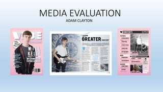
Targeting Indie Audiences
- 2. In what ways does your media product use, develop or challenge forms and conventions of real media products? Research: Banner at the top which lists stories with line dividers inbetween. Big title which (usually) dominates the page. A clear image of the band or artist. Name of the band or artist featured in big (not usually bigger than the title). Barcode, price and dare are mandatory. A small caption to give small detail. Headlines with small piece of description underneath. Brief as possible. Big clear image that dominates page, goes on either side of the page. Huge title which goes across the top, in this case overlaps onto next page. A small subheading like ‘In the studio’ An article- normally 3 columns long, equal sizes smaller font. Smaller image to break up the text, with a caption in the corner. Page number and name of the magazine in bottom corner is a convention. Pull quote- breaks up the text and stands out from the article. Drop capital- Commonly used in articles to start it off.
- 3. Front cover USE: - Main image is fun and quirky - Bright colour scheme - Wide range of stories - Range of fonts - Model in front of the text CHALLENGE: - Does not include a band, only one artist. - Only uses one image, whereas a lot of other magazines use side images like the one on the right. Develop: - Language techniques - Brought image in front of the title.
- 4. Contents page USE: - Used a range of images. - Captions to accompany the images. - Subheadings and page numbers. - Repeated colour scheme. - Different sections divided up. CHALLENGE: - I included a note from the editor. - I don’t include a ‘special section’. Develop: - The top banner - Overall layout
- 5. Double page spread USE: - Interview style article. - Multiple images - A quote to break up the text. - Three columns - Drop capital - Image on one side CHALLENGE: - Unique background choice for the main image. - One artist featured instead of a band. Develop: - Questions in bold text. - Lines to divide the columns.
- 6. How does your media product represent particular social groups? AGE REPRESENTATION: Most of the models who were featured in my magazine were mid teens. They were represented as mature- this was demonstrated by the posses they used. You could also interpret the images as quite serious, however the headlines compromise for this. The fonts and colours can come across as fun and quirky, which represents a more lively social group. Serious/ reserved face expression can represent an older audience. Fun and quirky font can represent a younger audience.
- 7. How does your media product represent particular social groups? GENDER REPRESENTATION: MALES: The images represent males as it shows their cool and reserved look. Also they are represented as successful musicians. They are also represented as passionate about music. From this image on the right, males could be represented as eccentric and adventurous due to their hair colour. Represents males as cool trendy fashion icons.
- 8. What kind of media institution might distribute your media product and why? I would choose BAUER MEDIA to distribute my magazine because: It is one of the most established distributers in the world and I feel like this will be the best thing for my magazine as they publish similar genres to mine. They distribute magazines all over the world which means I can spread the name of my magazine and make it a worldwide product. It is a well-known company with great publicity and marketing which will help me to expand out to new customers. Magazines Bauer already publishes:
- 9. What kind of media institution might distribute your media product and why? A distributer that I would not pick would be Seymour Distribution because although they are a very popular distributor, their genre would not fit mine. They already distribute a magazine called ‘We love pop’ which is a very different genre which would not appeal to my audience who expect more about the music and not the attraction appeal.
- 10. What kind of media institution might distribute your media product and why? ADVERTISEMENT: The main ways I will advertise through social media and television. Social media: Social media is a great way to promote your magazine and it is also free. Bauer has a large following on the likes of twitter, and they also have their own website where you can purchase the magazines they publish. This is the current music section for Bauer. Kerrang magazine hosts it’s own tour and features popular artists/bands. This is a good way to get new readers of your magazine, however this is pricey and may not pay off! Social media sites which are popular for advertising.
- 11. Who would be the audience for your media product? AGE: - In my magazine, age is targeted from a middle teenager to mid adult (16-26). This is because the content is casual but informative, but still fun and quirky. The fonts are fun and interesting to look at, but still get the message across. -I think the images show age as trendy. This is depicted through the fashion and modern layouts used. -The colour scheme can appeal to older aged audiences, as instead of using hot pinks and royal blues (associated with younger audiences), I have used salmon pinks and faded/ washed out blues- Which can appeal to an older audience. Informal caption relates to a younger audience.
- 12. GENDER: I wanted to target audience for my magazine to appeal to both genders as indie magazines are quite versatile to their audiences in comparison to heavy metal (predominantly male). Who would be the audience for your media product? MEN: My magazine would appeal to men because the colour scheme is very mixed as it contains pink and blue. ‘Stereotypically’ blue would attract men. The stories are about the bands and music projects. Not as much about the sex appeal but the actual music itself. WOMAN: Similarly, Woman would be an audience for my magazine because the pink could attract them. The fonts used could be seen as a bit feminine (glowing). Indie music as a whole appeals to both genders as it can have an aggressive side to it, but also a soft ambience about it.
- 13. Who would be the audience for your media product? Here are three examples of members of my target audience: NAME: Aidan AGE: 17 CLASS: Middle class SOCIAL INTERACTS: Likes going to gigs. FAVOURITE BAND: Arctic Monkeys NAME: Rachael AGE: 16 CLASS: Middle/ upper SOCIAL INTERACTS: Likes listening to vinyl records. FAVOURITE BAND: The Courteneers NAME: Josh AGE: 21 CLASS: Lower middle SOCIAL INTERACTS: Likes being active and going surfing. FAVOURITE BAND: Foals
- 14. How did you attract/address your audience? Things I learned from target research: - Have the colour scheme mostly pink, blue and white - Have a male artist on the front cover. - The age range etc. Here are my results after asking 15 students of mixed gender from my target audience the following questions.
- 15. How did you attract/address your audience? Language: The language I used was casual with an informal tone. By using a pun and an alliteration on the front cover, it gives the magazine more of a fun feel. The response given my the artist is dramatic and engaging. But he also comes across as cool and funny. Images: I wanted my images to come across as personal to the reader. I wanted my images to attract the audience by including different locations, poses and face expressions. Also the fashion of the artists could attract other audiences.
- 16. How did you attract/address your audience? As you can see here, I have listened to a lot of the feedback my target audience gave me and made the necessary changes to my product to make it more appealing to my target audience.
- 17. How did you attract/address your audience? Here is a video of a male from my target audience giving me feedback from my rough cut to my final cut.
- 18. What have you learnt about technologies from the process of constructing this product? Photography: I used the manual setting on the camera so that I could change settings such as the aperture. I held this button half way down to get better focus. The focus The zoom The camera I used to take my photos was a Nikon D5100. The main things I was aware of when taking my photos were: the shutter speed and exposure.
- 19. What have you learnt about technologies from the process of constructing this product? Shot composition- rule of thirds and different shot types.
- 20. What have you learnt about technologies from the process of constructing this product? Lighting: Image editing:
- 21. What have you learnt about technologies from the process of constructing this product? Clone stamp Magnetic lasso tool Eraser Brush Magic wand tool Red eye tool Layers Masks
- 22. What have you learnt about technologies from the process of constructing this product? Frames Eyedropper Swatches- Store colours Gradient swatches Effects Drop shadow Outer/inner glow Gradient fill
- 23. Looking back at your preliminary task, what do you feel you have learnt in the progression from it to the full product?
- 24. Looking back at your preliminary task, what do you feel you have learnt in the progression from it to the full product?