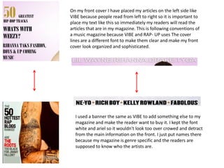
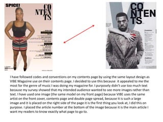
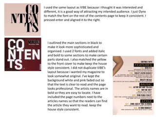
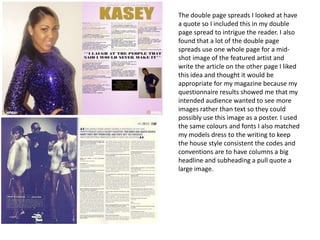
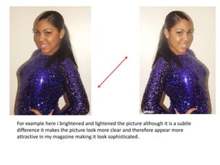
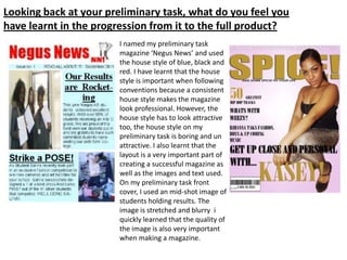
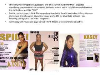
Media Magazine Evaluation

      Daniella Solomon
Research on existing magazines
                            I used VIBE, RAP- UP and Billboard
                            magazines to help me create my
                            music magazine. I followed the codes
                            and conventions of VIBE because
                            both our magazines are designed to
                            attracted the same audience.
                            I used VIBE’s layout because it is eye
                            catching and attractive, I thought this
                            was most appropriate for my intended
                            audience. I have not copied to layout
                            completely but I used most
                            features, the Mast head for example
                            ,the position of the model and the
                            matching color scheme.
In what ways does your media product use, develop or
     challenge forms and conventions of real media products?
                                  The genre of music for my music
                                  Is R&B/ Hip- Hop to create my music
                                  magazine front cover looked at R&B, Hip-
                                  Hop and which gave me a good idea of
                                  how to design a magazine using an
                                  appropriate colour scheme, layout etc, I
                                  didn’t duplicate the VIBE front cover
                                  completely for example I didn't use text
                                  on the right side of the magazine because
                                  I wanted to keep it original and not too
                                  over crowded. I looked into different
                                  magazines but VIBE appealed to me the
                                  most.
I used the idea of the model being placed over the top of my Masthead to show that my readers are
expected to immediately know what the magazine is called although you can not see the whole word. I
thought this was very effective at showing that my magazine is very audience intended, I used a bold Impact
font with a drop shadow affect similar to vibe to make it stand out as well as giving it a sophisticated look.
I laid out my main headline similarly to VIBE. I chose the musty yellow colour for my headline because it
stands out against the light pink background I chose a different font for my main article because most
magazines have a number of different fonts as their house style but I kept it the same colour as the
mast head to make the layout look consistent. I used and intriguing cover line similar to VIBE to make
the reader want to read the article. The font for my cover line is Oynx because it matches my other
cover lines on my magazine and looks interested something that my audience would be immediately
attracted to.


I have put a barcode at the bottom left of my front cover to follow conventions of
R&B/ Hip- Hop magazines. I placed it at the bottom so it doesn’t detract from the
design of the magazine but it is visible for the people that will purchase my
magazine. Most magazines such as VIBE and Billboard also do this. I noticed that
the barcodes on those magazines have the price which is what I did with my
barcode to make it look more realistic and professional.
On my front cover I have placed my articles on the left side like
VIBE because people read from left to right so it is important to
place my text like this so immediately my readers will read the
articles that are in my magazine. This is following conventions of
a music magazine because VIBE and RAP- UP uses The cover
lines are a different font to make them clear and make my front
cover look organized and sophisticated.


  I used a banner the same as VIBE to add something else to my
  magazine and make the reader want to buy it. I kept the font
  white and ariel so it wouldn't look too over crowed and detract
  from the main information on the front. I just put names there
  because my magazine is genre specific and the readers are
  supposed to know who the artists are.
I have followed codes and conventions on my contents page by using the same layout design as
VIBE Magazine use on their contents page. I decided to use this because it appealed to me the
most for the genre of music I was doing my magazine for. I purposely didn’t use too much text
because my survey showed that my intended audience wanted to see more images rather than
text. I have used one image (the same model on my front page) because VIBE uses the same
artist on the front cover, contents page and double page spread, because it is such a large
image and it is placed on the right side of the page it is the first thing you look at, I did this on
purpose. I placed the article number at the bottom of the image because it is the main article I
want my readers to know exactly what page to go to.
I used the same layout as VIBE because i thought it was interested and
different, it is a good way of attracting my intended audience. I just Oynx
to match the font on the rest of the contents page to keep it consistent. I
pressed enter and aligned it to the right.


  I outlined the main sections in black to
  make it look more sophisticated and
  organised. I used 2 fonts and added italic
  and bold to some sections to make certain
  parts stand out. I also matched the yellow
  to the front cover to make keep the house
  style consistent. I did not duplicate VIBE’s
  layout because i wanted my magazine to
  look somewhat original. I’ve kept the
  background white and pink faded out so
  that the text is clear to read and the page
  looks professional. The artists names are in
  bold so they are easy to locate. I have
  included the page numbers next to the
  articles names so that the readers can find
  the article they want to read. keep the
  house style consistent.
The double page spreads I looked at have
a quote so I included this in my double
page spread to intrigue the reader. I also
found that a lot of the double page
spreads use one whole page for a mid-
shot image of the featured artist and
write the article on the other page I liked
this idea and thought it would be
appropriate for my magazine because my
questionnaire results showed me that my
intended audience wanted to see more
images rather than text so they could
possibly use this image as a poster. I used
the same colours and fonts I also matched
my models dress to the writing to keep
the house style consistent the codes and
conventions are to have columns a big
headline and subheading a pull quote a
large image.
What kind of media institution might distribute your
media product and why?

                        Original Choice.
                        www.ipcmedia.com


                         Final choice
                         www.bauermedia.com

                   I would choose Bauer to publish my magazine because they
                   already publish my genre of music and I created a magazine
                   that is already on the market.
                   Bauer would be able to do that best because it has a
                   readership of over 19 million people in the UK alone it is also
                   well established in the TV and Radio industry, it is a huge
                   international company.
Who would be the audience for your media product?
                                                                           My magazine is £3.99
                                                                           because my survey results
                                                                           show that my target
                                                                           audience would prefer to
                                                                           pay under £5.00. I also gave
                                                                           my magazine this price
                                                                           because most R&B
                                                                           magazines that I looked at
                                                                           were nearly always over
                                                                           £2.00


      The target audience for my magazine is 16-25 year old males and females, who are
      interested in Hip- Hop/ R&B music, film, fashion etc... I have made a reader profile
      about the target audience for my magazine, showing images of what sort of things
      would be advertised/featured in my magazine because they represent my target
      audience’s interests. My target audience would be interested in
      fashion, partying, drinking, cars, technology etc. My target audience’s occupation be
      mostly students at school or college/university, working part-time.
How did you attract/address your audience?
 I created a questionnaire to find out what people thought of existing
magazines and what they would like to see more of in magazines . I used a
big mid shot on the front of my magazine to attract my audience, I didn't
include too much text because I am trying to attract my age range and I
thought they would rather see more images to text. I used yellow, pink and
black colours, these light bright colours are associated with R&B magazines
so I felt that it was appropriate.

                               I styled my model in dresses and heels to appeal to a male audience
                               as well as female. My audience would be able to relate to the clothing
                               because they would be interested in partying and modelling, i also
                               asked my model to pose in a “seductive” way because “sex sells” and I
                               wanted her to stand out so the reader is immediately drawn to her
                               outfits and makeup.
What have you learnt about technologies from the
process of constructing this product?

                      I used Photoshop CS5 to create my magazine and from this, I learnt how to
                      create an effective, attractive magazine cover, contents page and double page
                      spread.
                      I learnt how to use layers effectively to place text and images in the correct
                      places. I also played around with the programme and learned how to import
                      photos and edit them, making them brighter, cropping etc. I used the shift key
                      while resizing photographs which was very helpful.
                      I had most difficulty cutting out the images from, the background but i asked a
                      peer and this problem was quickly resolved.


 I used the ‘fx’ tool on Photoshop to make my text stand out against the background images and
 clearer to read. I used effects such as drop shadow, bevel and emboss and stroke on mostly my
 images , text and mast header to make it bolder and more attractive on my magazine.
For example here i brightened and lightened the picture although it is a subtle
difference it makes the picture look more clear and therefore appear more
attractive in my magazine making it look sophisticated.
Looking back at your preliminary task, what do you feel you
have learnt in the progression from it to the full product?
                       I named my preliminary task
                       magazine ‘Negus News’ and used
                       the house style of blue, black and
                       red. I have learnt that the house
                       style is important when following
                       conventions because a consistent
                       house style makes the magazine
                       look professional. However, the
                       house style has to look attractive
                       too, the house style on my
                       preliminary task is boring and un
                       attractive. I also learnt that the
                       layout is a very important part of
                       creating a successful magazine as
                       well as the images and text used.
                       On my preliminary task front
                       cover, I used an mid-shot image of
                       students holding results. The
                       image is stretched and blurry i
                       quickly learned that the quality of
                       the image is also very important
                       when making a magazine.
•   I think my music magazine is successful and it has turned out better than I expected
    considering the problems I encountered, I think to make it better I could have added text on
    the right side as well like “VIBE”
•   On the contents page, I think if I managed my time better I could have taken different images
    and include them however having one image worked to my advantage because i was
    following the layout of the “VIBE” magazine.
•   I am happy with my double page spread I think it looks professional and attractive.

Media magazine evaluation

  • 1.
  • 2.
    Research on existingmagazines I used VIBE, RAP- UP and Billboard magazines to help me create my music magazine. I followed the codes and conventions of VIBE because both our magazines are designed to attracted the same audience. I used VIBE’s layout because it is eye catching and attractive, I thought this was most appropriate for my intended audience. I have not copied to layout completely but I used most features, the Mast head for example ,the position of the model and the matching color scheme.
  • 3.
    In what waysdoes your media product use, develop or challenge forms and conventions of real media products? The genre of music for my music Is R&B/ Hip- Hop to create my music magazine front cover looked at R&B, Hip- Hop and which gave me a good idea of how to design a magazine using an appropriate colour scheme, layout etc, I didn’t duplicate the VIBE front cover completely for example I didn't use text on the right side of the magazine because I wanted to keep it original and not too over crowded. I looked into different magazines but VIBE appealed to me the most. I used the idea of the model being placed over the top of my Masthead to show that my readers are expected to immediately know what the magazine is called although you can not see the whole word. I thought this was very effective at showing that my magazine is very audience intended, I used a bold Impact font with a drop shadow affect similar to vibe to make it stand out as well as giving it a sophisticated look.
  • 4.
    I laid outmy main headline similarly to VIBE. I chose the musty yellow colour for my headline because it stands out against the light pink background I chose a different font for my main article because most magazines have a number of different fonts as their house style but I kept it the same colour as the mast head to make the layout look consistent. I used and intriguing cover line similar to VIBE to make the reader want to read the article. The font for my cover line is Oynx because it matches my other cover lines on my magazine and looks interested something that my audience would be immediately attracted to. I have put a barcode at the bottom left of my front cover to follow conventions of R&B/ Hip- Hop magazines. I placed it at the bottom so it doesn’t detract from the design of the magazine but it is visible for the people that will purchase my magazine. Most magazines such as VIBE and Billboard also do this. I noticed that the barcodes on those magazines have the price which is what I did with my barcode to make it look more realistic and professional.
  • 5.
    On my frontcover I have placed my articles on the left side like VIBE because people read from left to right so it is important to place my text like this so immediately my readers will read the articles that are in my magazine. This is following conventions of a music magazine because VIBE and RAP- UP uses The cover lines are a different font to make them clear and make my front cover look organized and sophisticated. I used a banner the same as VIBE to add something else to my magazine and make the reader want to buy it. I kept the font white and ariel so it wouldn't look too over crowed and detract from the main information on the front. I just put names there because my magazine is genre specific and the readers are supposed to know who the artists are.
  • 6.
    I have followedcodes and conventions on my contents page by using the same layout design as VIBE Magazine use on their contents page. I decided to use this because it appealed to me the most for the genre of music I was doing my magazine for. I purposely didn’t use too much text because my survey showed that my intended audience wanted to see more images rather than text. I have used one image (the same model on my front page) because VIBE uses the same artist on the front cover, contents page and double page spread, because it is such a large image and it is placed on the right side of the page it is the first thing you look at, I did this on purpose. I placed the article number at the bottom of the image because it is the main article I want my readers to know exactly what page to go to.
  • 7.
    I used thesame layout as VIBE because i thought it was interested and different, it is a good way of attracting my intended audience. I just Oynx to match the font on the rest of the contents page to keep it consistent. I pressed enter and aligned it to the right. I outlined the main sections in black to make it look more sophisticated and organised. I used 2 fonts and added italic and bold to some sections to make certain parts stand out. I also matched the yellow to the front cover to make keep the house style consistent. I did not duplicate VIBE’s layout because i wanted my magazine to look somewhat original. I’ve kept the background white and pink faded out so that the text is clear to read and the page looks professional. The artists names are in bold so they are easy to locate. I have included the page numbers next to the articles names so that the readers can find the article they want to read. keep the house style consistent.
  • 8.
    The double pagespreads I looked at have a quote so I included this in my double page spread to intrigue the reader. I also found that a lot of the double page spreads use one whole page for a mid- shot image of the featured artist and write the article on the other page I liked this idea and thought it would be appropriate for my magazine because my questionnaire results showed me that my intended audience wanted to see more images rather than text so they could possibly use this image as a poster. I used the same colours and fonts I also matched my models dress to the writing to keep the house style consistent the codes and conventions are to have columns a big headline and subheading a pull quote a large image.
  • 9.
    What kind ofmedia institution might distribute your media product and why? Original Choice. www.ipcmedia.com Final choice www.bauermedia.com I would choose Bauer to publish my magazine because they already publish my genre of music and I created a magazine that is already on the market. Bauer would be able to do that best because it has a readership of over 19 million people in the UK alone it is also well established in the TV and Radio industry, it is a huge international company.
  • 10.
    Who would bethe audience for your media product? My magazine is £3.99 because my survey results show that my target audience would prefer to pay under £5.00. I also gave my magazine this price because most R&B magazines that I looked at were nearly always over £2.00 The target audience for my magazine is 16-25 year old males and females, who are interested in Hip- Hop/ R&B music, film, fashion etc... I have made a reader profile about the target audience for my magazine, showing images of what sort of things would be advertised/featured in my magazine because they represent my target audience’s interests. My target audience would be interested in fashion, partying, drinking, cars, technology etc. My target audience’s occupation be mostly students at school or college/university, working part-time.
  • 11.
    How did youattract/address your audience? I created a questionnaire to find out what people thought of existing magazines and what they would like to see more of in magazines . I used a big mid shot on the front of my magazine to attract my audience, I didn't include too much text because I am trying to attract my age range and I thought they would rather see more images to text. I used yellow, pink and black colours, these light bright colours are associated with R&B magazines so I felt that it was appropriate. I styled my model in dresses and heels to appeal to a male audience as well as female. My audience would be able to relate to the clothing because they would be interested in partying and modelling, i also asked my model to pose in a “seductive” way because “sex sells” and I wanted her to stand out so the reader is immediately drawn to her outfits and makeup.
  • 12.
    What have youlearnt about technologies from the process of constructing this product? I used Photoshop CS5 to create my magazine and from this, I learnt how to create an effective, attractive magazine cover, contents page and double page spread. I learnt how to use layers effectively to place text and images in the correct places. I also played around with the programme and learned how to import photos and edit them, making them brighter, cropping etc. I used the shift key while resizing photographs which was very helpful. I had most difficulty cutting out the images from, the background but i asked a peer and this problem was quickly resolved. I used the ‘fx’ tool on Photoshop to make my text stand out against the background images and clearer to read. I used effects such as drop shadow, bevel and emboss and stroke on mostly my images , text and mast header to make it bolder and more attractive on my magazine.
  • 13.
    For example herei brightened and lightened the picture although it is a subtle difference it makes the picture look more clear and therefore appear more attractive in my magazine making it look sophisticated.
  • 14.
    Looking back atyour preliminary task, what do you feel you have learnt in the progression from it to the full product? I named my preliminary task magazine ‘Negus News’ and used the house style of blue, black and red. I have learnt that the house style is important when following conventions because a consistent house style makes the magazine look professional. However, the house style has to look attractive too, the house style on my preliminary task is boring and un attractive. I also learnt that the layout is a very important part of creating a successful magazine as well as the images and text used. On my preliminary task front cover, I used an mid-shot image of students holding results. The image is stretched and blurry i quickly learned that the quality of the image is also very important when making a magazine.
  • 15.
    I think my music magazine is successful and it has turned out better than I expected considering the problems I encountered, I think to make it better I could have added text on the right side as well like “VIBE” • On the contents page, I think if I managed my time better I could have taken different images and include them however having one image worked to my advantage because i was following the layout of the “VIBE” magazine. • I am happy with my double page spread I think it looks professional and attractive.