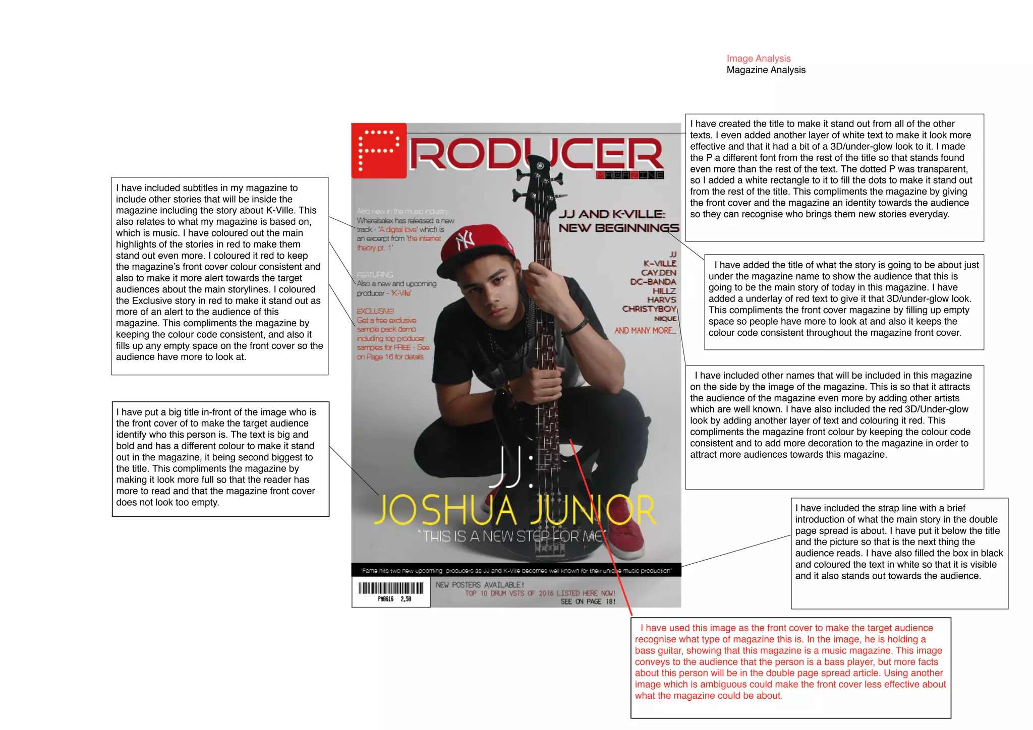
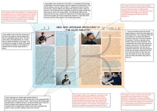
The document describes the design choices made for a magazine cover and double page spread. For the cover, the title was made to stand out with layered text and a unique font for one letter. Subtitles and story highlights were added in red to maintain consistency. Names of artists and a 3D text effect in red were also included. For the double page spread, images were selected to identify the musicians featured. Watermarks, titles, and column organization were used to structure the layout and fill space. Color was used throughout to make elements stand out and engage the audience.