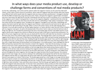
Evaluation question 1
In what ways does your media product use, develop or
challenge forms and conventions of real media products?
In what ways does your media product use, develop or
challenge forms and conventions of real media products?
Throughout the entire time that I have been creating my media magazine I have learnt how to use different
types of media products such as Photoshop being the key programme. By using this programme I have
enhanced my skills of using Photoshop which will allow me to create better things when using the
programme. I started out by not being able to use Photoshop at all, not knowing any buttons or options that I
could use to then being able to successfully create a magazine that has many effects on it and has taken a lot
of time to be made the best it can be. As time went on I started to get a better idea of how to use the
programme and start to play around with the magazine, by the first draft for the magazine I managed to
create something fairly good although there was a lot of room for improvement. By the finished product I had
managed to use many different techniques to get the magazine looking good and attractive by using the skills
available on Photoshop. To the left is the tool bar that allows you to perform the most important skills to
enhance your own photos or other photos from cameras or the internet so that they look much better than
you originally started with. The title of the magazine is similar to the magazine ‘NME’. It is very catchy and you
can clearly see what the title is when looking at the front page, this would be beneficial as it would stand out
on the shelf to other magazines. A good, clear picture is needed for the magazine front cover as all
professional magazines like NME have so I took a picture that entices the reader but is also goes well with the
layout of the magazine front cover and doesn’t make it look too crowded. The title is very important when it
comes a magazine as it is the main aspect that will grab the readers attention when they look at the magazine,
if it is loud and clear then they may pick it up whereas if the title wasn’t very clear or it was too small then
they may miss it and not be drawn into it. The page layout of my magazine is very similar to most magazines
as professional looking magazines have a main picture, normally mid shot or full face so that it takes up the
whole page and draws the reader in. My magazine has a full face picture with captions and description all
around the image so that it doesn’t cover up anything, having text over the image is fine but having it so that
it destroys the image or covers up too much of the image will make a magazine look unprofessional. In my
magazine I have many pictures with the user wearing a certain outfit that reflects the music genre I am
focusing on, Indie rock. The style of the outfit and brands that my image wears are very similar to what bands
would wear themselves so it links in with the fact that the style of the band is reflected with the image on the
magazine. If the magazine was a pop magazine and you had a rock and roll star on the front then it wouldn’t
go and it would look out of place, so having an image that links in with the music genre you are talking about
is crucial for the magazines look. To get the best pictures I took many images so that when it came to putting
it on the magazine front cover I had many to choose from and play around with until I found one that looked
suitable for the magazine I had in mind. I used my own camera for the pictures and I took them outside of the
school so that I could get a picture with other features included, for example I had one where the person I was
using was leaning against a tree, not only does this bring in a unusual look but also a good picture that would
suit a magazine front cover.
For the title, subheadings, main article and the captions within the magazine I tried to use the same font, Microsoft
Tahaiti, so that I kept a certain amount of consistency which made the magazine look neat and tidy rather than having
many different fonts which would make the magazine look very messy and look unprofessional. I managed to develop
the title the NME normally do by using a fairly short word, ‘Noise’, that gave the magazine a good header and looked
neat once I had chosen the right font for the title. Choosing the font was very crucial in my opinion as it is a very big part
of the magazine and if it doesn’t look good then it may ruin the magazine altogether. I positioned the title at the top
centre of the page so that it was clear that it was the title and not a subheading or large caption, by doing this I made it
clear which text was the magazine name. Throughout the magazine I managed to use many titles, subheadings and
captions that had to look the right when the magazine was finished, in other words the text had to be the right size, the
right font and the right positioning on the page. When it came to the article I had to use the right language that a
character in my music genre would use, this was highly important as I had to talk like a indie rock star so that it linked in
with my magazine music genre. As well as the physical side of the article I had to make sure that the technical side of
things was right too, this included the positioning of the text on the double page and that I had added columns on the
page as almost every magazine has columns to divide the text and make it look easy to read but also professional. The
genre of my music magazine was indie rock, you can clearly tell this from the outfit style that my character is wearing in
the front cover and on the contents page as well as the double page. The language that is used in my article also
suggests that the genre of the music is Indie Rock as they talk like any other indie rock band member would because the
language comes with the style that they have. Reading through the double page spread I have used the right language
for the genre of music I am focusing on, I have asked questions that relate only to the music that they produce and a
few more in depth detail about the person/band I am writing about. In my media product I have challenged the likes of
NME and how they represent their main character or band in the magazine. I have done this by having a very large
picture on the front so that it would stand out on the shelf and people who are interested in the sort of music that my
magazine is on. I have also added many subtitles on the front page about other bands and key features within the
magazine as this will also make someone looking at the magazine want to buy it, especially if there is a band or person
that they pay particular attention to and want to see the latest about them. As well as having text I have added many
pictures throughout the entire magazine, the front page has a large mid shot of the focused character, the contents
page has three main images, two as pictures relating to the subheading and paragraph that will be the main features in
the magazine and the other as a large poster like picture that makes the contents page look clean and tidy but also
features many aspects so it doesn’t look to bear. The double page spread has a main image on one page and text about
the certain person or band I am concentrating my article on. On all pages I have included their name as representation,
using it as a title and including it subheadings and main text. Finally, the colour scheme of my magazine is a combination
of light blue, black and white, I have used these colours because I feel that they go well together but more importantly
makes the magazine look sharp and clear. For the text I have used all three colours as they can all be read easily when
put onto a background with any of the colours. For the magazine title I have used the blue to make it stand out against
the black and white picture, also for the subheadings including other bands and other information regarding what is in
the magazine I have used both black and blue text in a pattern that makes the magazine look professional.
In what ways does your media product use, develop or
challenge forms and conventions of real media products?
In some ways I have developed the
likes of NME’s layout with the text
and colour scheme except I have
changed the colours round to my
liking and what I think looks best. The
colours that I have used are
consistent throughout the magazine
and don’t change as you need to
keep it consistent to make it look
professional and not tacky. The
colours used can be used anywhere
on the magazine as they don’t clash if
they are put next to each other, NME
and Q Magazine have used red in
their title on almost every magazine,
this shows consistency and that it is
done fairly regularly.

Evaluation question 1

  • 1.
    Evaluation question 1 Inwhat ways does your media product use, develop or challenge forms and conventions of real media products?
  • 2.
    In what waysdoes your media product use, develop or challenge forms and conventions of real media products? Throughout the entire time that I have been creating my media magazine I have learnt how to use different types of media products such as Photoshop being the key programme. By using this programme I have enhanced my skills of using Photoshop which will allow me to create better things when using the programme. I started out by not being able to use Photoshop at all, not knowing any buttons or options that I could use to then being able to successfully create a magazine that has many effects on it and has taken a lot of time to be made the best it can be. As time went on I started to get a better idea of how to use the programme and start to play around with the magazine, by the first draft for the magazine I managed to create something fairly good although there was a lot of room for improvement. By the finished product I had managed to use many different techniques to get the magazine looking good and attractive by using the skills available on Photoshop. To the left is the tool bar that allows you to perform the most important skills to enhance your own photos or other photos from cameras or the internet so that they look much better than you originally started with. The title of the magazine is similar to the magazine ‘NME’. It is very catchy and you can clearly see what the title is when looking at the front page, this would be beneficial as it would stand out on the shelf to other magazines. A good, clear picture is needed for the magazine front cover as all professional magazines like NME have so I took a picture that entices the reader but is also goes well with the layout of the magazine front cover and doesn’t make it look too crowded. The title is very important when it comes a magazine as it is the main aspect that will grab the readers attention when they look at the magazine, if it is loud and clear then they may pick it up whereas if the title wasn’t very clear or it was too small then they may miss it and not be drawn into it. The page layout of my magazine is very similar to most magazines as professional looking magazines have a main picture, normally mid shot or full face so that it takes up the whole page and draws the reader in. My magazine has a full face picture with captions and description all around the image so that it doesn’t cover up anything, having text over the image is fine but having it so that it destroys the image or covers up too much of the image will make a magazine look unprofessional. In my magazine I have many pictures with the user wearing a certain outfit that reflects the music genre I am focusing on, Indie rock. The style of the outfit and brands that my image wears are very similar to what bands would wear themselves so it links in with the fact that the style of the band is reflected with the image on the magazine. If the magazine was a pop magazine and you had a rock and roll star on the front then it wouldn’t go and it would look out of place, so having an image that links in with the music genre you are talking about is crucial for the magazines look. To get the best pictures I took many images so that when it came to putting it on the magazine front cover I had many to choose from and play around with until I found one that looked suitable for the magazine I had in mind. I used my own camera for the pictures and I took them outside of the school so that I could get a picture with other features included, for example I had one where the person I was using was leaning against a tree, not only does this bring in a unusual look but also a good picture that would suit a magazine front cover.
  • 3.
    For the title,subheadings, main article and the captions within the magazine I tried to use the same font, Microsoft Tahaiti, so that I kept a certain amount of consistency which made the magazine look neat and tidy rather than having many different fonts which would make the magazine look very messy and look unprofessional. I managed to develop the title the NME normally do by using a fairly short word, ‘Noise’, that gave the magazine a good header and looked neat once I had chosen the right font for the title. Choosing the font was very crucial in my opinion as it is a very big part of the magazine and if it doesn’t look good then it may ruin the magazine altogether. I positioned the title at the top centre of the page so that it was clear that it was the title and not a subheading or large caption, by doing this I made it clear which text was the magazine name. Throughout the magazine I managed to use many titles, subheadings and captions that had to look the right when the magazine was finished, in other words the text had to be the right size, the right font and the right positioning on the page. When it came to the article I had to use the right language that a character in my music genre would use, this was highly important as I had to talk like a indie rock star so that it linked in with my magazine music genre. As well as the physical side of the article I had to make sure that the technical side of things was right too, this included the positioning of the text on the double page and that I had added columns on the page as almost every magazine has columns to divide the text and make it look easy to read but also professional. The genre of my music magazine was indie rock, you can clearly tell this from the outfit style that my character is wearing in the front cover and on the contents page as well as the double page. The language that is used in my article also suggests that the genre of the music is Indie Rock as they talk like any other indie rock band member would because the language comes with the style that they have. Reading through the double page spread I have used the right language for the genre of music I am focusing on, I have asked questions that relate only to the music that they produce and a few more in depth detail about the person/band I am writing about. In my media product I have challenged the likes of NME and how they represent their main character or band in the magazine. I have done this by having a very large picture on the front so that it would stand out on the shelf and people who are interested in the sort of music that my magazine is on. I have also added many subtitles on the front page about other bands and key features within the magazine as this will also make someone looking at the magazine want to buy it, especially if there is a band or person that they pay particular attention to and want to see the latest about them. As well as having text I have added many pictures throughout the entire magazine, the front page has a large mid shot of the focused character, the contents page has three main images, two as pictures relating to the subheading and paragraph that will be the main features in the magazine and the other as a large poster like picture that makes the contents page look clean and tidy but also features many aspects so it doesn’t look to bear. The double page spread has a main image on one page and text about the certain person or band I am concentrating my article on. On all pages I have included their name as representation, using it as a title and including it subheadings and main text. Finally, the colour scheme of my magazine is a combination of light blue, black and white, I have used these colours because I feel that they go well together but more importantly makes the magazine look sharp and clear. For the text I have used all three colours as they can all be read easily when put onto a background with any of the colours. For the magazine title I have used the blue to make it stand out against the black and white picture, also for the subheadings including other bands and other information regarding what is in the magazine I have used both black and blue text in a pattern that makes the magazine look professional. In what ways does your media product use, develop or challenge forms and conventions of real media products? In some ways I have developed the likes of NME’s layout with the text and colour scheme except I have changed the colours round to my liking and what I think looks best. The colours that I have used are consistent throughout the magazine and don’t change as you need to keep it consistent to make it look professional and not tacky. The colours used can be used anywhere on the magazine as they don’t clash if they are put next to each other, NME and Q Magazine have used red in their title on almost every magazine, this shows consistency and that it is done fairly regularly.