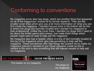
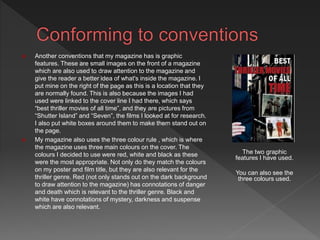
The document discusses the process of creating a magazine cover that conforms to conventions based on research of existing magazines. Key points:
- The creator analyzed various magazines to understand common conventions like mastheads, central images, cover lines, headlines, plugs, and use of color.
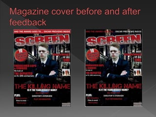
- Feedback was gathered on early designs and incorporated, such as moving cover lines from over the central image to the sides.
- The final magazine cover includes all researched conventions like the masthead, central image, cover lines, headlines, plugs, and follows conventions on layout and use of color. The cover aims to look professional by conforming to existing magazine standards.