The document summarizes the changes made from the preliminary to the finished school magazine.
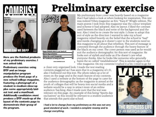
In the preliminary: the front cover took inspiration from a music magazine and focused on rebellion; the contents page layout was rushed.
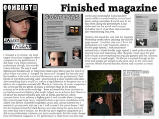
For the finished magazine: the candidate changed everything and incorporated issue numbers, dates, and genre text on the cover; the contents page took inspiration from another candidate's work but with their own spin; the double page spread took inspiration from another source and used tools like layering and grids.
The key lesson was that more meaningful text and improved layout, color, and photos were needed for a higher grade. Inspiration was drawn from various magazines and candidates to create a cohesive, polished final product.