
Recommended
More Related Content
What's hot
What's hot (20)
Viewers also liked
Viewers also liked (20)
Similar to As media evaluation
Similar to As media evaluation (20)
More from AishaC
Recently uploaded
Recently uploaded (16)
As media evaluation
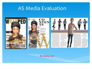
- 1. AS Media Evaluation By Aisha Corr
- 2. In what way does your product use, develop or challenge forms and conventions of real media products? (Front Cover) The magazine that influenced me the most and gave me most of my ideas was; VIBE magazine, which is a very popular magazine worldwide and uses a variety of artists from a variety of music genres, such as Lil Wayne (a Hip Hop, Rapper) Ciara (R&B, Singer) and Janet Jackson (Pop, Singer). So the magazine fits in perfectly with my ideology hence the fact that I chose to elaborate on it. When doing my magazine I had to consider the different codes and conventions I wanted to use which again had to fit in with my ideology, so again I looked to vibe magazine for help. I looked at the way they laid out their pages in terms of the positioning of the photographs and the angle in which they were taken at. My front cover also includes a lot more information than VIBE magazine this is because I wanted to have a lot of varieties on there to match the ideology of wanting a wide The use of the strap line also came from range of audiences. Linking it to the name of the magazine For example, the cover of VIBE vibe magazine, listing the different artists ‘wrapped’ (wrapping people together to become one). magazines usually use close up’s that will be featured in the issue, this gives of the artist to show their the audience a wider insight of what to expressions. So I also decided to expect within the magazine. The strap line use a close up image and also adds attractiveness to the front cover. because the artist on my front cover is a new artist I decided not to hide any of her facial feature i.e. Eyes, this is because my aim My magazine also uses the is to get her recognised. idea of having the main image covering parts of the I decided to use a plain magazines masthead. This is white background to send effective because the name of a message of purity and the magazine is established goodness to my without covering parts of the audience. The white image. The positioning of the background also makes magazine is also influenced by the main image of the vibe magazine. magazine stand out, it also gives it a glow.
- 3. In what way does your product use, develop or challenge forms and conventions of real media products? (Contents ∗ My magazine contents page also uses Page) The font size I used however, is much larger ideas from VIBE magazines contents than that of VIBE page with the use of the first letter of magazine this is the magazines name standing out on because my magazine is the page, because of the large font going to be new in the used. So with Vibe it was the ‘V’ and market therefore with my magazine ‘Wrapped’ it is the everything must stand ‘W’. This make s the magazine stand out. However this will be out from other magazines. I chose to use the ‘letter’ idea because it is consistent so that the something that I can keep consistent audience find it easier to throughout all of the magazines I may read. My target produce. So that the magazine is audience is mostly those recognisable and that people will in their teenage ages relate the letter ‘W’ with my magazine and if they see small even when not reading it. writing they are most likely not to read it. My contents page also includes additional information about the image used such as; where to find Also the fact that the the clothing she is wearing contents page uses a and who took the photograph The positioning of the page also mirrors VIBE magazine as traditional font to show and where it was taken, this the main image is positioned largely on the left side of the that the magazine is also mirrors VIBE magazine. page. This is important because the audience will then know modern but however it This was done because the kind of publicity is gained by the magazine. For example also has traditional young people like fashion VIBE magazine is using Kanye West who is a well known aspects. Showing that and following trends, very successful rapper, so the fact that he is used send s a traditional music is not therefore they may look to positive message to the audience. And I will like the same for forgotten. the contents page for the my magazine. latest fashion worn by their idols.
- 4. In what way does your product use, develop or challenge forms and conventions of real media products? (Double Page Spread) I chose to use less images than The fact that I used a variety of images of VIBE Magazine because I didn’t the same character wearing the same want to give a lot away about her. clothing links in with Vibe magazines double This shows mystery and leaves page spread on Solange Knowles. I used 1 the audience wanting to know large image with colour where my star artist more, so they will keep reading is standing boldly and stands out. However I the magazine. also used smaller images in black and white. The reason for this choice us because I The reason why I decided to use want my audience to know that she can full length images of her is loosen up, (this is shown through the because I want the audience to different poses). see the whole picture of what is presented. I also decided not to use any props such as jewellery I used a multi coloured banner to separate etc. because this shows that she the images to the articles because is simple and sends the business and fun should not be combined. message that she worries more I used colours that matched her clothing to about her music than her make the page look better in the sense of appearance. standing out and being noticeable. Another The article is very straight reason to why I used colours to math her forward and it doesn’t contain clothing is because it almost shows her masses of writing. This is true colours. Showing that she is bold and because I also want to please stands out just as the late image in colour. the younger generation and they wouldn’t want to read a lot of writing as it would just bore them. This also ties in to I chose to use quotes to draw the attention of the reader, as they will want to know why the fact that the font is larger she said the things that she said. The quotes are also in blue just so that they can stand than that of VIBE magazine. out and also because again it matches the theme of the double page spread.
- 5. How does your magazine product represent social groups? This image appeals to the social group of young people, this is because the artist used in the image is young and stylish. So the young people are more likely to be influenced by her or look to her for fashion tips. The colours she is wearing are very bright and eye-catching. Which again for fill the expectations of the younger generation of about 14-21 year olds. This also links in with the black race as the artist is black. I would say that this also fits in with any social class group because she is dressed pretty presentably. This appeals to all social groups because it gives information about where to buy clothing from to follow trends etc. and everybody follows trends even the old generation. However this excludes the older generation simple because they wouldn’t necessary shop at ‘Topshop’. The fact that Topshop & River Island are present also excludes the social class group of poor people or some of the working class as Topshop & River Island are relatively expensive shops. However H&M is a relatively cheap and affordable shop. The magazine front cover appeals to all types of people because there are a variety of artists available for all different genres of music. For example for the lovers of Hip Hop there are; Lil Wayne (WAYNE), Nicki Minaj, Drake, J Cole, Lil Twist. TYGA and Jay-Z which are two very popular rappers. Also for the lovers of Pop there are; JAY, Trey Songs and Chris Brown. Trey Songz and Chris Brown also tie into the genre of R&B along with Drake, Nicki Minaj, J Cole, Lil Twist and Big Sean. The front cover also includes the bar code which gives the information of the price, and the price is affordable so it would suite all social class members. The name of the magazine shows that the magazine brings all people that listen to music together as it is ‘wrapping’ people in one due to the varieties available within the magazine.
- 6. What kind of media institution might distribute your media product and why? I would want BAUER to publish my magazine because they have worked with the likes of Q and KERRANG! magazines which are both very popular magazines. The fact that they don’t fit in with my genre gives me a good chance of getting into the business with them because of my new ideas. BAUER magazine was founded in 1875 which means that it has been successful enough to be around for Bauer Media Group is a a long time and it also means that they know what multinational media company they are doing and they are very experienced. headquartered in Hamburg, Germany which operates in 15 countries worldwide. Since the BAUER also distributes, Radio and Music Televisions, this company was founded in 1875, means that it is a cross media convergence. BAUER works it has been privately-owned and with Kiss TV, 4Music. Kerrang! TV, The Box, Smash Hits under management by the TV and Q TV. As well as working with magazines and Bauer family. It was formerly radio. Bauer also have their own radio station called Bauer called Heinrich Bauer Verlag Radio, this shows that it is very successful. KG, abbreviated to HBV and usually shortened to H. Bauer.
- 7. TARGET AUDIENCE AN DHOW THIS APPEALS TO THEM. My targeted audience is basically anyone who listens to music. However some issues may include more about certain types of music than others. For example this issues includes more about Hip Hop, R&B and Pop more than any other Genres of music. I am also targeting my magazine at people of all class, because the magazine is relatively cheap and all social groups will be ale to afford it, like the working class people. My magazine attracts its targeted audience through the use of artists and genre. For example this issues uses artists of the likes of Lil Wayne (Hip Hop), JAY (Pop) and Chris Brown (R&B). So people into different genres of music have a choice due to the variety. The thing about my magazine is that it mostly influences young people of the age of 14-21. this is because of the use of colours and the layout. The layout is very simple and understandable this links in with the younger people because they don’t like things to be very complicated and in dept. I also tried to use large font and bright colours to attract the younger targeted audience, this is shown widely o the double page spread and the front cover. It also appeals to them through the use of informal language as magazines like ‘VIBE’ don’t use, so this makes my magazine stand out and attract the younger people. However the contents page shows characteristics that the older generation would prefer due to the traditional writing style I decided to use. The page also links in with the younger generation because of the main image of the page. My magazine is most likely to draw the attention of black people as the front cover’s main image is that of a black lady. ‘WRAPPED’ appeals to the targeted audience because it is bringing people that listen to music of all genres by different artists together as they will read the magazine.
- 8. Audience Feedback QUESTIONS ASKED; 2.Are you male or female? 3.How old are you? 4.What type of music do you listen to? 5.How much would you pay for a music magazine? 6.What would attract you to buy a magazine? Answer 1; Answer 2; 2.Male 2.Female 3.17 3.14 4.Hip Hop & R&B 4.Pop 5.£2.00-£3.00 5.£1.00-£1.50 6.Favourite artist on the front cover. 6.Interviews on well known artists Answer 3; Answer 4; 2.Female 2.Transvestite 3.20 3.19 4.Indie and Rock 4.Chilled out music 5.£.3.00-£5.00 5.£1.00-£4.00 6.How much is in the magazine (quantity & quality) 6.Fashion
- 9. What have you learnt about technologies from the process of constructing this product? I’ve learnt different skills from using Photo shop. These skills helped me to produce my magazine. The magic wand tool helped to crop out parts of the images that were not needed. It was easier because it used colour to outline what was not wanted. The text tool helped me to write on the image. And conduct the features present on the front cover. The black and white tool helped me to change the image from being in colour to being in black & white.