EVALUATION
1. IN WHAT WAYS DOES YOUR MEDIA PRODUCT USE,
DEVELOP OR CHALLENGE THE FORMS AND CONVENTIONS
OF REAL MEDIA PRODUCTS?
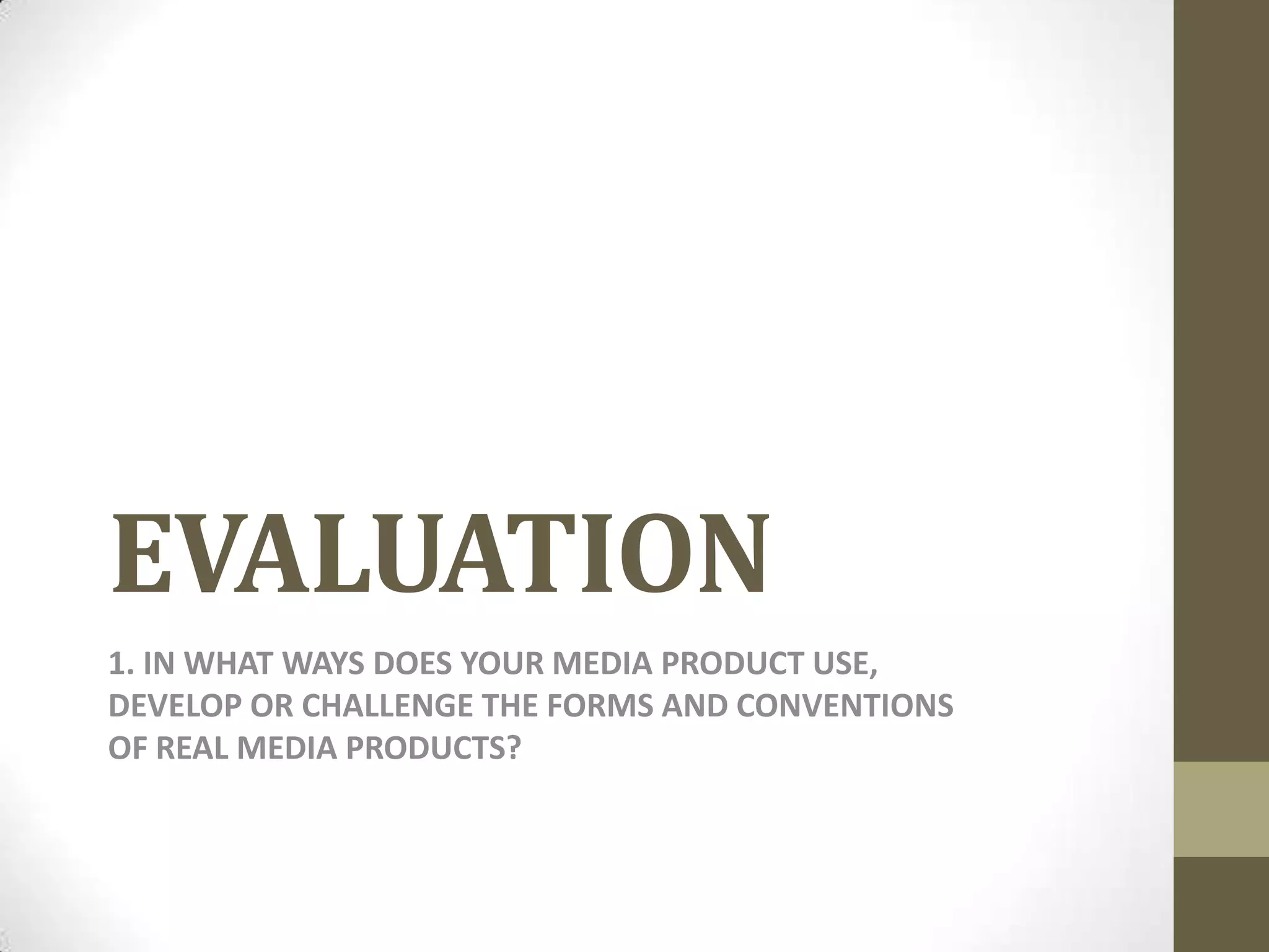
FRONT COVER
            Real media product                                                                                    My media product


                                                         USE:
                                                         I used this magazine as inspiration for my
                                                         final front cover for my music magazines.
                                                         I liked the simplicity of this magazine in
                                                         particular as I thought it left enough
                                                         space to include and focus on the main
                                                         genre of the magazine (indie) and the
                                                         model. There aren’t any side stories or
                                                         images on this cover either which allows
                                                         focus and attention from readers to be
                                                         drawn to the model representing the
                                                         main story of this magazine


DEVELOP:                                                                        CHALLENGE:
I developed the real media product in my music magazine by including            Rather than having a dull colour scheme, I chose the colour scheme
more things on the cover i.e. side stories. I also added conventions such       according to the colour my model is wearing to make the magazine
as puff lines to persuade readers to want to purchase and read my               seem more attractive. The masthead and text on the real media
product as there’s an incentive.                                                magazine product is white which isn’t really eye-catching for readers
                                                                                as the background is quite dull itself. To challenge this, I chose a very
                                                                                dark colour for my masthead and font according tot the colour that
                                                                                my model is wearing. In fact, most of the font on my title page is in
                                                                                colours such as dark green and black in order to stand out.
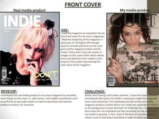
Real media product                                    CONTENTS PAGE                                   My media product


                                                              USE:
                                                       I used this music magazine to give an
                                                       ide for how mine will look as I found
                                                       the layout and contents quite simply
                                                       but still attractive. I liked the close up
                                                       shot of the main artist as it felt as if the
                                                       reader could get ‘up close and
                                                       personal’ with the main artist of my
                                                       magazine. I also used the masthead of
                                                       the music magazine on my contents
                                                       page as well in order for readers to be
                                                       familiar with the name of my magazine
                                                       and are aware of the logo so it
                                                       becomes more recognisable and well
                                                       known. I also kept all the subheadings
                                                       and text on one side of the page which
                                                       allows the focus to be on the main
                                                       image of the artist as well as the list of
                                                       contents.


DEVELOP:                                                                   CHALLENGE
As well as using some of the features of this real media product, I        I challenged this real media product by reducing the amount of text on the
developed it in ways I thought would be more effective. I used my          page. Rather than keeping the text small and a little harder to read, I
main image as the background for my contents page which made               enlarged my text which allowed me to put just the most important page
the magazine focus more on my main artist as a whole. I also               numbers to side stories that I thought readers would be most interested
added the main story about her as one of the biggest texts on the          in. I also didn’t use any side images which gave more focus on my main
page with the heading “NATALIE” which is eye-catching and draws            story. I used effects such as reducing the opacity so rather than the
the attention of the reader straight to the text about her. It is also     background pictures and colours looking too bold, it blended in giving a
easy to recognise that this is the text that goes with the main            soft tone to my music magazine and making it look slightly more classy
image on this page.                                                        and expensive which matches my audience profile.
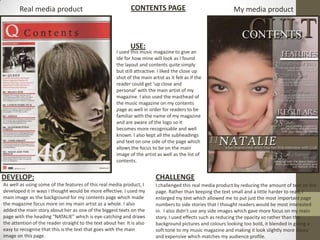
Real media products                   DOUBLE-PAGE SPREAD                                       My media product

                                       USE:
                                       I used the idea of the large text being one of
                                       the main focuses on the page and covering a
                                       large section on the page because I thought
                                       it looked attractive and was quite unique
                                       DEVELOP:
                                       I developed this by putting a block background
                                       behind the text so that the text could stand
                                       out more against the background and also to
                                       stand out in comparison to the rest of the
                                       page. I also made the text slightly smaller so
                                       that my interview was able to fit on the page
                                       as well as the large text


CHALLENGE:                                                                                USE:
                                                                                        I used the idea here on this magazine of the
I challenged this feature on this real media
                                                                                        subheading being on the other page with my
product in my media product by rather than
                                                                                        image of the artist so the page wouldn’t look
using the a descriptive caption of the main artist,
                                                                                        too much like a poster for a child's magazine
I used a quote from the interview. Almost
                                                                                        but more of a sophisticated way of indicating
imitating a floating quote as well as a masthead
                                                                                        this was the main image to match the tory on
for the page. I also made the text size range from
                                                                                        the opposite page.
different sizes to make my text look a bit random
and unique whereas in the real media magazine,
the text size was kept the same however the font
                                                                                          DEVELOP:
                                                                                        I developed this by making my text slightly
style changed. I also didn’t make the masthead
                                                                                        larger so it isn't mistaken for the description
as large as the masthead in the real media
                                                                                        for the image i.e. where it was taken etc.,. I
product because I wanted more space for my
                                                                                        also put a block-style background behind
interview. This meant I had to also make my
                                                                                        the text so that the text was easily
interview text smaller as well as the masthead.
                                                                                        recognisable in front of the main artists
                                                                                        black skirt.

Evaluation

  • 1.
    EVALUATION 1. IN WHATWAYS DOES YOUR MEDIA PRODUCT USE, DEVELOP OR CHALLENGE THE FORMS AND CONVENTIONS OF REAL MEDIA PRODUCTS?
  • 2.
    FRONT COVER Real media product My media product USE: I used this magazine as inspiration for my final front cover for my music magazines. I liked the simplicity of this magazine in particular as I thought it left enough space to include and focus on the main genre of the magazine (indie) and the model. There aren’t any side stories or images on this cover either which allows focus and attention from readers to be drawn to the model representing the main story of this magazine DEVELOP: CHALLENGE: I developed the real media product in my music magazine by including Rather than having a dull colour scheme, I chose the colour scheme more things on the cover i.e. side stories. I also added conventions such according to the colour my model is wearing to make the magazine as puff lines to persuade readers to want to purchase and read my seem more attractive. The masthead and text on the real media product as there’s an incentive. magazine product is white which isn’t really eye-catching for readers as the background is quite dull itself. To challenge this, I chose a very dark colour for my masthead and font according tot the colour that my model is wearing. In fact, most of the font on my title page is in colours such as dark green and black in order to stand out.
  • 3.
    Real media product CONTENTS PAGE My media product USE: I used this music magazine to give an ide for how mine will look as I found the layout and contents quite simply but still attractive. I liked the close up shot of the main artist as it felt as if the reader could get ‘up close and personal’ with the main artist of my magazine. I also used the masthead of the music magazine on my contents page as well in order for readers to be familiar with the name of my magazine and are aware of the logo so it becomes more recognisable and well known. I also kept all the subheadings and text on one side of the page which allows the focus to be on the main image of the artist as well as the list of contents. DEVELOP: CHALLENGE As well as using some of the features of this real media product, I I challenged this real media product by reducing the amount of text on the developed it in ways I thought would be more effective. I used my page. Rather than keeping the text small and a little harder to read, I main image as the background for my contents page which made enlarged my text which allowed me to put just the most important page the magazine focus more on my main artist as a whole. I also numbers to side stories that I thought readers would be most interested added the main story about her as one of the biggest texts on the in. I also didn’t use any side images which gave more focus on my main page with the heading “NATALIE” which is eye-catching and draws story. I used effects such as reducing the opacity so rather than the the attention of the reader straight to the text about her. It is also background pictures and colours looking too bold, it blended in giving a easy to recognise that this is the text that goes with the main soft tone to my music magazine and making it look slightly more classy image on this page. and expensive which matches my audience profile.
  • 4.
    Real media products DOUBLE-PAGE SPREAD My media product USE: I used the idea of the large text being one of the main focuses on the page and covering a large section on the page because I thought it looked attractive and was quite unique DEVELOP: I developed this by putting a block background behind the text so that the text could stand out more against the background and also to stand out in comparison to the rest of the page. I also made the text slightly smaller so that my interview was able to fit on the page as well as the large text CHALLENGE: USE: I used the idea here on this magazine of the I challenged this feature on this real media subheading being on the other page with my product in my media product by rather than image of the artist so the page wouldn’t look using the a descriptive caption of the main artist, too much like a poster for a child's magazine I used a quote from the interview. Almost but more of a sophisticated way of indicating imitating a floating quote as well as a masthead this was the main image to match the tory on for the page. I also made the text size range from the opposite page. different sizes to make my text look a bit random and unique whereas in the real media magazine, the text size was kept the same however the font DEVELOP: I developed this by making my text slightly style changed. I also didn’t make the masthead larger so it isn't mistaken for the description as large as the masthead in the real media for the image i.e. where it was taken etc.,. I product because I wanted more space for my also put a block-style background behind interview. This meant I had to also make my the text so that the text was easily interview text smaller as well as the masthead. recognisable in front of the main artists black skirt.