Synthetic Fiber Construction in lab .pptxPavel ( NSTU)
Synthetic fiber production is a fascinating and complex field that blends chemistry, engineering, and environmental science. By understanding these aspects, students can gain a comprehensive view of synthetic fiber production, its impact on society and the environment, and the potential for future innovations. Synthetic fibers play a crucial role in modern society, impacting various aspects of daily life, industry, and the environment. ynthetic fibers are integral to modern life, offering a range of benefits from cost-effectiveness and versatility to innovative applications and performance characteristics. While they pose environmental challenges, ongoing research and development aim to create more sustainable and eco-friendly alternatives. Understanding the importance of synthetic fibers helps in appreciating their role in the economy, industry, and daily life, while also emphasizing the need for sustainable practices and innovation.
We all have good and bad thoughts from time to time and situation to situation. We are bombarded daily with spiraling thoughts(both negative and positive) creating all-consuming feel , making us difficult to manage with associated suffering. Good thoughts are like our Mob Signal (Positive thought) amidst noise(negative thought) in the atmosphere. Negative thoughts like noise outweigh positive thoughts. These thoughts often create unwanted confusion, trouble, stress and frustration in our mind as well as chaos in our physical world. Negative thoughts are also known as “distorted thinking”.
Welcome to TechSoup New Member Orientation and Q&A (May 2024).pdfTechSoup
In this webinar you will learn how your organization can access TechSoup's wide variety of product discount and donation programs. From hardware to software, we'll give you a tour of the tools available to help your nonprofit with productivity, collaboration, financial management, donor tracking, security, and more.
The Art Pastor's Guide to Sabbath | Steve ThomasonSteve Thomason
What is the purpose of the Sabbath Law in the Torah. It is interesting to compare how the context of the law shifts from Exodus to Deuteronomy. Who gets to rest, and why?
Palestine last event orientationfvgnh .pptxRaedMohamed3
An EFL lesson about the current events in Palestine. It is intended to be for intermediate students who wish to increase their listening skills through a short lesson in power point.
The Roman Empire A Historical Colossus.pdfkaushalkr1407
The Roman Empire, a vast and enduring power, stands as one of history's most remarkable civilizations, leaving an indelible imprint on the world. It emerged from the Roman Republic, transitioning into an imperial powerhouse under the leadership of Augustus Caesar in 27 BCE. This transformation marked the beginning of an era defined by unprecedented territorial expansion, architectural marvels, and profound cultural influence.
The empire's roots lie in the city of Rome, founded, according to legend, by Romulus in 753 BCE. Over centuries, Rome evolved from a small settlement to a formidable republic, characterized by a complex political system with elected officials and checks on power. However, internal strife, class conflicts, and military ambitions paved the way for the end of the Republic. Julius Caesar’s dictatorship and subsequent assassination in 44 BCE created a power vacuum, leading to a civil war. Octavian, later Augustus, emerged victorious, heralding the Roman Empire’s birth.
Under Augustus, the empire experienced the Pax Romana, a 200-year period of relative peace and stability. Augustus reformed the military, established efficient administrative systems, and initiated grand construction projects. The empire's borders expanded, encompassing territories from Britain to Egypt and from Spain to the Euphrates. Roman legions, renowned for their discipline and engineering prowess, secured and maintained these vast territories, building roads, fortifications, and cities that facilitated control and integration.
The Roman Empire’s society was hierarchical, with a rigid class system. At the top were the patricians, wealthy elites who held significant political power. Below them were the plebeians, free citizens with limited political influence, and the vast numbers of slaves who formed the backbone of the economy. The family unit was central, governed by the paterfamilias, the male head who held absolute authority.
Culturally, the Romans were eclectic, absorbing and adapting elements from the civilizations they encountered, particularly the Greeks. Roman art, literature, and philosophy reflected this synthesis, creating a rich cultural tapestry. Latin, the Roman language, became the lingua franca of the Western world, influencing numerous modern languages.
Roman architecture and engineering achievements were monumental. They perfected the arch, vault, and dome, constructing enduring structures like the Colosseum, Pantheon, and aqueducts. These engineering marvels not only showcased Roman ingenuity but also served practical purposes, from public entertainment to water supply.
Read| The latest issue of The Challenger is here! We are thrilled to announce that our school paper has qualified for the NATIONAL SCHOOLS PRESS CONFERENCE (NSPC) 2024. Thank you for your unwavering support and trust. Dive into the stories that made us stand out!
This is a presentation by Dada Robert in a Your Skill Boost masterclass organised by the Excellence Foundation for South Sudan (EFSS) on Saturday, the 25th and Sunday, the 26th of May 2024.
He discussed the concept of quality improvement, emphasizing its applicability to various aspects of life, including personal, project, and program improvements. He defined quality as doing the right thing at the right time in the right way to achieve the best possible results and discussed the concept of the "gap" between what we know and what we do, and how this gap represents the areas we need to improve. He explained the scientific approach to quality improvement, which involves systematic performance analysis, testing and learning, and implementing change ideas. He also highlighted the importance of client focus and a team approach to quality improvement.
2024.06.01 Introducing a competency framework for languag learning materials ...Sandy Millin
http://sandymillin.wordpress.com/iateflwebinar2024
Published classroom materials form the basis of syllabuses, drive teacher professional development, and have a potentially huge influence on learners, teachers and education systems. All teachers also create their own materials, whether a few sentences on a blackboard, a highly-structured fully-realised online course, or anything in between. Despite this, the knowledge and skills needed to create effective language learning materials are rarely part of teacher training, and are mostly learnt by trial and error.
Knowledge and skills frameworks, generally called competency frameworks, for ELT teachers, trainers and managers have existed for a few years now. However, until I created one for my MA dissertation, there wasn’t one drawing together what we need to know and do to be able to effectively produce language learning materials.
This webinar will introduce you to my framework, highlighting the key competencies I identified from my research. It will also show how anybody involved in language teaching (any language, not just English!), teacher training, managing schools or developing language learning materials can benefit from using the framework.
Model Attribute Check Company Auto PropertyCeline George
In Odoo, the multi-company feature allows you to manage multiple companies within a single Odoo database instance. Each company can have its own configurations while still sharing common resources such as products, customers, and suppliers.
How to Create Map Views in the Odoo 17 ERPCeline George
The map views are useful for providing a geographical representation of data. They allow users to visualize and analyze the data in a more intuitive manner.
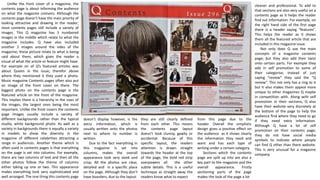
1. Unlike the front cover of a magazine, the
contents page is about informing the audience
on what the magazine contains. Although the
contents page doesn’t have the main priority of
looking attractive and drawing in the reader;
most contents pages still include a variety of
images. This Q magazine has 5 numbered
images in the middle which relate to what the
magazine includes. Q have also included
another 2 images around the sides of the
magazine; these picture relate to what is being
said about them, which gives the reader a
visual of what the article or feature might have.
For example on of Q’s featured articles was
about Queen in the issue, therefor above
where they mentioned it they used a photo.
Music magazine Contents pages often also put
an image of the front cover on there. The
biggest photo on the contents page is the
featured article on the front of the magazine.
This implies there is a hierarchy in the sizes of
the images, the largest ones being the most
important. Unlike the front covers the contents
page images usually include a variety of
different backgrounds rather than the typical
studio, white background photo. As well as a
variety in backgrounds there is equally a variety
in models to show the diversity in the
magazine of different celebrities attracting a
range in audiences. Another theme which is
often used in contents pages is that everything
on the page is set into columns. For example,
there are two columns of text and then all the
other photos follow the theme of columns
either taking up one or two. This appearance
makes everything look very sophisticated and
well arranged. The one thing this contents page
doesn’t display however, is the
extra information, which is
usually written onto the photos
next to where to number is
written.
Due to the fact everything in
this magazine is set into
columns, makes the overall
appearance look very sleek and
crisp. All the photos are clear,
detailed and in a specific place
on the page. Although they don’t
have boarders; due to the layout
from this page due to the
header. Overall the simplistic
design gives a positive effect on
the audience as it shows clearly
the information they need and
want and has each type of
writing under a certain category.
Sections which the contents
page are split up into are also a
key part to the magazine and the
overall appearance. Firstly
sectioning parts of the page
makes the look of the page a lot
they are still clearly defined
from each other. This means
the contents page layout
doesn’t look clumsy, gawky or
accidental. Because of this
specific layout, the readers
attention is drawn straight
towards the header at the top
of the page, the bold red strip
overpowers all the other
subtle details. This is a useful
technique as straight away the
readers know what to expect
cleaner and professional. To add to
that sections are also very useful on a
contents page as it helps the reader
find out information. For example, on
the right hand side of the first page
there is a header saying “features”.
This helps the reader as it shows
them all the featured article that are
included in this magazine issue.
Not only does Q use the main
concepts of a magazine contents
page; but they also add their twist
onto certain parts. For example they
add in self promotion to some of
their categorise; instead of just
saying “review” they said the “Q
review”. This not only has a ring to it
but it also makes them appeal more
unique to other magazines Q maybe
in competition with. Along with self
promotion in their sections, Q also
have their website very discretely at
the bottom of the page to help the
audience find where they need to go
if they need extra information.
Although Q have a lot of self
promotion on their contents page;
they do not have social media
symbols to indicate where people
can find Q other than there website.
This is very unusual for a magazine
company.
2. Unlike other contents pages, Billboards doesn’t fit the
usual conventions of what a contents page should appear like.
For starters the overall layout only takes over 1 page, this is
unusual for a magazine as usually a contents page would take
up a double page as there is a lot to include. Another way this
magazine layout is different to others is that there is extra
information down the side of the page. This part of the
magazine is something only Billboard offer and reinforces the
idea that Billboard are a music genre magazine; notifying the
top albums and songs. To add to the idea of their layout being
in a certain format Billboard haven’t written their name big
and only takes up a small amount of the page. Although it is
small due to the noticeable colours it still manages to be seen
and made clear.
The layout of this page is very distinctive due the page
being divided into blocks, the block vary on the type of
article, feature or added information it is based on. Unlike
other magazines although this one is divided into block the
columns are not very clear as some parts are certain widths
whilst others are thicker or thinner. Due to the fact there are
no clear columns it makes the overall appeal look un-
organised. However when you look at the titles of each
category it informs the reader about each section to the
magazine. This comes in useful as the audience don’t have
read the whole page to find out specific information, it is
already made clear just by looking at it.
The colours that are dominating this page are black, white,
grey and blue. This pallet is very common in magazines and is
seen as safe, although is still effective. The contrasting colours
complement each other making the pictures and headers
stand out. As well as that these colours appeal to both male
and female audiences of any ages which is a common theme
in music magazines. By widening their audience they can sell
more magazines and become more successful as a company.
This magazine also doesn’t fit the conventions of a usual magazine
as there are very few images on there.as Billboard have prioritised
their colour scheme above the amount of images they have, informs
us that they aim for a higher target audience. To add to that the
images themselves suggest that this magazine is aimed at an older
audience.
The blue lines on the contents page break up the
categorise and the different elements to the
magazine. These lines make the page look more
presentable and clearer, it shows what goes with
what. To add to that the fact that Billboard have used
the colour blue it makes the lines stand out more.
Another technique Billboard use is that they leave a
white background to draw the readers attention to
the text on the page. However it sometimes also
helps the images stand out, for example the women
on one knee.
Although Billboard is the masthead of the whole
magazine the title of this page is simply “contents”,
as this title is written in capital letters and is in a
black bold font; it connotes solidness and strength
towards the magazine. Also the fact that the title is
black against a white background and at the top of
the page. These contrasts make the masthead stand
out more and appear more prominent on this
contents page.
This magazine contents page also includes a lot of
minor details which help is sell and give the company
itself (Billboard) self promotion. For example towards
the top of the page it says the issue number, this
means that the audience know that there are lots
more magazines by Billboard that they can go a buy.
To add to that at the bottom of the page it states
other online applications readers can go to, to find
out more information on a particular part of the
magazine etc.
3. Unlike all the other magazine contents pages I
had analysed on this one the Editor had written a
note. This can be used as an introduction for the
magazine and to intrigue the reader to want to buy
or read the magazine. There is nothing particularly
special about an editors note it just ties loose ends
together and gives the reader a bit more of an incite
to the magazine and the editor him/herself.
The biggest image on this contents page is the
man with a tattoo on his neck, as it is the biggest
image it over powers all the others. It also gives the
reader an idea that this is the most important
picture and what the editors wants them to see
first. Due to the fact that this image is a close up,
shows that the editors wanted the audience to
focus on his facial features and expression. Because
of this it make the image feel personal and have
meaning to the readers looking at it. To add to all
that because of the photo has something to do with
the interview, it gives a hint that the article itself is
about personal topics and will be down o earth so
that the audience feel closer to the celebrity.
Although the overall layout of this contents page
is very busy and full, it has been set out in a grid-like
way so that everything is in a specific place, this
keeps the page from looking un-organised. Keerang
are very successful with their layout as they use the
concept of columns to keep everything in line with
each other and not appear as if it has just been
thrown onto the page. The majority of the page is
images of bands and musicians which indicates they
aim towards a younger audience, teens, young
adults.
The actual part of the magazine page where Kerrang list what is
going to be included. They sector each category off and list what is
included in that category underneath. This is a good way to display
information as it is clear and the audience can easily find what they
want and what page its on without reading through the list. This way of
displaying information also might help the magazine sell if readers see a
lot of interesting stories.
This contents page has a very vague colour
scheme as the colours used are very muted.
However they do use the colour yellow as if it was
a highlighter. Everything important on the page
Kerrang have typed in yellow with a black box
around it. The contrast between the yellow and the
black emphasises the yellow to make it stand out
more when readers are looking at the page. The
colour yellow also connotes happiness and joy.
Kerrang use this in hope the readers are drawn to
this colour and view it to feel an automatic positive
feel about the magazine.
This contents page is very unusual to others
due to the fact Kerrang’s name is not stated, by
briefly looking at this contents page a reader
would not be able to tell what magazine this is
from. Although their name is on the thumbnail
of their front cover; this is minor detail which
will not be spotted. The lack of self promotion
could limit their readers as they do not label
everything. However Kerrang have put an issue
number and the date on the headline which
adds small detailing.
Although this contents page doesn’t include
their company name it does include a unique
feature which isn’t usually a necessity when
creating a contents page. In the top right there
is a quote form a featured band. This add on
creates the idea of a relationship between the
reader and the band, it makes the page appeal
to people on a more personal level. Providing a
quote is also a good way to hook in readers and
get them wanting the magazine.