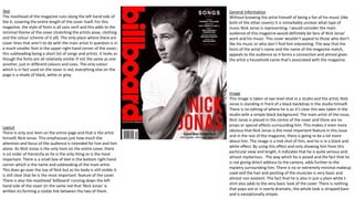
Image
Similar to the over two magazine covers, this image is also taken in
the studio but this picture is an extreme close up of the artist,
Rihanna. The background is just plain white, making it look as though
Rihanna is popping out of the page and emphasises that she is the
main and yet again most important feature of this particular issue of
the magazine. Another factor which emphasises that she is the most
important aspect of the issue is the fact that her head is actually
going over the top of the masthead of the cover. This points out the
fact that this particular magazine believes that she should be the sole
and main focus of attention and in an order of hierarchy, Rihanna is
the most important feature – not the name or the presence of the
magazine itself. Rihanna is the only person or thing placed on the
cover (aside from any headings) indicating that she is the star. She is
also posed with half of her face covered by her hair, turning towards
camera; giving a dazed smoulder whilst glancing back over her
shoulder. Her body is almost twisted away from camera itself whilst
her face is pointed directly towards it and she is giving direct address
to camera. The photo is taken at eye level which could be a way of
trying to put the artist on the same rank as whoever is looking at it.
There are no props or dramatic editing done on the cover but it’s
clear that Rihanna’s hair has been styled and her makeup done to
look extensively made up but still natural. Her very made up face and
hair indicate that she takes her appearance seriously and also hints
that the rest of the interview with her inside of the magazine, will be
revealing; as her outfit is considerably small and lot of her upper
body is showing. It’s also apparent that this shot wasn’t meant to be
natural or ‘caught off guard’ it is very clear that Rihanna has been
positioned in this specific way, in this specific outfit in order to
appeal and attract the most people possible. The fact that Rihanna is
a solo artist is emphasised in this cover as she is not sharing the
attention with anybody else, all of the limelight is primarily on her
and that’s it. Direct address being given to the camera also highlights
the connection between the artist and camera.
Text
The masthead is at the very top of the cover and reaches from one
side to the other, it’s the whole width of the magazine. There are
also a considerable amount of cover lines, all of which along the
right hand side of cover; there are three in total plus the heading of
the cover star herself. Excluding the name ‘Rihanna’ which is in a
serif font, it looks as though the rest of the text is in sans serif. I
think that this is done to emphasise the artist's name as the most
important feature in the magazine.
Layout
There are several graphical items on the cover but as Rihanna is
the only feature on the entire page, there is no specific hierarchy
of anything and there isn’t a real layout as the artist is the sole
focus on the cover. The layout of the whole cover is considerably
spread out and is definitely not overcrowded, however it is also
filled enough to not look bare, empty or too basic.
General Information
By focusing on the cover alone, it is quite unclear about what
particular type of music is supposed to be represented. However
fans of Rihanna, who will be reading and buying the magazine, will
know what type of music she makes and what they will be reading
about if they buy the issue. By having the artist strike a very sultry
looking pose, the magazine is adding a sex appeal to the cover and
so this will add even more interest and audience to the magazine. I
think that the main reason they have chosen this specific pose,
style and ‘look’ for Rihanna is purely to appeal to a larger audience.
Obviously fans of Rihanna will be drawn to the magazine but it’s
also to do with people who may not be fans of her music but may
like her edgy and quite glamorous look which is greatly enhanced
in this particular style and pose.
Image
Set in the studio, having just a plain cream background which looks
untouched and barely edited, with the music artist Lily Allen in the
very centre of the cover. She is clearly the main focus of the cover as
she is the sole person featured and is giving direct address to the
camera. The long shot of her body is almost the entire length of the
magazine which emphasises her importance. The angle of which the
picture is taken is from a distance but at eye level as the audience is
neither looking up or down at the artist. She is posed with her back to
the camera, glancing over her shoulder with a shy but stern expression
on her face. Her jet black hair matches the bottom part of her outfit as
well as the two animals beside her. The two animals act as metaphors
for an ‘animal nature’ whilst also matching the colour scheme of her
appearance. The darkness of her eye makeup, hair and the animals
could also link with the controversy of the artist or some of her songs.
The fact that she is also in minimal clothing suggests that she is
stripped down for the interview and it is very honest, as are what she
sings about.
Text
The masthead of the magazine is placed in the upper left hand
corner and a very small section of it is actually placed behind the
artist. This could be because the magazine is implying that it’s the
artist and not the actual magazine which is the most important
aspect. There are only a couple of fonts which are used as not to
unnecessarily overcomplicate the magazine. The masthead is it’s
own font which is consistent with every other of it’s covers and the
main headline and cover lines are in a mixture of colours and sizes
but in the same font. All of the text on the entire cover are in upper
case and not lower case. The majority of the text is in sans serif but
the small black box along the very bottom of the magazine does
have the same font used previously but serif now. But overall the
overall type of fonts used are quite basic and not too extravagant
this is to make sure the audiences attention is kept on the image
itself. Aside from shades of black and white, the only real colours
that are used throughout the cover are red and blue. This could be
to keep focus on the artist themselves and not to overcrowd the
page with too much going on. There are a few cover lines that are
used on the page but these mostly in the upper right hand corner of
the magazine with only a few other artists featured at the very
bottom of the magazine with not much focus being put onto them.
Layout
The majority of text is placed in the upper section of the magazine
with only a few of the other stories featured on the cover, placed
near the bottom of the page. Pushed up against the right hand side
of the page is also a pop up bow with ‘25 Greatest Rock Movies’ in
the middle of it. This is clearly not the main feature of the magazine
due to its size and positioning but is still important enough to be
featured on the front cover. At first glance it’s evident to see that the
most important aspect of the cover is the image of the artist, closely
followed by the masthead of the magazine with all of the cover lines
and other features behind them in order of importance.
General Information
The exact genre of the music isn’t entirely clear but as the artist and
magazine are both very well known. The magazine ‘Q’ features a
variety of artists representing all types of music but having the artist
Lily Allen on the cover means that the particular type of music that’s
been broadcasted is pop music but for an older audience as a lot of
her songs are explicit. I would say that the audience that this issue
would appeal to is any fans of Lily Allen, these being young adults
who actually listen to her songs. However without knowing who Lily
Allen is and the type of songs that she makes, there could be some
confusion over what type of music is being advertised. There could
be more of an audience, this being consistent fans of the magazine.
The cover itself has been made to appear to an audience by making
sure the focus is purely on the artist and what they’re about. This
way fans of Lily Allen’s will find the magazine appealing as they want
to read more about the artist and songs that they like instead of
information about the magazine or other artists they aren’t
interested in.
Image
This image is taken at eye level shot in a studio and the artist, Nick
Jonas is standing in front of a black backdrop in the studio himself.
There is no editing of where he is as it’s clear this was taken in the
studio with a simple black background. The main artist of the issue,
Nick Jonas is placed in the centre of the cover and there are no
props or special effects surrounding him. This makes it even more
obvious that Nick Jonas is the most important feature in this issue
and in the rest of the magazine, there is going to be a lot more
about him. The image is a mid shot of him, and he is in a black and
white effect. By using this effect and only showing him from this
particular view and length, it indicates that he is quite serious and
almost mysterious. The way which he is posed and the fact that he
is not giving direct address to the camera, adds further to the
mystery surrounding him. There is no or extremely minimal makeup
used and the hair and positing of the musician is very basic and
almost non existent. The fact that he is also in just a plain white t-
shirt also adds to the very basic look of the cover. There is nothing
that pops out or is overly dramatic, the whole look is stripped bare
and is exceptionally simple.
Text
The masthead of the magazine runs along the left hand side of
the it, covering the entire length of the cover itself. For this
magazine, the style of fonts is all sans serif and this adds to the
minimal theme of the cover (matching the artists pose, clothing
and the colour scheme of it all). The only place where there are
cover lines that aren't to do with the main artist in question is in
a much smaller font in the upper right hand corner of the cover.;
this subheading being a short list of songs and artists. It looks as
though the fonts are all relatively similar if not the same as one
another; just in different colours and sizes. The only colour
which is in fact used on the cover is red, everything else on the
page is a shade of black, white or grey.
Layout
There is only one item on the entire page and that is the artist
himself, Nick Jonas. This emphasises just how much the
attention and focus of the audience is intended for him and him
alone. As Nick Jonas is the only item on the entire cover, there
is no order of hierarchy as he is the only thing so is the most
important. There is a small box of text in the bottom right hand
corner which is the name and subheading of the main artist.
This does go over the top of Nick but as his body is still visible it
is still clear that he is the most important feature of the cover.
There is also the masthead ‘billboard’ running down the left
hand side of the cover (in the same red that ‘Nick Jonas’ is
written in) forming a visible link between the two of them.
General Information
Without knowing the artist himself of being a fan of his music (like
both of the other covers) it is remarkably unclear what type of
music Nick Jonas is representing. I would consider the main
audience of this magazine would definitely be fans of Nick Jonas’
work and his music. This cover wouldn’t appeal to those who don’t
like his music or who don’t find him interesting. The way that the
fonts of the artist’s name and the name of the magazine match,
appeals to the audience as it forms a connection and almost gives
the artist a household name that’s associated with the magazine.

Magazine Cover Analysis

  • 1.
    Image Similar to theover two magazine covers, this image is also taken in the studio but this picture is an extreme close up of the artist, Rihanna. The background is just plain white, making it look as though Rihanna is popping out of the page and emphasises that she is the main and yet again most important feature of this particular issue of the magazine. Another factor which emphasises that she is the most important aspect of the issue is the fact that her head is actually going over the top of the masthead of the cover. This points out the fact that this particular magazine believes that she should be the sole and main focus of attention and in an order of hierarchy, Rihanna is the most important feature – not the name or the presence of the magazine itself. Rihanna is the only person or thing placed on the cover (aside from any headings) indicating that she is the star. She is also posed with half of her face covered by her hair, turning towards camera; giving a dazed smoulder whilst glancing back over her shoulder. Her body is almost twisted away from camera itself whilst her face is pointed directly towards it and she is giving direct address to camera. The photo is taken at eye level which could be a way of trying to put the artist on the same rank as whoever is looking at it. There are no props or dramatic editing done on the cover but it’s clear that Rihanna’s hair has been styled and her makeup done to look extensively made up but still natural. Her very made up face and hair indicate that she takes her appearance seriously and also hints that the rest of the interview with her inside of the magazine, will be revealing; as her outfit is considerably small and lot of her upper body is showing. It’s also apparent that this shot wasn’t meant to be natural or ‘caught off guard’ it is very clear that Rihanna has been positioned in this specific way, in this specific outfit in order to appeal and attract the most people possible. The fact that Rihanna is a solo artist is emphasised in this cover as she is not sharing the attention with anybody else, all of the limelight is primarily on her and that’s it. Direct address being given to the camera also highlights the connection between the artist and camera. Text The masthead is at the very top of the cover and reaches from one side to the other, it’s the whole width of the magazine. There are also a considerable amount of cover lines, all of which along the right hand side of cover; there are three in total plus the heading of the cover star herself. Excluding the name ‘Rihanna’ which is in a serif font, it looks as though the rest of the text is in sans serif. I think that this is done to emphasise the artist's name as the most important feature in the magazine. Layout There are several graphical items on the cover but as Rihanna is the only feature on the entire page, there is no specific hierarchy of anything and there isn’t a real layout as the artist is the sole focus on the cover. The layout of the whole cover is considerably spread out and is definitely not overcrowded, however it is also filled enough to not look bare, empty or too basic. General Information By focusing on the cover alone, it is quite unclear about what particular type of music is supposed to be represented. However fans of Rihanna, who will be reading and buying the magazine, will know what type of music she makes and what they will be reading about if they buy the issue. By having the artist strike a very sultry looking pose, the magazine is adding a sex appeal to the cover and so this will add even more interest and audience to the magazine. I think that the main reason they have chosen this specific pose, style and ‘look’ for Rihanna is purely to appeal to a larger audience. Obviously fans of Rihanna will be drawn to the magazine but it’s also to do with people who may not be fans of her music but may like her edgy and quite glamorous look which is greatly enhanced in this particular style and pose.
  • 2.
    Image Set in thestudio, having just a plain cream background which looks untouched and barely edited, with the music artist Lily Allen in the very centre of the cover. She is clearly the main focus of the cover as she is the sole person featured and is giving direct address to the camera. The long shot of her body is almost the entire length of the magazine which emphasises her importance. The angle of which the picture is taken is from a distance but at eye level as the audience is neither looking up or down at the artist. She is posed with her back to the camera, glancing over her shoulder with a shy but stern expression on her face. Her jet black hair matches the bottom part of her outfit as well as the two animals beside her. The two animals act as metaphors for an ‘animal nature’ whilst also matching the colour scheme of her appearance. The darkness of her eye makeup, hair and the animals could also link with the controversy of the artist or some of her songs. The fact that she is also in minimal clothing suggests that she is stripped down for the interview and it is very honest, as are what she sings about. Text The masthead of the magazine is placed in the upper left hand corner and a very small section of it is actually placed behind the artist. This could be because the magazine is implying that it’s the artist and not the actual magazine which is the most important aspect. There are only a couple of fonts which are used as not to unnecessarily overcomplicate the magazine. The masthead is it’s own font which is consistent with every other of it’s covers and the main headline and cover lines are in a mixture of colours and sizes but in the same font. All of the text on the entire cover are in upper case and not lower case. The majority of the text is in sans serif but the small black box along the very bottom of the magazine does have the same font used previously but serif now. But overall the overall type of fonts used are quite basic and not too extravagant this is to make sure the audiences attention is kept on the image itself. Aside from shades of black and white, the only real colours that are used throughout the cover are red and blue. This could be to keep focus on the artist themselves and not to overcrowd the page with too much going on. There are a few cover lines that are used on the page but these mostly in the upper right hand corner of the magazine with only a few other artists featured at the very bottom of the magazine with not much focus being put onto them. Layout The majority of text is placed in the upper section of the magazine with only a few of the other stories featured on the cover, placed near the bottom of the page. Pushed up against the right hand side of the page is also a pop up bow with ‘25 Greatest Rock Movies’ in the middle of it. This is clearly not the main feature of the magazine due to its size and positioning but is still important enough to be featured on the front cover. At first glance it’s evident to see that the most important aspect of the cover is the image of the artist, closely followed by the masthead of the magazine with all of the cover lines and other features behind them in order of importance. General Information The exact genre of the music isn’t entirely clear but as the artist and magazine are both very well known. The magazine ‘Q’ features a variety of artists representing all types of music but having the artist Lily Allen on the cover means that the particular type of music that’s been broadcasted is pop music but for an older audience as a lot of her songs are explicit. I would say that the audience that this issue would appeal to is any fans of Lily Allen, these being young adults who actually listen to her songs. However without knowing who Lily Allen is and the type of songs that she makes, there could be some confusion over what type of music is being advertised. There could be more of an audience, this being consistent fans of the magazine. The cover itself has been made to appear to an audience by making sure the focus is purely on the artist and what they’re about. This way fans of Lily Allen’s will find the magazine appealing as they want to read more about the artist and songs that they like instead of information about the magazine or other artists they aren’t interested in.
  • 3.
    Image This image istaken at eye level shot in a studio and the artist, Nick Jonas is standing in front of a black backdrop in the studio himself. There is no editing of where he is as it’s clear this was taken in the studio with a simple black background. The main artist of the issue, Nick Jonas is placed in the centre of the cover and there are no props or special effects surrounding him. This makes it even more obvious that Nick Jonas is the most important feature in this issue and in the rest of the magazine, there is going to be a lot more about him. The image is a mid shot of him, and he is in a black and white effect. By using this effect and only showing him from this particular view and length, it indicates that he is quite serious and almost mysterious. The way which he is posed and the fact that he is not giving direct address to the camera, adds further to the mystery surrounding him. There is no or extremely minimal makeup used and the hair and positing of the musician is very basic and almost non existent. The fact that he is also in just a plain white t- shirt also adds to the very basic look of the cover. There is nothing that pops out or is overly dramatic, the whole look is stripped bare and is exceptionally simple. Text The masthead of the magazine runs along the left hand side of the it, covering the entire length of the cover itself. For this magazine, the style of fonts is all sans serif and this adds to the minimal theme of the cover (matching the artists pose, clothing and the colour scheme of it all). The only place where there are cover lines that aren't to do with the main artist in question is in a much smaller font in the upper right hand corner of the cover.; this subheading being a short list of songs and artists. It looks as though the fonts are all relatively similar if not the same as one another; just in different colours and sizes. The only colour which is in fact used on the cover is red, everything else on the page is a shade of black, white or grey. Layout There is only one item on the entire page and that is the artist himself, Nick Jonas. This emphasises just how much the attention and focus of the audience is intended for him and him alone. As Nick Jonas is the only item on the entire cover, there is no order of hierarchy as he is the only thing so is the most important. There is a small box of text in the bottom right hand corner which is the name and subheading of the main artist. This does go over the top of Nick but as his body is still visible it is still clear that he is the most important feature of the cover. There is also the masthead ‘billboard’ running down the left hand side of the cover (in the same red that ‘Nick Jonas’ is written in) forming a visible link between the two of them. General Information Without knowing the artist himself of being a fan of his music (like both of the other covers) it is remarkably unclear what type of music Nick Jonas is representing. I would consider the main audience of this magazine would definitely be fans of Nick Jonas’ work and his music. This cover wouldn’t appeal to those who don’t like his music or who don’t find him interesting. The way that the fonts of the artist’s name and the name of the magazine match, appeals to the audience as it forms a connection and almost gives the artist a household name that’s associated with the magazine.