The document discusses the mastheads of four magazines - Q, Kerrang!, Billboard, and Rolling Stone.
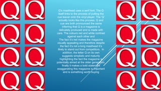
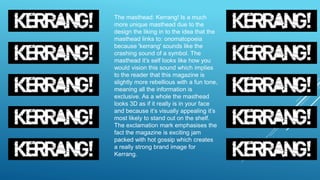
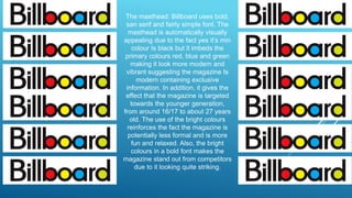
The Q masthead uses a serif font and resembles the process of cueing a vinyl record, implying the magazine is carefully produced. Kerrang!'s unique masthead resembles a crashing cymbal sound, implying a rebellious and fun tone. Billboard's masthead uses bold sans serif fonts and primary colors, suggesting a modern, youthful target audience. Rolling Stone's masthead has an edgy, Broadway-like serif font in red and white, implying an older, more mature audience despite its well-known brand.
Read| The latest issue of The Challenger is here! We are thrilled to announce that our school paper has qualified for the NATIONAL SCHOOLS PRESS CONFERENCE (NSPC) 2024. Thank you for your unwavering support and trust. Dive into the stories that made us stand out!
How to Create Map Views in the Odoo 17 ERPCeline George
The map views are useful for providing a geographical representation of data. They allow users to visualize and analyze the data in a more intuitive manner.
Welcome to TechSoup New Member Orientation and Q&A (May 2024).pdfTechSoup
In this webinar you will learn how your organization can access TechSoup's wide variety of product discount and donation programs. From hardware to software, we'll give you a tour of the tools available to help your nonprofit with productivity, collaboration, financial management, donor tracking, security, and more.
The French Revolution, which began in 1789, was a period of radical social and political upheaval in France. It marked the decline of absolute monarchies, the rise of secular and democratic republics, and the eventual rise of Napoleon Bonaparte. This revolutionary period is crucial in understanding the transition from feudalism to modernity in Europe.
For more information, visit-www.vavaclasses.com
How to Make a Field invisible in Odoo 17Celine George
It is possible to hide or invisible some fields in odoo. Commonly using “invisible” attribute in the field definition to invisible the fields. This slide will show how to make a field invisible in odoo 17.
Palestine last event orientationfvgnh .pptxRaedMohamed3
An EFL lesson about the current events in Palestine. It is intended to be for intermediate students who wish to increase their listening skills through a short lesson in power point.
The Roman Empire A Historical Colossus.pdfkaushalkr1407
The Roman Empire, a vast and enduring power, stands as one of history's most remarkable civilizations, leaving an indelible imprint on the world. It emerged from the Roman Republic, transitioning into an imperial powerhouse under the leadership of Augustus Caesar in 27 BCE. This transformation marked the beginning of an era defined by unprecedented territorial expansion, architectural marvels, and profound cultural influence.
The empire's roots lie in the city of Rome, founded, according to legend, by Romulus in 753 BCE. Over centuries, Rome evolved from a small settlement to a formidable republic, characterized by a complex political system with elected officials and checks on power. However, internal strife, class conflicts, and military ambitions paved the way for the end of the Republic. Julius Caesar’s dictatorship and subsequent assassination in 44 BCE created a power vacuum, leading to a civil war. Octavian, later Augustus, emerged victorious, heralding the Roman Empire’s birth.
Under Augustus, the empire experienced the Pax Romana, a 200-year period of relative peace and stability. Augustus reformed the military, established efficient administrative systems, and initiated grand construction projects. The empire's borders expanded, encompassing territories from Britain to Egypt and from Spain to the Euphrates. Roman legions, renowned for their discipline and engineering prowess, secured and maintained these vast territories, building roads, fortifications, and cities that facilitated control and integration.
The Roman Empire’s society was hierarchical, with a rigid class system. At the top were the patricians, wealthy elites who held significant political power. Below them were the plebeians, free citizens with limited political influence, and the vast numbers of slaves who formed the backbone of the economy. The family unit was central, governed by the paterfamilias, the male head who held absolute authority.
Culturally, the Romans were eclectic, absorbing and adapting elements from the civilizations they encountered, particularly the Greeks. Roman art, literature, and philosophy reflected this synthesis, creating a rich cultural tapestry. Latin, the Roman language, became the lingua franca of the Western world, influencing numerous modern languages.
Roman architecture and engineering achievements were monumental. They perfected the arch, vault, and dome, constructing enduring structures like the Colosseum, Pantheon, and aqueducts. These engineering marvels not only showcased Roman ingenuity but also served practical purposes, from public entertainment to water supply.
CLASS 11 CBSE B.St Project AIDS TO TRADE - INSURANCE
Masthead analysis
1.
2. Q’s masthead uses a serif font. The Q
itself links to the process of putting the
cue leaver onto the vinyl player. The ‘Q’
actually looks like this process. Q and
cue are both pronounced the same
inferring that Q is a magazine is
delicately produced and is made with
care. The colours red and white contrast
against each other and
The fact it’s red makes the magazine
visually appealing and therefore despite
the fact it’s not a long masthead it’s
likely to stand out from competitors. In
addition, the letter Q on its own
suggests simplistic and maturity
highlighting the fact the magazine is
potentially aimed at the older generation,
finally it makes a bold statement
exaggerating this magazine is important
and is something worth buying
3. The masthead: Kerrang! Is a much
more unique masthead due to the
design the liking in to the idea that the
masthead links to: onomatopoeia
because 'kerrang' sounds like the
crashing sound of a symbol. The
masthead it’s self looks like how you
would vision this sound which implies
to the reader that this magazine is
slightly more rebellious with a fun tone,
meaning all the information is
exclusive. As a whole the masthead
looks 3D as if it really is in your face
and because it’s visually appealing it’s
most likely to stand out on the shelf.
The exclamation mark emphasises the
fact the magazine is exciting jam
packed with hot gossip which creates
a really strong brand image for
Kerrang.
4. The masthead: Billboard uses bold,
san serif and fairly simple font. The
masthead is automatically visually
appealing due to the fact yes it’s min
colour Is black but it imbeds the
primary colours red, blue and green
making it look more modern and
vibrant suggesting the magazine Is
modern containing exclusive
information. In addition, it gives the
effect that the magazine is targeted
towards the younger generation,
from around 16/17 to about 27 years
old. The use of the bright colours
reinforces the fact the magazine is
potentially less formal and is more
fun and relaxed. Also, the bright
colours in a bold font makes the
magazine stand out from competitors
due to it looking quite striking.
5. Straight away the masthead:
RollingStone has an edgy look the
serif font looks like it would be
used in Broadway. The font
consists of the contrasting colours
red and white and therefore it
becomes visually appealing. The
3D affect makes the masthead pop
out making it become something
you’re more likely to notice against
others. However, the masthead
does look quite dull and old
fashioned suggesting that the
magazine’s preferred target
audience is aimed at the older
generation due to it being more
mature and formal. The masthead
isn’t the main focus of the
magazine as the brand itself Is well
respected so it doesn’t need to
promote it’s self as much as newer
magazine companies would.