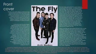
The magazine is called The Fly, a free music magazine published monthly in the UK since 1999 with a circulation of over 100,000. Issue 164 from September 2013 features Arctic Monkeys as the main interview.
The front cover uses a black and white photo of Arctic Monkeys to draw readers in. Little text is used to allow the band image to be the main focus.
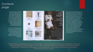
The contents page also keeps design simple with a single sans-serif font. A photo of musician Roses Gabor is featured along with a list of articles on the left side.
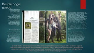
A double page article on the band Haim utilizes green tones and many photos. The band is shown together to represent their bond as sisters working in the