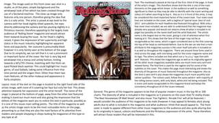
The image on the magazine cover features two artists sitting side by side on a sofa in a relaxed manner directly addressing the camera. Their coordinated pink outfits and casual clothing style represent their rap and R&B genre. The title is at a 90 degree angle uniquely for this magazine. Text uses contrasting serif and sans serif fonts to represent the diversity of music discussed. The layout emphasizes the artists over text, showing their importance to attracting audiences. The magazine targets a wide range of music fans including young adults.
Flirtatious Taylor Swift draws eyes on Rolling Stone cover
1. Image: The image featured on this magazine cover is a studio shot, and is
shown to be this by the plain white background and floor behind the
artist. This was presumably used to emphasis and draw attention to the
artist, as well as the text surrounding her and the title of the magazine.
Only one artist is included in the image, therefore again drawing attention
primarily to her. The artist featured is Taylor Swift and she is seen to be
sitting down looking slightly up to the camera ( camera being at a high
angle) with all her body being shown except her feet in a long shot image.
She is posed in the image with her legs crossed, her head turned away
from her body towards the camera, directly addressing the reader of the
magazine. As well as this she is pushing her hair out of her face with her
left hand, in a flirtatious manner, therefore all of her body language would
appeal to the predominantly male audience of Rolling Stones magazine.
This is again emphasised with her facial expression, which includes her
looking somewhat serious matched with a faint smile. This as well as her
direct address to the audience, attracts the male audience of this
magazine, as they would think she is looking at them personally. The
artist is dressed in a plain, white top and brown shorts, however she is
draped with a high school American football jacket over her shoulders (
using plain clothes underneath this draws attention significantly to the
jacket and its meaning). The significance of the football jacket is a
reflection of her high school heartbreak, and young love themed songs
and also identifies her as the cheerleader stereotype of high school life.
Her hair is a little messy, and her makeup especially on her eyes is dark
and again slightly untidy. This could be seen as an attempt to rebel against
the cheerleader/ girl next door persona, shown in her clothing possibly
hinting at a new transition in music differing from pop.
Text: The masthead ‘Rolling Stone’ is presented behind the artist at
the top of the page, therefore indicating is lesser importance
compared the main image of Taylor but also showing that it is an
significant factor to the cover. We could also get the idea that the
magazine and specifically its name is well known already and
therefore does not need to be the main element to the magazine
cover. Six main headlines are used throughout the cover all differing
in size, colour and boldness of each. All of the text is placed
surrounding the artist, not covering hardly any of her body, with the
bottom half of the photo not being covered by any text at all. Four
fonts are used throughout the cover including the title font, and two
different fonts for the headlines and one other for the subtitles under
the headlines, used to show the writer of the article. By using a few
different fonts on the cover, it creates an individuality between each
of the stories and makes the cover more interesting as a whole.
Majority of the text on the magazine is using both upper and lower
case letters (usually having capital letters as the upper case at the
start of the words), however there are some exceptions with the
words ‘HOT LIST’ and ‘THE HEARTBREAK KID’ all being in upper case.
More attention is drawn to these headline and subtitles because of
this and also present the popularity and interest the reader should
have in these headlines and the stories that come with them. The
colours of the font follow the main colour scheme of the entire
magazine itself, using red in the title and the word ‘HOT’, for all the
other text either white or black is used. The use of red on the word
hot, is a connotation of red meaning heat and fire, therefore
matching with the word hot. By using only these three colours, the
text become iconic to this specific magazine and again make the focus
of the cover the artist. All of the text is in serif, therefore making the
magazine give a much more mature and older feel, identifying the
young adult targeted audience.
Layout: On the page the image of the artist is featured in the middle of the cover. This gives
her sole importance and attention. All of the cover stories on the page are placed around her,
in a border like theme (again showing she is the main element). The main text that overlaps
onto the image is that of the artists story stating her name ‘Taylor Swift’ and subtitle in a large
white font, standing out against her blue jacket. This also draws attention to the text and
demonstrates how it is a key story in this particular magazine issue. As the magazine name is
at the top of the page, it follows the normal layout of most magazines and again presents its
importance on the cover, as readers may identify the magazine just from this title.
General: The genre of the magazine appears to be that of popular modern music in the top 40 or
100 charts. We can understand that a range of musical genres are talked about throughout the
magazine, due to the text on the cover ranging from Led Zeppelin (rock music), John Lennon and
Taylor Swift (pop and country). Also the magazine features other stories not just concerning music
but other issues and events, such as culture and film therefore giving it a widespread audience base.
I would consider the audience of this magazine to be male (however it may appeal to females also)
young adults due to what is included in the magazine and what audience I think that would appeal
to. Overall the front cover is made to appear fairly simple and clear to the audience, as of its use of
basic colours as well as the minimal text used throughout. Again this shows how the attention of the
audience is put onto the image and accordingly shows that the artists story is what they want to use
to draw readers in.
2. Image: The image used on this front cover was shot in a
studio, as of the plain, simple background and the
windswept look of her which has been created through the
use of a fan/wind machine. The close up image only
features only one person, therefore giving the idea that
she is a solo artist. The artist is posed at eye level to the
camera with her head slightly tilted upwards, her eyes
directly addressing the camera and lips pouting slightly in a
flirtatious manner, therefore appealing to the largely male
audience of ‘Rolling Stone’ magazine and would attract
them towards buying the issue. As her head is slightly
raised, it gives the impression of her superiority and high
status in the music industry, highlighting her apparent
fame and popularity. Her costume is presumably black
however it is only faintly seen at the bottom of the page.
Due to its simplicity, we can tell that it is not a prominent
or important factor of the cover. Her hair is very big and
windswept into a messy and untidy fashion, hinting
towards a 60’s/70’s theme, matching with the thick cat-
eyed flicked black eyeliner. This could highlight her music
genre, of soul ballads, taking some influence from that
time period and the singers then. Other than them two
main features, all the other makeup and appearance is
fairly simplistic.
Text: The masthead is placed at the top of the first, third of the page, in front
of the artist’s image. This therefore shows that the title is one of the main
elements on the page which draws in the audience as well as something
significant to them as they may be able to identify with the iconic writing and
colour of it when searching to buy it. Also as it is in front of the artist, it may
be considered the most important factor of the covers look. Four main cover
lines are included on the cover, with a tagline of ‘special issue: best of rock
2011’ and subtitles for each headline also featured throughout. With only a
few cover lines included, we are able to understand that the magazine may
already very popular and would not need to show all what is included in its
pages but possibly on the name itself and the artist featured. The artists
name is the largest text on the cover, giving it a lot of attention when first
looking at it. This shows that the face of the singer may not be as
recognisable as her name, which is again considered due to the title covering
the top of her head as mentioned before. Due to this we can see that a main
attribute to the magazines success is the cover itself and who is included on
it as well as throughout the magazine. There are around three fonts used in
total across the page, with one being used for the iconic magazine name and
its logo. The others included are that which are a ‘Broadway’ type font with
serif features. This shows the magazines age as well as its originality against
all the other music magazines available (who use much more sans serif and
relaxed fonts). The final font is used for the tagline and for some of the
subtitles on the cover. This makes the page more interesting and shows the
diversity of the genres of music featured throughout the magazine. Also as
this font is sans serif it also shows the magazines much more youthful and
calmer qualities. The colours used, follow the same pattern with majority of
the rolling stones covers, with only black, white and red being included. This
is iconic and easily recognisable to this magazine brand and keeps the
consistency throughout all of the issues released.
Layout: most of the text on the page is located to the right hand side of the
artists image, with none of it covering her face but only her hair. This draws
attention towards her expression and the artist herself. The name of the
singer is placed at the bottom of page, away from the other text featured,
making it stand out much more and also giving the impression that the
editors of the magazine want you to notice this text in particular, possibly as
it is one of this issues main selling points. The title of the magazine as well
as the artists image seem to be the most noticeable items on the page,
presenting to us that they are also the main factors of its attention from
readers and people shopping in shops looking for magazines of this type or
any type at all.
General: The genre of the magazine appears to be that of popular modern music in the top 40 or 100
charts. The diversity of what is included in the magazine as it presents on the cover that TV reality shows
‘The Real Housewives Of Wall Street’ and also music ‘Foo Fighters’, ‘Arcade Fire’ will all be featured. I
would consider the audience of this magazine to be male (however it may appeal to females also) young
adults due to what is included in the magazine and what audience I think that would appeal to. The front
cover is made to appear different from other music magazines to the audience and also quite alluring due
to its originality in layout, colours and features and the flirtatious expression of the artist. These therefore
will attract those readers that will be interested in this.
3. Image: The image featured on the cover was taken on location, as of
the living room style of the background and props featured, such as
the rug and sofa. Two artists are included on the cover, sitting side by
side, both leaning slightly towards the camera whilst directly
addressing it in a relaxed and calm manner. Due to this pose of both
people, we are able to see that they are comfortable in their
profession and it could therefore be assumed that they are popular in
their work by acting so. Again by leaning towards and directly
addressing the camera and also by having the camera at eye level, we
can also get the idea that the photographer is trying to give us the
impression that the artists featured are in conversation with the
audience of the magazine (making them much more likable to them).
Their relaxed posture, limbs and facial expressions also present this
and therefore creates a comfortable and familiar tone of the
magazine for those reading it. The image is a long shot of their entire
bodies and outfits, accordingly showing us that their style and
especially their colour coordinated pink shows and jumper (matching
with the title of the magazines cover) are an important asset to their
image and reputation. Their costumes give a representation of their
genre of music being that of rap and R&B, and therefore by wearing
such clothes which are connected with that style of music, like
trainers, and baggy casual clothing, this genre is prominently
presented to the audience and attracts those interested in that genre.
However we could also get the impression that these artists are trying
to give the feeling of superiority to an extent due one of artists (the
one to the right) having his head slightly tilted upwards looking down
at the camera. This expresses the presumed popularity of these
people in the music industry.
Text: The magazine title in featured at a 90 degree angle on the left hand
side of the page. This is original to Billboard magazine, as it is unusual and
different to the usual position of in the middle of the top third of the page.
This text matched the colours of the outfits worn by the artists, and is
different for each issue depending of the colour featured or worn by the
person in the image. The masthead is not covering any of the artists, and
therefore give them equal importance and significance on the page and the
magazine covers attempt at attracting readers. The main headline featured,
is in a serif traditional looking font, which is supposed to be a contrast the
bubble sans serif font of the bold masthead. Also the serif font is used to
imitate the old fashioned statement, of ‘The Tale Of Top Dawg’. This
headline has connections to old Hollywood films and also to stories told in
history whilst having some modern element e.g. The use of dawg, is a fairly
modern term associated with the artists genre of music. Other cover lines
are presented on the page in a serif looking font similar to that of the main
headline, however due to their small size we are able to see that they are
not as of importance to the cover compared to that of the image,
masthead and main headline. With only two fonts used and both opposing
each other in serif and sans serif, it presents the diversity of music
discussed in the magazine and also the wide range of people who read it.
The masthead is in all lower case letters, whilst all the other text used uses
both upper and lower case. This gives the masthead a much more relaxed
and youthful feel, matching to that of the expression and body language of
the artists in the image. The colour scheme of the fonts and cover overall
are mainly white and pink, however greys are also used in the image to
make all the text and people featured stand out more. By only having
simple colour pattern, the magazines hassle and calm tone is again shown
without even reading a word of the text.Layout: The layout of various aspects of the cover show the importance of each of them in interesting
audiences and also showing the significance of the stories included. The artists are featured towards the
bottom of the page, with no text covering them. This gives the idea of a conversation is occurring
between them and the audience as mentioned before. They all take up majority of the space on the
cover, showing that they are an important factor. All of the text other than the mast head it featured
above the head of the artists, with some forming a banner like pattern, and other text filling all the
remaining space above them. This again emphasises the image and draws attention towards the artists
rather than the text. Finally the masthead in featured on the left hand side turned 90 degrees clockwise.
This is iconic to Billboard magazine and as well as this does not cover any of the important image and
leaves space for the text to be included.
General: the genre of the magazine is made clear due to the various fonts being
used showing that a range of different genres are discussed in the magazine. Also,
text on the cover such as ‘Kiss Vs Rock Hall Of Fame’ and ‘The Return Of Rick Ross’
show this again as of these artists being very different in terms of music from each
other. Therefore the targeted audience of this magazine would range from many
different people who have various tastes in music. As well as this i think that the
age group of this magazine is for young adults and teens, due to the language and
colours used, attracting these age groups.