Masthead
The masthead of this magazine
stands out to the rest of the
page as it uses a black and
white contrast for the words, so
the reader knows exactly what
they are going to be reading
without searching for the
magazine. It uses an usual font
that goes with with the genre of
the magazine (rock) so the
reader then knows the
magazine is about rock
artists/bands. The masthead is
behind the dominant image so
it does not take the attention
away from the main theme of
the magazine.
Coverline
The cover lines on this magazine have the main title of what
is involved highlighted and more information about it
underneath, this gives the reader an insight of what is
involved in the magazine without giving too much away. The
colours used, stick to the colour scheme of the magazine,
and make the cover lines stand out whilst not taking
attention away from the dominant image.
Barcode
The barcode of this magazine is in a
small format so it does not take up
much of the front cover as it is not an
important part of the magazine,
however is in a big enough font so the
reader knows how much they are
paying for the magazine before the
get to the cashier.
Dominant Image
Kerrang magazine have used a
dominant image central to the frame
of the magazine, to make it more
visible to the reader and attract their
attention. The style of the artist;
their hair colour being bright, and
their style of clothes being mostly
leather and their body stances and
language gives the reader the vibe
that this artist is from a punk rock
background. The facial expression of
the artist is quite natural with a half
smile, giving the reader the intention
there is something to look forward to
in the magazine about their band.
The magazine have also used a blank
background in the image, this could
mean that they are giving away no
information on the front cover so the
viewer will have to read the article to
find out more.
Plug
The plug on
Kerrang uses the
same font and
colour scheme as
the rest of the
magazine however
is highlighted with
a red circle,
suggesting it has
some sort of
importance to the
magazine. It also
attracts the
readers eye as it is
a different design
(circle) to the rest
of the magazine.
Main sell-line
The main sell-line of
the magazine is just
the bands name, this
makes the reader
well aware of who
the article is going to
be about. The
magazine have also
used the same font
as what is on the
bands album and the
same ‘spider’ symbol
in the ‘o’ which is
the bands logo, this
shows the magazine
is going to have a
main focus on them
as it is the only font
that has been
changed and
adapted due to the
artist or band.
Sub-head
The sub-head expands on the main
sell-line of this magazine, it is also
highlighted in a different colour to
all the other text linking it to the
importance of the main sell-line,
also the colour red symbolising
danger linking it to the bands album
‘danger days’ . On this sub-head the
magazine has wrote ‘the inside
story’ which does not give much
away about the article but makes
the reader want to keep reading and
open the magazine.
Target Audience
The target
audience for this
magazine is male
older teens to
mid tweenties
(18-25) based on
the font of the
text and the
format of the
magazine, is
more grown up,
and the colours
used are more
masculine
suggesting it is
aimed at males.
Colour Scheme
The colour scheme for this magazine ranges front, red,
yellow black and white, all these colours contrast each
other, and are very bold colour. This makes the
magazine stand out on the shelf from other magazine
as it will be the first thing the reader sees.
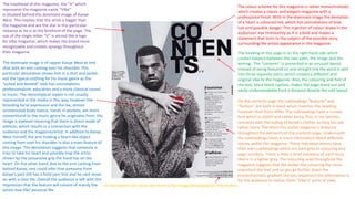
The masthead of this magazine, the “V” which
represents the magazine name “Vibe”
is situated behind the dominant image of Kanye
West. This implies that the artist is bigger than
the magazine and are the star in this particular
instance as he is at the forefront of the page. The
use of the single letter “V” is almost like a logo
for Vibe magazine, which makes the brand more
recognizable and creates synergy throughout
their magazine.
The colour scheme for this magazine is rather monochromatic
which creates a classic and elegant magazine with a
professional finish. With in the dominate image the dentation
of a heart is coloured red, which has connotations of love,
lust and possible danger. This injection of colour draws in the
audiences' eye imminently as it is a bold and makes a
statement that hints to the subject of the possible story
surrounding the artists appearance in the magazine.
The dominate image is of rapper Kanye West at mid
shot with an arm coming over his shoulder. This
particular denotation shows him in a shirt and jacket;
not the typical clothing for his music genre as the
”suited and booted” look has connotations
professionalism, education and a more classical sound
in music. The stereotypical rapper is not usually
represented in the media in this way, however the
brooding facial expression and the lax, almost
uninterested body stance, hands in pockets, are more
conventional to the music genre he originates from. the
image is eyelevel meaning that there is direct mode of
address, which results in a connection with the
audience and the magazine/artist. In addition to Kanye
West himself, the arm holding a heart-like object
coming from over his shoulder is also a main feature of
this image. The denotation suggests that someone is
tries to take his heart and possibly trap the artist;
shown by the possessive grip the hand has on the
heart. On the other hand, due to the arm coming from
behind Kanye, one could infer that someone from
Kanye’s past still has a hold over him and he cant move
on with is love life. Overall the audience is left with the
impression that the feature will consist of mainly the
artists love life/ personal life.
The heading of this page is on the right hand side which
creates balance between the two sides, the image and the
writing. The “contents” is presented in an unusual layout,
instead of being featured on one straight line the word is split
into three separate parts, which creates a different and
original vibe to the magazine. Also, the colouring and font of
the text, black block capitals, makes the page stand out and
easily understandable from a distance despite the odd layout.
On the contents page the subheadings “features” and
“fashion” are both in black which matches the heading,
however their fonts differ. The subheadings have a cursive
font which is stylish and rather fancy. This, in my opinion,
connects with the styling of Kanye’s clothes as they too are
rather fancy. Therefore this stylish elegance is featured
throughout the elements of the contents page. Underneath
the subheadings there is more information about different
stories within the magazine. These individual stories have
their own subheadings which are dark grey in colouring and
page numbers. There is then a brief summery of each story
that is in a lighter grey. The colouring used throughout the
magazine suggests that the darker the colouring the more
important the text and as you go further down the
monochromatic gradient the less important the information is
for the audience to notice, from “Vibe’s” point of view.
At the bottom left hand side there is the image/photographer information
Dominant central image, eye level camera shot, with natural lighting to make the
artist stand out against the grey background. The artist wears very over the top
make-up, hair and outfits to express that she is very over the top artist and is
used to attention being on her. It also take up one full page making it the main
view of the article and the reader immediately knows who they are reading
about.
The magazine have used the stereotypical colours of purple,
pink and whites to suggest that this magazine is aimed at a more
female audience.
The words ‘woman of the
year’ is written in black
compared to the contrast of
the white writing to make it
stand out from the rest of the
article, it is also repeated in
the right top corner to show
the reader that she IS
‘woman of the year’ and this
is an impressive title, it will
also make the reader
remember this article, and
the information in it.
The article title is written in bold
letters, that have a bigger and
different font, making it unique
to the magazine, this makes the
title stand out from the rest of
the text and give it a different
vibe to the other text so the
reader is immediately intrigued
by this.
The kicker ‘fans are still’ is in a
bolder bigger text to the rest
of the column this makes the
reader aware of where the
article starts and they will
know that this is where they
will find all the information on
the article. The magazine has
used traditional columns for
the article making it look
more neat and mature.
It is clear that this magazine is
of a pop or R & B genre as the
colours pink and purple are
associated with pop, as are
bright colours, and the style
used for Beyoncé could be
related to R & B also, Beyoncé
is known for her being in the
charts for pop or R & B music.

Deconstruction 2

  • 1.
    Masthead The masthead ofthis magazine stands out to the rest of the page as it uses a black and white contrast for the words, so the reader knows exactly what they are going to be reading without searching for the magazine. It uses an usual font that goes with with the genre of the magazine (rock) so the reader then knows the magazine is about rock artists/bands. The masthead is behind the dominant image so it does not take the attention away from the main theme of the magazine. Coverline The cover lines on this magazine have the main title of what is involved highlighted and more information about it underneath, this gives the reader an insight of what is involved in the magazine without giving too much away. The colours used, stick to the colour scheme of the magazine, and make the cover lines stand out whilst not taking attention away from the dominant image. Barcode The barcode of this magazine is in a small format so it does not take up much of the front cover as it is not an important part of the magazine, however is in a big enough font so the reader knows how much they are paying for the magazine before the get to the cashier. Dominant Image Kerrang magazine have used a dominant image central to the frame of the magazine, to make it more visible to the reader and attract their attention. The style of the artist; their hair colour being bright, and their style of clothes being mostly leather and their body stances and language gives the reader the vibe that this artist is from a punk rock background. The facial expression of the artist is quite natural with a half smile, giving the reader the intention there is something to look forward to in the magazine about their band. The magazine have also used a blank background in the image, this could mean that they are giving away no information on the front cover so the viewer will have to read the article to find out more. Plug The plug on Kerrang uses the same font and colour scheme as the rest of the magazine however is highlighted with a red circle, suggesting it has some sort of importance to the magazine. It also attracts the readers eye as it is a different design (circle) to the rest of the magazine. Main sell-line The main sell-line of the magazine is just the bands name, this makes the reader well aware of who the article is going to be about. The magazine have also used the same font as what is on the bands album and the same ‘spider’ symbol in the ‘o’ which is the bands logo, this shows the magazine is going to have a main focus on them as it is the only font that has been changed and adapted due to the artist or band. Sub-head The sub-head expands on the main sell-line of this magazine, it is also highlighted in a different colour to all the other text linking it to the importance of the main sell-line, also the colour red symbolising danger linking it to the bands album ‘danger days’ . On this sub-head the magazine has wrote ‘the inside story’ which does not give much away about the article but makes the reader want to keep reading and open the magazine. Target Audience The target audience for this magazine is male older teens to mid tweenties (18-25) based on the font of the text and the format of the magazine, is more grown up, and the colours used are more masculine suggesting it is aimed at males. Colour Scheme The colour scheme for this magazine ranges front, red, yellow black and white, all these colours contrast each other, and are very bold colour. This makes the magazine stand out on the shelf from other magazine as it will be the first thing the reader sees.
  • 2.
    The masthead ofthis magazine, the “V” which represents the magazine name “Vibe” is situated behind the dominant image of Kanye West. This implies that the artist is bigger than the magazine and are the star in this particular instance as he is at the forefront of the page. The use of the single letter “V” is almost like a logo for Vibe magazine, which makes the brand more recognizable and creates synergy throughout their magazine. The colour scheme for this magazine is rather monochromatic which creates a classic and elegant magazine with a professional finish. With in the dominate image the dentation of a heart is coloured red, which has connotations of love, lust and possible danger. This injection of colour draws in the audiences' eye imminently as it is a bold and makes a statement that hints to the subject of the possible story surrounding the artists appearance in the magazine. The dominate image is of rapper Kanye West at mid shot with an arm coming over his shoulder. This particular denotation shows him in a shirt and jacket; not the typical clothing for his music genre as the ”suited and booted” look has connotations professionalism, education and a more classical sound in music. The stereotypical rapper is not usually represented in the media in this way, however the brooding facial expression and the lax, almost uninterested body stance, hands in pockets, are more conventional to the music genre he originates from. the image is eyelevel meaning that there is direct mode of address, which results in a connection with the audience and the magazine/artist. In addition to Kanye West himself, the arm holding a heart-like object coming from over his shoulder is also a main feature of this image. The denotation suggests that someone is tries to take his heart and possibly trap the artist; shown by the possessive grip the hand has on the heart. On the other hand, due to the arm coming from behind Kanye, one could infer that someone from Kanye’s past still has a hold over him and he cant move on with is love life. Overall the audience is left with the impression that the feature will consist of mainly the artists love life/ personal life. The heading of this page is on the right hand side which creates balance between the two sides, the image and the writing. The “contents” is presented in an unusual layout, instead of being featured on one straight line the word is split into three separate parts, which creates a different and original vibe to the magazine. Also, the colouring and font of the text, black block capitals, makes the page stand out and easily understandable from a distance despite the odd layout. On the contents page the subheadings “features” and “fashion” are both in black which matches the heading, however their fonts differ. The subheadings have a cursive font which is stylish and rather fancy. This, in my opinion, connects with the styling of Kanye’s clothes as they too are rather fancy. Therefore this stylish elegance is featured throughout the elements of the contents page. Underneath the subheadings there is more information about different stories within the magazine. These individual stories have their own subheadings which are dark grey in colouring and page numbers. There is then a brief summery of each story that is in a lighter grey. The colouring used throughout the magazine suggests that the darker the colouring the more important the text and as you go further down the monochromatic gradient the less important the information is for the audience to notice, from “Vibe’s” point of view. At the bottom left hand side there is the image/photographer information
  • 3.
    Dominant central image,eye level camera shot, with natural lighting to make the artist stand out against the grey background. The artist wears very over the top make-up, hair and outfits to express that she is very over the top artist and is used to attention being on her. It also take up one full page making it the main view of the article and the reader immediately knows who they are reading about. The magazine have used the stereotypical colours of purple, pink and whites to suggest that this magazine is aimed at a more female audience. The words ‘woman of the year’ is written in black compared to the contrast of the white writing to make it stand out from the rest of the article, it is also repeated in the right top corner to show the reader that she IS ‘woman of the year’ and this is an impressive title, it will also make the reader remember this article, and the information in it. The article title is written in bold letters, that have a bigger and different font, making it unique to the magazine, this makes the title stand out from the rest of the text and give it a different vibe to the other text so the reader is immediately intrigued by this. The kicker ‘fans are still’ is in a bolder bigger text to the rest of the column this makes the reader aware of where the article starts and they will know that this is where they will find all the information on the article. The magazine has used traditional columns for the article making it look more neat and mature. It is clear that this magazine is of a pop or R & B genre as the colours pink and purple are associated with pop, as are bright colours, and the style used for Beyoncé could be related to R & B also, Beyoncé is known for her being in the charts for pop or R & B music.