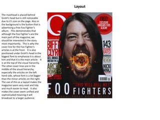
Q Front Page Analysis
By Meghan Moore
Cover Image
The shot is a studio shot, as we can
tell by the white background. There
is one main person in the image,
however we can distinguish that
there are another four in his mouth,
not including himself. The image
itself is a mid-shot, using direct
address, at eye-level showing we are
equal to him.
Dave Grohl is positioned with his
mouth opening in a screaming facial
expression, so that his mouth is open
to reveal flames and the band Foo
Fighters. This is used to highlight the
importance of Grohl in the band, and
how the Foo Fighters come from him.
The band are positioned in a long
shot, so far that we can’t even
distinguish facial features. However,
we can see they are positioned with
their instruments which
demonstrates that they are a band.
Grohl’s hair frames his face, with one
side partially covering an eye. This is
very iconic when it comes to rock
music (although the magazine is
labeled as a pop magazine) which is
the genre that the Foo Fighters play.
Many people associate long hair with
rock and roll as it is a classic look
concerning the genre.
Also, regarding Grohl himself, his
beard is very iconic in regards to him.
If he is wearing a costume we can’t
see it, and the band inside his mouth
seem to be mostly wearing t-shirts
and jeans which is a very laid back
look, demonstrating they are a laid
back band. The only props used are
the instruments the band is holding.
Text
The masthead is in the top left
corner, but is hidden by Grohl’s head.
This demonstrates that he is more
important than the magazine or
“brand name”, and he is what will
bring the audience in. The same can
be said for the other cover lines,
which are in the foreground of the
picture, to further highlight that they
are what sells the magazines.
There are 7 cover lines used on the
cover of the magazine, one of them
in a button, and stay within the
house style of red, gold, black and
white. The use of red and gold
makes the magazine seem smarter
and more sophisticated than other
magazines of the same genre. The
use of different colours for different
parts of the articles also helps the
important bits stand out more. The
same can be said considering there
are no other pictures on the front
cover, demonstrating that Grohl and
his article is the most important.
Everything is in capital letters in the
same sans-serif front except for the
line about Grohl saving rock and roll
which stands out by the use of a serif
front.
The title of “Foo Fighters” also stands
out under Grohl’s head and is one of
the biggest pieces of text on the
cover, demonstrating that this is the
band that Grohl is the front man for
and that this makes it important.
This is the thing that will encourage
readers to pick up the magazine.
Layout
The masthead is placed behind
Grohl’s head but is still noticeable
due to it’s size on the page. Also in
the background is the button that is
advertising a free Foo Fighter’s
album. This demonstrates that
although the Foo Fighter’s are the
main part of the magazine, we
should be interested in the story
most importantly. This is why the
cover line for the Foo Fighter’s
articles is at the front. It is also
positioned under Grohl’s head in the
biggest font to emphasize it is about
him and that it is the main article. It
is at the top of the visual hierarchy.
The other cover lines are in the
middle of the visual hierarchy,
especially the articles on the left
hand side, whose font is a lot bigger
than the minor articles on the right.
The use of this as a layout makes the
magazine seem very neat and tidy
and much easier to read. It also
makes the cover seem unified and
sophisticated meaning it will
broadcast to a larger audience.
General
The genre of the magazine as a pop
magazine is made clear by the use of
more sophisticated fonts. However,
in regards to the Dave Grohl cover
where it is taking on a more rock and
roll vibe, lots of the genre’s
iconography is shown through the
use of the flames, screaming
expression and the long, dark hair.
The audience is most likely to be
older teenage girls, because
stereotypically reds and golds are
more feminine and the fact that it is
neatly set out appeals to girls more.
However, any fans of the band will
definitely appealed to due to the fact
that the font was made bigger in
regards to the name of the band.
The front cover appeals to an
audience due to it’s neat order as it
makes it easier to read in a rush.
Also, all the fonts are quite big
making it easier to read. An
audience member can quickly look at
a cover line and decide that it is
something they are interested in
reading about.

Q Front Page Analysis

  • 1.
    Q Front PageAnalysis By Meghan Moore
  • 2.
    Cover Image The shotis a studio shot, as we can tell by the white background. There is one main person in the image, however we can distinguish that there are another four in his mouth, not including himself. The image itself is a mid-shot, using direct address, at eye-level showing we are equal to him. Dave Grohl is positioned with his mouth opening in a screaming facial expression, so that his mouth is open to reveal flames and the band Foo Fighters. This is used to highlight the importance of Grohl in the band, and how the Foo Fighters come from him. The band are positioned in a long shot, so far that we can’t even distinguish facial features. However, we can see they are positioned with their instruments which demonstrates that they are a band. Grohl’s hair frames his face, with one side partially covering an eye. This is very iconic when it comes to rock music (although the magazine is labeled as a pop magazine) which is the genre that the Foo Fighters play. Many people associate long hair with rock and roll as it is a classic look concerning the genre. Also, regarding Grohl himself, his beard is very iconic in regards to him. If he is wearing a costume we can’t see it, and the band inside his mouth seem to be mostly wearing t-shirts and jeans which is a very laid back look, demonstrating they are a laid back band. The only props used are the instruments the band is holding.
  • 3.
    Text The masthead isin the top left corner, but is hidden by Grohl’s head. This demonstrates that he is more important than the magazine or “brand name”, and he is what will bring the audience in. The same can be said for the other cover lines, which are in the foreground of the picture, to further highlight that they are what sells the magazines. There are 7 cover lines used on the cover of the magazine, one of them in a button, and stay within the house style of red, gold, black and white. The use of red and gold makes the magazine seem smarter and more sophisticated than other magazines of the same genre. The use of different colours for different parts of the articles also helps the important bits stand out more. The same can be said considering there are no other pictures on the front cover, demonstrating that Grohl and his article is the most important. Everything is in capital letters in the same sans-serif front except for the line about Grohl saving rock and roll which stands out by the use of a serif front. The title of “Foo Fighters” also stands out under Grohl’s head and is one of the biggest pieces of text on the cover, demonstrating that this is the band that Grohl is the front man for and that this makes it important. This is the thing that will encourage readers to pick up the magazine.
  • 4.
    Layout The masthead isplaced behind Grohl’s head but is still noticeable due to it’s size on the page. Also in the background is the button that is advertising a free Foo Fighter’s album. This demonstrates that although the Foo Fighter’s are the main part of the magazine, we should be interested in the story most importantly. This is why the cover line for the Foo Fighter’s articles is at the front. It is also positioned under Grohl’s head in the biggest font to emphasize it is about him and that it is the main article. It is at the top of the visual hierarchy. The other cover lines are in the middle of the visual hierarchy, especially the articles on the left hand side, whose font is a lot bigger than the minor articles on the right. The use of this as a layout makes the magazine seem very neat and tidy and much easier to read. It also makes the cover seem unified and sophisticated meaning it will broadcast to a larger audience.
  • 5.
    General The genre ofthe magazine as a pop magazine is made clear by the use of more sophisticated fonts. However, in regards to the Dave Grohl cover where it is taking on a more rock and roll vibe, lots of the genre’s iconography is shown through the use of the flames, screaming expression and the long, dark hair. The audience is most likely to be older teenage girls, because stereotypically reds and golds are more feminine and the fact that it is neatly set out appeals to girls more. However, any fans of the band will definitely appealed to due to the fact that the font was made bigger in regards to the name of the band. The front cover appeals to an audience due to it’s neat order as it makes it easier to read in a rush. Also, all the fonts are quite big making it easier to read. An audience member can quickly look at a cover line and decide that it is something they are interested in reading about.