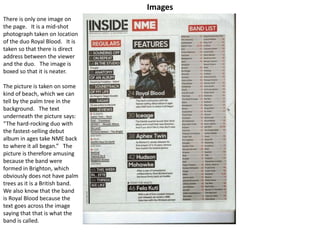
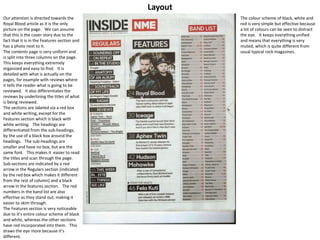
NME Contents Page Analysis
By Meghan Moore
Images
There is only one image on
the page. It is a mid-shot
photograph taken on location
of the duo Royal Blood. It is
taken so that there is direct
address between the viewer
and the duo. The image is
boxed so that it is neater.
The picture is taken on some
kind of beach, which we can
tell by the palm tree in the
background. The text
underneath the picture says:
“The hard-rocking duo with
the fastest-selling debut
album in ages take NME back
to where it all began.” The
picture is therefore amusing
because the band were
formed in Brighton, which
obviously does not have palm
trees as it is a British band.
We also know that the band
is Royal Blood because the
text goes across the image
saying that that is what the
band is called.
Layout
Our attention is directed towards the
Royal Blood article as it is the only
picture on the page. We can assume
that this is the cover story due to the
fact that it is in the Features section and
has a photo next to it.
The contents page is very uniform and
is split into three columns on the page.
This keeps everything extremely
organized and easy to find. It is
detailed with what is actually on the
pages, for example with reviews where
it tells the reader what is going to be
reviewed. It also differentiates the
reviews by underlining the titles of what
is being reviewed.
The sections are labeled via a red box
and white writing, except for the
Features section which is black with
white writing. The headings are
differentiated from the sub-headings,
by the use of a black box around the
headings. The sub-headings are
smaller and have no box, but are the
same font. This makes it easier to read
the titles and scan through the page.
Sub-sections are indicated by a red
arrow in the Regulars section (indicated
by the red box which makes it different
from the rest of column) and a black
arrow in the features section. The red
numbers in the band list are also
effective as they stand out, making it
easier to skim through.
The Features section is very noticeable
due to it’s entire colour scheme of black
and white, whereas the other sections
have red incorporated into them. This
draws the eye more because it’s
different.
The colour scheme of black, white and
red is very simple but effective because
a lot of colours can be seen to distract
the eye. It keeps everything unified
and means that everything is very
muted, which is quite different from
usual typical rock magazines.
Sections
There are three sections used to
categorize the articles: Regulars,
features and Band List. In each section
there are quite a few articles. The
section with the least articles is
Features, which makes sense as
everything else is common per week.
Each of the articles is laid out the same
except for the band list. With Regulars
and Features the article is surrounded
by a black box with the page number on
the left hand side. The Band List is the
exception. It is ordered in alphabetical
order, with red numbers on the right.
This makes it different from the other
columns which makes it more
noticeable. It is easier to skim through
it since it is an alphabetical order.
None of the articles are labeled
specifically as cover articles and there is
no noticeable advertisement for any
social media or subscription data.
There is a small footer on the left hand
side of the page who says who took the
picture for the cover of the magazine.

NME Contents Page Analysis

  • 1.
    NME Contents PageAnalysis By Meghan Moore
  • 2.
    Images There is onlyone image on the page. It is a mid-shot photograph taken on location of the duo Royal Blood. It is taken so that there is direct address between the viewer and the duo. The image is boxed so that it is neater. The picture is taken on some kind of beach, which we can tell by the palm tree in the background. The text underneath the picture says: “The hard-rocking duo with the fastest-selling debut album in ages take NME back to where it all began.” The picture is therefore amusing because the band were formed in Brighton, which obviously does not have palm trees as it is a British band. We also know that the band is Royal Blood because the text goes across the image saying that that is what the band is called.
  • 3.
    Layout Our attention isdirected towards the Royal Blood article as it is the only picture on the page. We can assume that this is the cover story due to the fact that it is in the Features section and has a photo next to it. The contents page is very uniform and is split into three columns on the page. This keeps everything extremely organized and easy to find. It is detailed with what is actually on the pages, for example with reviews where it tells the reader what is going to be reviewed. It also differentiates the reviews by underlining the titles of what is being reviewed. The sections are labeled via a red box and white writing, except for the Features section which is black with white writing. The headings are differentiated from the sub-headings, by the use of a black box around the headings. The sub-headings are smaller and have no box, but are the same font. This makes it easier to read the titles and scan through the page. Sub-sections are indicated by a red arrow in the Regulars section (indicated by the red box which makes it different from the rest of column) and a black arrow in the features section. The red numbers in the band list are also effective as they stand out, making it easier to skim through. The Features section is very noticeable due to it’s entire colour scheme of black and white, whereas the other sections have red incorporated into them. This draws the eye more because it’s different. The colour scheme of black, white and red is very simple but effective because a lot of colours can be seen to distract the eye. It keeps everything unified and means that everything is very muted, which is quite different from usual typical rock magazines.
  • 4.
    Sections There are threesections used to categorize the articles: Regulars, features and Band List. In each section there are quite a few articles. The section with the least articles is Features, which makes sense as everything else is common per week. Each of the articles is laid out the same except for the band list. With Regulars and Features the article is surrounded by a black box with the page number on the left hand side. The Band List is the exception. It is ordered in alphabetical order, with red numbers on the right. This makes it different from the other columns which makes it more noticeable. It is easier to skim through it since it is an alphabetical order. None of the articles are labeled specifically as cover articles and there is no noticeable advertisement for any social media or subscription data. There is a small footer on the left hand side of the page who says who took the picture for the cover of the magazine.