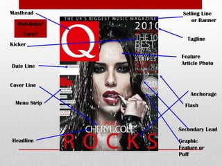
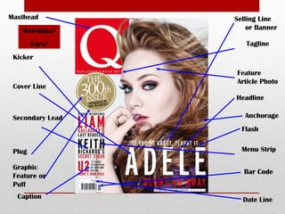
This document summarizes the key design conventions used on magazine covers:
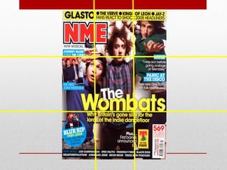
1. Magazine covers typically use consistent color schemes and fonts to create brand recognition while also relating to the theme or artist. For example, Q magazine commonly uses black, white, and red colors.
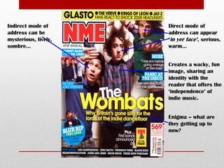
2. Headlines, images, and text are purposefully placed in specific areas of the cover to guide the reader's eyes. Main images and headlines are largest to draw attention.
3. Photography techniques like full-body shots are used to make the artist appear larger than life and convey a sense of success or iconic status. Poses and backgrounds can symbolize new images or music.
4. Negative space allows the artist to stand out without being