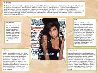
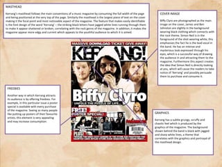
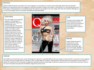
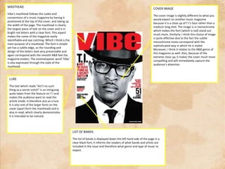
Analyzing MusicMagazineFront Covers
MASTHEADThe first noticeable element of this magazine is the huge picture of Amy Winehouse that consumes the majority of the page. As Rolling Stone is an extremely famous magazine, the audience will be familiar with the brand and although the image is entirely dominating the page and blocking most of the masthead, readers will still be able to identify the magazine and recognise the name even if it is partly hidden. Furthermore, Rolling Stone develop the same design in each issue hence allowing the audience to become aware of this particular structure as it is now a trademark. Also, the font of the masthead is quite original and retro producing an antique feel, suggesting that this is a long running magazine which is very established.LUREThe quote ‘The Diva and Her Demons’   on the left hand side of the cover acts as a lure, which encourages the audience to read the story inside. Also, due to the fact Amy Winehouse’s private life is quite regularly seen in the media, a feature about her in Rolling Stone would be very interesting to her fans, and may attract a larger audience. The fact the quote is in a bright red colour is yet another attempt at making the lure more obvious and noticeable.LIST OF BANDSThe artists involved in the issue are listed down the side in a very organised manner, all in the same colour and size. This is an element that displays the magazines maturity and shows that Rolling Stone has developed its own style.HEADLINEAs Amy Winehouse is the main story of the issue, a larger caption is presented with it.  It is positioned at the bottom of the page so the picture can be seen clearly, and the headline is in a larger font so it is easily identifiable. However, the words are still placed over the image to make the appearance more interesting. The caption is a similar colour to the masthead, which implies that Amy Winehouse is a large part of the magazine.COVER IMAGEI personally feel thatthe cover image is rather interesting; this is because her appearance really embodies her personality, and the magazine hasn’t altered her trademark ‘look’. Her infamous beehive hairstyle and winged eyeliner are present, and her many unique tattoos are also on display. Her clothing is quite simple and I think this is due to the fact her natural image is attention-grabbing and doesn’t need to be changed.  I also think this adds truth to the article.
MASTHEADKerrang’s masthead follows the main conventions of a music magazine by consuming the full width of the page and being positioned at the very top of the page. Similarly the masthead is the largest piece of text on the cover making it the focal point and most noticeable aspect of the magazine. The feature that makes easily identifiable is the font design of the word ‘Kerrang’ – the striking black letters have jagged white lines running through them to make it appear shattered or broken, correlating with the rock genre of the magazine. In addition, it makes the magazine appear more edgy and current which appeals to the youthful audience to which it is aimed.COVER IMAGEBiffyClyro are photographed as the main image on the cover, James and Ben Johnston are slightly in the background wearing black clothing which connects with the rock theme. Simon Neil is in the foreground of the shot wearing white, this emphasises the fact he is the lead vocal in the band. He has an intense and mysterious look expressed through his eyes, which is a successful way of drawing the audience in and attracting them to the magazine. Furthermore this aspect creates the idea that Simon Neil is directly looking at you, which will cause the readers to take notice of ‘Kerrang’ and possibly persuade them to purchase and consume it.FREEBIESAnother way in which Kerrang attracts its audience is by offering freebies. For example, in this particular issue a poster special is available with every purchase of the magazine. Seeing as many people like putting up posters of their favourite artists, this element is very appealing and may increase consumption.GRAPHICSKerrang has a subtle grungy, scruffy and chaotic feel which is produced by the graphics of the magazine. The background shown behind the band is black with jagged and sharp white lines, a theme that correlates with the graphics and portrayal of the masthead design.
MASTHEADQ doesn’t follow the general conventions of a music magazine, as it only takes up a certain section of the page rather than the full width. I believe this is because the name of the magazine is fairly short and doesn’t require a lot of space. I think the fact it is in the top left hand corner of the page is interesting because it immediately draws the audience’s eye straight to the cover image rather than the masthead. Although as it is in red ( a very bright colour) it is still quite noticeable and easily identifiable.COVER IMAGEThe cover image on this particular magazine is of Lady Gaga. To correspond with her unique and individual style, she is controversially bare chested with an odd pointed glove covering her breasts. This image is rather revealing and not what would usually be expected on a music magazine cover, but her fans and the intended audience will be accepting of this as this outlandish behaviour is what is expected of Lady Gaga. Similarly, to make the picture more edgy she is wearing spiked leather trousers and her hair is curly an unkempt.  I personally like the image as it captures her essence as a musician and will draw  the public in.LUREThe piece of text reading ‘100 most shocking moments in music’ acts as a lure, because it entices the audience and encourages them to read the entire article.BARCODEQ again follows the general conventions of a music magazine by placing the barcode in the bottom right corner of the page. Displayed with it are issue number and price details.HEADLINEThe headline on this particular cover is quite interesting; this is because it is partially hidden by the cover image, an element which is unusual for a music magazine. The colour of the text is bright white so it stands out, and is a rather large size. However, referring back to the point about the concealment of various letters – I believe the intention for this is to provide an edgier feel, evoking the essence of Lady Gaga. Furthermore, because she is such a well known artist even if parts of her name are blocked, the public will immediately recognise her and her name.
MASTHEADVibe’s masthead follows the codes and conventions of a music magazine by having it positioned at the top of the cover, and taking up the width of the page. The masthead is clearly the largest piece of text on the cover and is in bright red letters with a clear font. This aspect makes the name of the magazine easily identifiable and eye catching. Which I think is the main purpose of a masthead. The font is simple yet has a subtle edge, as the rounding and design of the letters look very presentable and again correspond with the smooth R&B feel the magazine evokes. The onomatopoeic word ‘Vibe’ is also expressed through the style of the masthead COVER IMAGEThe cover image is slightly different to what you would expect on another music magazine because it is a close up of T.I’s face rather than a medium long shot. The image is in monochrome which makes the font (which is red) stand out much more. Similarly, I think this choice of image is quite effective due to the fact the subtle monochrome tones correspond with the sophisticated way in which he is styled. Moreover, I think it relates to the R&B genre of this magazine as well. Also, because of the extreme close up, it makes the cover much more compelling and will immediately capture the audience’s attention.LUREThe text which reads “Ain’t no such thing as a secret snitch” is an intriguing quite taken from the feature on T.I and makes the audience want to read the article inside. It therefore acts as a lure. It is also one of the larger fonts on the cover (apart form the masthead) and is also in read, which clearly demonstrates it is intended to be noticed.LIST OF BANDSThe list of bands is displayed down the left hand side of the page in a clear black font, it informs the readers of what bands and artists are included in the issue and therefore what genre and type of music to expect.
MASTHEADNME’s masthead follows main conventions of a magazine cover. It is positioned on the left top hand corner of the page in a simple and bold font. It is the largest piece of text on the cover, demonstrating that it is clearly the first detail intended to catch its audience’s eye. The lettering chosen is also rather modern implying the magazine is aimed at a younger audience age range. This is an important aspect as it makes the brand of the magazine easily identifiable and allows readers to notice and identify the brand without fully reading it.  The words ‘NME’ and ‘RIHANNA’ are both in a very bright shade of pink, which would have been a conscious decision, indicating that these are the pieces of text that are the main features of the magazine. The title ‘RIHANNA’ is in the middle of the cover which conveys this is subject the magazine is mainly based around. The other colours are duller; consisting of mainly black and white suggesting the main focus is much more prominent.HEADLINEExcept for the masthead, the headline reading ‘Rihanna’ is the largest font on the page. This makes it the focal point of the cover, therefore capturing the audience’s interest. This is a clever technique, because the headline is one of the first things that will be seen on the cover and due to the fact Rihanna is a very famous and influential musician her fans will be attracted to the magazine.COVER IMAGERihanna is photographed in an unusual pose, almost creating the idea she is leaning out of the page. This element is quite effective and yet another method to attract the audience.  She has adapted a rather edgy and angular pose evoking the quirky nature of the magazine. This aspect also sparks interest from the audience, and because she is an influential musician – the fact she is the main feature will attract her fans, therefore increasing circulation and consumption of NME.  LIST OF BANDSNME follows the basic conventions of a music magazine by displaying a list of bands to the left hand side of the page. This is a clever selling point ad it informs readers what will be included in the magazine, and because they are all popular and current artists the audience will be familiar with their music and possibly fans. Due to this fact it will encourage the public to purchase the magazineBARCODENME follows the common conventions by placing its barcode in the bottom right of the page and by displaying issue details and price in the same place. However the angle of the barcode is slightly different than to what is usually expected as it is vertical.

Music magazine analysis covers

  • 1.
  • 2.
    MASTHEADThe first noticeableelement of this magazine is the huge picture of Amy Winehouse that consumes the majority of the page. As Rolling Stone is an extremely famous magazine, the audience will be familiar with the brand and although the image is entirely dominating the page and blocking most of the masthead, readers will still be able to identify the magazine and recognise the name even if it is partly hidden. Furthermore, Rolling Stone develop the same design in each issue hence allowing the audience to become aware of this particular structure as it is now a trademark. Also, the font of the masthead is quite original and retro producing an antique feel, suggesting that this is a long running magazine which is very established.LUREThe quote ‘The Diva and Her Demons’ on the left hand side of the cover acts as a lure, which encourages the audience to read the story inside. Also, due to the fact Amy Winehouse’s private life is quite regularly seen in the media, a feature about her in Rolling Stone would be very interesting to her fans, and may attract a larger audience. The fact the quote is in a bright red colour is yet another attempt at making the lure more obvious and noticeable.LIST OF BANDSThe artists involved in the issue are listed down the side in a very organised manner, all in the same colour and size. This is an element that displays the magazines maturity and shows that Rolling Stone has developed its own style.HEADLINEAs Amy Winehouse is the main story of the issue, a larger caption is presented with it. It is positioned at the bottom of the page so the picture can be seen clearly, and the headline is in a larger font so it is easily identifiable. However, the words are still placed over the image to make the appearance more interesting. The caption is a similar colour to the masthead, which implies that Amy Winehouse is a large part of the magazine.COVER IMAGEI personally feel thatthe cover image is rather interesting; this is because her appearance really embodies her personality, and the magazine hasn’t altered her trademark ‘look’. Her infamous beehive hairstyle and winged eyeliner are present, and her many unique tattoos are also on display. Her clothing is quite simple and I think this is due to the fact her natural image is attention-grabbing and doesn’t need to be changed. I also think this adds truth to the article.
  • 3.
    MASTHEADKerrang’s masthead followsthe main conventions of a music magazine by consuming the full width of the page and being positioned at the very top of the page. Similarly the masthead is the largest piece of text on the cover making it the focal point and most noticeable aspect of the magazine. The feature that makes easily identifiable is the font design of the word ‘Kerrang’ – the striking black letters have jagged white lines running through them to make it appear shattered or broken, correlating with the rock genre of the magazine. In addition, it makes the magazine appear more edgy and current which appeals to the youthful audience to which it is aimed.COVER IMAGEBiffyClyro are photographed as the main image on the cover, James and Ben Johnston are slightly in the background wearing black clothing which connects with the rock theme. Simon Neil is in the foreground of the shot wearing white, this emphasises the fact he is the lead vocal in the band. He has an intense and mysterious look expressed through his eyes, which is a successful way of drawing the audience in and attracting them to the magazine. Furthermore this aspect creates the idea that Simon Neil is directly looking at you, which will cause the readers to take notice of ‘Kerrang’ and possibly persuade them to purchase and consume it.FREEBIESAnother way in which Kerrang attracts its audience is by offering freebies. For example, in this particular issue a poster special is available with every purchase of the magazine. Seeing as many people like putting up posters of their favourite artists, this element is very appealing and may increase consumption.GRAPHICSKerrang has a subtle grungy, scruffy and chaotic feel which is produced by the graphics of the magazine. The background shown behind the band is black with jagged and sharp white lines, a theme that correlates with the graphics and portrayal of the masthead design.
  • 4.
    MASTHEADQ doesn’t followthe general conventions of a music magazine, as it only takes up a certain section of the page rather than the full width. I believe this is because the name of the magazine is fairly short and doesn’t require a lot of space. I think the fact it is in the top left hand corner of the page is interesting because it immediately draws the audience’s eye straight to the cover image rather than the masthead. Although as it is in red ( a very bright colour) it is still quite noticeable and easily identifiable.COVER IMAGEThe cover image on this particular magazine is of Lady Gaga. To correspond with her unique and individual style, she is controversially bare chested with an odd pointed glove covering her breasts. This image is rather revealing and not what would usually be expected on a music magazine cover, but her fans and the intended audience will be accepting of this as this outlandish behaviour is what is expected of Lady Gaga. Similarly, to make the picture more edgy she is wearing spiked leather trousers and her hair is curly an unkempt. I personally like the image as it captures her essence as a musician and will draw the public in.LUREThe piece of text reading ‘100 most shocking moments in music’ acts as a lure, because it entices the audience and encourages them to read the entire article.BARCODEQ again follows the general conventions of a music magazine by placing the barcode in the bottom right corner of the page. Displayed with it are issue number and price details.HEADLINEThe headline on this particular cover is quite interesting; this is because it is partially hidden by the cover image, an element which is unusual for a music magazine. The colour of the text is bright white so it stands out, and is a rather large size. However, referring back to the point about the concealment of various letters – I believe the intention for this is to provide an edgier feel, evoking the essence of Lady Gaga. Furthermore, because she is such a well known artist even if parts of her name are blocked, the public will immediately recognise her and her name.
  • 5.
    MASTHEADVibe’s masthead followsthe codes and conventions of a music magazine by having it positioned at the top of the cover, and taking up the width of the page. The masthead is clearly the largest piece of text on the cover and is in bright red letters with a clear font. This aspect makes the name of the magazine easily identifiable and eye catching. Which I think is the main purpose of a masthead. The font is simple yet has a subtle edge, as the rounding and design of the letters look very presentable and again correspond with the smooth R&B feel the magazine evokes. The onomatopoeic word ‘Vibe’ is also expressed through the style of the masthead COVER IMAGEThe cover image is slightly different to what you would expect on another music magazine because it is a close up of T.I’s face rather than a medium long shot. The image is in monochrome which makes the font (which is red) stand out much more. Similarly, I think this choice of image is quite effective due to the fact the subtle monochrome tones correspond with the sophisticated way in which he is styled. Moreover, I think it relates to the R&B genre of this magazine as well. Also, because of the extreme close up, it makes the cover much more compelling and will immediately capture the audience’s attention.LUREThe text which reads “Ain’t no such thing as a secret snitch” is an intriguing quite taken from the feature on T.I and makes the audience want to read the article inside. It therefore acts as a lure. It is also one of the larger fonts on the cover (apart form the masthead) and is also in read, which clearly demonstrates it is intended to be noticed.LIST OF BANDSThe list of bands is displayed down the left hand side of the page in a clear black font, it informs the readers of what bands and artists are included in the issue and therefore what genre and type of music to expect.
  • 6.
    MASTHEADNME’s masthead followsmain conventions of a magazine cover. It is positioned on the left top hand corner of the page in a simple and bold font. It is the largest piece of text on the cover, demonstrating that it is clearly the first detail intended to catch its audience’s eye. The lettering chosen is also rather modern implying the magazine is aimed at a younger audience age range. This is an important aspect as it makes the brand of the magazine easily identifiable and allows readers to notice and identify the brand without fully reading it. The words ‘NME’ and ‘RIHANNA’ are both in a very bright shade of pink, which would have been a conscious decision, indicating that these are the pieces of text that are the main features of the magazine. The title ‘RIHANNA’ is in the middle of the cover which conveys this is subject the magazine is mainly based around. The other colours are duller; consisting of mainly black and white suggesting the main focus is much more prominent.HEADLINEExcept for the masthead, the headline reading ‘Rihanna’ is the largest font on the page. This makes it the focal point of the cover, therefore capturing the audience’s interest. This is a clever technique, because the headline is one of the first things that will be seen on the cover and due to the fact Rihanna is a very famous and influential musician her fans will be attracted to the magazine.COVER IMAGERihanna is photographed in an unusual pose, almost creating the idea she is leaning out of the page. This element is quite effective and yet another method to attract the audience. She has adapted a rather edgy and angular pose evoking the quirky nature of the magazine. This aspect also sparks interest from the audience, and because she is an influential musician – the fact she is the main feature will attract her fans, therefore increasing circulation and consumption of NME. LIST OF BANDSNME follows the basic conventions of a music magazine by displaying a list of bands to the left hand side of the page. This is a clever selling point ad it informs readers what will be included in the magazine, and because they are all popular and current artists the audience will be familiar with their music and possibly fans. Due to this fact it will encourage the public to purchase the magazineBARCODENME follows the common conventions by placing its barcode in the bottom right of the page and by displaying issue details and price in the same place. However the angle of the barcode is slightly different than to what is usually expected as it is vertical.