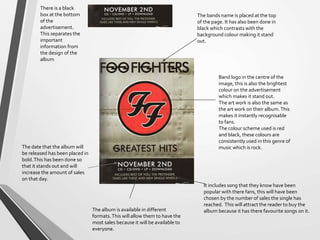
Magazine advert
analysis
LouiseWilcock
A2 Media
Band logo in the centre of the
image, this is also the brightest
colour on the advertisement
which makes it stand out.
The art work is also the same as
the art work on their album.This
makes it instantly recognisable
to fans.
The colour scheme used is red
and black, these colours are
consistently used in this genre of
music which is rock.
It includes song that they know have been
popular with there fans, this will have been
chosen by the number of sales the single has
reached. This will attract the reader to buy the
album because it has there favourite songs on it.
The bands name is placed at the top
of the page. It has also been done in
black which contrasts with the
background colour making it stand
out.
The date that the album will
be released has been placed in
bold.This has been done so
that it stands out and will
increase the amount of sales
on that day.
The album is available in different
formats.This will allow them to have the
most sales because it will be available to
everyone.
There is a black
box at the bottom
of the
advertisement.
This separates the
important
information from
the design of the
album
The album art work used for
the advertisement is the same
that is being used for there
album cover.This makes it
more recognisable to the
audience who will be
purchasing this product.
The type of album that this is
going to be has been placed in
bold, allowing it to stand out
from the other font being used.
The release date for the album
has been written in yellow.This
contrasts from the other colours
being used in the background.
The audience have been given the choose of two
options in how to buy the song.
This will increase the amount of sales for the song by
giving them two options.
The record company
name is at the bottom
of the advistiment
I place where the audience can buy
the product has been shown.This
will make it easy for the audience
to buy the album. It is also
advertising the company
‘play.com’
The advertisement
includes songs that are
popular with the fans of
the band.This will
increase the sales because
the fans will know that
songs that they like are on
the album.
It also says that there is
extras with buying the
album which will entice
the audience to buy the
album.
This is a quote from
one of their songs
which the audience
will connect with and
understand.
This is also the name
of the album and has
been put in a large
font to make it stand
out and be
noticeable to the
audience.
The colour scheme that has been
used on the advertisement is white,
black and red.These are common
colour that support the genre of
music.
The name of the band has been
put in bold to make sure it stands
out. It is also in white which
contrasts with the background
colour.

Magazine advert analysis

  • 1.
  • 2.
    Band logo inthe centre of the image, this is also the brightest colour on the advertisement which makes it stand out. The art work is also the same as the art work on their album.This makes it instantly recognisable to fans. The colour scheme used is red and black, these colours are consistently used in this genre of music which is rock. It includes song that they know have been popular with there fans, this will have been chosen by the number of sales the single has reached. This will attract the reader to buy the album because it has there favourite songs on it. The bands name is placed at the top of the page. It has also been done in black which contrasts with the background colour making it stand out. The date that the album will be released has been placed in bold.This has been done so that it stands out and will increase the amount of sales on that day. The album is available in different formats.This will allow them to have the most sales because it will be available to everyone. There is a black box at the bottom of the advertisement. This separates the important information from the design of the album
  • 3.
    The album artwork used for the advertisement is the same that is being used for there album cover.This makes it more recognisable to the audience who will be purchasing this product. The type of album that this is going to be has been placed in bold, allowing it to stand out from the other font being used. The release date for the album has been written in yellow.This contrasts from the other colours being used in the background. The audience have been given the choose of two options in how to buy the song. This will increase the amount of sales for the song by giving them two options. The record company name is at the bottom of the advistiment I place where the audience can buy the product has been shown.This will make it easy for the audience to buy the album. It is also advertising the company ‘play.com’
  • 4.
    The advertisement includes songsthat are popular with the fans of the band.This will increase the sales because the fans will know that songs that they like are on the album. It also says that there is extras with buying the album which will entice the audience to buy the album. This is a quote from one of their songs which the audience will connect with and understand. This is also the name of the album and has been put in a large font to make it stand out and be noticeable to the audience. The colour scheme that has been used on the advertisement is white, black and red.These are common colour that support the genre of music. The name of the band has been put in bold to make sure it stands out. It is also in white which contrasts with the background colour.