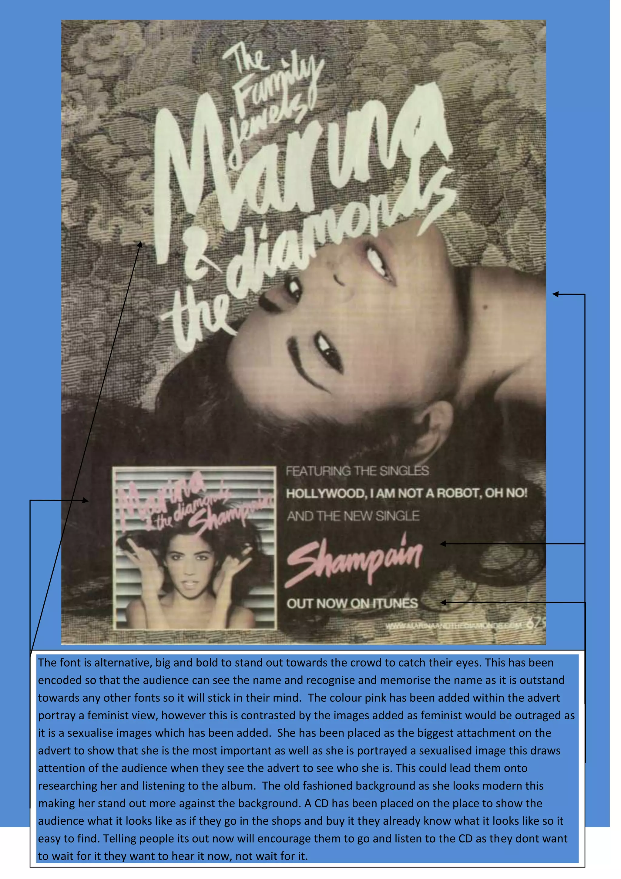
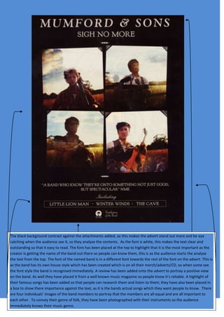
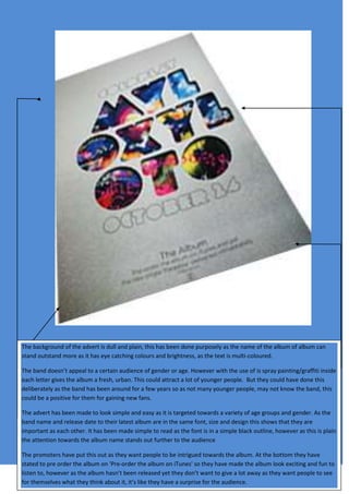
The font used in the advert is large and bold to stand out from other fonts and be memorable. A pink color was added to portray a feminist view, though the sexualized images of women contrast this. The main image takes up the most space to indicate her importance and draw attention, potentially leading viewers to research her and the album. Background details like the CD and release date information help viewers find and engage with the album. The plain background makes the colorful text and images pop out to attract and engage the audience.


