The document summarizes two websites for Taylor Swift and Billie Eilish.
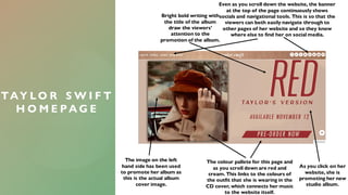
For Taylor Swift's website, it promotes her new album with bold writing and uses her outfit colors from the album cover. Navigation and social media links are always visible. Product images and descriptions aim to increase sales.
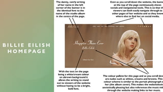
Billie Eilish's website uses her album font and nude colors inspired by her album cover photo. Navigation and social media links are also always visible. Writing stands out against background colors.