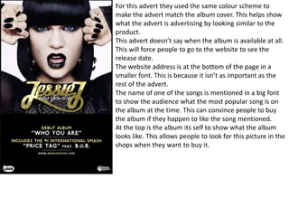
For this advert they used the same colour scheme to
make the advert match the album cover. This helps show
what the advert is advertising by looking similar to the
product.
This advert doesn’t say when the album is available at all.
This will force people to go to the website to see the
release date.
The website address is at the bottom of the page in a
smaller font. This is because it isn’t as important as the
rest of the advert.
The name of one of the songs is mentioned in a big font
to show the audience what the most popular song is on
the album at the time. This can convince people to buy
the album if they happen to like the song mentioned.
At the top is the album its self to show what the album
looks like. This allows people to look for this picture in the
shops when they want to buy it.
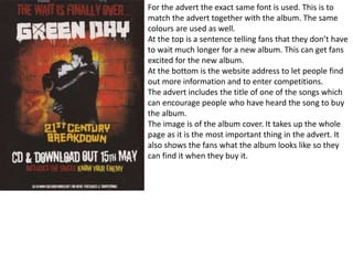
For the advert the exact same font is used. This is to
match the advert together with the album. The same
colours are used as well.
At the top is a sentence telling fans that they don’t have
to wait much longer for a new album. This can get fans
excited for the new album.
At the bottom is the website address to let people find
out more information and to enter competitions.
The advert includes the title of one of the songs which
can encourage people who have heard the song to buy
the album.
The image is of the album cover. It takes up the whole
page as it is the most important thing in the advert. It
also shows the fans what the album looks like so they
can find it when they buy it.
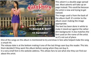
This advert is a double page spread
size. Most adverts will take up on
page instead. This could be because
the artist is new and trying to get
noticed.
The image used is from the back of
the album itself. It’s similar to the
album cover making the image
appropriate.
The text has been done in white to
make it stand out against the rather
dim background. It also matches the
font used on the name of the artist
so it’s not out of place.
One of the songs on the album is mentioned to try and draw in fans who helped make the song
a smash hit.
The release date is at the bottom making it one of the last things seen buy the reader. This lets
them decided if they want the album before seeing when they can buy it.
In a very small font is the website address. This allows fans to see what else they can find out
about the artist.
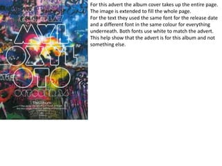
For this advert the album cover takes up the entire page.
The image is extended to fill the whole page.
For the text they used the same font for the release date
and a different font in the same colour for everything
underneath. Both fonts use white to match the advert.
This help show that the advert is for this album and not
something else.
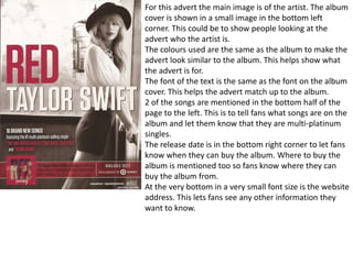
For this advert the main image is of the artist. The album
cover is shown in a small image in the bottom left
corner. This could be to show people looking at the
advert who the artist is.
The colours used are the same as the album to make the
advert look similar to the album. This helps show what
the advert is for.
The font of the text is the same as the font on the album
cover. This helps the advert match up to the album.
2 of the songs are mentioned in the bottom half of the
page to the left. This is to tell fans what songs are on the
album and let them know that they are multi-platinum
singles.
The release date is in the bottom right corner to let fans
know when they can buy the album. Where to buy the
album is mentioned too so fans know where they can
buy the album from.
At the very bottom in a very small font size is the website
address. This lets fans see any other information they
want to know.
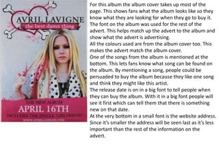
For this album the album cover takes up most of the
page. This shows fans what the album looks like so they
know what they are looking for when they go to buy it.
The font on the album was used for the rest of the
advert. This helps match up the advert to the album and
show what the advert is advertising.
All the colours used are from the album cover too. This
makes the advert match the album cover.
One of the songs from the album is mentioned at the
bottom. This lets fans know what song can be found on
the album. By mentioning a song, people could be
persuaded to buy the album because they like one song
and think they might like this artist.
The release date is on in a big font to tell people when
they can buy the album. With it in a big font people will
see it first which can tell them that there is something
new on that date.
At the very bottom in a small font is the website address.
Since it’s smaller the address will be seen last as it’s less
important than the rest of the information on the
advert.
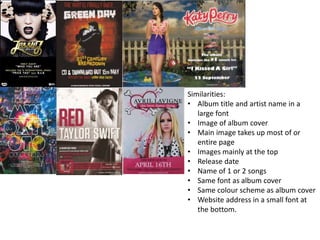
Similarities:
• Album title and artist name in a
large font
• Image of album cover
• Main image takes up most of or
entire page
• Images mainly at the top
• Release date
• Name of 1 or 2 songs
• Same font as album cover
• Same colour scheme as album cover
• Website address in a small font at
the bottom.

Magazine adverts

  • 1.
    For this advertthey used the same colour scheme to make the advert match the album cover. This helps show what the advert is advertising by looking similar to the product. This advert doesn’t say when the album is available at all. This will force people to go to the website to see the release date. The website address is at the bottom of the page in a smaller font. This is because it isn’t as important as the rest of the advert. The name of one of the songs is mentioned in a big font to show the audience what the most popular song is on the album at the time. This can convince people to buy the album if they happen to like the song mentioned. At the top is the album its self to show what the album looks like. This allows people to look for this picture in the shops when they want to buy it.
  • 2.
    For the advertthe exact same font is used. This is to match the advert together with the album. The same colours are used as well. At the top is a sentence telling fans that they don’t have to wait much longer for a new album. This can get fans excited for the new album. At the bottom is the website address to let people find out more information and to enter competitions. The advert includes the title of one of the songs which can encourage people who have heard the song to buy the album. The image is of the album cover. It takes up the whole page as it is the most important thing in the advert. It also shows the fans what the album looks like so they can find it when they buy it.
  • 3.
    This advert isa double page spread size. Most adverts will take up on page instead. This could be because the artist is new and trying to get noticed. The image used is from the back of the album itself. It’s similar to the album cover making the image appropriate. The text has been done in white to make it stand out against the rather dim background. It also matches the font used on the name of the artist so it’s not out of place. One of the songs on the album is mentioned to try and draw in fans who helped make the song a smash hit. The release date is at the bottom making it one of the last things seen buy the reader. This lets them decided if they want the album before seeing when they can buy it. In a very small font is the website address. This allows fans to see what else they can find out about the artist.
  • 4.
    For this advertthe album cover takes up the entire page. The image is extended to fill the whole page. For the text they used the same font for the release date and a different font in the same colour for everything underneath. Both fonts use white to match the advert. This help show that the advert is for this album and not something else.
  • 5.
    For this advertthe main image is of the artist. The album cover is shown in a small image in the bottom left corner. This could be to show people looking at the advert who the artist is. The colours used are the same as the album to make the advert look similar to the album. This helps show what the advert is for. The font of the text is the same as the font on the album cover. This helps the advert match up to the album. 2 of the songs are mentioned in the bottom half of the page to the left. This is to tell fans what songs are on the album and let them know that they are multi-platinum singles. The release date is in the bottom right corner to let fans know when they can buy the album. Where to buy the album is mentioned too so fans know where they can buy the album from. At the very bottom in a very small font size is the website address. This lets fans see any other information they want to know.
  • 6.
    For this albumthe album cover takes up most of the page. This shows fans what the album looks like so they know what they are looking for when they go to buy it. The font on the album was used for the rest of the advert. This helps match up the advert to the album and show what the advert is advertising. All the colours used are from the album cover too. This makes the advert match the album cover. One of the songs from the album is mentioned at the bottom. This lets fans know what song can be found on the album. By mentioning a song, people could be persuaded to buy the album because they like one song and think they might like this artist. The release date is on in a big font to tell people when they can buy the album. With it in a big font people will see it first which can tell them that there is something new on that date. At the very bottom in a small font is the website address. Since it’s smaller the address will be seen last as it’s less important than the rest of the information on the advert.
  • 7.
    Similarities: • Album titleand artist name in a large font • Image of album cover • Main image takes up most of or entire page • Images mainly at the top • Release date • Name of 1 or 2 songs • Same font as album cover • Same colour scheme as album cover • Website address in a small font at the bottom.