Analysis of magazine advert
Coldplay
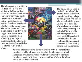
The album name is written in
white and bold font and is
similar to bubble writing
which makes the album name
more prominent and grabs
the audience attention
quickly as it stands out
against the chaos or mixture
of colors in the background.
The bands name and the
album name is written in he
biggest font as the band
wants to promote their
album by grabbing the
audience attention towards
their name which would also
lead to the fame of this
album.
The bright colors used in
the background and the
graffiti makes the advert
more interesting and eye
catching which will lead to
a larger sale of the advert.
On the other hand this
advert also represents the
track “Every teardrop is a
waterfall” in which the
same background has
been used. This makes it
more familiar for the
reader and they can easily
understand the meaning
behind this background.
As usual the release date has been written with the same font as
the album and band name and is below the album name which
the reader or audience would read immediately after they read
the album name. In this way they get an idea of when the album
would be available for them.
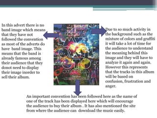
An important convention has been followed here as the name of
one of the track has been displayed here which will encourage
the audience to buy their album . It has also mentioned the site
from where the audience can download the music easily.
Due to so much activity in
the background such as the
mixture of colors and graffiti
it will take a lot of time for
the audience to understand
the meaning behind this
image and they will have to
analyze it again and again.
However this represents
that the tracks in this album
will be based on
confusion, frustration and
anger.
In this advert there is no
band image which means
that they have not
followed the convention
as most of the adverts do
have band image. This
means that the band is
already famous among
their audience that they
donot need to display
their image inorder to
sell their album.
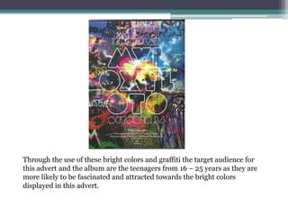
Through the use of these bright colors and graffiti the target audience for
this advert and the album are the teenagers from 16 – 25 years as they are
more likely to be fascinated and attracted towards the bright colors
displayed in this advert.

Coldplay

  • 1.
    Analysis of magazineadvert Coldplay
  • 2.
    The album nameis written in white and bold font and is similar to bubble writing which makes the album name more prominent and grabs the audience attention quickly as it stands out against the chaos or mixture of colors in the background. The bands name and the album name is written in he biggest font as the band wants to promote their album by grabbing the audience attention towards their name which would also lead to the fame of this album. The bright colors used in the background and the graffiti makes the advert more interesting and eye catching which will lead to a larger sale of the advert. On the other hand this advert also represents the track “Every teardrop is a waterfall” in which the same background has been used. This makes it more familiar for the reader and they can easily understand the meaning behind this background. As usual the release date has been written with the same font as the album and band name and is below the album name which the reader or audience would read immediately after they read the album name. In this way they get an idea of when the album would be available for them.
  • 3.
    An important conventionhas been followed here as the name of one of the track has been displayed here which will encourage the audience to buy their album . It has also mentioned the site from where the audience can download the music easily. Due to so much activity in the background such as the mixture of colors and graffiti it will take a lot of time for the audience to understand the meaning behind this image and they will have to analyze it again and again. However this represents that the tracks in this album will be based on confusion, frustration and anger. In this advert there is no band image which means that they have not followed the convention as most of the adverts do have band image. This means that the band is already famous among their audience that they donot need to display their image inorder to sell their album.
  • 4.
    Through the useof these bright colors and graffiti the target audience for this advert and the album are the teenagers from 16 – 25 years as they are more likely to be fascinated and attracted towards the bright colors displayed in this advert.