KERRANG! CONTENTS
DECONSTRUCTION
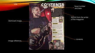
title
Issue number
and date
Words from the writer
of the magazine
Dominant image
Image reference
contents
Issue number-
The point of an issue number is identification and doesn't mean a lot to the customer so it is also
often small and out of the way. This magazine has repeated the issue number in a larger, more
noticeable font than it was on the cover page. It may have decided to do this as to save space on
the cover but still include it in the magazine. Some people may take interest in what issue they have
as they may collect all of them.
Date –
The reader would only be interested In the date to ensure they are reading an up to date issue. The
date on the cover of this magazine was very small and unnoticeable so the magazine has chosen to
repeat it where they had more space.
Title –
The title is there just to show what this page is about, ‘contents’. This magazine has put it in a fairly
large, white, 3D text with images and drawings around/within it. This makes the title bold and clear
yet adds another layer on top that makes the page seem more exciting.
Dominant image –
The dominant image is there to attract the reader. By showing a large image of a band or singer,
the target audience and those who like the pictured artists will want to read that article. The other
purpose of the dominant image is show who/what an article is about. The dominant image on this
contents page is of ‘Twin Atlantic’ performing and it takes up almost two thirds of the page so it is
the first thing readers notice and pay attention to.
Image reference –
By giving a page reference and saying who it is, this makes it easier for readers to be attracted to
this story as they can see who it is and can straight away go to this page/article. It is positioned on
the image to show the connection but towards the bottom so it doesn't’t block the main focus of
the image. Just above the page reference, vertically along the side of the page, is a reference to
who took the photograph. The point of this is to give credit to the photographer although it is in
very small white font and isn't noticeable which shows that the magazine doesn't necessarily care
about it and doesn't think its important but know they have to because it’s a legal requirement to
give credit.
Contents –
The page is for contents so the main body of the page is what is on each page. In this magazine
they have decided to split the contents into sections instead of page numbers so they have split it
into news, features, lives, reviews and gigs. They have written a short paragraph stating what in the
magazine relates to that section with page references after each article mentioned. This makes it
easier for the reader to find what they want to read instead of looking through all the articles, not
knowing exactly what they're about.
Words from the writer-
Positioned in between the title and the main text, there is a paragraph from the writer himself with
an image of him and a member of ‘my chemical romance’. His note is about the focus of the
magazine, the anniversary of ‘the black parade’, an album from ‘my chemical romance’. This
paragraph is very casual and direct to the reader. This creates a relationship between the magazine
and the readers.

Kerrang contents deconstruction

  • 1.
  • 2.
    title Issue number and date Wordsfrom the writer of the magazine Dominant image Image reference contents
  • 3.
    Issue number- The pointof an issue number is identification and doesn't mean a lot to the customer so it is also often small and out of the way. This magazine has repeated the issue number in a larger, more noticeable font than it was on the cover page. It may have decided to do this as to save space on the cover but still include it in the magazine. Some people may take interest in what issue they have as they may collect all of them. Date – The reader would only be interested In the date to ensure they are reading an up to date issue. The date on the cover of this magazine was very small and unnoticeable so the magazine has chosen to repeat it where they had more space. Title – The title is there just to show what this page is about, ‘contents’. This magazine has put it in a fairly large, white, 3D text with images and drawings around/within it. This makes the title bold and clear yet adds another layer on top that makes the page seem more exciting.
  • 4.
    Dominant image – Thedominant image is there to attract the reader. By showing a large image of a band or singer, the target audience and those who like the pictured artists will want to read that article. The other purpose of the dominant image is show who/what an article is about. The dominant image on this contents page is of ‘Twin Atlantic’ performing and it takes up almost two thirds of the page so it is the first thing readers notice and pay attention to. Image reference – By giving a page reference and saying who it is, this makes it easier for readers to be attracted to this story as they can see who it is and can straight away go to this page/article. It is positioned on the image to show the connection but towards the bottom so it doesn't’t block the main focus of the image. Just above the page reference, vertically along the side of the page, is a reference to who took the photograph. The point of this is to give credit to the photographer although it is in very small white font and isn't noticeable which shows that the magazine doesn't necessarily care about it and doesn't think its important but know they have to because it’s a legal requirement to give credit.
  • 5.
    Contents – The pageis for contents so the main body of the page is what is on each page. In this magazine they have decided to split the contents into sections instead of page numbers so they have split it into news, features, lives, reviews and gigs. They have written a short paragraph stating what in the magazine relates to that section with page references after each article mentioned. This makes it easier for the reader to find what they want to read instead of looking through all the articles, not knowing exactly what they're about. Words from the writer- Positioned in between the title and the main text, there is a paragraph from the writer himself with an image of him and a member of ‘my chemical romance’. His note is about the focus of the magazine, the anniversary of ‘the black parade’, an album from ‘my chemical romance’. This paragraph is very casual and direct to the reader. This creates a relationship between the magazine and the readers.