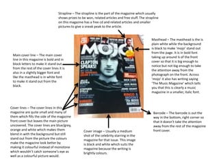
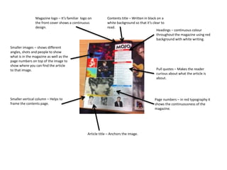
Strapline – The strapline is the part of the magazine which usually 
shows prizes to be won, related articles and free stuff. The strapline 
on this magazine has a free cd and related articles and smaller 
pictures to give a sneak peak to the article. 
Masthead – The masthead is the is 
plain white while the background 
is black to make ‘mojo’ stand out 
from the page. It is in bold font 
taking up around ¼ of the front 
cover so that it is big enough to 
notice but not big enough to take 
the attention away from the 
photograph on the front. Across 
‘mojo’ it also has writing saying 
‘The Music Magazine’ which tells 
you that this is clearly a music 
magazine in a smaller, italic font. 
Main cover line – The main cover 
line in this magazine is bold and in 
block letters to make it stand out 
from the rest of the cover lines it is 
also in a slightly bigger font and 
like the masthead is in white font 
to make it stand out from the 
black. 
Cover lines – The cover lines in this 
magazine are quite small and many of 
them which fills the side of the magazine 
front cover but leaves the main picture 
uncovered. The cover lines are blue/grey, 
orange and white which makes them 
blend in with the background but still 
stand out from the picture the colours 
make the magazine look better by 
making it colourful instead of monotone 
which wouldn’t catch someone's eye as 
well as a colourful picture would. 
Cover image – Usually a medium 
shot of the celebrity starring in the 
magazine for that issue. This image 
is black and white which suits the 
magazine because the writing is 
brightly colours. 
Barcode – The barcode is out the 
way in the bottom, right corner so 
that it doesn’t take the attention 
away from the rest of the magazine 
front cover.
Contents title – Written in black on a 
white background so that it’s clear to 
read. 
Magazine logo – It’s familiar logo on 
the front cover shows a continuous 
design. 
Headings – continuous colour 
throughout the magazine using red 
background with white writing. 
Smaller images – shows different 
angles, shots and people to show 
what is in the magazine as well as the 
page numbers on top of the image to 
show where you can find the article 
to that image. Pull quotes – Makes the reader 
curious about what the article is 
about. 
Smaller vertical column – Helps to 
frame the contents page. 
Article title – Anchors the image. 
Page numbers – in red typography it 
shows the continuousness of the 
magazine.
Main image – Biggest image on the page 
shows who this article is about. 
Smaller images – confirm what the 
main image is about. 
Quotes – Quotes are in 
bold and the colours are 
red and blue to make it 
stand out from the black 
writing. Or they are in 
circles in the middle of the 
text to make it pop out. 
Smaller images that are 
relevant to the article – these 
smaller images are used to 
show images you would 
connect to the ‘band’ or 
‘musician’. 
Text – Parts of the text is 
bold to make it stand out 
from the rest of the text 
which isn’t bold. This 
article is an interview 
which the bold is the 
person interviewing and 
the non-bold is the person 
being interview. 
Captions – these tell you 
about the images they 
are on top of, telling the 
reader what they are 
doing.

Mojo

  • 1.
    Strapline – Thestrapline is the part of the magazine which usually shows prizes to be won, related articles and free stuff. The strapline on this magazine has a free cd and related articles and smaller pictures to give a sneak peak to the article. Masthead – The masthead is the is plain white while the background is black to make ‘mojo’ stand out from the page. It is in bold font taking up around ¼ of the front cover so that it is big enough to notice but not big enough to take the attention away from the photograph on the front. Across ‘mojo’ it also has writing saying ‘The Music Magazine’ which tells you that this is clearly a music magazine in a smaller, italic font. Main cover line – The main cover line in this magazine is bold and in block letters to make it stand out from the rest of the cover lines it is also in a slightly bigger font and like the masthead is in white font to make it stand out from the black. Cover lines – The cover lines in this magazine are quite small and many of them which fills the side of the magazine front cover but leaves the main picture uncovered. The cover lines are blue/grey, orange and white which makes them blend in with the background but still stand out from the picture the colours make the magazine look better by making it colourful instead of monotone which wouldn’t catch someone's eye as well as a colourful picture would. Cover image – Usually a medium shot of the celebrity starring in the magazine for that issue. This image is black and white which suits the magazine because the writing is brightly colours. Barcode – The barcode is out the way in the bottom, right corner so that it doesn’t take the attention away from the rest of the magazine front cover.
  • 2.
    Contents title –Written in black on a white background so that it’s clear to read. Magazine logo – It’s familiar logo on the front cover shows a continuous design. Headings – continuous colour throughout the magazine using red background with white writing. Smaller images – shows different angles, shots and people to show what is in the magazine as well as the page numbers on top of the image to show where you can find the article to that image. Pull quotes – Makes the reader curious about what the article is about. Smaller vertical column – Helps to frame the contents page. Article title – Anchors the image. Page numbers – in red typography it shows the continuousness of the magazine.
  • 3.
    Main image –Biggest image on the page shows who this article is about. Smaller images – confirm what the main image is about. Quotes – Quotes are in bold and the colours are red and blue to make it stand out from the black writing. Or they are in circles in the middle of the text to make it pop out. Smaller images that are relevant to the article – these smaller images are used to show images you would connect to the ‘band’ or ‘musician’. Text – Parts of the text is bold to make it stand out from the rest of the text which isn’t bold. This article is an interview which the bold is the person interviewing and the non-bold is the person being interview. Captions – these tell you about the images they are on top of, telling the reader what they are doing.