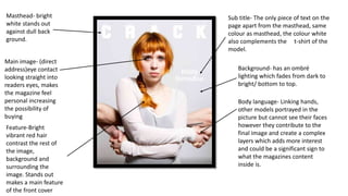
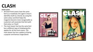
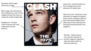
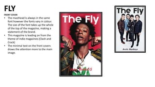
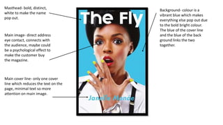
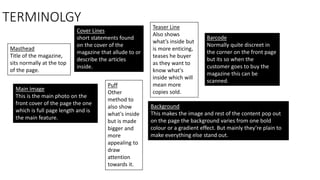
The document discusses the design conventions of magazine front covers for the magazines Billboard, Crack, Clash, and Fly. Some key points:
- All magazines use consistent masthead fonts and positioning to build brand recognition.
- Covers typically feature a full-page main model image making direct eye contact with the viewer.
- Minimal text is used to draw readers in, with cover lines, teaser lines, and puffs providing just enough information without summaries.
- Background colors, fonts, sizing and positioning of elements are designed deliberately to make key information pop out at readers.