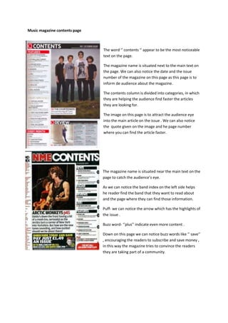
1. Music magazine contents page
The word ‘’ contents ‘’ appear to be the most noticeable
text on the page.
The magazine name is situated next to the main text on
the page. We can also notice the date and the issue
number of the magazine on this page as this page is to
inform de audience about the magazine.
The contents column is divided into categories, in which
they are helping the audience find faster the articles
they are looking for.
The image on this page is to attract the audience eye
into the main article on the issue . We can also notice
the quote given on the image and he page number
where you can find the article faster.
The magazine name is situated near the main text on the
page to catch the audience’s eye.
As we can notice the band index on the left side helps
he reader find the band that they want to read about
and the page where they can find those information.
Puff- we can notice the arrow which has the highlights of
the issue .
Buzz word- ‘’plus’’ indicate even more content .
Down on this page we can notice buzz words like ‘’ save’’
, encouraging the readers to subscribe and save money ,
in this way the magazine tries to convince the readers
they are taking part of a community.
2. On the left side we can find the latest music
chart with the magazine logo on the right
corner.
This column it’s divided in some categories o
help de reader find what they are looking for.
The word ‘’contents is written in a similar font
as ‘’no1’’ to make these 2 word the main titles
on the page. The way in which these words are
written is very modern which represents the
billboard style.
The four images on the page represents the
main articles on this issue with the number of
the page specified on the left bottom.
The yellow word ‘’contents’’ on the black
background seems to be the most noticeable text
on the page. As we can notice the main articles
from this issue are illustrated on the left side
showing us the page where we can find them and
instead of some callouts from the articles they
preferred to fill the gap with an image of the
double page spread.
Buzz words like ‘’get it’’ catches the readers eye
and engages the consumer in the community.
The use of ‘’kerrang !this week ‘’ suggest to the
readers that they will be getting a review of the
highlights of the week .
3. The image of the front cover is situated near the main
text on the page with the date line underneath it.
The articles are separated into two columns to help
the reader find more easily what they are looking for.
As metal hammer is a niche magazine it uses a
unique font to write all the contents. The page
number is written in red to catch the reader’s eye and
the article you will find at that page is written in black.
Puff- It appears to be ripped off, which connotes the
violence of hard rock music.
Buzz words- such as ‘’incoming’’ are informing the
readers what they will find in the next issue of the
magazine.
On the right side of the page we can notice the
editor’s message to the readers, which establish a
special relationship with the audience .