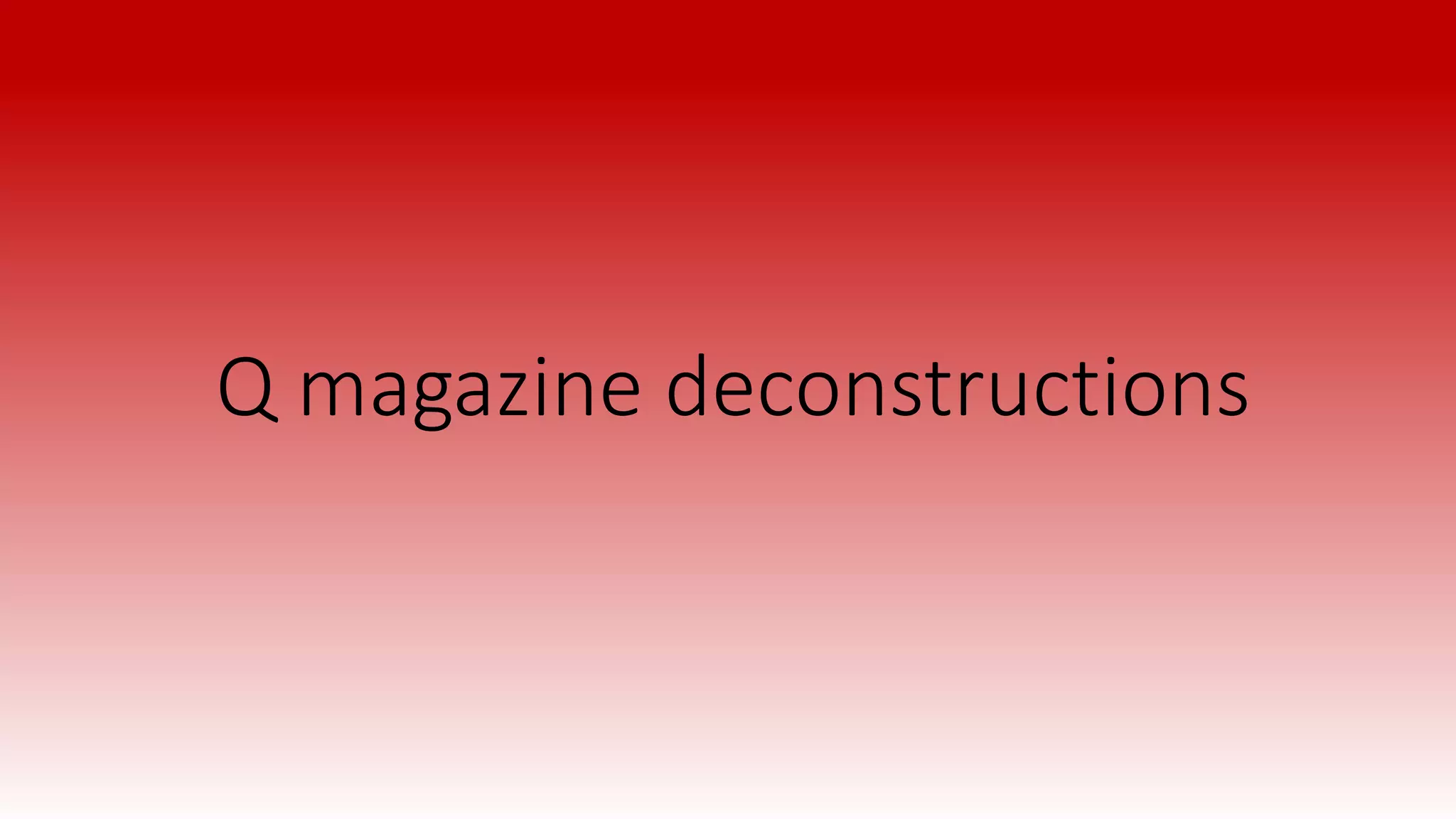
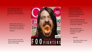
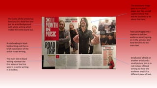
Q magazine deconstructions
The masthead is shown in a
red box and then there is a
white “Q” in the box, telling
the audience what magazine it
is.
A plug that is trying to
attract the audience and
convince them to buy the
magazine. It is bright red so
it will automatically grab the
audiences attention.
The main image covers the
whole entire cover but still
leaves room around the outside
to sell there magazine.
Other artists that are
included in the magazine,
this attracts a wider
audience.
Barcode
Advertise the artists and
articles that are inside of the
issue so that the audience
know what is inside of the
magazine.
Quote and the name of the
artist in big writing along the
bottom of the page.
The colour scheme is red,
white and black.
The masthead tells the
audience what page they are
on. It stands out because the
writing is in a red box. Picture of the front cover.
The dominant image does not cover
the whole page however it does still
draw in the audience and lets them
know who the featured artist is.
Sub image to give the
audience a bit more of a
inside of what is inside of
the magazine.
There is not a full contents, it is
just featured articles. The title
of the band or artist is written
in bolder writing and then a
brief description below in a
different font.
Another sub image
however this sub image has
the number of the article
the image relates to on it.
More sub images letting the
audience know what the article looks
like and what page they need to go
to.
The main featured artist has the
article number below the
dominant image in bold black
writing so it stands out to the
audience.
The name of the article has
been put in a bold font and
put on a red background
with white writing which
makes the name stand out.
A sub heading in black
bold writing and then a
brief explanation of the
article in red writing.
The main text in black
writing however the
first letter of the first
word is in white writing
in a red box.
Two sub images and a
caption to tell the
audience what is going
on in the pictures and
how they link to the
main text.
The dominant image
goes across both
pages and has a small
caption below that
tell the audience a bit
about the band.
Small piece of text on
another artist and a
small picture. this is in
red instead of black
writing to show the
audience that it is a
different piece of text.

Q

  • 1.
  • 2.
    The masthead isshown in a red box and then there is a white “Q” in the box, telling the audience what magazine it is. A plug that is trying to attract the audience and convince them to buy the magazine. It is bright red so it will automatically grab the audiences attention. The main image covers the whole entire cover but still leaves room around the outside to sell there magazine. Other artists that are included in the magazine, this attracts a wider audience. Barcode Advertise the artists and articles that are inside of the issue so that the audience know what is inside of the magazine. Quote and the name of the artist in big writing along the bottom of the page. The colour scheme is red, white and black.
  • 3.
    The masthead tellsthe audience what page they are on. It stands out because the writing is in a red box. Picture of the front cover. The dominant image does not cover the whole page however it does still draw in the audience and lets them know who the featured artist is. Sub image to give the audience a bit more of a inside of what is inside of the magazine. There is not a full contents, it is just featured articles. The title of the band or artist is written in bolder writing and then a brief description below in a different font. Another sub image however this sub image has the number of the article the image relates to on it. More sub images letting the audience know what the article looks like and what page they need to go to. The main featured artist has the article number below the dominant image in bold black writing so it stands out to the audience.
  • 4.
    The name ofthe article has been put in a bold font and put on a red background with white writing which makes the name stand out. A sub heading in black bold writing and then a brief explanation of the article in red writing. The main text in black writing however the first letter of the first word is in white writing in a red box. Two sub images and a caption to tell the audience what is going on in the pictures and how they link to the main text. The dominant image goes across both pages and has a small caption below that tell the audience a bit about the band. Small piece of text on another artist and a small picture. this is in red instead of black writing to show the audience that it is a different piece of text.