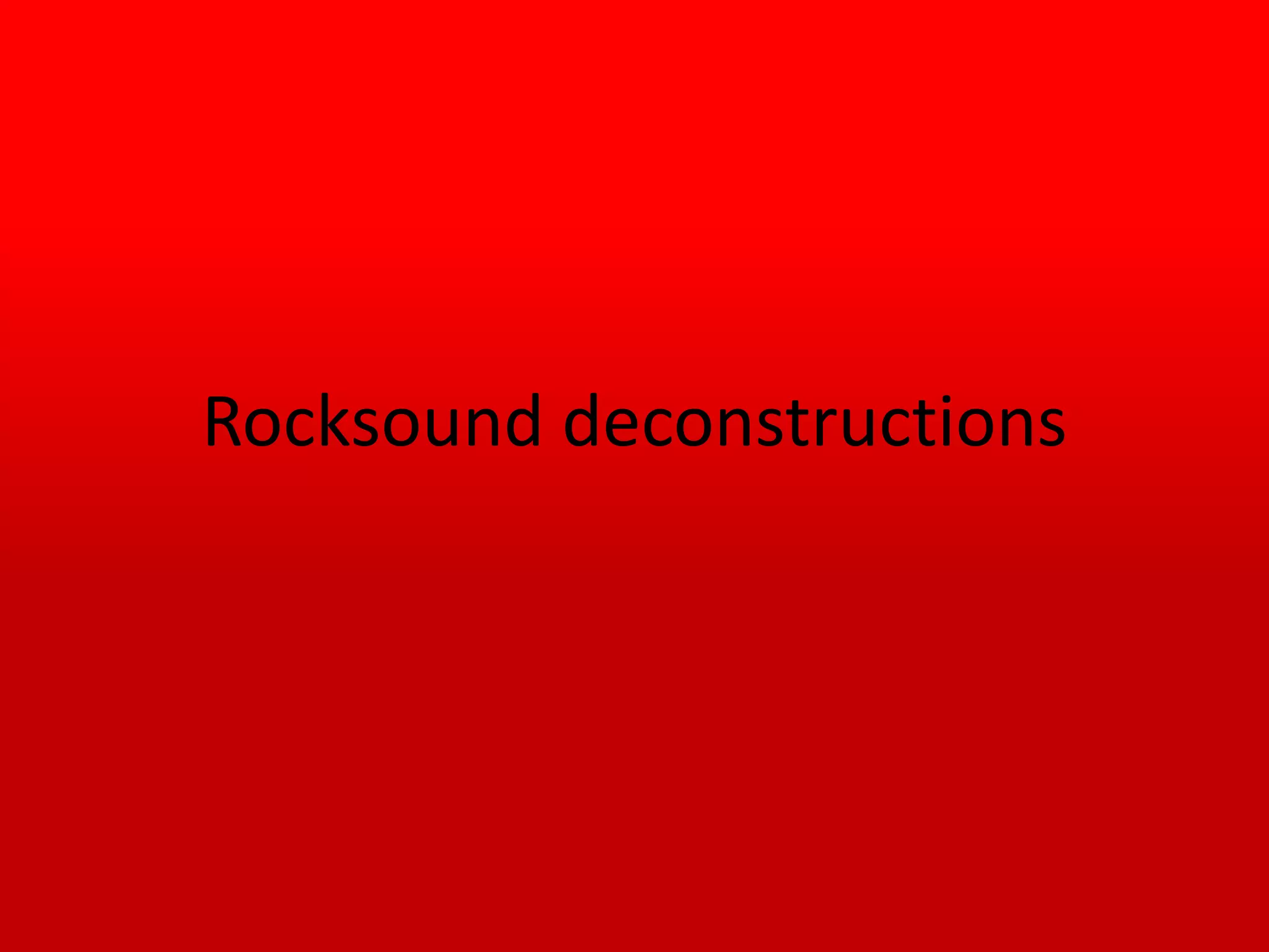
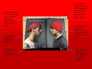
The front cover of the magazine features a light blue masthead with a circled R logo. The skyline says "special collectors edition" to attract audiences. A large central image is the main focus, and basic information like the issue number, price and month are listed in the bottom right corner. Sell lines related to the central image are written sideways in white and red to stand out. The color scheme of red, white, black and light blue fits the genre of the magazine.
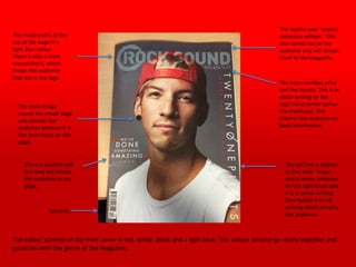
The contents page lists the different sections and includes pictures to showcase what's inside. Each page listing includes the page number and brief explanation. The main title has a red outline and white text. The color scheme is similar to the front cover