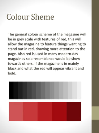
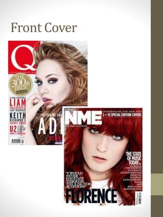
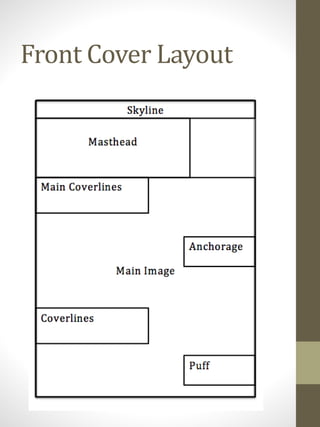
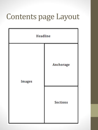
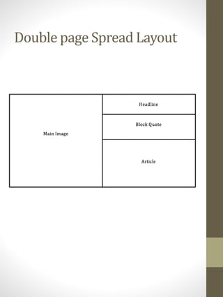
Layout Design
By Lauren Clarke
Font
Masthead Designs – True Sound
Colour Sheme
The general colour scheme of the magazine will
be in grey scale with features of red, this will
allow the magazine to feature things wanting to
stand out in red, drawing more attention to the
page. Also red is used in many modern-day
magazines so a resemblance would be show
towards others. If the magazine is in mainly
black and what the red will appear vibrant and
bold.
Front Cover
Front Cover
The front cover will be keep minimalistic and
will have one main feature. The main image will
be the focus of the cover meaning the will be a
small amount of coverlines eta. The main image
will be in black and white taking up most of the
cover, if their were a few artists on the cover
for the main image, it would be superimposed
implying that the magazine if well known. The
masthead, True Sound, will be in bold red
writing to stand out and similar to the main
coverline. The featured coverline will also be in
red, but either a different shade or not in bold.
The cover will not feature a skyline or tagline
due to cover being kept minimalistic, by having
both the cover may appear crowded. The cover
may feature some anchorage to interest the
target audience even more, however a puff or
anchorage may not be necessary.
Front Cover Layout
Contents page
Contents page
The contents page, like the cover page, will be
kept minimalistic, this will mean the house
style of the magazine will be kept simple. The
headlines will be in bold red writing to stand
out. The images will run along the left side of
the page and the sections on the right side,
containing a list of the contents. The images
will compliment the contents throughout the
magazine, whereas the main image on the
cover will compliment the artist featured on
the double page spread. The anchorage will be
able the list of contents so this will be the first
thing the audience would read. The anchorage
would then interest the audience to continue
reading.
Contents page Layout
Double page Spread
Double page Spread
The main image will cover the whole of the left
page and will be of the artist/artists feature of
the main story. The image will be in black and
white, keeping the house style consistent. The
headline will either be at the top of the left or
right page, left being superimposed of the main
image or right being in bold red at the top of
the page. The block quote will either be below
the main image if the headline is on the right
side, however if the the headline is about the
image, the block quote will be above the
article. The article will be at the bottom on the
right side.
Double page Spread Layout

Magazine Layout Design

  • 1.
  • 2.
  • 3.
    Colour Sheme The generalcolour scheme of the magazine will be in grey scale with features of red, this will allow the magazine to feature things wanting to stand out in red, drawing more attention to the page. Also red is used in many modern-day magazines so a resemblance would be show towards others. If the magazine is in mainly black and what the red will appear vibrant and bold.
  • 4.
  • 5.
    Front Cover The frontcover will be keep minimalistic and will have one main feature. The main image will be the focus of the cover meaning the will be a small amount of coverlines eta. The main image will be in black and white taking up most of the cover, if their were a few artists on the cover for the main image, it would be superimposed implying that the magazine if well known. The masthead, True Sound, will be in bold red writing to stand out and similar to the main coverline. The featured coverline will also be in red, but either a different shade or not in bold. The cover will not feature a skyline or tagline due to cover being kept minimalistic, by having both the cover may appear crowded. The cover may feature some anchorage to interest the target audience even more, however a puff or anchorage may not be necessary.
  • 6.
  • 7.
  • 8.
    Contents page The contentspage, like the cover page, will be kept minimalistic, this will mean the house style of the magazine will be kept simple. The headlines will be in bold red writing to stand out. The images will run along the left side of the page and the sections on the right side, containing a list of the contents. The images will compliment the contents throughout the magazine, whereas the main image on the cover will compliment the artist featured on the double page spread. The anchorage will be able the list of contents so this will be the first thing the audience would read. The anchorage would then interest the audience to continue reading.
  • 9.
  • 10.
  • 11.
    Double page Spread Themain image will cover the whole of the left page and will be of the artist/artists feature of the main story. The image will be in black and white, keeping the house style consistent. The headline will either be at the top of the left or right page, left being superimposed of the main image or right being in bold red at the top of the page. The block quote will either be below the main image if the headline is on the right side, however if the the headline is about the image, the block quote will be above the article. The article will be at the bottom on the right side.
  • 12.