SlideShare a Scribd company logo
Deconstruction
Deconstruction is the way that the layout on a magazine works, this involves the positions and placement of information and images on a
magazine page and what effects that can have on the reader and how it can have symbolism and attract an audience to purchase it, this involves
a number of techniques that the creator uses as well as how each of the pages done in terms of layout and formula which magazine companies
use, it also includes how the creator uses them and what they bring to the table that is different or more effective than other companies, the
magazine genre that I will be researching on when it comes to this will be the music magazines and how they layout there magazines more
importantly Kerrang and what formulas they strongly lye heavily on, the types of magazine pages I will be looking at will be the front cover,
content page and double page spreads and how each one is different from the other type, I will also look into the features and how I can use
them for my own target audience.
Front cover research one
• This front cover by Kerrang shows a in your face layout design to make it stand out, it does this by having the main image cover
up a large majority of the page it has also been organized so that the artists on the page are organized so that the most
successful and famous is in front and the further behind you get in the layers the less famous and successful you get this is so
that way people will recognize the person on the magazine and have a higher chance of knowing who it is on it, the main cover
line for the front cover is also made to be big and has on it ” 50 ALBUMS YOU NEED TO HEAR BEFORE YOU DIE “ the dramatic
use of the word “die” and “need” shows that the magazine is almost telling the viewer to pick it up it is telling the reader that
they need this magazine and need to know this piece of information, the background of the magazine also goes with the topic
as it says die at the same time the background shows graves adding an element of fun to the magazine making it more
attractive, the barcode for the cover is in the bottom right of the magazine at the bottom likely due to the fact we scan things
from top to bottom meaning that the barcode isn't the main attraction and people aren't drawn to it and are instead drawn to
the rest of the magazine, the cover lines of the magazine show almost of questions but at the same time they go with the
theme of the front cover of the magazine “6 BLOODY GREAT POSTERS!” and ”GERARD WAY EATS THE UK!” the pare both go
with the theme of the cover or go with at least main line which is death, at the same time these could also be rhetorical
questions because it could make the viewer think does he ”EAT THE UK!” making the viewer think what does the magazine
mean by this almost luring the viewer in with question, the artist themselves are positioned to look fun as it shows at the front
artist Kurt Cobain pulling a face with Billie Joe Armstrong pulling a pout this shows that the magazine doesn't’t in any way take
itself seriously and is more about having fun than being about facts and figures, the mast head is behind the artists themselves
could this be the magazine trying to say that the magazine isn't as great as the artists on it and that the artists on it are to great
for it.
Front cover research two
The front cover of this NME magazine shows a extremely big image or main image of Dave Grohl with a cover line/main cover line
saying “ IM NOT DEAD!” in capital letters with an exclamation mark the fact that it has his band name the ”Foo Fighters”
underneath it this could also be a play on words as you cannot fight when your dead this could therefore of been done to make
the artist sound more dramatic and more cool saying he fights even when he’s dead, the magazine has a the mass head in big and
bold slightly behind a image meaning that the magazine isn't necessarily focused on itself but much rather getting the information
out there this could mean the magazine is trying to say it has more to offer than the other ones out there, the main cover story
reads “NEW PRIMALS ALBUM REVIEWED” this has been worded so that it doesn't’t actually give you any detail about the topic
and only gives you so much information so that the viewer thinks “what have they got to say about the review” giving a higher
chance of the person picking it up and reading it however this could also be saying that it isn't a big topic as it is at the bottom of
the page as we scan from top to bottom naturally meaning it will be one of the last things that you see before say walking past
therefore it could be saying that the album being reviewed isn't that big of a subject and isn't as important as the rest of the
information to take in from the cover, at the same time the main image is of someone who is very successful as he is known for
being in three big bands meaning that there is a higher chance of someone knowing who he is and picking up the magazine, this
means that the audience of this magazine is likely a older audience as it will be of someone who knows what bands the artists is
from and his work and what he has done so likely to be of audience that understands rock music, for my own magazine and
audience I could make it so that I have a play on words with the way I word my sentences so that it makes the reader think more
and become more interested in the magazine.
Content page research one
• The dominant image of this content page shows Dave Grohl walking towards the camera with his guitar over his right shoulder
while he looks to his left this as a result adds a sense of drama and at the same time this could also have meaning saying that
he's walking away from something to focus on his music or could say that he is just him and his music, the sub images are
organized so that they are in places were there is no information making them the main focus in them areas and not the
information requiring either the person to know the picture and what is going on rather than it telling you this could possibly of
been done to save information and so that the magazine content pages don’t require you to put a lot of effort into them you just
have to look at the images to get information as it expects you to know the people, the sell lines are down the left side of the
content page they are smaller than the main image and under and below two sub images, highlighted and bigger than the
information on the sell lines is each one of them has a music artist as its title this could have been done so that you don’t have
to read all the information you just need to see your artist read the page number and then turn to that page to get the
information you either want or more of it, however a trick that could have been done here is how we naturally read from top to
bottom therefore for advertising purposes could the more successful artist have there name higher so it is quicker to see making
the viewer more likely to be interested, for my own work what I could do is I could think about my model and props angles and
how I could add meaning to them to make it more interesting and dramatic for the viewer to read.
Content page research two
• On this content page the dominant image is not so much in the center much rather it is further to the top of the page than
the bottom or the middle as it is just below the mast head and even slightly covering it this could possible be saying or the
magazine saying that it isn't about us its about this artist here, the dominant image itself is of the Artic Monkeys singer Alex
Turner however the patriot has been taken to show him looking to his right with his sunglasses on and his hair styled this as a
result makes him look stylish and attractive to the viewer as they are more likely to pay attention to him, when it comes to
the sell lines they are all over the left side and bottom of the page this could likely of been done as the magazine is trying to
get as many artist on it as possible so that way there is a higher chance of someone's band they like being on it at the same
time it has the numbers bigger than the artists name and paragraph meaning that the viewer doesn't’t even have to read the
paragraph they just need to see the band name and the number and then they can turn to the page that they want, what
makes this content page also interesting is how it has the sub images placed underneath the dominant image and to the left
of it this as a result could be the magazine trying to say that this artist id bigger and more important than these artists
making the viewer/reader pay more attention to the bigger picture than the little ones as they will not see the little ones as
being as important as the big one, along the right side of the content page is information on reviews of artists what makes it
interesting is how these artist have there own spot on the page there are not with the other sell line artists, for my own
magazine I could look at what artists I use and how I can make it so that one seems more important than the others without
actually writing anything that suggests that.
Double page spreads research one
On the top right of the double page spread is a quote saying “WE WERE REBELLING AGAINST WHO WE WERE” it then says who is saying it underneath saying “Frank Iero” the quote is also in
the colour red this could have been done as red is often correlated with rebelling and blood and bad topics therefore the magazine could be trying to say them rebelling isn't seen or is a good
thing, the main image takes up more than a full page this could be done to show that the band is a big thing that people know about the way that they are position also suggests that they
don’t need to do anything as none are pulling extremely dramatic poses this at the same time could be the magazines way of trying to go with the topic of rebelling shows they don’t need to
pose and that they are themselves as at the same time they aren't dressed fancy they are wearing casually clothes, what makes this double page spread interesting is how it doesn't’t have any
sub images this is likely to have been done so that there is no distractions and so that you just focus on the band that the magazine wants you to, for my own magazine what I could do is take
inspiration from the way which the models have been angled as there is four of them but none of them are the same angle dressed the same or are pulling the same facial expression, I could
also take inspiration from the style and how they have been presented as the band (My Chemical Romance) is know for being an emo punk rock metal band meaning that the band is going to
be dressed in the genre they are meaning I could do something similar with my genre were I dress my models or model in the style of a the genre what I am doing, some symbolism behind
the way the models have been angled and presented could how the quote says “WE WERE REBELLING AGAINST WHO WE WERE” the symbolism could be that they are a band and in the main
image they don’t have there instruments this could show who they are rebelling by not being who they are know for being.
Double page research two
In the middle of the page there is a quote by the artist (Jay-Z) red and full capital saying “EVERYONE TRYING TO DO SOMETHING NEW IS GOING TO COME UP AGAINST A NOEL GALLAGHER
FIGURE IN THEIR LIFE” what makes this quote interesting is how Jay-Z is angled and presented in the main image as it shows him were sunglasses or shades which you can see his eyes this as a
result adds a sense of mystery as you don’t know what he is thinking as you cant see his full facial expression and at the same time it is just his face and head this could be as a result a way of
Jay-Z saying am the one who said that nobody else or nobody was there to influence me these are my own words as it does not show him with anybody else, the quote itself could be a
reference to how Noel Gallagher was done for plagiarism three times therefore it could also be Jay-Z’s way of saying that no matter what you create there's going to be those that try to profit
from it, the main image also has two colours behind it red and green the correlation to this could be red being a colour that is often correlated with anger and hatred and green which is often
correlated with things being okay, good and positive, one thing about the image which is likely to have been done on purpose is how the red over laps the green and is more brighter and
stands out this as a result could be the magazine way of saying that there is more on the models mind which is bad than there is good, the way the double spread sheet has been laid out is on
the right side you have the main image and then on the right page it is only information with a massive “J” on it and then on top of the “J” is a masthead which says “THE MOST EXCITING
PEOPLE IN MUSIC JAY-Z” the way the mast head has been laid out on top of the ”J” could be the magazines way of saying that Jay-Z or the artist is on top of everything and that he’s on top of
it all with what he is doing, for my own magazine what I could do for inspiration from this double page is I could use my colours and what they are correlated with to add hidden meaning to
the main images and at the same time what I could also do is add a quote but not just a quote but one which people can read and think and understand what it is a reference to.

More Related Content

What's hot

Media studies magazine evaluation
Media studies   magazine evaluationMedia studies   magazine evaluation
Media studies magazine evaluationjessiemc
 
Media vibe1 2
Media vibe1 2Media vibe1 2
Media vibe1 2
ammz786
 
Media Studies Coursework 1
Media Studies Coursework 1Media Studies Coursework 1
Media Studies Coursework 1Zoyia
 
How did I attract/address my audience?
How did I attract/address my audience?How did I attract/address my audience?
How did I attract/address my audience?
tashaay27
 
AS media Music Magazine
AS media Music MagazineAS media Music Magazine
AS media Music Magazinebisma1
 
Survey analysis
Survey analysisSurvey analysis
Survey analysis
Karis Hays
 
Market research
Market researchMarket research
Market research
Karis Hays
 
Evaluation - Question One Powerpoint
Evaluation - Question One PowerpointEvaluation - Question One Powerpoint
Evaluation - Question One Powerpoint
Searle9085
 
My evaluation
My evaluationMy evaluation
My evaluation
Karis Hays
 
Evaluation powerpoint
Evaluation powerpointEvaluation powerpoint
Evaluation powerpoint
Alice Bates
 
Evaluation powerpoint
Evaluation powerpointEvaluation powerpoint
Evaluation powerpoint
Alice Bates
 
Evaluation powerpoint
Evaluation powerpointEvaluation powerpoint
Evaluation powerpoint
Alice Bates
 
Research final
Research final Research final
Research final
Tom Batty
 
Factual pp
Factual ppFactual pp
Factual pp
AlfieJones3
 
Pitch 2
Pitch 2Pitch 2
Pitch 2
Karis Hays
 

What's hot (19)

Media studies magazine evaluation
Media studies   magazine evaluationMedia studies   magazine evaluation
Media studies magazine evaluation
 
Media
MediaMedia
Media
 
My magazine proposal
My magazine proposalMy magazine proposal
My magazine proposal
 
Media vibe1 2
Media vibe1 2Media vibe1 2
Media vibe1 2
 
Media Studies Coursework 1
Media Studies Coursework 1Media Studies Coursework 1
Media Studies Coursework 1
 
How did I attract/address my audience?
How did I attract/address my audience?How did I attract/address my audience?
How did I attract/address my audience?
 
AS media Music Magazine
AS media Music MagazineAS media Music Magazine
AS media Music Magazine
 
Magazine Analysis
Magazine AnalysisMagazine Analysis
Magazine Analysis
 
Survey analysis
Survey analysisSurvey analysis
Survey analysis
 
Market research
Market researchMarket research
Market research
 
Evaluation - Question One Powerpoint
Evaluation - Question One PowerpointEvaluation - Question One Powerpoint
Evaluation - Question One Powerpoint
 
My evaluation
My evaluationMy evaluation
My evaluation
 
Evaluation powerpoint
Evaluation powerpointEvaluation powerpoint
Evaluation powerpoint
 
Evaluation powerpoint
Evaluation powerpointEvaluation powerpoint
Evaluation powerpoint
 
Evaluation powerpoint
Evaluation powerpointEvaluation powerpoint
Evaluation powerpoint
 
Evaluation- one
Evaluation- one Evaluation- one
Evaluation- one
 
Research final
Research final Research final
Research final
 
Factual pp
Factual ppFactual pp
Factual pp
 
Pitch 2
Pitch 2Pitch 2
Pitch 2
 

Viewers also liked

Front cover rationales
Front cover rationalesFront cover rationales
Front cover rationales
megansheratonx
 
Final costume, hair and make up.
Final costume, hair and make up.Final costume, hair and make up.
Final costume, hair and make up.
Francesca Foston
 
Double page spread flat plan
Double page spread flat planDouble page spread flat plan
Double page spread flat plan
megansheratonx
 
Inspirations research media
Inspirations research mediaInspirations research media
Inspirations research media
SionyTatey
 
Institution research
Institution researchInstitution research
Institution research
megansheratonx
 
Location scout
Location scoutLocation scout
Location scout
Shazgreen17
 
Audience profile
Audience profileAudience profile
Audience profile
Shazgreen17
 
Magazine analysis
Magazine analysisMagazine analysis
Magazine analysis
Shazgreen17
 
Media planning document
Media planning documentMedia planning document
Media planning document
megansheratonx
 
evaluation question 1
evaluation question 1evaluation question 1
evaluation question 1
BethDoesMedia
 
Calander media as
Calander media asCalander media as
Calander media as
patta123
 
Draft one feedback improved
Draft one feedback improvedDraft one feedback improved
Draft one feedback improved
Shazgreen17
 

Viewers also liked (20)

Front cover rationales
Front cover rationalesFront cover rationales
Front cover rationales
 
Final costume, hair and make up.
Final costume, hair and make up.Final costume, hair and make up.
Final costume, hair and make up.
 
Double page spread flat plan
Double page spread flat planDouble page spread flat plan
Double page spread flat plan
 
Inspirations research media
Inspirations research mediaInspirations research media
Inspirations research media
 
Institution research
Institution researchInstitution research
Institution research
 
Location scout
Location scoutLocation scout
Location scout
 
Flat plans
Flat plansFlat plans
Flat plans
 
Audience profile
Audience profileAudience profile
Audience profile
 
Magazine analysis
Magazine analysisMagazine analysis
Magazine analysis
 
Location scout
Location scoutLocation scout
Location scout
 
Media planning document
Media planning documentMedia planning document
Media planning document
 
Colour schemes
Colour schemesColour schemes
Colour schemes
 
Reader profile
Reader profileReader profile
Reader profile
 
evaluation question 1
evaluation question 1evaluation question 1
evaluation question 1
 
Question 7
Question 7Question 7
Question 7
 
Question 3
Question 3Question 3
Question 3
 
Calander media as
Calander media asCalander media as
Calander media as
 
Draft one feedback improved
Draft one feedback improvedDraft one feedback improved
Draft one feedback improved
 
Calender
CalenderCalender
Calender
 
Question 1
Question 1Question 1
Question 1
 

Similar to Deconstruction reserach media

Inspirations research media
Inspirations research mediaInspirations research media
Inspirations research media
SionyTatey
 
Presentation1
Presentation1Presentation1
Presentation1
bethmagic
 
Music magazine analysis
Music magazine analysisMusic magazine analysis
Music magazine analysistomgoodyear
 
Evaluation question 1
Evaluation question 1Evaluation question 1
Evaluation question 1
10afrmal
 
Music magazine analysis
Music magazine analysisMusic magazine analysis
Music magazine analysisaydan1
 
Music magazine analysis
Music magazine analysisMusic magazine analysis
Music magazine analysiseleanornatalie
 
Unit 14
Unit 14Unit 14
Unit 14
owenshepherd7
 
Music magazine analysis
Music magazine analysisMusic magazine analysis
Music magazine analysiseleanornatalie
 
Music magazine analysis
Music magazine analysisMusic magazine analysis
Music magazine analysisDemiRowley
 
Evaluation
EvaluationEvaluation
Evaluationreisslee
 
AS Media Evaluation
AS Media EvaluationAS Media Evaluation
AS Media Evaluation
EleanorBoland1
 
Nme front cover analysis
Nme front cover analysisNme front cover analysis
Nme front cover analysisasmediaf13
 
Evaluation
EvaluationEvaluation
Evaluation
BradleyYoungman123
 
Textual Analysis
Textual AnalysisTextual Analysis
Textual Analysis
Angelika Bober
 
Draft proposal
Draft proposalDraft proposal
Draft proposal
ChloeBakerMedia
 

Similar to Deconstruction reserach media (20)

Inspirations research media
Inspirations research mediaInspirations research media
Inspirations research media
 
2. research
2. research2. research
2. research
 
Presentation1
Presentation1Presentation1
Presentation1
 
Music magazine analysis
Music magazine analysisMusic magazine analysis
Music magazine analysis
 
Evaluation question 1
Evaluation question 1Evaluation question 1
Evaluation question 1
 
Music magazine analysis
Music magazine analysisMusic magazine analysis
Music magazine analysis
 
Music magazine analysis
Music magazine analysisMusic magazine analysis
Music magazine analysis
 
Photographic reserach
Photographic reserachPhotographic reserach
Photographic reserach
 
Photographic reserach
Photographic reserachPhotographic reserach
Photographic reserach
 
Unit 14
Unit 14Unit 14
Unit 14
 
Music magazine analysis
Music magazine analysisMusic magazine analysis
Music magazine analysis
 
Music magazine analysis
Music magazine analysisMusic magazine analysis
Music magazine analysis
 
Evaluation
EvaluationEvaluation
Evaluation
 
AS Media Evaluation
AS Media EvaluationAS Media Evaluation
AS Media Evaluation
 
Question 1
Question 1Question 1
Question 1
 
Task 9
Task 9Task 9
Task 9
 
Nme front cover analysis
Nme front cover analysisNme front cover analysis
Nme front cover analysis
 
Evaluation
EvaluationEvaluation
Evaluation
 
Textual Analysis
Textual AnalysisTextual Analysis
Textual Analysis
 
Draft proposal
Draft proposalDraft proposal
Draft proposal
 

More from SionyTatey

Question 1 of evaluation question slide two complete
Question 1 of evaluation question slide two completeQuestion 1 of evaluation question slide two complete
Question 1 of evaluation question slide two complete
SionyTatey
 
Evaluation question 3
Evaluation question 3Evaluation question 3
Evaluation question 3
SionyTatey
 
Question 1 of evaluation question slide two complete
Question 1 of evaluation question slide two completeQuestion 1 of evaluation question slide two complete
Question 1 of evaluation question slide two complete
SionyTatey
 
Calander
CalanderCalander
Calander
SionyTatey
 
Calander
CalanderCalander
Calander
SionyTatey
 
Models profiles
Models profilesModels profiles
Models profiles
SionyTatey
 
Billboard rationale
Billboard rationaleBillboard rationale
Billboard rationale
SionyTatey
 
Website link page rationale two
Website link page rationale twoWebsite link page rationale two
Website link page rationale two
SionyTatey
 
Website main page rationale
Website main page rationaleWebsite main page rationale
Website main page rationale
SionyTatey
 
Website link page one
Website link page oneWebsite link page one
Website link page one
SionyTatey
 
Article rationale
Article rationaleArticle rationale
Article rationale
SionyTatey
 
Advert rationale
Advert rationaleAdvert rationale
Advert rationale
SionyTatey
 
Content page rationale
Content page rationaleContent page rationale
Content page rationale
SionyTatey
 
Front cover rationale
Front cover rationaleFront cover rationale
Front cover rationale
SionyTatey
 
Rationals media one
Rationals media oneRationals media one
Rationals media one
SionyTatey
 
Magazine deconstruction
Magazine deconstructionMagazine deconstruction
Magazine deconstruction
SionyTatey
 
Evaluation question 4
Evaluation question 4Evaluation question 4
Evaluation question 4
SionyTatey
 

More from SionyTatey (17)

Question 1 of evaluation question slide two complete
Question 1 of evaluation question slide two completeQuestion 1 of evaluation question slide two complete
Question 1 of evaluation question slide two complete
 
Evaluation question 3
Evaluation question 3Evaluation question 3
Evaluation question 3
 
Question 1 of evaluation question slide two complete
Question 1 of evaluation question slide two completeQuestion 1 of evaluation question slide two complete
Question 1 of evaluation question slide two complete
 
Calander
CalanderCalander
Calander
 
Calander
CalanderCalander
Calander
 
Models profiles
Models profilesModels profiles
Models profiles
 
Billboard rationale
Billboard rationaleBillboard rationale
Billboard rationale
 
Website link page rationale two
Website link page rationale twoWebsite link page rationale two
Website link page rationale two
 
Website main page rationale
Website main page rationaleWebsite main page rationale
Website main page rationale
 
Website link page one
Website link page oneWebsite link page one
Website link page one
 
Article rationale
Article rationaleArticle rationale
Article rationale
 
Advert rationale
Advert rationaleAdvert rationale
Advert rationale
 
Content page rationale
Content page rationaleContent page rationale
Content page rationale
 
Front cover rationale
Front cover rationaleFront cover rationale
Front cover rationale
 
Rationals media one
Rationals media oneRationals media one
Rationals media one
 
Magazine deconstruction
Magazine deconstructionMagazine deconstruction
Magazine deconstruction
 
Evaluation question 4
Evaluation question 4Evaluation question 4
Evaluation question 4
 

Recently uploaded

Between Filth and Fortune- Urban Cattle Foraging Realities by Devi S Nair, An...
Between Filth and Fortune- Urban Cattle Foraging Realities by Devi S Nair, An...Between Filth and Fortune- Urban Cattle Foraging Realities by Devi S Nair, An...
Between Filth and Fortune- Urban Cattle Foraging Realities by Devi S Nair, An...
Mansi Shah
 
一比一原版(Bristol毕业证书)布里斯托大学毕业证成绩单如何办理
一比一原版(Bristol毕业证书)布里斯托大学毕业证成绩单如何办理一比一原版(Bristol毕业证书)布里斯托大学毕业证成绩单如何办理
一比一原版(Bristol毕业证书)布里斯托大学毕业证成绩单如何办理
smpc3nvg
 
Transforming Brand Perception and Boosting Profitability
Transforming Brand Perception and Boosting ProfitabilityTransforming Brand Perception and Boosting Profitability
Transforming Brand Perception and Boosting Profitability
aaryangarg12
 
PORTFOLIO FABIANA VILLANI ARCHITECTURE.pdf
PORTFOLIO FABIANA VILLANI ARCHITECTURE.pdfPORTFOLIO FABIANA VILLANI ARCHITECTURE.pdf
PORTFOLIO FABIANA VILLANI ARCHITECTURE.pdf
fabianavillanib
 
Exploring the Future of Smart Garages.pdf
Exploring the Future of Smart Garages.pdfExploring the Future of Smart Garages.pdf
Exploring the Future of Smart Garages.pdf
fastfixgaragedoor
 
一比一原版(CITY毕业证书)谢菲尔德哈勒姆大学毕业证如何办理
一比一原版(CITY毕业证书)谢菲尔德哈勒姆大学毕业证如何办理一比一原版(CITY毕业证书)谢菲尔德哈勒姆大学毕业证如何办理
一比一原版(CITY毕业证书)谢菲尔德哈勒姆大学毕业证如何办理
9a93xvy
 
Common Designing Mistakes and How to avoid them
Common Designing Mistakes and How to avoid themCommon Designing Mistakes and How to avoid them
Common Designing Mistakes and How to avoid them
madhavlakhanpal29
 
一比一原版(RHUL毕业证书)伦敦大学皇家霍洛威学院毕业证如何办理
一比一原版(RHUL毕业证书)伦敦大学皇家霍洛威学院毕业证如何办理一比一原版(RHUL毕业证书)伦敦大学皇家霍洛威学院毕业证如何办理
一比一原版(RHUL毕业证书)伦敦大学皇家霍洛威学院毕业证如何办理
9a93xvy
 
一比一原版(NCL毕业证书)纽卡斯尔大学毕业证成绩单如何办理
一比一原版(NCL毕业证书)纽卡斯尔大学毕业证成绩单如何办理一比一原版(NCL毕业证书)纽卡斯尔大学毕业证成绩单如何办理
一比一原版(NCL毕业证书)纽卡斯尔大学毕业证成绩单如何办理
7sd8fier
 
一比一原版(Glasgow毕业证书)格拉斯哥大学毕业证成绩单如何办理
一比一原版(Glasgow毕业证书)格拉斯哥大学毕业证成绩单如何办理一比一原版(Glasgow毕业证书)格拉斯哥大学毕业证成绩单如何办理
一比一原版(Glasgow毕业证书)格拉斯哥大学毕业证成绩单如何办理
n0tivyq
 
Portfolio.pdf
Portfolio.pdfPortfolio.pdf
Portfolio.pdf
garcese
 
RTUYUIJKLDSADAGHBDJNKSMAL,D
RTUYUIJKLDSADAGHBDJNKSMAL,DRTUYUIJKLDSADAGHBDJNKSMAL,D
RTUYUIJKLDSADAGHBDJNKSMAL,D
cy0krjxt
 
Design Thinking Design thinking Design thinking
Design Thinking Design thinking Design thinkingDesign Thinking Design thinking Design thinking
Design Thinking Design thinking Design thinking
cy0krjxt
 
一比一原版(MMU毕业证书)曼彻斯特城市大学毕业证成绩单如何办理
一比一原版(MMU毕业证书)曼彻斯特城市大学毕业证成绩单如何办理一比一原版(MMU毕业证书)曼彻斯特城市大学毕业证成绩单如何办理
一比一原版(MMU毕业证书)曼彻斯特城市大学毕业证成绩单如何办理
7sd8fier
 
Top 5 Indian Style Modular Kitchen Designs
Top 5 Indian Style Modular Kitchen DesignsTop 5 Indian Style Modular Kitchen Designs
Top 5 Indian Style Modular Kitchen Designs
Finzo Kitchens
 
CA OFFICE office office office _VIEWS.pdf
CA OFFICE office office office _VIEWS.pdfCA OFFICE office office office _VIEWS.pdf
CA OFFICE office office office _VIEWS.pdf
SudhanshuMandlik
 
一比一原版(BU毕业证书)伯恩茅斯大学毕业证成绩单如何办理
一比一原版(BU毕业证书)伯恩茅斯大学毕业证成绩单如何办理一比一原版(BU毕业证书)伯恩茅斯大学毕业证成绩单如何办理
一比一原版(BU毕业证书)伯恩茅斯大学毕业证成绩单如何办理
h7j5io0
 
一比一原版(Bolton毕业证书)博尔顿大学毕业证成绩单如何办理
一比一原版(Bolton毕业证书)博尔顿大学毕业证成绩单如何办理一比一原版(Bolton毕业证书)博尔顿大学毕业证成绩单如何办理
一比一原版(Bolton毕业证书)博尔顿大学毕业证成绩单如何办理
h7j5io0
 
一比一原版(UCB毕业证书)伯明翰大学学院毕业证成绩单如何办理
一比一原版(UCB毕业证书)伯明翰大学学院毕业证成绩单如何办理一比一原版(UCB毕业证书)伯明翰大学学院毕业证成绩单如何办理
一比一原版(UCB毕业证书)伯明翰大学学院毕业证成绩单如何办理
h7j5io0
 
Top Israeli Products and Brands - Plan it israel.pdf
Top Israeli Products and Brands - Plan it israel.pdfTop Israeli Products and Brands - Plan it israel.pdf
Top Israeli Products and Brands - Plan it israel.pdf
PlanitIsrael
 

Recently uploaded (20)

Between Filth and Fortune- Urban Cattle Foraging Realities by Devi S Nair, An...
Between Filth and Fortune- Urban Cattle Foraging Realities by Devi S Nair, An...Between Filth and Fortune- Urban Cattle Foraging Realities by Devi S Nair, An...
Between Filth and Fortune- Urban Cattle Foraging Realities by Devi S Nair, An...
 
一比一原版(Bristol毕业证书)布里斯托大学毕业证成绩单如何办理
一比一原版(Bristol毕业证书)布里斯托大学毕业证成绩单如何办理一比一原版(Bristol毕业证书)布里斯托大学毕业证成绩单如何办理
一比一原版(Bristol毕业证书)布里斯托大学毕业证成绩单如何办理
 
Transforming Brand Perception and Boosting Profitability
Transforming Brand Perception and Boosting ProfitabilityTransforming Brand Perception and Boosting Profitability
Transforming Brand Perception and Boosting Profitability
 
PORTFOLIO FABIANA VILLANI ARCHITECTURE.pdf
PORTFOLIO FABIANA VILLANI ARCHITECTURE.pdfPORTFOLIO FABIANA VILLANI ARCHITECTURE.pdf
PORTFOLIO FABIANA VILLANI ARCHITECTURE.pdf
 
Exploring the Future of Smart Garages.pdf
Exploring the Future of Smart Garages.pdfExploring the Future of Smart Garages.pdf
Exploring the Future of Smart Garages.pdf
 
一比一原版(CITY毕业证书)谢菲尔德哈勒姆大学毕业证如何办理
一比一原版(CITY毕业证书)谢菲尔德哈勒姆大学毕业证如何办理一比一原版(CITY毕业证书)谢菲尔德哈勒姆大学毕业证如何办理
一比一原版(CITY毕业证书)谢菲尔德哈勒姆大学毕业证如何办理
 
Common Designing Mistakes and How to avoid them
Common Designing Mistakes and How to avoid themCommon Designing Mistakes and How to avoid them
Common Designing Mistakes and How to avoid them
 
一比一原版(RHUL毕业证书)伦敦大学皇家霍洛威学院毕业证如何办理
一比一原版(RHUL毕业证书)伦敦大学皇家霍洛威学院毕业证如何办理一比一原版(RHUL毕业证书)伦敦大学皇家霍洛威学院毕业证如何办理
一比一原版(RHUL毕业证书)伦敦大学皇家霍洛威学院毕业证如何办理
 
一比一原版(NCL毕业证书)纽卡斯尔大学毕业证成绩单如何办理
一比一原版(NCL毕业证书)纽卡斯尔大学毕业证成绩单如何办理一比一原版(NCL毕业证书)纽卡斯尔大学毕业证成绩单如何办理
一比一原版(NCL毕业证书)纽卡斯尔大学毕业证成绩单如何办理
 
一比一原版(Glasgow毕业证书)格拉斯哥大学毕业证成绩单如何办理
一比一原版(Glasgow毕业证书)格拉斯哥大学毕业证成绩单如何办理一比一原版(Glasgow毕业证书)格拉斯哥大学毕业证成绩单如何办理
一比一原版(Glasgow毕业证书)格拉斯哥大学毕业证成绩单如何办理
 
Portfolio.pdf
Portfolio.pdfPortfolio.pdf
Portfolio.pdf
 
RTUYUIJKLDSADAGHBDJNKSMAL,D
RTUYUIJKLDSADAGHBDJNKSMAL,DRTUYUIJKLDSADAGHBDJNKSMAL,D
RTUYUIJKLDSADAGHBDJNKSMAL,D
 
Design Thinking Design thinking Design thinking
Design Thinking Design thinking Design thinkingDesign Thinking Design thinking Design thinking
Design Thinking Design thinking Design thinking
 
一比一原版(MMU毕业证书)曼彻斯特城市大学毕业证成绩单如何办理
一比一原版(MMU毕业证书)曼彻斯特城市大学毕业证成绩单如何办理一比一原版(MMU毕业证书)曼彻斯特城市大学毕业证成绩单如何办理
一比一原版(MMU毕业证书)曼彻斯特城市大学毕业证成绩单如何办理
 
Top 5 Indian Style Modular Kitchen Designs
Top 5 Indian Style Modular Kitchen DesignsTop 5 Indian Style Modular Kitchen Designs
Top 5 Indian Style Modular Kitchen Designs
 
CA OFFICE office office office _VIEWS.pdf
CA OFFICE office office office _VIEWS.pdfCA OFFICE office office office _VIEWS.pdf
CA OFFICE office office office _VIEWS.pdf
 
一比一原版(BU毕业证书)伯恩茅斯大学毕业证成绩单如何办理
一比一原版(BU毕业证书)伯恩茅斯大学毕业证成绩单如何办理一比一原版(BU毕业证书)伯恩茅斯大学毕业证成绩单如何办理
一比一原版(BU毕业证书)伯恩茅斯大学毕业证成绩单如何办理
 
一比一原版(Bolton毕业证书)博尔顿大学毕业证成绩单如何办理
一比一原版(Bolton毕业证书)博尔顿大学毕业证成绩单如何办理一比一原版(Bolton毕业证书)博尔顿大学毕业证成绩单如何办理
一比一原版(Bolton毕业证书)博尔顿大学毕业证成绩单如何办理
 
一比一原版(UCB毕业证书)伯明翰大学学院毕业证成绩单如何办理
一比一原版(UCB毕业证书)伯明翰大学学院毕业证成绩单如何办理一比一原版(UCB毕业证书)伯明翰大学学院毕业证成绩单如何办理
一比一原版(UCB毕业证书)伯明翰大学学院毕业证成绩单如何办理
 
Top Israeli Products and Brands - Plan it israel.pdf
Top Israeli Products and Brands - Plan it israel.pdfTop Israeli Products and Brands - Plan it israel.pdf
Top Israeli Products and Brands - Plan it israel.pdf
 

Deconstruction reserach media

  • 1. Deconstruction Deconstruction is the way that the layout on a magazine works, this involves the positions and placement of information and images on a magazine page and what effects that can have on the reader and how it can have symbolism and attract an audience to purchase it, this involves a number of techniques that the creator uses as well as how each of the pages done in terms of layout and formula which magazine companies use, it also includes how the creator uses them and what they bring to the table that is different or more effective than other companies, the magazine genre that I will be researching on when it comes to this will be the music magazines and how they layout there magazines more importantly Kerrang and what formulas they strongly lye heavily on, the types of magazine pages I will be looking at will be the front cover, content page and double page spreads and how each one is different from the other type, I will also look into the features and how I can use them for my own target audience.
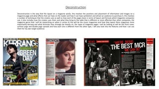
  • 2. Front cover research one • This front cover by Kerrang shows a in your face layout design to make it stand out, it does this by having the main image cover up a large majority of the page it has also been organized so that the artists on the page are organized so that the most successful and famous is in front and the further behind you get in the layers the less famous and successful you get this is so that way people will recognize the person on the magazine and have a higher chance of knowing who it is on it, the main cover line for the front cover is also made to be big and has on it ” 50 ALBUMS YOU NEED TO HEAR BEFORE YOU DIE “ the dramatic use of the word “die” and “need” shows that the magazine is almost telling the viewer to pick it up it is telling the reader that they need this magazine and need to know this piece of information, the background of the magazine also goes with the topic as it says die at the same time the background shows graves adding an element of fun to the magazine making it more attractive, the barcode for the cover is in the bottom right of the magazine at the bottom likely due to the fact we scan things from top to bottom meaning that the barcode isn't the main attraction and people aren't drawn to it and are instead drawn to the rest of the magazine, the cover lines of the magazine show almost of questions but at the same time they go with the theme of the front cover of the magazine “6 BLOODY GREAT POSTERS!” and ”GERARD WAY EATS THE UK!” the pare both go with the theme of the cover or go with at least main line which is death, at the same time these could also be rhetorical questions because it could make the viewer think does he ”EAT THE UK!” making the viewer think what does the magazine mean by this almost luring the viewer in with question, the artist themselves are positioned to look fun as it shows at the front artist Kurt Cobain pulling a face with Billie Joe Armstrong pulling a pout this shows that the magazine doesn't’t in any way take itself seriously and is more about having fun than being about facts and figures, the mast head is behind the artists themselves could this be the magazine trying to say that the magazine isn't as great as the artists on it and that the artists on it are to great for it.
  • 3. Front cover research two The front cover of this NME magazine shows a extremely big image or main image of Dave Grohl with a cover line/main cover line saying “ IM NOT DEAD!” in capital letters with an exclamation mark the fact that it has his band name the ”Foo Fighters” underneath it this could also be a play on words as you cannot fight when your dead this could therefore of been done to make the artist sound more dramatic and more cool saying he fights even when he’s dead, the magazine has a the mass head in big and bold slightly behind a image meaning that the magazine isn't necessarily focused on itself but much rather getting the information out there this could mean the magazine is trying to say it has more to offer than the other ones out there, the main cover story reads “NEW PRIMALS ALBUM REVIEWED” this has been worded so that it doesn't’t actually give you any detail about the topic and only gives you so much information so that the viewer thinks “what have they got to say about the review” giving a higher chance of the person picking it up and reading it however this could also be saying that it isn't a big topic as it is at the bottom of the page as we scan from top to bottom naturally meaning it will be one of the last things that you see before say walking past therefore it could be saying that the album being reviewed isn't that big of a subject and isn't as important as the rest of the information to take in from the cover, at the same time the main image is of someone who is very successful as he is known for being in three big bands meaning that there is a higher chance of someone knowing who he is and picking up the magazine, this means that the audience of this magazine is likely a older audience as it will be of someone who knows what bands the artists is from and his work and what he has done so likely to be of audience that understands rock music, for my own magazine and audience I could make it so that I have a play on words with the way I word my sentences so that it makes the reader think more and become more interested in the magazine.
  • 4. Content page research one • The dominant image of this content page shows Dave Grohl walking towards the camera with his guitar over his right shoulder while he looks to his left this as a result adds a sense of drama and at the same time this could also have meaning saying that he's walking away from something to focus on his music or could say that he is just him and his music, the sub images are organized so that they are in places were there is no information making them the main focus in them areas and not the information requiring either the person to know the picture and what is going on rather than it telling you this could possibly of been done to save information and so that the magazine content pages don’t require you to put a lot of effort into them you just have to look at the images to get information as it expects you to know the people, the sell lines are down the left side of the content page they are smaller than the main image and under and below two sub images, highlighted and bigger than the information on the sell lines is each one of them has a music artist as its title this could have been done so that you don’t have to read all the information you just need to see your artist read the page number and then turn to that page to get the information you either want or more of it, however a trick that could have been done here is how we naturally read from top to bottom therefore for advertising purposes could the more successful artist have there name higher so it is quicker to see making the viewer more likely to be interested, for my own work what I could do is I could think about my model and props angles and how I could add meaning to them to make it more interesting and dramatic for the viewer to read.
  • 5. Content page research two • On this content page the dominant image is not so much in the center much rather it is further to the top of the page than the bottom or the middle as it is just below the mast head and even slightly covering it this could possible be saying or the magazine saying that it isn't about us its about this artist here, the dominant image itself is of the Artic Monkeys singer Alex Turner however the patriot has been taken to show him looking to his right with his sunglasses on and his hair styled this as a result makes him look stylish and attractive to the viewer as they are more likely to pay attention to him, when it comes to the sell lines they are all over the left side and bottom of the page this could likely of been done as the magazine is trying to get as many artist on it as possible so that way there is a higher chance of someone's band they like being on it at the same time it has the numbers bigger than the artists name and paragraph meaning that the viewer doesn't’t even have to read the paragraph they just need to see the band name and the number and then they can turn to the page that they want, what makes this content page also interesting is how it has the sub images placed underneath the dominant image and to the left of it this as a result could be the magazine trying to say that this artist id bigger and more important than these artists making the viewer/reader pay more attention to the bigger picture than the little ones as they will not see the little ones as being as important as the big one, along the right side of the content page is information on reviews of artists what makes it interesting is how these artist have there own spot on the page there are not with the other sell line artists, for my own magazine I could look at what artists I use and how I can make it so that one seems more important than the others without actually writing anything that suggests that.
  • 6. Double page spreads research one On the top right of the double page spread is a quote saying “WE WERE REBELLING AGAINST WHO WE WERE” it then says who is saying it underneath saying “Frank Iero” the quote is also in the colour red this could have been done as red is often correlated with rebelling and blood and bad topics therefore the magazine could be trying to say them rebelling isn't seen or is a good thing, the main image takes up more than a full page this could be done to show that the band is a big thing that people know about the way that they are position also suggests that they don’t need to do anything as none are pulling extremely dramatic poses this at the same time could be the magazines way of trying to go with the topic of rebelling shows they don’t need to pose and that they are themselves as at the same time they aren't dressed fancy they are wearing casually clothes, what makes this double page spread interesting is how it doesn't’t have any sub images this is likely to have been done so that there is no distractions and so that you just focus on the band that the magazine wants you to, for my own magazine what I could do is take inspiration from the way which the models have been angled as there is four of them but none of them are the same angle dressed the same or are pulling the same facial expression, I could also take inspiration from the style and how they have been presented as the band (My Chemical Romance) is know for being an emo punk rock metal band meaning that the band is going to be dressed in the genre they are meaning I could do something similar with my genre were I dress my models or model in the style of a the genre what I am doing, some symbolism behind the way the models have been angled and presented could how the quote says “WE WERE REBELLING AGAINST WHO WE WERE” the symbolism could be that they are a band and in the main image they don’t have there instruments this could show who they are rebelling by not being who they are know for being.
  • 7. Double page research two In the middle of the page there is a quote by the artist (Jay-Z) red and full capital saying “EVERYONE TRYING TO DO SOMETHING NEW IS GOING TO COME UP AGAINST A NOEL GALLAGHER FIGURE IN THEIR LIFE” what makes this quote interesting is how Jay-Z is angled and presented in the main image as it shows him were sunglasses or shades which you can see his eyes this as a result adds a sense of mystery as you don’t know what he is thinking as you cant see his full facial expression and at the same time it is just his face and head this could be as a result a way of Jay-Z saying am the one who said that nobody else or nobody was there to influence me these are my own words as it does not show him with anybody else, the quote itself could be a reference to how Noel Gallagher was done for plagiarism three times therefore it could also be Jay-Z’s way of saying that no matter what you create there's going to be those that try to profit from it, the main image also has two colours behind it red and green the correlation to this could be red being a colour that is often correlated with anger and hatred and green which is often correlated with things being okay, good and positive, one thing about the image which is likely to have been done on purpose is how the red over laps the green and is more brighter and stands out this as a result could be the magazine way of saying that there is more on the models mind which is bad than there is good, the way the double spread sheet has been laid out is on the right side you have the main image and then on the right page it is only information with a massive “J” on it and then on top of the “J” is a masthead which says “THE MOST EXCITING PEOPLE IN MUSIC JAY-Z” the way the mast head has been laid out on top of the ”J” could be the magazines way of saying that Jay-Z or the artist is on top of everything and that he’s on top of it all with what he is doing, for my own magazine what I could do for inspiration from this double page is I could use my colours and what they are correlated with to add hidden meaning to the main images and at the same time what I could also do is add a quote but not just a quote but one which people can read and think and understand what it is a reference to.