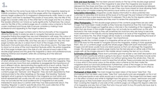
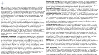
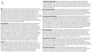
The document summarizes the contents page of a magazine. It discusses various design elements including the title, page numbers, headings, date and issue number, subscription information, photographs and layout. The title uses the magazine's house style and bold fonts to represent power for its male audience. Page numbers are in black font to aid navigation. Headings like "Features" and "Regulars" introduce article types in bold with red underlines. The main image is of band Take That in black and white to portray them as classic artists. Other images and summaries entice readers to learn more without revealing full details. The layout places text on the sides framing images in the middle.
More than ever, open source software is at the heart of modern online businesses and technology companies. Open source is nearly everywhere: web browsers, smartphones, home wireless routers, databases, web servers, and countless components of free, commercial, and large enterprise software. But most open source software comes with strings attached, and if misunderstood, they can trip up the unwary.
Recently Ansel Halliburton held a webinar to discuss the common pitfalls in open source licensing, and the best practices for avoiding them.
In a conference held jointly by AMSCO and Nigerian Planning Commission, a panel discussion was held on "Increasing Access to Finance" in the context of Nigeria.
(PFC305) Embracing Failure: Fault-Injection and Service Reliability | AWS re:...Amazon Web Services
Complex distributed systems fail. They fail more frequently, and in different ways, as they scale and evolve over time. In this session, you learn how Netflix embraces failure to provide high service availability. Netflix discusses their motivations for inducing failure in production, the mechanics of how Netflix does this, and the lessons they learned along the way. Come hear about the Failure Injection Testing (FIT) framework and suite of tools that Netflix created and currently uses to induce controlled system failures in an effort to help discover vulnerabilities, resolve them, and improve the resiliency of their cloud environment.
Synacor Mail – Operation Zimbra for Service Providers, Part IIZimbra
Join Matthew Berg, Synacor E-mail Lead Engineer, to this video series about Operation Zimbra Collaboration for Service Providers.
In this second part Matthew will talk about Synacor Operations.
Biological screening of herbal drugs: Introduction and Need for
Phyto-Pharmacological Screening, New Strategies for evaluating
Natural Products, In vitro evaluation techniques for Antioxidants, Antimicrobial and Anticancer drugs. In vivo evaluation techniques
for Anti-inflammatory, Antiulcer, Anticancer, Wound healing, Antidiabetic, Hepatoprotective, Cardio protective, Diuretics and
Antifertility, Toxicity studies as per OECD guidelines
June 3, 2024 Anti-Semitism Letter Sent to MIT President Kornbluth and MIT Cor...Levi Shapiro
Letter from the Congress of the United States regarding Anti-Semitism sent June 3rd to MIT President Sally Kornbluth, MIT Corp Chair, Mark Gorenberg
Dear Dr. Kornbluth and Mr. Gorenberg,
The US House of Representatives is deeply concerned by ongoing and pervasive acts of antisemitic
harassment and intimidation at the Massachusetts Institute of Technology (MIT). Failing to act decisively to ensure a safe learning environment for all students would be a grave dereliction of your responsibilities as President of MIT and Chair of the MIT Corporation.
This Congress will not stand idly by and allow an environment hostile to Jewish students to persist. The House believes that your institution is in violation of Title VI of the Civil Rights Act, and the inability or
unwillingness to rectify this violation through action requires accountability.
Postsecondary education is a unique opportunity for students to learn and have their ideas and beliefs challenged. However, universities receiving hundreds of millions of federal funds annually have denied
students that opportunity and have been hijacked to become venues for the promotion of terrorism, antisemitic harassment and intimidation, unlawful encampments, and in some cases, assaults and riots.
The House of Representatives will not countenance the use of federal funds to indoctrinate students into hateful, antisemitic, anti-American supporters of terrorism. Investigations into campus antisemitism by the Committee on Education and the Workforce and the Committee on Ways and Means have been expanded into a Congress-wide probe across all relevant jurisdictions to address this national crisis. The undersigned Committees will conduct oversight into the use of federal funds at MIT and its learning environment under authorities granted to each Committee.
• The Committee on Education and the Workforce has been investigating your institution since December 7, 2023. The Committee has broad jurisdiction over postsecondary education, including its compliance with Title VI of the Civil Rights Act, campus safety concerns over disruptions to the learning environment, and the awarding of federal student aid under the Higher Education Act.
• The Committee on Oversight and Accountability is investigating the sources of funding and other support flowing to groups espousing pro-Hamas propaganda and engaged in antisemitic harassment and intimidation of students. The Committee on Oversight and Accountability is the principal oversight committee of the US House of Representatives and has broad authority to investigate “any matter” at “any time” under House Rule X.
• The Committee on Ways and Means has been investigating several universities since November 15, 2023, when the Committee held a hearing entitled From Ivory Towers to Dark Corners: Investigating the Nexus Between Antisemitism, Tax-Exempt Universities, and Terror Financing. The Committee followed the hearing with letters to those institutions on January 10, 202
Welcome to TechSoup New Member Orientation and Q&A (May 2024).pdfTechSoup
In this webinar you will learn how your organization can access TechSoup's wide variety of product discount and donation programs. From hardware to software, we'll give you a tour of the tools available to help your nonprofit with productivity, collaboration, financial management, donor tracking, security, and more.
Embracing GenAI - A Strategic ImperativePeter Windle
Artificial Intelligence (AI) technologies such as Generative AI, Image Generators and Large Language Models have had a dramatic impact on teaching, learning and assessment over the past 18 months. The most immediate threat AI posed was to Academic Integrity with Higher Education Institutes (HEIs) focusing their efforts on combating the use of GenAI in assessment. Guidelines were developed for staff and students, policies put in place too. Innovative educators have forged paths in the use of Generative AI for teaching, learning and assessments leading to pockets of transformation springing up across HEIs, often with little or no top-down guidance, support or direction.
This Gasta posits a strategic approach to integrating AI into HEIs to prepare staff, students and the curriculum for an evolving world and workplace. We will highlight the advantages of working with these technologies beyond the realm of teaching, learning and assessment by considering prompt engineering skills, industry impact, curriculum changes, and the need for staff upskilling. In contrast, not engaging strategically with Generative AI poses risks, including falling behind peers, missed opportunities and failing to ensure our graduates remain employable. The rapid evolution of AI technologies necessitates a proactive and strategic approach if we are to remain relevant.
Acetabularia Information For Class 9 .docxvaibhavrinwa19
Acetabularia acetabulum is a single-celled green alga that in its vegetative state is morphologically differentiated into a basal rhizoid and an axially elongated stalk, which bears whorls of branching hairs. The single diploid nucleus resides in the rhizoid.
Synthetic Fiber Construction in lab .pptxPavel ( NSTU)
Synthetic fiber production is a fascinating and complex field that blends chemistry, engineering, and environmental science. By understanding these aspects, students can gain a comprehensive view of synthetic fiber production, its impact on society and the environment, and the potential for future innovations. Synthetic fibers play a crucial role in modern society, impacting various aspects of daily life, industry, and the environment. ynthetic fibers are integral to modern life, offering a range of benefits from cost-effectiveness and versatility to innovative applications and performance characteristics. While they pose environmental challenges, ongoing research and development aim to create more sustainable and eco-friendly alternatives. Understanding the importance of synthetic fibers helps in appreciating their role in the economy, industry, and daily life, while also emphasizing the need for sustainable practices and innovation.
Introduction to AI for Nonprofits with Tapp NetworkTechSoup
Dive into the world of AI! Experts Jon Hill and Tareq Monaur will guide you through AI's role in enhancing nonprofit websites and basic marketing strategies, making it easy to understand and apply.
Model Attribute Check Company Auto PropertyCeline George
In Odoo, the multi-company feature allows you to manage multiple companies within a single Odoo database instance. Each company can have its own configurations while still sharing common resources such as products, customers, and suppliers.
Honest Reviews of Tim Han LMA Course Program.pptxtimhan337
Personal development courses are widely available today, with each one promising life-changing outcomes. Tim Han’s Life Mastery Achievers (LMA) Course has drawn a lot of interest. In addition to offering my frank assessment of Success Insider’s LMA Course, this piece examines the course’s effects via a variety of Tim Han LMA course reviews and Success Insider comments.
2. Title- The title has the same house style as the rest of the magazine, keeping an
overall consistency throughout all of the pages within the magazine. As the
primary target audience for Q magazine is predominantly male, there is a use of
large, black, bold text to represent the power of masculinity. Also the title of this
page has a border unlike any of the other text on the page and this is to attract
the readers attention as it stand out quite significantly. Furthermore, the colours
used for the title of this contents page are of a similar colour scheme to the front
covers masthead and house style to ensure consistency making it look
professional and appealing to the target audience.
Page Numbers- The page numbers add to the functionality of the magazine
allowing the reader to easily be able to navigate themselves around the
magazine finding the pages they are most interested in with ease. The colour of
the page numbers follow the colour scheme and house style of Q as they are in
black, just like the contents title, and they are also in a bold font. Also the main
page numbers are also in a black font in front of the images of the artists
featured in that particular article as well as in the article column. This helps them
to stand out as some of the most important features within the entire magazine.
All of the page numbers are in the style of a list, placed at each side of the
double page spread and this gives the magazine a clean and professional look,
keeping minimal and simplistic whilst still containing all of the relevant
information.
Headings and Subheadings- These are used to give the reader a general idea
of what articles and content they will be able to find within the magazine. They
are bold and also have thick red underlines to exaggerate the importance of
each different article, demonstrating the significance of each article. They fit
the house style of the magazine again standing out to the reader, drawing in
their attention making them want to read on. The main headings on the
contents page are ‘Features’ and ‘Regulars’; they are both separated by their
individual style to the other headings on the page. The heading ‘Features’
highlights what is going to be featured in the magazine as most artists and
bands represented are usually one offs and could possibly interest readers who
may not actually be the usual audience for Q magazine but are purely
interested to read about a certain artist they may feel passionate about. The
heading ‘Regulars’ is used to specifically show the usual collectors of the
magazine what is always/is usually within Q magazine.
Date and Issue Number- This has been placed clearly on the top of the double page spread
and this allows the collectors of the magazine to see when the magazine was issued and
released into the shops and they can then see when the next issue will probably be released.
The issue number also allows the reader to see if they may have missed an issue allowing them
to take action of maybe ordering the previous issue online or just miss one issue out.
Subscription Information- Magazines usually display information to allow potential new
customers to subscribe and receive all the issues of Q through the post instead of them having
to go out and buy a new issue every time it is released. This is also for the regular collectors if
their previous subscription expires and they want to renew the subscription.
Other Photographs- On the double page spread of the contents page there are also other
images that have been made smaller as they have less importance than the main image,
however all of the images put together play a vital role in the marketing of the magazine. The
artists that are shown in the smaller images may not actually be as well known as the artist
featured in the main image as they will sometimes be musicians who are trying to become
more well-known in the industry and by being featured in an issue of the magazine can help
them to achieve this. The other images will be made to a smaller size representing the level of
importance in each image, (smaller image = less importance)
Layout- Usually the contents page of a magazine will be set out in ordered columns so it
becomes easy for the reader to navigate around the magazine, making it more appealing to
them. Also on a contents page usually the whole page is filled with both information and
images and will never usually have any blank spaces as that can damage the magazines
image. This double page contents page mainly has the text placed on either side of the two
pages with all the images placed in the middle almost making the text act as a frame.
Summaries of Each Article- These short summaries give the reader a very brief description and
insight of what a particular article is going to be about. Usually these summaries include some
of the most exciting pieces of information, but without giving away the whole story. They do
this to encourage the reader to want to read the full article. These summaries are also placed
in a box which is the same colour as the whole colour scheme as this then make the
magazine stand out and look professional. Furthermore, some of the images on the double
page spread will be linked the some of the summaries all in conjunction with each other so
they do not confuse the readers of the magazine.
Photograph of Main Artist- The main image has been taken of the band ‘Take That.’ The
photograph that has been used make ‘Take That’ look playful and very energetic as this is not
the usual pose bands or solo artists would use in a photo-shoot. The image that has been used
is in the effect of black and white to highlight how this group is a classic, well-known and well-
loved group as they have been around for such a long time. Having this large image of ‘Take
That 'covering the majority of one side of the contents page can intrigue the regular collectors
of Q magazine and also fans of Take That who may just want to buy this particular issue due to
the main article being all about them.
3. Title- The title of the contents page has the same house style as the rest of the
magazine to ensure consistency throughout the issue. As the primary target
audience of Q is Male, Q chooses to use bold fonts to represent power and
authority. In addition, the title has a border unlike the other areas of text that are
also on the same page and this has been done to attract the readers attention
and clearly display the information to allow the readers to understand what this
particular issue is about. Furthermore, the colours that have been used for the
title’s font are of a similar colour scheme to the rest of the magazine e.g. red,
black and white.
Page Numbers- The page numbers add to the functionality of the magazine
allowing the reader to easily be able to navigate themselves around the
magazine finding the pages they are most interested in with ease. The colour of
the page numbers follow the colour scheme and house style of Q as they are in
black, just like the contents title, and they are also in a bold font. Also the main
page numbers are also in a black font in front of the images of the artists
featured in that particular article as well as in the article column. This helps them
to stand out as some of the most important features within the entire magazine.
All of the page numbers are in the style of a list, placed at each side of the
double page spread and this gives the magazine a clean and professional look,
keeping minimal and simplistic whilst still containing all of the relevant
information.
Headings and Subheadings- These are used to give the reader a general idea
of what articles and content they will be able to find within the magazine. They
are bold and also have thick red underlines to exaggerate the importance of
each different article, demonstrating the significance of each article. They fit
the house style of the magazine again standing out to the reader, drawing in
their attention making them want to read on. The main headings on the
contents page are ‘Features’ and ‘Regulars’; they are both separated by their
individual style to the other headings on the page. The heading ‘Features’
highlights what is going to be featured in the magazine as most artists and
bands represented are usually one offs and could possibly interest readers who
may not actually be the usual audience for Q magazine but are purely
interested to read about a certain artist they may feel passionate about. The
heading ‘Regulars’ is used to specifically show the usual collectors of the
magazine what is always/is usually within Q magazine.
Date and Issue Number- This has been placed clearly on the top of the double page spread
and this allows the collectors of the magazine to see when the magazine was issued and
released into the shops and they can then see when the next issue will probably be released.
The issue number also allows the reader to see if they may have missed an issue allowing them
to take action of maybe ordering the previous issue online or just miss one issue out.
Subscription Information- Magazines usually display information to allow potential new
customers to subscribe and receive all the issues of Q through the post instead of them having
to go out and buy a new issue every time it is released. This is also for the regular collectors if
their previous subscription expires and they want to renew the subscription.
Summaries of Each Article- These short summaries give the reader a very brief description and
insight of what a particular article is going to be about. Usually these summaries include some
of the most exciting pieces of information, but without giving away the whole story. They do
this to encourage the reader to want to read the full article. These summaries are also placed
in a box which is the same colour as the whole colour scheme as this then make the
magazine stand out and look professional. Furthermore, some of the images on the double
page spread will be linked the some of the summaries all in conjunction with each other so
they do not confuse the readers of the magazine.
Photograph of Main Artist- The main article in this magazine is about John Lennon. The main
image is of John Lennon himself, the shot that has been taken is very serious and professional
demonstrating John to be a very serious artist. Q has chosen this as their main image as he is a
widely known artist who has been around for a considerable amount of time starring in the
Beatles and also as a solo artist and therefore would appeal to a very large audience. The
colour of this main image is black and white to emphasise John Lennon as an example of a
classic artist and that his legacy has been around for a recognisable amount of time. The
black and white image stands out against the other images placed on the contents page as
not only is it the biggest image, it is the only one in black and white whereas the others are in
colour. Having the main image of the effect black and white can highlight class in society
and tradition, this also helps to describe the artist through the use of just an image.
Layout- Usually the contents page of a magazine will be set out in ordered columns so it
becomes easy for the reader to navigate around the magazine, making it more appealing to
them. Also on a contents page usually the whole page is filled with both information and
images and will never usually have any blank spaces as that can damage the magazines
image. This double page contents page mainly has the text placed on either side of the two
pages with all the images placed in the middle almost making the text act as a frame.
Other Photographs- On the double page spread of the contents page there are also other
images that have been made smaller as they have less importance than the main image,
however all of the images put together play a vital role in the marketing of the magazine. The
artists that are shown in the smaller images may not actually be as well known as the artist
featured in the main image as they will sometimes be musicians who are trying to become
more well-known in the industry and by being featured in an issue of the magazine can help.
4. Title- The title of the contents page has the same house style as the rest of the
magazine to ensure consistency throughout the issue using a bold, modern and
almost graffiti styled font. As the primary target audience of Billboard are
teenagers of both genders, Billboard chooses to use modern styled fonts to
appeal to the younger generation and make the magazine seem ‘cool.’ In
addition, the title has a border unlike the other areas of text that are also on the
same page, but this has been done to draw in the readers attention and clearly
be able to recognise what page of the magazine they are looking at.
Furthermore, the colours that have been used for the title’s font and border
follow the colour scheme of the whole magazine and the other issues e.g. blue,
black, white and a few of the primary colours.
Page Numbers- The page numbers add to the functionality of the magazine
allowing the reader to easily be able to navigate themselves around the
magazine finding the pages that they are going to be most interested in. The
colour of the page numbers follow the colour scheme and the house style of
Billboard as they are in black, just like the contents title, and they are also in a
bold font but stand out less than the title, as Billboard would not want the page
numbers to over rule the main aspect; being the title. Also the main (most
important) page numbers are in front of some of the images that are displayed
on this page giving the audience a visual image of who a particular article is
about. This helps them to stand out as some of the most important features
within the magazine. All of the page numbers are in the style of smaller lists
placed in certain categories such as ‘Upfront’ and ‘Music’ this gives the
magazine an organised and professional look containing all the relevant
information in a format that the readers will easily be able to understand.
Photograph of Main Artist- The main image for this contents page has been placed in the
middle of the page next to the majority of the text and information. The main image is a
coloured image of a solo artist who is seen to be looking away into the distance (looking in the
opposite direction of the text) this connotes the artist to be looking into his ‘successful’ future
ahead of the other artists that have been labelled as he is looking away from them and is the
main artist of this issue.
Layout- The layout of this contents page is fairly simple to ensure that the
readers are able to easily navigate around the issue. Billboard choose to have
a slight different layout by having a strip on the right hand side of the page
showing all the current number 1 music albums, songs and artists which would
be set out in alphabetical order to allow the audience to easily find who they
may be looking for. Then on the other side, they have a few images from the
more interesting pages in the magazine and the text displaying and
summarising each page and article. Practically all the space is filled.
Summaries of Each Article- These short summaries give the reader a very brief description and
insight of what a particular article is going to be about. Usually these summaries include some
of the most exciting pieces of information, but without giving away the whole story.
These summaries are placed next to the title of some of the pages that are exemplified in a
bright blue colour, there is no real organisation Furthermore, some of the images on the double
page spread will be linked the some of the summaries all in conjunction with each other so they
do not confuse the readers of the magazine.
Headings and Subheadings- These are used to give the reader a general idea of what articles
and content they will be able to find within the magazine. They are bold and also have thick
red underlines to exaggerate the importance of each different article, demonstrating the
significance of each article. They fit the house style of the magazine again standing out to the
reader, drawing in their attention making them want to read on. The main headings on the
contents page are ‘Music’ and ‘Regulars’; they are both separated by their individual style to
the other headings on the page. The heading ‘Features’ highlights what is going to be featured
in the magazine as most artists and bands represented are usually one offs and could possibly
interest readers who may not actually be the usual audience for Billboard magazine but are
purely interested to read about a certain artist they may feel passionate about.
Other Photographs- On the single page contents page there are also other images that have
been made smaller as they have less importance than the main image, however all of the
images put together play a vital role in the marketing of the magazine. The artists that are
shown in the smaller images may not actually be as well known as the artist featured in the
main image as they will sometimes be musicians who are trying to become more well-known in
the industry and by being featured in an issue of the magazine can help.
Date and Issue Number- This has been placed clearly on the top of the double page spread
and this allows the collectors of the magazine to see when the magazine was issued and
released into the shops and they can then see when the next issue will probably be released.
The issue number also allows the reader to see if they may have missed an issue allowing them
to take action of maybe ordering the previous issue online or just miss one issue out.
Subscription Information- Magazines usually display information to allow potential new
customers to subscribe and receive all the issues of Billboard through the post instead of them
having to go out and buy a new issue every time it is released. This is also for the regular
collectors if their previous subscription expires and they want to renew the subscription.