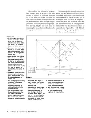
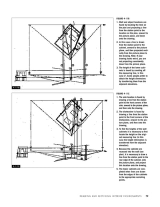
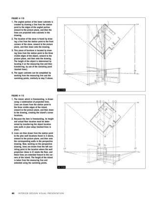
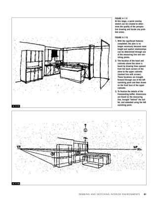
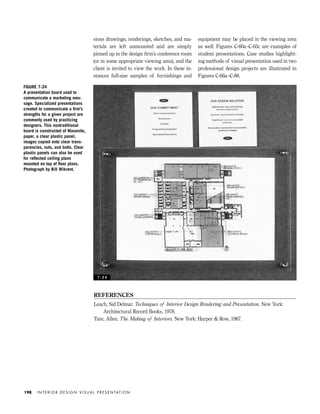
Downloaded 330 times


![REFERENCES
Benun, Ilise. Self Promotion Online. Cincinnati, Ohio: North Light Books, 2001.
Berry, Wayne. 15 Seconds: Creating a CD-ROM from a Web Site [online]. Available at
www.15seconds.com/issue/990708.htm, 1999.
Berryman, Gregg. Designing Creative Portfolios. Menlo Park, Calif.: Crisp Publications, 1994.
———. Designing Creative Resumes. Menlo Park, Calif.: Crisp Publications, 1990.
Bostwick, Burdette. Resume Writing. New York: John Wiley & Sons, 1990.
Horton, S., and P. Lynch. Web Style Guide: Basic Design Principles for Creating Web Sites. New
Haven, Conn.: Yale University Press, 2002.
Kirby, J. Douglas. Educational Technology: Digital Portfolios [online]. Available at
www.dkirby.com/edtech/digitalportfolio.htm, 2002.
Linton, Harold. Portfolio Design. New York: W. W. Norton, 2000.
Marquand, Ed. Graphic Design Presentations. New York: Van Nostrand Reinhold, 1986.
Oldach, Mark. Creativity for Graphic Designers. New York: McGraw-Hill, 1998.
Rich, Jason. Job Hunting for the Utterly Confused. Cincinnati, Ohio: North Light Books, 1995.
Swan, Alan. The New Graphic Design School. New York: John Wiley & Sons, 1997.
Williams, Robin. The Non-Designer’s Web Book. Berkeley, Calif.: Peachpit Press, 2000.
———. The Little Mac Book. Berkeley, Calif.: Peachpit Press, 1999.
———. The Non-Designer’s Type Book. Berkeley, Calif.: Peachpit Press, 1998.
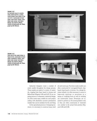
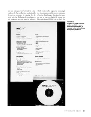
all computers will have the programs needed to
open and view customized slide shows and spe-
cialized CAD images. In cases where these items
are used, it is necessary to include viewer soft-
ware on the CD as well as instructions for use.
My interviews with those hiring designers
consistently point to a willingness to review
digital portfolios. All of those interviewed to
date have stated that they would be willing to
access a Web site if the resume and cover let-
ter indicated a high-caliber applicant. One firm
expressed concern about inserting an unkown
CD into the company’s computer system due to
a fear of viruses. However, the digital portfolio
is consistently seen by employers as a way to
get one’s foot in the door, paving the way for
the “real” portfolio. Therefore, the digital por-
folio is a worthwhile tool for recording and
sharing one’s work, but it should be used as
part of a total package that relies on the re-
sume, cover letter, and physical portfolio to
convey strengths, skills, and knowledge.
Clearly, developing a successful resume and
portfolio takes work, talent, and time. The
graphic design and organization of these ele-
ments deserve careful consideration and a seri-
ous look inward. By taking an honest inventory
of your objectives, work, interests, talents, and
skills, you can design a system that communi-
cates your identity to potential employers. Devel-
oping a schedule and budget for your portfolio
system in your final semester at school is ex-
tremely helpful. Researching potential employ-
ers and firms early in your last year of school is
highly advisable. Practicing professionals are
well advised to save everything (make copies!)
for inclusion in a future portfolio — because in
a designer’s life learning never ends.
I N T E R I O R D E S I G N V I S U A L P R E S E N TAT I O N226
IDVP 8 5/27/03 3:30 PM Page 226](https://image.slidesharecdn.com/interiordesignvisualpresentation-150721071009-lva1-app6891/85/INTERIOR-DESIGN-VISUAL-PRESENTATION-238-320.jpg)

The document is a guide on interior design visual presentation techniques, emphasizing graphics, models, and methods for effective communication in the design process. It covers various drawing styles, including orthographic projections, perspective drawings, and computer-generated imagery, while also discussing the importance of presentation quality in conveying design concepts. The intention is to serve as a primer for students and practitioners, highlighting diverse presentation methods rather than standardizing a single approach.