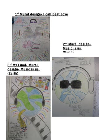
Individual 3 mural designs
•Download as DOC, PDF•
0 likes•138 views
The document proposes 3 mural design concepts: 1) "I call beat Love", 2) "Music is us (Earth)", and 3) an improved "Music is us (Earth)" design.
Report
Share
Report
Share
Recommended
Analysing existing digipaks
The digipak for Muse's album "Black Holes & Revelations" follows a conventional layout with the band name on the front and tracklist on the back. It uses imagery throughout relating to the album's apocalyptic and space themes, including images of the four horsemen of the apocalypse and the sun. The typography on the front cover is in all capital sans serif letters matching the style on the booklet. Images inside portray the band as serious musicians and the CD tray design suggests the genre of space rock.
Project pitch for digipak and magazine advert
Carl Ward proposes a magazine advertisement and digipak design for a folk band. He researches ads by Mumford and Sons and Noah and the Whale as examples for fitting the folk genre. For the magazine ad, Carl sketches layout ideas including the band name, digipak name/features, and release date. For the digipak design, Carl considers front cover images combining the band name with nature images relating to the album. The inside would include the CDs with tree tops, reviews, and band information. The back would list songs and continue the front image. Carl aims to practice filming techniques in addition to lip syncing for a required video task and seeks audience feedback through a survey.
Evaluation question 2
The combination of the band's main album and ancillary texts is effective because:
1) All media products share similarities to create brand recognition and stick to the band's genre.
2) The color blue is used throughout promotional materials to represent the album's nickname.
3) Referencing songs through album artwork follows industry conventions and highlights singles to potential buyers.
Ancillary task – digipak drafts
Robbie Watson is designing a digipak for an album featuring triangle shapes and the colors red, black and white. The front cover features a house-like triangle design referencing the album's name. The back cover also uses triangles to list the song titles. The inside left depicts an empty stage to highlight an acoustic song version. The inside right has a simpler upside down triangle design since it will be covered by the CD.
Digi pack Analysis
The document provides details from a Linkin Park album cover and back cover. It summarizes key elements like the band name in bold font, the album name below it, an image of a band member from the music video, song lyrics from the first track, and production crew credits. Overall, it aims to connect the album visually to the band's music video and give fans information about the album's contents.
Mood board
A digipak typically contains two CDs labeled as disk one and disk two, along with a contents listing providing the song number for each track to help listeners identify and skip to favorite songs. Some digipaks may also include additional items like a poster of the artist, as Beyoncé did for her Flawless album which included a poster for purchasers. Digipaks appeal to music fans who enjoy collecting albums across various music genres.
Poster analysis
The poster advertises an upcoming Arctic Monkeys album using their logo, name, and album release date to clearly communicate what is being promoted while reinforcing the band's image and star power. A minimalist black and white design features their soundwave-style logo in the top center, reminiscent of the band's style across platforms like YouTube. The lack of additional images suggests the band wants fans to focus solely on the new album.
What do digipacks include
1. The document describes the typical contents and layout of a digipack, including images of the artist on the front and sides, the album title, track listing, barcode, and sometimes a band logo or symbol representing their style of music.
2. It contrasts the digipacks of major artist Britney Spears and indie band Oasis. Spears' pack prominently features seductive images of her on three sides to entice buyers, while Oasis' does not show the band but instead features a guitar to represent their music style.
3. Both packs include the artist and album name on the front and spine for identification.
Poster analysis
The poster advertises the new album from Arctic Monkeys using minimal design elements. It features the band's name and logo in black and white at the top to identify the band and reinforce their image. Below is their soundwave-style logo reminiscent of how the band presents itself across platforms. The release date informs viewers when the album can be purchased on CD or downloaded, communicating availability on different platforms. An overall minimalist design with just text and the soundwave image aims to focus attention on the album itself for fans.
Media Evaluation Question 2
The document discusses the creation of a music brand identity across three promotional pieces - a music video, digital album packaging, and magazine advertisement. The group established a consistent brand identity using the motif of a red handprint, which featured prominently in all three pieces. House colors of red, black, and white were also used consistently to create a simple yet effective visual style. While the font changed slightly between pieces for variety, the red handprint image motif remained the same central identifying element. Still images from the music video were also utilized in creating the ancillary promotional materials.
Evaluation question 3
The document discusses how the main product (music video) and ancillary texts (album covers, inserts, poster) work together through consistent use of house colors, imagery, and typography. The creator established green, blue, and brown as the house colors based on a location shoot. These colors were then featured across all ancillary texts through photo editing to create a cohesive brand identity. Additionally, imagery of the artist and location were repeated as motifs, white typography was used consistently, and fake industry information was included to make the materials seem more professional.
Media Evaluation Question 2
The document discusses the creation of a music brand identity across three promotional pieces - a music video and two ancillary tasks. The brand identity centered around a red hand motif that was featured prominently in the video and printed materials. House colors of red, black, and white were used consistently, and typography was mostly consistent across pieces with a subtle change in the video. Genre characteristics like a fast cut pace without transitions were employed to match the fast tempo of the song. Still images from the video featuring the red hand motif were also used in the ancillary tasks to promote the album in a recognizable way.
Dan watts practice essay question
The document summarizes the application of communication theories to an album cover, back cover, and CD. The front cover features a dove symbolizing freedom from worries, as well as its association with drugs at raves. The producer name "Sanctum of House" indicates the genre is house music. Neale's theory is also applied through the consistent use of white, grey, and black colors on the covers and CD, as well as repeating the song title "Discolights."
Cd case – de shamonix
We took multiple photos of the band at their gigs to find the perfect image for the CD cover using a Canon EOS camera. We uploaded the photos to our Mac and edited them in Photoshop, choosing a low-key lit photo of the band in focus against a darker background. The back cover and inside booklets featured the same simple design and font as the front for consistency. The photo used on the CD was also used in a magazine ad to link the two. The overall case was kept basic but effectively promoted the band for their debut album.
Analysis digipak
The document analyzes common elements of album packaging designs such as digipaks. It notes that most designs prominently feature a close-up portrait of the artist to make them recognizable. They also usually display the artist's name in bold text to connect the name to the artist. Additionally, album titles are included to differentiate each release while relating to the music contained. Other standard elements include barcodes for identification, track listings, company logos and copyright information. The conclusion states that successful album designs attract audiences with bold, eye-catching elements focused on the artist to build their star image and reputation.
Charlie simpson – young pilgrim
The album cover features a simple layout with a central image of the artist in a natural field setting, playing a guitar. This relates to the folk/rock genre and ties into the natural locations and guitar playing featured in the artist's music videos. The camera uses a long shot to clearly show the natural location, guitar prop, and casual costume, linking these visual elements to the genre and theme of the artist's songs. Natural green and blue colors dominate the cover, as is common for this genre, with darker tones at the bottom graduating to lighter tones at the top. The fonts used for the artist and album names are a serif and sans-serif respectively, keeping with the simple style appropriate for this genre.
Conventions of a Digipak
A digipak is an alternative to a plastic jewel CD case, made of printed thick card containing a plastic CD holder. Digipaks allow artists to showcase their brand through images related to their music videos or style. Examples provided include albums by Hole, Black Honey, Harry Styles, and The Script that featured imagery connecting the album art to their music. The front of a digipak introduces the artist, while the inside, back, and fold-out panels continue imagery and lyrics to provide context for the artist and album. Advantages include giving audiences insight into the artist's vision, while disadvantages are less durability than jewel cases.
Fosterthepeople album cover
The album cover uses a warm yellow tone for the title "torches" and the torches in the image to visually link the two. The stylised drawing on the nonconventional cover links to the indie pop genre. Additionally, the drawing showcases the band's creative aspects. The same thin, elongated font is used on the back cover and album information to maintain visual continuity. Websites on the back lead to the band's and production companies' sites. The cover artwork was designed by a friend of the band's singer but caused initial debate, though it became integrated into their live shows and merchandise.
Evaluation q2
The document discusses the themes, promotion methods, house style, layout, imagery, and critical theory used for a music video and accompanying print products. The main themes of the music video are happiness, energy, color, and unity, as shown through camera work, set design, and editing. Promotion will involve releasing teaser images on social media to attract both male and female audiences. The house style carries over colors, fonts, and branding across print products to create cohesion. Layout maintains a simple, playful style. Multiple locations are used in the video to add interest, while photography in the streets reinforces themes of freedom. Maintaining eye contact with the audience breaks the fourth wall and creates intimacy.
Cd digipak analysis
The document describes the design elements of a music album packaging in a digipak format. It includes an image of the artist on the front cover with the track listing and barcode on the back. The album covers and an article about the artist are included inside the digipak, which houses the CD tray in the middle and uses a dark color scheme reflecting the artist's expression.
Digipak analysis
This document analyzes the design elements of several music compilation digipaks, including those for Foo Fighters, Linkin Park, and Autonomie. Some key findings are that vintage vinyl designs signal older rock music, simplistic color schemes and designs appeal most to audiences, and including track listings and additional materials like booklets can encourage purchases. Consistency across the front, back, and interior packaging is also important for audience understanding.
Seafret album cover
This document analyzes the album covers and packaging of albums by the band Seafret. It summarizes:
The first album, "Tell Me It's Real", has a plain blue background that allows the band name and album title to stand out in monotone grayscale costumes. The band members on the cover links to authenticity. The title is in white text for subtlety to match the band as new artists.
The back has the same art deco font as the album title. It is minimal with no artwork, drawing focus to the artists and their craft.
The EP "Oceans" cover also uses blues and has blurred shapes like looking through water, linking to the band name meaning sea fog
In what ways does your media product use
Our media products used many conventions of real bands. Our poster design was similar to album covers we researched, using the same font as Two Door Cinema Club. The poster also included the band's website. Our music video featured the band playing instruments, as in other indie videos. Some shots used a bloom effect. While most indie videos focus on the band, ours specifically featured the lead singer. Our album packaging followed conventions like splitting song titles across two discs. However, our music video challenged conventions by lacking a narrative, unlike most of Two Door Cinema Club's videos, though keeping with the genre's simpler, homemade style.
Question one
The document discusses how the media producer's digipak and music video both use and challenge conventions of real media texts.
The digipak follows conventions like a 4-panel layout but challenges conventions like positioning of the artist name and track listing. The music video uses conventions like close-ups of the performer but challenges conventions through its dark urban setting rather than bright locations typically seen.
Weak intertextual references to Bob Dylan and a stronger reference to Sinéad O'Connor through close-up shots are also made.
Ancillary Task Research by FlowMotion Films
The document analyzes Rudimental's album cover design for their album "Home" and their official website. It notes several key design elements of the album cover including the group's name in large font at the top to emphasize its importance, a small graffiti image indicating their drum and bass music style, and consistency in the bold typography. It also observes the synergy between the album cover and website designs with the same color scheme and font. The document examines other album covers and concludes with lessons learned about the importance of positioning images/text effectively and maintaining synergy between album and website designs to match the artist's style and genre of music.
Ici & itd
Furniture designers come from architecture or interior design backgrounds. They research styles, sketch ideas, develop concepts, select materials, and communicate with clients and manufacturers. The design process involves conceptualizing, prototyping, documentation, and managing production. Furniture designers consider budgets, aesthetics, functionality, and client needs. They create conceptual drawings to present ideas and technical drawings with specifications for manufacturing.
Mural art presentation update 2016
Mankind has created murals on walls for thousands of years, dating back to paintings of animals in caves in France made with natural pigments. Murals have been produced in many cultures around the world on interior and exterior walls of buildings, from ancient Egyptian tombs and Roman bedrooms to the Sistine Chapel ceiling. Modern murals often convey important community messages or celebrate local history and wildlife. Large murals located high on buildings use bright colors and bold designs to be visible from the street below and bring visual interest to neighborhoods.
Mural design project
The document provides information about a mural design project for a high school music wing. It discusses key concepts of mural design including understanding the project criteria, outcomes, and rubric. It also includes examples of different murals from around the world and through history for inspiration. The music wing makeover project challenges students to design murals that will be visually appealing, appropriate for the space, and reflective of the music program. The designs will be judged and selected by the music department. Students should consider themes, styles, elements, and principles when developing their designs.
Architecture in Thailand
The document discusses the history and architecture of temples in Thailand. It describes the typical layout of a Thai Buddhist temple complex, which includes ordination halls, libraries, bell towers, and most prominently, chedis or stupas that house Buddhist relics. The architectural styles of temples evolved over time, from early Khmer influences to distinctive Lanna and Rattanakosin styles. Key elements like the multi-tiered roofs and naga bargeboards are elaborated on. The document provides examples of specific temple structures and regional variations in Thailand.
Indian old master's painting- Jamini Roy
Jamini Roy was a famous Indian painter born in 1887 who died in 1972. He is known for pioneering a distinct style of painting that drew inspiration from the folk art of rural Bengal. Roy's paintings often depicted scenes from everyday life and used simple forms and flat areas of color influenced by the traditions of tribal art.
More Related Content
What's hot
Poster analysis
The poster advertises the new album from Arctic Monkeys using minimal design elements. It features the band's name and logo in black and white at the top to identify the band and reinforce their image. Below is their soundwave-style logo reminiscent of how the band presents itself across platforms. The release date informs viewers when the album can be purchased on CD or downloaded, communicating availability on different platforms. An overall minimalist design with just text and the soundwave image aims to focus attention on the album itself for fans.
Media Evaluation Question 2
The document discusses the creation of a music brand identity across three promotional pieces - a music video, digital album packaging, and magazine advertisement. The group established a consistent brand identity using the motif of a red handprint, which featured prominently in all three pieces. House colors of red, black, and white were also used consistently to create a simple yet effective visual style. While the font changed slightly between pieces for variety, the red handprint image motif remained the same central identifying element. Still images from the music video were also utilized in creating the ancillary promotional materials.
Evaluation question 3
The document discusses how the main product (music video) and ancillary texts (album covers, inserts, poster) work together through consistent use of house colors, imagery, and typography. The creator established green, blue, and brown as the house colors based on a location shoot. These colors were then featured across all ancillary texts through photo editing to create a cohesive brand identity. Additionally, imagery of the artist and location were repeated as motifs, white typography was used consistently, and fake industry information was included to make the materials seem more professional.
Media Evaluation Question 2
The document discusses the creation of a music brand identity across three promotional pieces - a music video and two ancillary tasks. The brand identity centered around a red hand motif that was featured prominently in the video and printed materials. House colors of red, black, and white were used consistently, and typography was mostly consistent across pieces with a subtle change in the video. Genre characteristics like a fast cut pace without transitions were employed to match the fast tempo of the song. Still images from the video featuring the red hand motif were also used in the ancillary tasks to promote the album in a recognizable way.
Dan watts practice essay question
The document summarizes the application of communication theories to an album cover, back cover, and CD. The front cover features a dove symbolizing freedom from worries, as well as its association with drugs at raves. The producer name "Sanctum of House" indicates the genre is house music. Neale's theory is also applied through the consistent use of white, grey, and black colors on the covers and CD, as well as repeating the song title "Discolights."
Cd case – de shamonix
We took multiple photos of the band at their gigs to find the perfect image for the CD cover using a Canon EOS camera. We uploaded the photos to our Mac and edited them in Photoshop, choosing a low-key lit photo of the band in focus against a darker background. The back cover and inside booklets featured the same simple design and font as the front for consistency. The photo used on the CD was also used in a magazine ad to link the two. The overall case was kept basic but effectively promoted the band for their debut album.
Analysis digipak
The document analyzes common elements of album packaging designs such as digipaks. It notes that most designs prominently feature a close-up portrait of the artist to make them recognizable. They also usually display the artist's name in bold text to connect the name to the artist. Additionally, album titles are included to differentiate each release while relating to the music contained. Other standard elements include barcodes for identification, track listings, company logos and copyright information. The conclusion states that successful album designs attract audiences with bold, eye-catching elements focused on the artist to build their star image and reputation.
Charlie simpson – young pilgrim
The album cover features a simple layout with a central image of the artist in a natural field setting, playing a guitar. This relates to the folk/rock genre and ties into the natural locations and guitar playing featured in the artist's music videos. The camera uses a long shot to clearly show the natural location, guitar prop, and casual costume, linking these visual elements to the genre and theme of the artist's songs. Natural green and blue colors dominate the cover, as is common for this genre, with darker tones at the bottom graduating to lighter tones at the top. The fonts used for the artist and album names are a serif and sans-serif respectively, keeping with the simple style appropriate for this genre.
Conventions of a Digipak
A digipak is an alternative to a plastic jewel CD case, made of printed thick card containing a plastic CD holder. Digipaks allow artists to showcase their brand through images related to their music videos or style. Examples provided include albums by Hole, Black Honey, Harry Styles, and The Script that featured imagery connecting the album art to their music. The front of a digipak introduces the artist, while the inside, back, and fold-out panels continue imagery and lyrics to provide context for the artist and album. Advantages include giving audiences insight into the artist's vision, while disadvantages are less durability than jewel cases.
Fosterthepeople album cover
The album cover uses a warm yellow tone for the title "torches" and the torches in the image to visually link the two. The stylised drawing on the nonconventional cover links to the indie pop genre. Additionally, the drawing showcases the band's creative aspects. The same thin, elongated font is used on the back cover and album information to maintain visual continuity. Websites on the back lead to the band's and production companies' sites. The cover artwork was designed by a friend of the band's singer but caused initial debate, though it became integrated into their live shows and merchandise.
Evaluation q2
The document discusses the themes, promotion methods, house style, layout, imagery, and critical theory used for a music video and accompanying print products. The main themes of the music video are happiness, energy, color, and unity, as shown through camera work, set design, and editing. Promotion will involve releasing teaser images on social media to attract both male and female audiences. The house style carries over colors, fonts, and branding across print products to create cohesion. Layout maintains a simple, playful style. Multiple locations are used in the video to add interest, while photography in the streets reinforces themes of freedom. Maintaining eye contact with the audience breaks the fourth wall and creates intimacy.
Cd digipak analysis
The document describes the design elements of a music album packaging in a digipak format. It includes an image of the artist on the front cover with the track listing and barcode on the back. The album covers and an article about the artist are included inside the digipak, which houses the CD tray in the middle and uses a dark color scheme reflecting the artist's expression.
Digipak analysis
This document analyzes the design elements of several music compilation digipaks, including those for Foo Fighters, Linkin Park, and Autonomie. Some key findings are that vintage vinyl designs signal older rock music, simplistic color schemes and designs appeal most to audiences, and including track listings and additional materials like booklets can encourage purchases. Consistency across the front, back, and interior packaging is also important for audience understanding.
Seafret album cover
This document analyzes the album covers and packaging of albums by the band Seafret. It summarizes:
The first album, "Tell Me It's Real", has a plain blue background that allows the band name and album title to stand out in monotone grayscale costumes. The band members on the cover links to authenticity. The title is in white text for subtlety to match the band as new artists.
The back has the same art deco font as the album title. It is minimal with no artwork, drawing focus to the artists and their craft.
The EP "Oceans" cover also uses blues and has blurred shapes like looking through water, linking to the band name meaning sea fog
In what ways does your media product use
Our media products used many conventions of real bands. Our poster design was similar to album covers we researched, using the same font as Two Door Cinema Club. The poster also included the band's website. Our music video featured the band playing instruments, as in other indie videos. Some shots used a bloom effect. While most indie videos focus on the band, ours specifically featured the lead singer. Our album packaging followed conventions like splitting song titles across two discs. However, our music video challenged conventions by lacking a narrative, unlike most of Two Door Cinema Club's videos, though keeping with the genre's simpler, homemade style.
Question one
The document discusses how the media producer's digipak and music video both use and challenge conventions of real media texts.
The digipak follows conventions like a 4-panel layout but challenges conventions like positioning of the artist name and track listing. The music video uses conventions like close-ups of the performer but challenges conventions through its dark urban setting rather than bright locations typically seen.
Weak intertextual references to Bob Dylan and a stronger reference to Sinéad O'Connor through close-up shots are also made.
Ancillary Task Research by FlowMotion Films
The document analyzes Rudimental's album cover design for their album "Home" and their official website. It notes several key design elements of the album cover including the group's name in large font at the top to emphasize its importance, a small graffiti image indicating their drum and bass music style, and consistency in the bold typography. It also observes the synergy between the album cover and website designs with the same color scheme and font. The document examines other album covers and concludes with lessons learned about the importance of positioning images/text effectively and maintaining synergy between album and website designs to match the artist's style and genre of music.
What's hot (17)
Viewers also liked
Ici & itd
Furniture designers come from architecture or interior design backgrounds. They research styles, sketch ideas, develop concepts, select materials, and communicate with clients and manufacturers. The design process involves conceptualizing, prototyping, documentation, and managing production. Furniture designers consider budgets, aesthetics, functionality, and client needs. They create conceptual drawings to present ideas and technical drawings with specifications for manufacturing.
Mural art presentation update 2016
Mankind has created murals on walls for thousands of years, dating back to paintings of animals in caves in France made with natural pigments. Murals have been produced in many cultures around the world on interior and exterior walls of buildings, from ancient Egyptian tombs and Roman bedrooms to the Sistine Chapel ceiling. Modern murals often convey important community messages or celebrate local history and wildlife. Large murals located high on buildings use bright colors and bold designs to be visible from the street below and bring visual interest to neighborhoods.
Mural design project
The document provides information about a mural design project for a high school music wing. It discusses key concepts of mural design including understanding the project criteria, outcomes, and rubric. It also includes examples of different murals from around the world and through history for inspiration. The music wing makeover project challenges students to design murals that will be visually appealing, appropriate for the space, and reflective of the music program. The designs will be judged and selected by the music department. Students should consider themes, styles, elements, and principles when developing their designs.
Architecture in Thailand
The document discusses the history and architecture of temples in Thailand. It describes the typical layout of a Thai Buddhist temple complex, which includes ordination halls, libraries, bell towers, and most prominently, chedis or stupas that house Buddhist relics. The architectural styles of temples evolved over time, from early Khmer influences to distinctive Lanna and Rattanakosin styles. Key elements like the multi-tiered roofs and naga bargeboards are elaborated on. The document provides examples of specific temple structures and regional variations in Thailand.
Indian old master's painting- Jamini Roy
Jamini Roy was a famous Indian painter born in 1887 who died in 1972. He is known for pioneering a distinct style of painting that drew inspiration from the folk art of rural Bengal. Roy's paintings often depicted scenes from everyday life and used simple forms and flat areas of color influenced by the traditions of tribal art.
Hussain Hypocrisy
M.F. Hussain depicted many Hindu religious figures, such as Goddess Lakshmi and Lord Ganesha, in controversial nude paintings. When questioned about offending Hindus, he claimed it was out of respect, but he provided inconsistent explanations. His depictions are criticized as inappropriate given iconic status of figures in Hinduism. In contrast, violent protests erupted globally over Prophet Muhammad cartoons, but Indian media coverage downplayed reaction against Hussain while harshly criticizing those opposing Prophet depictions. This suggests hypocrisy in defending free speech selectively based on religion depicted.
Jamini roy
Jamini Roy was a 20th century Indian artist born in 1887 in Bengal. He was trained in academic painting traditions but looked to folk art for inspiration. Roy helped develop a unique modern Indian art style by combining Western techniques with themes and styles from Indian folk traditions. Some of his most famous works featured Christian icons like Jesus portrayed in the Indian folk art style. Roy spent most of his life and career working in Calcutta and is considered an important figure in the development of modern Indian art.
Amrita sher gil(30 jan 1913-5 dec 1941)
Amrita Sher-Gil was an Indian painter born in 1913 in Budapest, Hungary to an Indian Sikh father and Hungarian-Jewish mother. She received artistic training in Europe before returning to India in the 1930s. Sher-Gil's works were strongly influenced by Indian styles like the Bengal school of art as well as European painters. Her portraits and scenes highlighting women's issues made her an influential figure. Sher-Gil passed away in 1941 at the young age of 28, but her art continues to inspire generations of artists in India and abroad.
Power plugs
this ppt is about the famous women painter artist .with the animations and good qauily of picture.....
Clay modeling
Ceramics are made from primary or secondary clay. Primary clay is formed from decomposing rock, while secondary clay is transported by water, air or ice. Earthenware is made from secondary clay and hardens at low temperatures but remains porous. Before making ceramics, clay must be wedged and kneaded to remove air bubbles and distribute water evenly to prevent explosions during firing. Clay goes through stages such as leather hard and bone dry during drying and is shaped using techniques like coil building and working with slabs. Tools are used to shape and model clay, then pieces are fired in kilns, with cones used to monitor heat levels during firing. Glazes can be applied after bisque firing to
Amdavad ni gufa
Balkrishna Vithaldas Doshi is an influential Indian architect known for designing Amdavad ni Gufa, an underground art gallery in Ahmedabad. The gallery was commissioned by artist M.F. Hussain as a space to permanently exhibit his works. Doshi designed the gallery to resemble a cave, with a roof composed of interconnected domes covered in mosaic tiles. The irregular tree-like columns inside support the domed ceiling. Inspired by natural structures like tortoise shells and soap bubbles, the gallery provides a unique combination of architecture and Hussain's cave-inspired wall paintings.
Satish gujral manisha
Satish Gujral is an Indian artist born in 1925 in Jhelum, Pakistan. He is known for his paintings, sculptures, murals and architecture. Gujral was part of the Progressive Artists' Group in Mumbai and studied art in Lahore, Mumbai, and Mexico. His early works focused on the anguish of partition through pieces like Mourning En Masse. Throughout his career, Gujral experimented with different mediums and materials. Notable works include his burnt wood sculptures and the Belgian Embassy in New Delhi. Gujral has received several honors and awards for his contributions to art.
Cont. architects ppt
Anupama Kundoo
- Year: 1980
- Area: 1,200 sqm
Castro Cafe was one of the first cafes in Delhi to serve Continental cuisine. It was designed by Romi Khosla to be an open, airy space that brought the outdoors in.
The cafe had a central courtyard with plants and trees, allowing natural light and ventilation to flow through. Large windows opened the interiors to the courtyard.
Materials like exposed brick, rough plaster and wood were used to give it a rustic yet sophisticated feel. Overhanging eaves and pergolas provided shade.
The space planning was flexible to accommodate different crowd sizes. It became a popular hangout and
Satish gujaral
This document provides biographical information about Satish Gujral, an Indian artist born in 1925. It notes that he is a painter, sculptor, architect, muralist, and writer who received education in mural techniques and fine arts. The document discusses some of Gujral's notable solo art shows from 1952 to 1974 and how his paintings and sculptures diversified in terms of materials and content starting in the late 1980s. It also describes some of Gujral's notable architectural works, including the Belgian Embassy in New Delhi, and provides details about his awards and honors.
Pottery
This document provides an overview of pottery, including its background, types of materials used, production techniques, forms, decorative techniques, and semiotic meanings. It discusses the three main types of pottery - earthenware, stoneware, and porcelainware - and how they are differentiated based on firing temperatures. The key production steps of preparing clay, forming, drying, firing, decorating and glazing are outlined. Notable Philippine pottery traditions like Sa-hyunh Kalanay, Novaliches, and Bau-Malay are described. The document also explores how pottery conveys meanings around power, gender roles, and religious beliefs.
Fiberglass ppt
This document provides information on fiberglass production including:
1) There are four main methods for producing fiberglass: hand lay-up, spray lay-up, pultrusion, and chopped strand mat.
2) Fiberglass was accidentally discovered in the 1930s and was used as a replacement for plywood in aircraft during World War II.
3) The document focuses on Mahavir Enterprise, a manufacturer of fiberglass sheets in India, and describes their production process, applications, and health and safety considerations.
Mughal Emperor Babur
Babur was born in 1483 in Fergana Valley and founded the Mughal Dynasty in India. Through his military genius, he defeated the Delhi Sultan Ibrahim Lodi at the First Battle of Panipat in 1526. He went on to defeat the Rajput confederacy led by Rana Sanga of Mewar at the Battle of Khanua and the Afghans at the Battle of Ghagra. Though he ruled for only four years, Babur established the foundations of the vast Mughal Empire and was a patron of architecture, building mosques like the Babri Mosque and gardens like the Bagh-e-Babur. He introduced gunpowder weapons and cavalry tactics
Exploring contemporary indian art
This document provides an overview of contemporary Indian art, outlining its historical background and major artistic movements from the 1950s onwards. It covers early Harappan and Mauryan art, as well as regional Southern and Western Indian art. Key 20th century artistic groups discussed include the Calcutta Group, Progressive Artists Group, and Young Turks. Major post-Independence trends explored are the return to Indian themes in the 1960s, moving from realism to fiction in the 1970s, and expanding into new territories in the 1980s. Contemporary genres like installation art, conceptual art, modern art, live art, and media art are also introduced.
Viewers also liked (18)
More from Michael
Stop motin
Stop motion animation is a technique where physically manipulated objects are photographed in small increments to create the illusion of movement when played as a continuous sequence. Clay figures are commonly used due to their ease of repositioning, and this type of animation is called clay animation. The document then analyzes several examples of stop motion animation from 1980 to 2010, noting improvements over time in areas like character and background clarity, synchronization of movement and sound, use of props, and facial expressions.
Hand drawn animation
Hand-drawn animation is the oldest form of animation where each frame is drawn by hand. It was most popular in the 1930s as seen in early cartoons like Walt Disney's 1928 "Steamboat Willie" featuring Mickey Mouse. Later, Warner Bros produced the popular "Tom and Jerry" series in color which had more complex emotions expressed and longer runtimes. Modern hand-drawn films like Disney's "The Princess and the Frog" continue to have fully animated characters with sound in vivid color and realistic yet fantastical stories.
Progress of women and Love Letters
The mural depicts the progression of women throughout history in a positive light. In the center is an image of "Mother Nature" to represent how nothing would exist without women. Surrounding her are women from different eras and occupations to highlight women's important roles in society across time. Quotes from the mural convey messages about women's capabilities and importance equal to or greater than men's.
Roles
The document outlines roles and tasks for planning an animation project. Sara is the researcher and will research story details, period details, and animation techniques. Zahra is the set/model designer and will brainstorm sets, draw designs, and create character drafts. Michael is the designer/editor and will develop the storyboard, source music, and consult on designs. Navina is the organizer and will create a production plan, do a risk assessment, take minutes, and keep track of time.
Photographs that show newsick working
Newsick was working and there are photographs that show this. The photographs in question show Newsick engaged in work-related activities. In just a few sentences, the document conveys that photographs exist depicting Newsick on the job.
Mural concept
The music department at Cranford Community College commissioned a mural for one of their practice rooms with the theme "Music brings us together." Research was conducted including student and staff surveys to determine what elements should be included in the mural design. Initial ideas were developed based on this research. A final mural concept was then selected that represented the theme and research findings.
Timeline for photrtyhfth
The document summarizes key developments in the history of photography from ancient times to the present day. It notes that camera obscuras were used as early as ancient times to project images. In the 16th century, lenses were added to camera obscuras to improve image quality. The first photosensitive compound was accidentally discovered in the late 18th century. Major developments then included the first photograph in the early 1800s, roll film cameras in the late 1800s, color photography in the early 1900s, and digital cameras and photo editing software in the late 1900s and 2000s.
Research on my final photography piece
The document traces the history of photography from ancient times to the present day, including early experiments with camera obscuras, the addition of lenses to improve images, the discovery of the photographic process using silver and light, developments in color film and instant photography in the 20th century, and the introduction of digital cameras and camera phones in more recent decades.
Making a pinhole camera from a pringle tube
The document provides instructions for making a pinhole camera from a Pringle tube using various materials. The steps include cutting the tube in half, creating a circular opening using sugar paper and a compass, covering the inside with black sugar paper, closing one end with tracing paper and securing it with an elastic band, and wrapping the outside with foil. The completed pinhole camera works well for its purpose.
Making a pinhole camera from a pringle tube
The document provides instructions for making a pinhole camera from a Pringle tube in 6 steps. The steps include cutting the tube in half, creating a circular opening using a compass, lining the inside with black paper, closing one end with tracing paper and securing it with a rubber band, and wrapping the outside in foil. The completed pinhole camera worked as intended.
Intial ideas by brainstorm
In a questionnaire, the audience was asked about their experiences with and preferences for murals. A majority had seen a mural before. When asked which music idol they would want to see in a mural, there was no clear consensus between response options like Madonna and Michael Jackson. Most responded that no idol was necessary. The questionnaire also asked about color preferences for murals, and bold, bright colors were favored. Non-traditional murals like graffiti style won out over traditional mural styles in another question.
Final results
The document reports on the results of a questionnaire given to 10 music teachers about their preferences for a mural in the school's music practice rooms. The teachers were asked about their favorite musical instrument, preferred mural designs, attractive colors, famous murals they've seen, and any music idols they would like depicted in the mural.
Hhh
Teachers were asked in a questionnaire about their preferences for a mural in the school's music practice rooms. They were asked about their favorite musical instrument, preferences between traditional or non-traditional mural styles, favorite colors, ideas for what to include in the mural such as musical idols or themes, and their overall thoughts on adding a musical mural to the practice rooms.
Final results from questionnaire
A questionnaire asked respondents about their favorite musical instrument, preferred type of mural, and attractive colors. Based on the results, guitar was the most popular instrument at 28%, while piano, clarinet, trumpet, cello and drums each received 9% or 18%. For murals, 67% preferred non-traditional styles over traditional at 33%. Regarding colors, no single color was specified as most attractive.
Final results
The document reports on the results of a questionnaire given to 10 music teachers about their preferences for a mural in the school's music practice rooms. The teachers were asked about their favorite musical instrument, preferred mural designs, attractive colors, famous murals seen, and any music idols they would like depicted in the mural.
Roles in our group
Navina was chosen as group leader because she is known for being bossy, which is needed to control the group's tasks, behavior, and communication. Michael was selected as the artistic director due to his imaginative and creative mind. Khatra was made the minute keeper because she is a hard worker who listens well and concentrates on tasks. Marie became the liaison because she is a good communicator who is enthusiastic and confident when presenting ideas.
Murals that exist in cranford
This document summarizes two murals found in Cranford. The first mural depicts the Cranford Carnival and uses only four colors in a clever coordination. It represents the themes of peace, equality, and fun through carnival, concert, and a large crowd. The second mural shows a multicultural theme through different religions and country flags, using brilliant color coordination. The reviewer likes that the second mural promotes a multicultural theme of including all religions and cultures.
Music brings us together mood board
Music has the power to unite people from different backgrounds and bring them together. Whether it's a concert, festival, or just listening to songs, music allows people to connect through shared experiences and appreciation of different genres and artists. Creating a mood board focused on themes of togetherness, diversity, and musical enjoyment can help illustrate how music serves as a universal language that transcends boundaries.
Mind map on music brings us together
This document is a mind map about how music can bring people together regardless of differences. It discusses how music positively impacts moods and cuts across boundaries of culture, religion, age, gender and learning styles. The mind map also suggests that music aids communication and is universally enjoyed through activities like dancing, singing in choirs or enjoying television shows focused on music.
More from Michael (20)
Recently uploaded
Your Skill Boost Masterclass: Strategies for Effective Upskilling
Your Skill Boost Masterclass: Strategies for Effective UpskillingExcellence Foundation for South Sudan
Strategies for Effective Upskilling is a presentation by Chinwendu Peace in a Your Skill Boost Masterclass organisation by the Excellence Foundation for South Sudan on 08th and 09th June 2024 from 1 PM to 3 PM on each day.DRUGS AND ITS classification slide share
Any substance (other than food) that is used to prevent, diagnose, treat, or relieve symptoms of a
disease or abnormal condition
Natural birth techniques - Mrs.Akanksha Trivedi Rama University
Natural birth techniques - Mrs.Akanksha Trivedi Rama UniversityAkanksha trivedi rama nursing college kanpur.
Natural birth techniques are various type such as/ water birth , alexender method, hypnosis, bradley method, lamaze method etcclinical examination of hip joint (1).pdf
described clinical examination all orthopeadic conditions .
Hindi varnamala | hindi alphabet PPT.pdf
हिंदी वर्णमाला पीपीटी, hindi alphabet PPT presentation, hindi varnamala PPT, Hindi Varnamala pdf, हिंदी स्वर, हिंदी व्यंजन, sikhiye hindi varnmala, dr. mulla adam ali, hindi language and literature, hindi alphabet with drawing, hindi alphabet pdf, hindi varnamala for childrens, hindi language, hindi varnamala practice for kids, https://www.drmullaadamali.com
BBR 2024 Summer Sessions Interview Training
Qualitative research interview training by Professor Katrina Pritchard and Dr Helen Williams
PCOS corelations and management through Ayurveda.
This presentation includes basic of PCOS their pathology and treatment and also Ayurveda correlation of PCOS and Ayurvedic line of treatment mentioned in classics.
The simplified electron and muon model, Oscillating Spacetime: The Foundation...
Discover the Simplified Electron and Muon Model: A New Wave-Based Approach to Understanding Particles delves into a groundbreaking theory that presents electrons and muons as rotating soliton waves within oscillating spacetime. Geared towards students, researchers, and science buffs, this book breaks down complex ideas into simple explanations. It covers topics such as electron waves, temporal dynamics, and the implications of this model on particle physics. With clear illustrations and easy-to-follow explanations, readers will gain a new outlook on the universe's fundamental nature.
বাংলাদেশ অর্থনৈতিক সমীক্ষা (Economic Review) ২০২৪ UJS App.pdf
বাংলাদেশের অর্থনৈতিক সমীক্ষা ২০২৪ [Bangladesh Economic Review 2024 Bangla.pdf] কম্পিউটার , ট্যাব ও স্মার্ট ফোন ভার্সন সহ সম্পূর্ণ বাংলা ই-বুক বা pdf বই " সুচিপত্র ...বুকমার্ক মেনু 🔖 ও হাইপার লিংক মেনু 📝👆 যুক্ত ..
আমাদের সবার জন্য খুব খুব গুরুত্বপূর্ণ একটি বই ..বিসিএস, ব্যাংক, ইউনিভার্সিটি ভর্তি ও যে কোন প্রতিযোগিতা মূলক পরীক্ষার জন্য এর খুব ইম্পরট্যান্ট একটি বিষয় ...তাছাড়া বাংলাদেশের সাম্প্রতিক যে কোন ডাটা বা তথ্য এই বইতে পাবেন ...
তাই একজন নাগরিক হিসাবে এই তথ্য গুলো আপনার জানা প্রয়োজন ...।
বিসিএস ও ব্যাংক এর লিখিত পরীক্ষা ...+এছাড়া মাধ্যমিক ও উচ্চমাধ্যমিকের স্টুডেন্টদের জন্য অনেক কাজে আসবে ...
How to Setup Warehouse & Location in Odoo 17 Inventory
In this slide, we'll explore how to set up warehouses and locations in Odoo 17 Inventory. This will help us manage our stock effectively, track inventory levels, and streamline warehouse operations.
RPMS TEMPLATE FOR SCHOOL YEAR 2023-2024 FOR TEACHER 1 TO TEACHER 3
RPMS Template 2023-2024 by: Irene S. Rueco
ISO/IEC 27001, ISO/IEC 42001, and GDPR: Best Practices for Implementation and...
Denis is a dynamic and results-driven Chief Information Officer (CIO) with a distinguished career spanning information systems analysis and technical project management. With a proven track record of spearheading the design and delivery of cutting-edge Information Management solutions, he has consistently elevated business operations, streamlined reporting functions, and maximized process efficiency.
Certified as an ISO/IEC 27001: Information Security Management Systems (ISMS) Lead Implementer, Data Protection Officer, and Cyber Risks Analyst, Denis brings a heightened focus on data security, privacy, and cyber resilience to every endeavor.
His expertise extends across a diverse spectrum of reporting, database, and web development applications, underpinned by an exceptional grasp of data storage and virtualization technologies. His proficiency in application testing, database administration, and data cleansing ensures seamless execution of complex projects.
What sets Denis apart is his comprehensive understanding of Business and Systems Analysis technologies, honed through involvement in all phases of the Software Development Lifecycle (SDLC). From meticulous requirements gathering to precise analysis, innovative design, rigorous development, thorough testing, and successful implementation, he has consistently delivered exceptional results.
Throughout his career, he has taken on multifaceted roles, from leading technical project management teams to owning solutions that drive operational excellence. His conscientious and proactive approach is unwavering, whether he is working independently or collaboratively within a team. His ability to connect with colleagues on a personal level underscores his commitment to fostering a harmonious and productive workplace environment.
Date: May 29, 2024
Tags: Information Security, ISO/IEC 27001, ISO/IEC 42001, Artificial Intelligence, GDPR
-------------------------------------------------------------------------------
Find out more about ISO training and certification services
Training: ISO/IEC 27001 Information Security Management System - EN | PECB
ISO/IEC 42001 Artificial Intelligence Management System - EN | PECB
General Data Protection Regulation (GDPR) - Training Courses - EN | PECB
Webinars: https://pecb.com/webinars
Article: https://pecb.com/article
-------------------------------------------------------------------------------
For more information about PECB:
Website: https://pecb.com/
LinkedIn: https://www.linkedin.com/company/pecb/
Facebook: https://www.facebook.com/PECBInternational/
Slideshare: http://www.slideshare.net/PECBCERTIFICATION
Advanced Java[Extra Concepts, Not Difficult].docx
This is part 2 of my Java Learning Journey. This contains Hashing, ArrayList, LinkedList, Date and Time Classes, Calendar Class and more.
ANATOMY AND BIOMECHANICS OF HIP JOINT.pdf
it describes the bony anatomy including the femoral head , acetabulum, labrum . also discusses the capsule , ligaments . muscle that act on the hip joint and the range of motion are outlined. factors affecting hip joint stability and weight transmission through the joint are summarized.
Chapter 4 - Islamic Financial Institutions in Malaysia.pptx
Chapter 4 - Islamic Financial Institutions in Malaysia.pptxMohd Adib Abd Muin, Senior Lecturer at Universiti Utara Malaysia
This slide is special for master students (MIBS & MIFB) in UUM. Also useful for readers who are interested in the topic of contemporary Islamic banking.
The History of Stoke Newington Street Names
Presented at the Stoke Newington Literary Festival on 9th June 2024
www.StokeNewingtonHistory.com
Recently uploaded (20)
Your Skill Boost Masterclass: Strategies for Effective Upskilling
Your Skill Boost Masterclass: Strategies for Effective Upskilling
Natural birth techniques - Mrs.Akanksha Trivedi Rama University
Natural birth techniques - Mrs.Akanksha Trivedi Rama University
The simplified electron and muon model, Oscillating Spacetime: The Foundation...
The simplified electron and muon model, Oscillating Spacetime: The Foundation...
বাংলাদেশ অর্থনৈতিক সমীক্ষা (Economic Review) ২০২৪ UJS App.pdf
বাংলাদেশ অর্থনৈতিক সমীক্ষা (Economic Review) ২০২৪ UJS App.pdf
How to Setup Warehouse & Location in Odoo 17 Inventory
How to Setup Warehouse & Location in Odoo 17 Inventory
RPMS TEMPLATE FOR SCHOOL YEAR 2023-2024 FOR TEACHER 1 TO TEACHER 3
RPMS TEMPLATE FOR SCHOOL YEAR 2023-2024 FOR TEACHER 1 TO TEACHER 3
Film vocab for eal 3 students: Australia the movie
Film vocab for eal 3 students: Australia the movie
ISO/IEC 27001, ISO/IEC 42001, and GDPR: Best Practices for Implementation and...
ISO/IEC 27001, ISO/IEC 42001, and GDPR: Best Practices for Implementation and...
Chapter 4 - Islamic Financial Institutions in Malaysia.pptx
Chapter 4 - Islamic Financial Institutions in Malaysia.pptx
Individual 3 mural designs
- 1. 1 st Mural design- I call beat Love 2 nd Mural design- Music is us (Earth) 3 rd My Final- Mural design- Music is us (Earth) Detailed Better