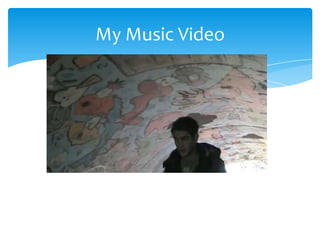
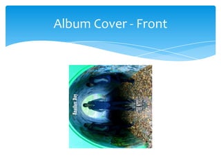
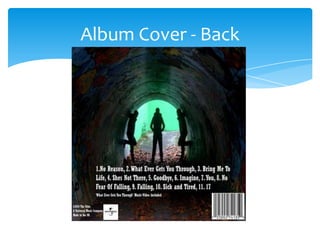
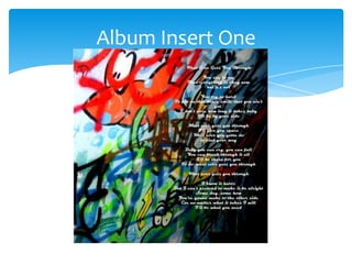
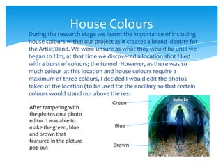
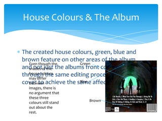
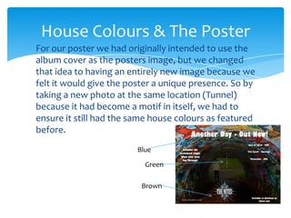
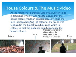
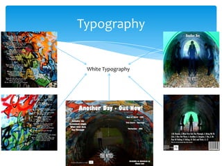
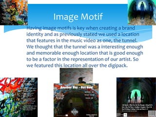
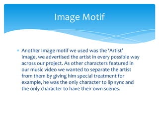
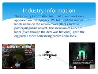
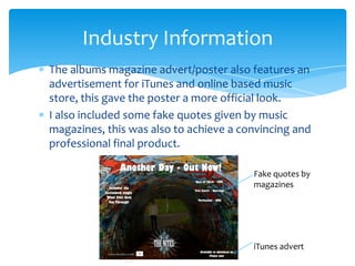
The document discusses how the main product (music video) and ancillary texts (album covers, inserts, poster) work together through consistent use of house colors, imagery, and typography. The creator established green, blue, and brown as the house colors based on a location shoot. These colors were then featured across all ancillary texts through photo editing to create a cohesive brand identity. Additionally, imagery of the artist and location were repeated as motifs, white typography was used consistently, and fake industry information was included to make the materials seem more professional.