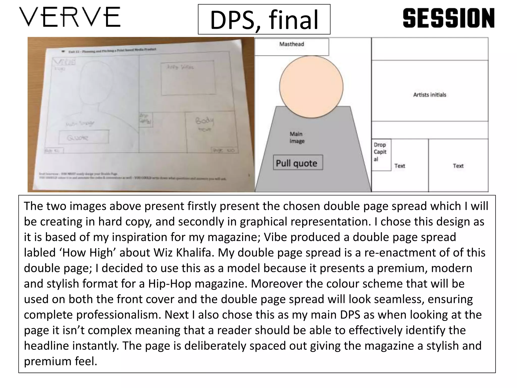
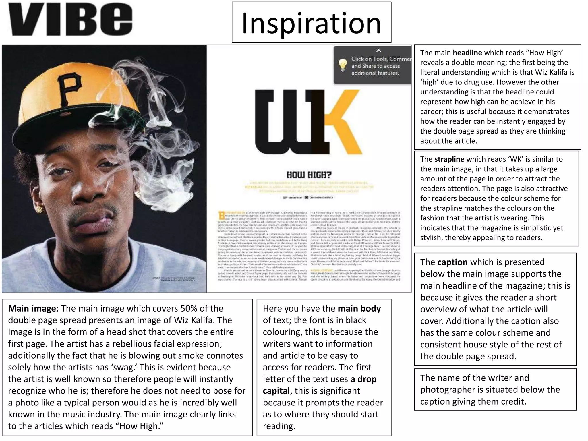
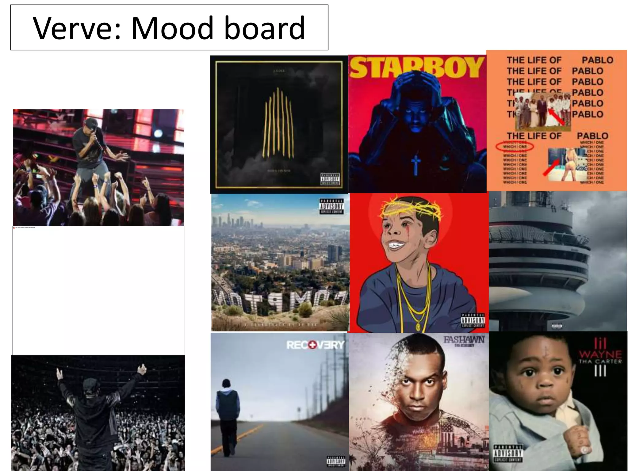
OCR –
Level 3 Cambridge Introductory Diploma in
Media
Unit 14:
Producing a print based media product
Evidence
Name: Jake Naunton
Candidate number: 3097
Centre number: 64135
St. Andrew’s Catholic School
64135
Set Brief - Print
Project/Brief –
Music Magazine & Promotion
Unit 14: Producing a print based
media product
Jake Naunton
Hand drawn drafts
Hand drawn drafts:
Hand drawn drafts
Headline: Is used to draw
attention to the
Graphic layout: DPS
MastheadHeadline
Image
Quote
Page number/ Small masthead Page number/ small masthead
Drop
Capital
Text Text Text
Graphic layout: DPS
Text Text
Pull Quote
(Main attraction)
Page number/ Small masthead Page number/ small masthead
Masthead
Album cover
Main
image
Graphic layout: Front cover
Masthead (Verve)
Strapline (In black font)
Main Headline (In red)
Cover
lines
Some
Black
Some Red
Cover
lines
Black
Red
Price and
Barcode
Promotions and News
Masthead (Verve)
Price and
Barcode
Main Headline
Main
image
Cover lines
Some Black
Some Red
Cover
lines
Black
Red
Graphic layout: DPS
TextTextDrop
Capital
Page number/ Small masthead Page number/ small masthead
QuotesName of writer/
Photographer
Competition/ promotion
Artists:
Name/Logo
/ Festival or
place
Main imageMain headline
Subtitle
Graphic layout: DPS
Main
image
Pull quote
Masthead
TextText
Drop
Capit
al
Artists initials
Front cover, final
The two images presented below demonstrate my chosen hand drawn draft and and
graphic design. Much like my chosen DPS the chosen front cover is inspiration from a
popular Eminem front cover for Vibe. The reason that the front cover was so popular
was because of the contrast of colours; the use of a white background completely
contrasted with the artist’s tanned skin. In my case I will be using a grey gradient
background, which will be contrasted with shades of red and black to make sure that the
main image. Much like Vibe front covers Richard Dyers ‘Star appeal’ is the main focus of
my magazine; this is clear as the main image will overlap the bottom of the masthead.
DPS, final
The two images above present firstly present the chosen double page spread which I will
be creating in hard copy, and secondly in graphical representation. I chose this design as
it is based of my inspiration for my magazine; Vibe produced a double page spread
labled ‘How High’ about Wiz Khalifa. My double page spread is a re-enactment of of this
double page; I decided to use this as a model because it presents a premium, modern
and stylish format for a Hip-Hop magazine. Moreover the colour scheme that will be
used on both the front cover and the double page spread will look seamless, ensuring
complete professionalism. Next I also chose this as my main DPS as when looking at the
page it isn’t complex meaning that a reader should be able to effectively identify the
headline instantly. The page is deliberately spaced out giving the magazine a stylish and
premium feel.
House style
Colour Scheme:
The three main colours that will be used in this magazine will be white, grey and red; although
this is a very similar house style to Session this will be useful in making the stars stand out. This
will be a useful tool as the three colours work conjunctively to enable the main image to stand
out.
Font:
The chosen font for Verve is called ‘Above demo’ this is taken from an artist listed on Dafont. I
chose this because I believe that this font style is very unique as it has distinctive accents on the
letters ‘E’ and ‘R.’ This is significant because I believe this makes the fonts style stand out as it
would be clearly notable by a potential consumer in a the shops; this is because of the letter
spacing that makes it look eye catching. This font also has the potential to look along the lines of
the Vibe masthead font which is wide a bold; although Above Demo is slightly slimmer it will still
have a similar eye catching effect.
Social Media:
Verve will be in a synergetic relationship with social media websites so that it will be able to
become a well established and well publicised business. Social media is the perfect way for Verve
to become a popular brand as it has no cost to set up it simply requires frequent updates.
Font Styles
Verve
Session
Editio
n
Font sites used:
-http://www.fontspace.com/herofonts/above-demo
-http://www.dafont.com
Above demo Renogare Sansation
Bebas Kai Motion Control Neue Raspoutine Bambi
Now that I have conducted research into my chosen font styles I have now chosen which two
fonts styles I will be using for my magazine designs. Both of the two fonts demonstrated above
are front Dafont.com this is because I am able to easily download these onto my computer
system. This is necessary because I need to be able to install them onto Photoshop in order to
include in them on my front cover and double page spread that I will be creating.
The chosen font for Verve is called ‘Above demo’ this is taken from an artist listed on Dafont. I
chose this because I believe that this font style is very unique as it has distinctive accents on the
letters ‘E’ and ‘R.’ This is significant because I believe this makes the fonts style stand out as it
would be clearly notable by a potential consumer in a the shops; this is because of the letter
spacing that makes it look eye catching.
Secondly the font chosen for the Session magazine is called, Motion Control Neue; this is also
taken from Dafont.com for the same reasons noted above. I choose this font style over all of the
other choices because the font style by default comes in capitals. This enables the magazine to
stand out as the text looks bulky; this is effective as it makes it eye catching the masthead at the
top of the front cover will be one of the main attractions. Moreover this font style looks as
though it is a similar match to those of Vibe and NME because of the wide styled font.
Font Styles Final
Magazine ideas: Mind map
Magazine ideas
Masthead
Frequency
Colour scheme
-Focus
-Notoriety
-Conclave
-Session
Types of
images Brand identity
The list of names presented to
the left of this text presents four
names which I came up with as a
concept for my second
magazine. The chosen and
arguably most effective
masthead which I have chosen is
bolded, “Session”
-Red
-Black
-Grey
My second magazine will be released on a monthly calendar as this is the
way Vibe used to be released before the business received major funding cut
backs meaning they couldn’t publish as many copies. My magazine would also
be released monthly as it would mean that the writers and editors would
have enough time to be able to produce enough content that would absorb a
lot of the readers time; therefore producing value for money. Moreover the
magazine would also be released monthly as there isn’t always enough music
news to cover each week, especially if the magazine is only focused around
one genre.
Types of images on the front would
include current collaborations and artists.
It could also potentially present images of
recent festivals and album covers. The
types of images would be of a mid shot/
close up shot; the images used would take
up a large majority of the front cover,
most likely around 75% of the cover. I
would deliberately do this to increase the
star appeal meaning that the magazine
would again attention in shops.
Bright bold colours will be used on the cover of each issue meaning that
the reader will instantly be able to identify the magazine, thereby
making it memorable. Also much like popular magazines in the industry
such as Vibe and NME on the front cover of each issue will be the use of
a limit of three colours; this means that the bran is easily recognisable
due to the stand out house styles. Moreover the masthead and
conventions will be of a similar font and size making it more appealing
for readers.
Inspiration slide
Colour scheme one Colour scheme two
Front cover analysis
House style: The main colours used on this
particular front cover are red, black, grey
and white. This is significant as the
connotations of these colours are
associated with rap and hip-hop. These
chosen colours are picked in conjunction
with Eminem, this is because it highlight
how he is the main attraction of the front
cover through Richard Dyer’s star appeal.
Main image: The main image presents
Eminem, it is evidently clear that he is the
main attraction of the front cover. This is
clear because he completely stands out
from the page; this is made possible by the
colour choice which projects the
noticeability of the star. This is an major
and pivotal feature of the front cover
because Eminem is one of the most
successful artists across any genre within
the 21st century as he has sold millions
records. This means that readers will feel
far more inclined to pick up the magazine
as they are excited by noticing a major star
on the front cover. In addition the front
cover clearly indicates the genre due to the
fierce, borderline aggressive posture of
Eminem; this clearly demonstrates to
readers that the magazine is of the Rap
genre.
Font: The font is a clean crisp stylish element
of text which allows consumers to identify
the magazine in shops. This is further made
easier by the sans serif font, this means that
the characters used in the word vibe are
easier to identify as they have clean edges.
This in turn makes the magazine stand out
because it is noticeable and evidently
different to other magazines.
Main cover line: The main cover line reads
“Eminem comes clean” this insinuates that
the widely recognised star will be revealing
exclusive information to the readers of Vibe.
This therefore acts as an incentive for
readers to purchase this particular issue of
vibe. This cover line perfectly ties in with the
main image as the posture of Eminem in the
image indicates that he may be hiding
something, therefore prompting the
consumers to purchase the magazine in
order to reveal this secret.
Strapline: The piece of text at the top of the magazine reads
“Busta Rhymes- DIMX-ODB-Cash Money-Puff Daddy” This
connotes how the editors of vibe are informing the readers of
what else they can discover in the magazine.
Masthead: The masthead which reads
“Vibe” combines two of the colours used
throughout the house style of the front
cover. The masthead involves both black and
red in a form of gradient; this is effective
because much like the colour scheme it adds
to the general sense that the magazine is
aimed at rap and hip-hop readers.
Inspiration
Main image: The main image which covers 50% of the
double page spread presents an image of Wiz Kalifa. The
image is in the form of a head shot that covers the entire
first page. The artist has a rebellious facial expression;
additionally the fact that he is blowing out smoke connotes
solely how the artists has ‘swag.’ This is evident because
the artist is well known so therefore people will instantly
recognize who he is; therefore he does not need to pose for
a photo like a typical person would as he is incredibly well
known in the music industry. The main image clearly links
to the articles which reads “How High.”
The main headline which reads “How High’
reveals a double meaning; the first being the
literal understanding which is that Wiz Kalifa is
‘high’ due to drug use. However the other
understanding is that the headline could
represent how high can he achieve in his
career; this is useful because it demonstrates
how the reader can be instantly engaged by
the double page spread as they are thinking
about the article.
The strapline which reads ‘WK’ is similar to
the main image, in that it takes up a large
amount of the page in order to attract the
readers attention. The page is also attractive
for readers because the colour scheme for
the strapline matches the colours on the
fashion that the artist is wearing. This
indicates that the magazine is simplistic yet
stylish, thereby appealing to readers.
Here you have the main body
of text; the font is in black
colouring, this is because the
writers want to information
and article to be easy to
access for readers. The first
letter of the text uses a drop
capital, this is significant
because it prompts the reader
as to where they should start
reading.
The caption which is presented
below the main image supports the
main headline of the magazine; this is
because it gives the reader a short
overview of what the article will
cover. Additionally the caption also
has the same colour scheme and
consistent house style of the rest of
the double page spread.
The name of the writer and
photographer is situated below the
caption giving them credit.
Verve: Mood board
Draft interview
1) Thank you for letting me take up some of your time how are you today?
I’m great thank you for having me here; it’s always a pleasure to reach out to you and all the readers. I gather all is well with you also?
2) Yes it’s not everyday we have a world wide star such as yourself in the building, today is one of the good days… So where do we start, you have recently released your third album, talk
to me about that.
Well it has been in the making for about 18 months, it is one of those albums that have almost entirely been created on the road. As during this time I was touring with Kanye West and I
also made secret appearances with the likes of Lil Wayne and Dr Dre and secret tours and shows. Therefore this album is very personal to me, it is about me growing up a young child and
learning the ways of the streets and how to live alone.
3) The success of the album rocketed to the top of the charts within hours of the release, how does this make you feel?
Honestly it is something that I didn’t deem to be possible, 10 or 15 years ago people were beginning to feel that the Hip-Hop industry was beginning to take dip in terms of fans and the
desire to make music. But as an artist that has grown up with music and Hip-Hop as a focus in my life it means a lot to realize the genre is not loosing interest but instead gaining. The
younger generation appears to enjoy this fresh new taste of Hip-Hop more than expected and it means a lot it is honestly overwhelming.
4) I hear that you have just released the tour dates across America; I see that a large amount of fans from European and Asian regions are concerned that dates will not be added to a
place near them. Do you have anything planned?
The dates in American were released for states such as New York, Chicago, Nashville and Miami; in each state I will be doing around 4 gigs a week in various locations, then I will jet off to
my next destination. So the tour bus will never really stop moving. In terms of expanding dates for Europe it is a huge focus on my mind and I have been organizing it since the release of
this album, so yes tour dates will be released very shortly.
5) Obviously this is the second tour that you will be running, is there anything that you plan to do differently this time?
Well my own personal tour hasn’t happened since around 2011 as I have been travelling a lot with other artists, however I can assure that in terms of production and nostalgia the tour
will not disappoint. Just over the last two years we have seen a rise in the quality of effects used on tour in various different genres such as EDM and I believe that the standard to work
will be translating over to the Hip-Hop genre very soon.
6) So you talk about the busy and frenzied life touring life style over the last 18 months, do you ever have any spare time when away?
Fortunately I do, when on tour during the day I am only at the event location around 4 hours before we go life for sound checks and technical tests. All the other time spent in the various
locations I got to travel to was spend exploring and enjoying the location. It also helps that ever since I was a kid I desired to travel the world and meet new people and discover amazing
place and that is exactly what I have been blessed to be able to do.
7) Do you have any plans to expand the brand you have been building over the last 10-15 years?
Yes a large inspiration of mine is the work of Kanye West and how he effectively used his public status as the back bone and main catalyst in order to drive his clothing brand forward. I
have strong hopes and desires to be able to do the same; I feel as though Kanye has found a gap in the premium clothing market for customers and fans to wear a new style of Hip-Hop
orientated clothing. The clothing brand that I have been developing will be on sale in the at the first tour date that occurs in just under a month in NYC Manhattan. So this is a very
exciting time for me.
8) I can imagine, in terms of you upcoming tour can we expect to see any special appearances?
I have some plans up my sleeves I intend to reveal when the time is right.
9) Can you give us any hinter as to who they may be?
I’m not allowed to say much but I can tell you that these are artists that I have worked with for a substantial number of years and have created outstanding relationships with. There are a
range of artists that have agreed to come to a variety of different shows ensuring that each show is amazing but in a very different way. Each live shows will be exclusive to the town or
venue that it is being played in to ensure that the show is different to anything that people have seen before. The artists that I have reached out to a notorious for having created some of
the most exhilarating performances over the last decade, so let’s just say the fans will be in for a treat.
10) In terms of cover acts on within the live shows have you handled who the guest performances are,
or was this an element you left to your production company?
I have personally chosen each of the acts that will be coming with me on tour because I believe heavily
about building momentum and hype throughout the show before I come on stage. As Hip-Hop is not
only my career and my occupation it is also my main passion in life, an aspect which I heavily enjoy
communication about it to others equally as passionate as myself about the culture of Hip-Hop. So in
order for me to be doing my job properly I must give young talent the opportunity to pump life into the
genre. So the artists that will be performing are handpicked in order to generate hype for the audience.
11) So you have discussed the over the last 5 years you have been on tour a lot, if you had to choose
your favorite destination to go on tour, where would it be?
It would have to be Miami ever since I was a kid I have loved music festivals and parties and this was
extremely up my alley, every time I visit there it is a new experience where I feel a tremendous feeling
of self-worth. Miami is effectively the state people visit to party into tomorrow, every time I have visited
my music have received an amazing response. I try to visit several times a year as I simply cannot get
enough of that place, and the weather is nice so that is always an added bonus.
12) So after your tour what are your plans for the future?
After my tour I plan to settle down and build a home for my family and my dogs; I am into interior
design so I will spend a great deal of time designing my own home. However working will not stop,
music is not only my occupation but my passion so I will still be working on new music whilst spending
time with my family.
Draft interview continued
Photography plan
Photography plan(2)
Test photography
Production plan
Monday Tuesday Wednesday Thursday Friday Saturday Sunday
Initial plans are
drawn, the writing
team begin to
determine what sort
of content that they
wish to include in
their magazine.
Interviewees are
now determined by
this point, contact is
made with them to
ensure that they can
be photographed
and interviewed in
time for the next
issue release.
The colour
scheme and
house style is
now beginning
to be thought of.
Interview artists and
ensure that the
camera technology is
configured so that high
quality images can be
capture.
Finish setting
up the scene
for artists to
have their
pictures
taken.
Day off Day Off
Complete by: End of
the day
Complete by: End of
the day
Complete by:
Next Monday
Complete by: 6th Complete by:
End of the
day
Complete
by: N/A
Complete by:
N/A
Week beginning: May 2nd 2016
Week beginning: May 9th 2016
Monday Tuesday Wednesday Thursday Friday Saturday Sunday
Featured artists will
arrive, spend the day
ensuring the relevant
images are captured.
Onto of this make
sure that that the
interviews are
finalised.
Type up any left over
interviews ready to
be transferred on
the main pages.
Begin editing
the main image
of the cover
Check the business
email for enquiries
relating to
advertisements for the
magazine.
Ensured that
the included
advertisemen
t companies
have been
contacted
with fees
paid for.
Day off Day Off
Complete by: End of
the day
Complete by: End of
the day
Complete by:
Thursday 12th
Complete by:
End of the day
Complete by:
End of the
Complete
by: N/A
Complete by:
N/A
Production plan
Monday Tuesday Wednesday Thursday Friday Saturday Sunday
Retrieve the emailed
graphical attachments
for the
advertisements and
collate them into an
organised folder.
Being editing the
rest of the image for
the magazine.
Publicise the
magazine via
social media and
email
notification to
subscribers.
Collate the majority of
stories from all the
external writers which
have been employed
for this be
implemented into the
final magazine
Finalise both
front cover,
advertisemen
ts and
interviews.
Day off Day Off
Complete by: End of
the day
Complete by: End of
the week
Complete by:
End of the day
Complete by: End of
the day
Complete by:
End of the
day
Complete
by: N/A
Complete by:
N/A
Week beginning: May 16th 2016
Week beginning: May 23rd 2016
Monday Tuesday Wednesday Thursday Friday Saturday Sunday
Continue to promote
the magazine via
social media and
newsletter.
Check and finalise
the colour scheme
along with all of the
graphical elements
that will be included
in the magazine.
Spend the
simply adding
everything to
the magazine
ensuring that
each day is fully
complete.
Complete the final
edition of the
magazine and review
any faults found over
night.
The editor
and producer
review the
magazine
and
executively
finalise it.
Sent of be
printing.
Begins the
distribution
process.
Complete by: End of
the day
Complete by: End of
the day
Complete by:
End of the day
Complete by:
End of the day
Complete by:
End of the
Complete
by: N/A
Complete by:
N/A
Production plan insight
The purpose of the production plan is to organize the weeks that lead up to the release of the
magazine. This is an important stage as it means that there will be no components missing from the
magazine on it’s release. The production plan covers all bases meaning that there are no issues with
product on it’s release. This provides the producers of the magazine with the peace of mind that their
product is complete and of high quality since it has the ability to be one of the top market contenders
in the genre.
Equipment a cost
When a consumer purchases a copy of their favorite magazine, or maybe they are adventuring into a
new genre they will typically not cast any thoughts towards the costs that are involved in producing a
single copy of that product. The first and ultimately necessary component in order to be able to create
a successful magazine is via the office space. Multinational businesses such as Apple spend millions of
dollars each year in order to fund numerous stores and office spaces across the globe. When
researching I identified I looked into the local office spaces available in my local area, Epsom. I first
looked at a location in the centre of Epsom, City Skylines under their features tab it was made clear
these office spaces are very equip and fit for purpose, thus justifying the costs which I ventured on to
discover. The features included, Wi-Fi access; fully furnished working spaces; 24 hour access; kitchen
facilities; storage and showers. The price to rent an office space which is suitable for the number of
employees which I have under my institution is, £350 per person in this case employee, per month. So
since I would be employing 40 business attributes this would come to £14,000, resulting in a total cost
of £168,000 per year, simply for a place for the employees to work. The next cost which has to be
covered when setting up a magazine business is the cost of the systems which workers will be using.
Due to the versatility and widely optimized system I have chosen to purchase Macintosh systems for all
employees. Since many of the workers will have to collaboratively work especially writers and
designers the widescreen from the 27” inch iMACs will be a perfect match. To purchase 40 of these it
will lead to a cost of £1,749.00 per unit, totalling to £69,960 for all systems to equip all workers. Next
we have to take into account the cost of the software that will need to be installed onto the systems in
order for the employees to complete their tasks. Firstly fundamental software such as Microsoft Word
and PowerPoint will not be necessary as Apple has formulated their own iterations of this software.
Source: http://www.cityskyline.co.uk/epsom/
https://propertylink.estatesgazette.com/property-details/6035627-ashley-avenue-epsom-kt18-5ad
http://www.apple.com/uk/shop/buy-mac/imac?cid=oas-emeia-domains-apple.co.uk
Equipment a cost (continued)
So evidently this leaves the creative forms of software via Adobe programs;
notably the main form of software which I will require will be the likes of
Photoshop for the production of my magazine front cover and the editing of all
images used within the pages included in the magazine itself. Moreover I will
require the likes of Fireworks to be able to create my own graphical elements
from scratch; on-top of this the next program which I will require as a base line
will be Adobe In-Design. This is a program which is highly optimised towards
organising and graphically displaying the magazine in the most visual desirable
way possible. Research has revealed how the cheapest way to gain access to
these programs is to purchase an Adobe Cloud package, this is because whilst
the cost is extremely high it grants access to 20+ programs. The screenshot
below identifies how this bundle will cost a sum of £45.73 per month per
system; notably if I total this up to cover all of the employees it will cost
£1,829.20 per month which annually rounds to £21,9590.40. Whilst this appears
to be an astronomical fee, this is essentially the fundamentals of the business as
we are based are relying on the subscription that Adobe provides. The next
piece of equipment that will be pivotal in producing a successful magazine with
high quality will be DSLR cameras. This will cost £649.00 per unit as we will be
purchasing two for our early established business, on-top the of this I will be
purchasing the lens demonstrated in the screenshot below. The rest of the
smaller less important items will be included in the summary table on the next
slide which identifies all of the costs that have been expended.
Source: https://creative.adobe.com/plans
http://www.jessops.com/online.store/categories/products/nikon/d7100-digital-slr-body-88944/show.html
http://www.jessops.com/online.store/categories/products/nikon/af-s-35mm-f-1-8g-dx-76070/show.html
Equipment a cost summary table
Item Cost
Office space (per month) £14,000
40x27” inch IMACS £69,960
All 20 Adobe creative programs £1,829.20 per month
DSLR Camera x2 £649.00
Lighting Equipment x2 £161.98
Corner Desks x40 £1,559.70
Chairs x40 £1,649.70
Staff and cost
Staff position Salary
Publisher £55,000
Editor £55,000
Journalist £18,000
Writers £25,000
Photographers £15,000
Marketing £22,000
Finance £35,000
Design £28,000
Human Resources £16,000
Due to my magazine being a
start-up business which is in it’s
primitive stages I have
determined tot try to cut costs
in terms of salaries by
employing predominantly
apprenticed workers. Notably
these salaries range from
£15,000 to around £20,000 as
they are still being trained and
are not yet skilled enough to
receive a high degree of
income. In terms of the way
that I decided to employ
Different levels of skilled individuals, the reason being was due to the nature of those jobs. Notably I spent
a considerable amount on the two superior roles in magazine production; this being the publisher and the
editor for my magazine. The reason I did this was to ensure that they can be strong managerial leaders in
order to keep the new apprenticed individuals in line and on track with their tasks. Also the jobs such as
design and journalism does not require a great degree of high and these are highly diverse jobs which
many people are capable of doing this is why I priced the salary in this manner.
Source: http://www.payscale.com/research/UK/Job=Graphic_Designer/Salary
http://www.forbes.com/sites/booked/2011/08/18/the-lives-and-salaries-of-magazine-and-book-editors-4/#7c7d62967806
Environment of Pitch
In order for my pitch to be successful it requires me to the
environment of my pitch in order. For my pitch I needed to
ensure that I had the items displayed around this slide. Firstly
the most useful tool in being able to present a successful
pitch was the clicker. This is because it enabled me to be
versatile when presenting my ideas to the audience; it meant
that I had the ability to move freely around and express my
ideas, thus engaging with the audience and making my pitch
successful. Secondly the fact that I had a DLSR camera has
meant that I had the ability to record evidence of my pitch in
high quality. Next the smart board has allowed me to display
the pitch in a way which is engaging and professional.
Conclusion
To summaries, LO2 covers the primitive stages of the development of my magazine
idea. Throughout this objective I have made decisions about the fundamentals of the
magazine I will be making, this includes the frequency of the magazine (how often it
will be released); the house styles I will be using; the font style that will be included on
both of the magazines. Moreover I also formulated two mood boards in order to
obtain a greater depth of knowledge into my chosen genre of Hip-Hop and Rap. This
research has enabled me to create concepts for front cover and double page spread
that I will be making on Photoshop CS 5.1; at first I created 8 different concept ideas in
hand draft format which is presented in above slides; I created 2 front covers and 2
double page spreads for both magazine theories, Verve and Session. Then once I had
hand drawn these I created graphical versions which are a replicate of the hand drawn
ones; however the purpose of these is to show how the magazine would be presented
in a finished product version (for example, on Photoshop.) This section of unit 14 is
more about the planning and primitive stages of the magazine production.
Location Recce
Location Recce (continued)
Health and safety at work legislation
The Health and Safety at Work act of 1974 is the most important and influential safety
legislation in UK history. The act is responsible for enforcing that employers comply to a
vast web of different factors to ensure the safety of their workers. The aim of the HSWA is
to ensure realist compliance with the laws that are in place; with a system which is
accurate and sustainable of determining and making sure that the business is complying
with the safety regulations. One of the main requirements for the Health and Safety at
Work act is that it is open source; this meaning that all employees and potential clients can
access this information to determine for themselves if this is a safe place to work.
In relation to my magazine it is more the smaller fundamental regulations to in connection
with human rights. This includes basic facilities such as access to a bathroom and a kitchen;
then it ranges to safe fire escape exits to safe desk chairs.
Source:
https://www.shponline.co.uk/
health-and-safety-at-work-
1974/
Risk Assessment (permissions)
Legal and Ethical issues
When creating magazine content publishers have to ensure that the content that they are creating is suitable and
appropriate to be viewed by a vast range of audiences. Many ethical issues surround the magazine industry
especially with gossip and magazines surrounding people, most notably celebrities. Consumers can be offended in a
vast web of reasons; some examples include, unthought-of language, explicit images (such a images on the beach;) a
clothing dress code which could affect certain culture or phrases or terminology which could be deemed offensive to
a certain culture. The terms ‘Ethics’ revolves around justice, kindness and honesty; it’s all about differentiating the
difference between right and wrong and ensuring to apply a system of moral codes to your decision making. When
creating magazine content it is important to ensure that what is included in the product will not offend anyone’s race
or culture; offensive language is frequently used in rap and Hip-Hop magazines like Vibe and XXL. However the use of
strong terms when describing black rappers as ‘n**gas’ has always got the potential of offended a wider range of an
audience. This can lead to complaints from various organisations and can easily lead to lawsuits and parties suing
others.
In terms of publishing a magazine there are a number of legal restraints and laws that publishing companies must
abide. This is most important when the content involves drama and actions concerning people along with different
cultures and ethnicities. Whilst magazine creators are free to craft whatever content they desire, they must still
ensure that they are sticking to laws from the likes of the EFF (Electronic Frontier Foundation); PCC (Press Complaints
Commission) and the ASA (Advertising standards Agency.
In relation to my magazine I have to ensure that all content included in the magazine is acceptable for all audiences,
in order to gain reputation as a genre favorite whilst still ensuring I stay within the boundaries of the legal and ethical
requirements. In order to do this I will ensure that the cover lines used on my front covers will be strictly about an
artists’ music and not about their personality or background. This reduces the chances of somebody becoming
offended with the language content included. However, admit ably it is difficult to not offend anybody when there is
such a large amount of content covered in each issue, especially since each culture has specific terms which they find
particularly offensive
To begin understanding Copyright we must first identify what Copyright means; it’s the exclusive right to
make copies, license, and otherwise exploit a literary, musical, or artistic work, whether printed, audio or
video; This gives the author rights to the works until death and for 70 years following their death. The
Copyright law was first thought of in 1709 by the Statute of Anne; by 1911 The Copyright Act was passed.
The main aim of this was to reduce and hopefully eliminate plagiarism of an individuals work. When the
law was altered in 1988 it effectively means that writers and photographers have their own rights for
their content; this is particularly notable in modern day magazines such as Q and Mixmag you will be able
to find rights assigned to the photographer under the image. This is due to copyright reasons, however
this may not have been visible before the act was passed.
Copyright is prominent throughout all magazines, it is most notably identified on pages with
advertisements; external advertisers will typically include their Copyright tag at the bottom of their
advertisement to highlight how the content is owned by them. The small screenshot presented at the
bottom of the slide highlights how whilst not all magazines will have a distinctive copyright tag, most will
ensure to include a form of identification. Typically this will include the masthead title, data or issues
title. Throughout the magazine industry various unique ways of including the copyright tag have been
established; for examples some magazines will include the copyright tag next to their logo or masthead
to make it clear to consumers and external businesses that they should not be able to use their content.
Whilst other establishments will include a ‘R’ tag on their content to highlight that they are the real
company and not a fake or spin off organisation.
Source:
http://www.dictionary.com/browse/copyright
https://www.copyrightservice.co.uk/copyright/p01_uk_copyright_law
Copyright
IP
When content creators make their own work they must find ways to protect it in order to ensure
they retain credibility and ownership. One way that allows content creators to protect their work
is through Intellectual Property (IP) this is the idea that products of human intelligence and
creation such as profitable goods; this is largely governed by federal law. Typically people will only
protect their works when they would potentially be at an economic benefit from the content that
they have created; this protects to works of their from external smaller businesses that try to
steal to take these works for their own benefit. In order to own Intellectual Property you have to
have either created it, bought it from its original owner or have a brand with a trade mark. When
protecting your property there are two ways of ensuring you keep the property that you have
created as your own right. Firstly through copyright which has the capability of protecting books,
films and music. Or a creator can also choose to obtain a Design Right, this is a way of protecting
shapes and objects which they have created. One of the best ways of protecting your works is
through a patent; in order to acquire a patent it can take up to 34 months with The U.S. Patent
and Trademark Office as of July 2011 there were 715,461 active standing patents. However the
main issue with a patent is the fact that is has a cost of up to £7000.
Watermark
Moreover, watermarks are also widely used
as a form of identification; a watermark
defines as a faint design made in some
paper during manufacture that is visible
when held against the light and typically
identifies the maker. Watermarks in terms
of photographs and business documents is
particularly useful as it ensures that the
works of that creator is protected.
Watermarks are typically a form of
transparent text that take up part of the
page in order to highlight that the work
somebody is looking at is owned by an
external establishment.
The screenshot on the right demonstrates
an example of the one of the watermark
cost plans to ensure that the rightful owner
continues to pertain their own property.
Source: https://www.visualwatermark.com/buy/
Data Protection Act 1988
The DPA controls how your personal information is used by organisations, businesses or the
government. This means that institutions that have rights and access to your personal information must
comply with tight laws to protect this sensitive data. Large businesses such as Facebook, who have
information banked about hundreds of millions of people are constantly under fire about the way in
which they store and conceal personal data. This is because Facebook is such a large social media
presence which is accessed globally meaning that millions of users access the site regularly. This means
that the company is endangered by hackers and advertisement agencies who are desperate to obtain
this information.
Laws:
• used fairly and lawfully
• used for limited, specifically stated purposes
• used in a way that is adequate, relevant and not excessive
• accurate
• kept for no longer than is absolutely necessary
• handled according to people’s data protection rights
• kept safe and secure
• not transferred outside the European Economic Area without adequate protection
There is stronger legal protection for more sensitive information, such as:
• ethnic background
• political opinions
• religious beliefs
• health
• sexual health
• criminal records
Source: https://www.gov.uk/data-protection/the-data-protection-act
Editors Code of Practice
The first way in which they regulate magazine content is through accuracy; this is a highly
important element when covering stories surrounding events that involve the actions of
people. The first concerning accuracy reads “The Press must take care not to publish
inaccurate, misleading or distorted information or images, including headlines not
supported by the text.” This is indicative as it highlights how media outlets are not
permitted to write stories and headlines which are misleading or offensive; this is because
no journalist or media business should have the right to falsely accuse somebody,
particularly a celebrity. This is because the story will potentially reach millions, which
evidently could have a negative effect on that person, potentially tarnishing their
reputation. Research has be formulated by numerous institutions to identify why
inaccuracy in so prominent within the media. “According to an in-depth study by the
American Society of Newspaper Editors in 1999, 23% of the public find factual errors in the
news stories of their daily paper at least once a week” This highlights how poorly research
is conducted before a story is published; whilst this doesn’t always occur in the music
magazine industry it is important for magazine companies to understand the repercussions
when publishing incorrect and infringing content.
When studying the role of regulatory bodies it is important to notice that there are
numerous codes to regulate the content produced by magazines. The next important one is
‘Privacy’ this serves to be a serious issue as it concerns the infringement of a person that is
being discussed within the content of a magazine. Often third party partners can become
offended with the content produced around their personal lives and activities (especially
when concerning celebrities).
Conclusion
The purpose of this learning objective was to identify that there are certain risks and
precautions that need to be taken in order to ensure the safety the model used in the
photography plan which will be situated at the location recce. As the LO progressed I
began to delve into the legal and ethical issues that are associated with creating a
magazine a running it effectively and legally. Unlike the primitive stages of unit 13
where the legal and ethical elements were only concerning the actual production of
the magazine; in this unit we had to look at the potential legal issues that are brought
on through the permissions needed in order for the consent to take the images of the
model. Furthermore, also in the department of potential risks that would have to be
considered is the location as there would have been numerous hazards in the physical
area where the images would be captured meaning that a risk assessment would need
to be carried out prior.
Equipment a cost
When a consumer purchases a copy of their favorite magazine, or maybe they are adventuring into a
new genre they will typically not cast any thoughts towards the costs that are involved in producing a
single copy of that product. The first and ultimately necessary component in order to be able to create
a successful magazine is via the office space. Multinational businesses such as Apple spend millions of
dollars each year in order to fund numerous stores and office spaces across the globe. When
researching I identified I looked into the local office spaces available in my local area, Epsom. I first
looked at a location in the centre of Epsom, City Skylines under their features tab it was made clear
these office spaces are very equip and fit for purpose, thus justifying the costs which I ventured on to
discover. The features included, Wi-Fi access; fully furnished working spaces; 24 hour access; kitchen
facilities; storage and showers. The price to rent an office space which is suitable for the number of
employees which I have under my institution is, £350 per person in this case employee, per month. So
since I would be employing 40 business attributes this would come to £14,000, resulting in a total cost
of £168,000 per year, simply for a place for the employees to work. The next cost which has to be
covered when setting up a magazine business is the cost of the systems which workers will be using.
Due to the versatility and widely optimized system I have chosen to purchase Macintosh systems for all
employees. Since many of the workers will have to collaboratively work especially writers and
designers the widescreen from the 27” inch iMACs will be a perfect match. To purchase 40 of these it
will lead to a cost of £1,749.00 per unit, totalling to £69,960 for all systems to equip all workers. Next
we have to take into account the cost of the software that will need to be installed onto the systems in
order for the employees to complete their tasks. Firstly fundamental software such as Microsoft Word
and PowerPoint will not be necessary as Apple has formulated their own iterations of this software.
Source: http://www.cityskyline.co.uk/epsom/
https://propertylink.estatesgazette.com/property-details/6035627-ashley-avenue-epsom-kt18-5ad
http://www.apple.com/uk/shop/buy-mac/imac?cid=oas-emeia-domains-apple.co.uk
Production process
The screenshot to the right
demonstrates a screenshot
image demonstrating that I have
made an attempt to contact the
publishers of Mixmag.
Unfortunately I was
unsuccessful; therefore on the
next slide I will explain the
production process for a typical
magazine.
Production process continued
Steps for creating a magazine:
1. Firstly the publishers have to set up a date for publication; this date is plain and simply the day which readers can purchase the product.
Now that the publishers have a date they now need to organize the schedule for the production of the magazine.
2. Next the publishers must manage the schedule of the process. The schedule is made in a way which allows each department to
complete their individual piece in time.
3. Following this you have the editorial and budgetary decision; this involves the senior editors of the magazine deciding what topics
should be covered and in what way in the next issue. Once the committee has decided what to include in the form of news, interviews
and stories the team then have to tackle budgetary decisions. This is when the team look at the available money to them and how it
should be spent towards the production of the magazine.
4. Now the next stage is named the content acquisition; this step is arguably the most potent of all steps as the writers and designers now
have to decide how they want the magazine to look, feel and read. The main way the magazine will be organized is by employees
working from publishing institution will begin to write on relevant topics and current news. At this point the artwork and graphics are
also developed. Another way the magazine produces the content is by hiring external writers to covers their desired topics. Additionally
this stage could also be considered the most important step because reports and journalists will be investigating the topics; moreover
research will also be done online using the web and databases. Finally meetings with stars being interviewed in the magazine will be
contacted.
5. After the content is arranged the next step in production is sub-editing; at this stage an editor will ensure that the quality of the
magazine is at it’s highest standard. This is an important step as it insures that the magazine is projected as professionally as possible; in
order to do this editor will check spelling and grammar of the magazine; they will also make sure that all articles follow the house style
of the magazine.
6. In addition page layout is the next step; here employees labeled “layout staff” are responsible for piecing all elements of the magazine
together. Here advertisements will also be implemented into the magazine.
7. The next step is, proofreading; at this stage the editorial department will print a hard copy of the entire magazine in order to try to find
some mistakes. This enables the magazine to be made as professional as possible.
8. The penultimate stage is where the magazine is printed; firstly the magazine prints only s couple of copies to ensure that the magazine
is perfect and make final checks. Then the magazine is sent into bulk printing.
9. Finally, the last stage is distribution, here the printing company have printed all the magazines and now they need to be packaged ready
to be sold to the public.
Source: http://hosbeg.com/the-magazine-production-process/
Equipment a cost (continued)
So evidently this leaves the creative forms of software via Adobe programs;
notably the main form of software which I will require will be the likes of
Photoshop for the production of my magazine front cover and the editing of all
images used within the pages included in the magazine itself. Moreover I will
require the likes of Fireworks to be able to create my own graphical elements
from scratch; on-top of this the next program which I will require as a base line
will be Adobe In-Design. This is a program which is highly optimised towards
organising and graphically displaying the magazine in the most visual desirable
way possible. Research has revealed how the cheapest way to gain access to
these programs is to purchase an Adobe Cloud package, this is because whilst
the cost is extremely high it grants access to 20+ programs. The screenshot
below identifies how this bundle will cost a sum of £45.73 per month per
system; notably if I total this up to cover all of the employees it will cost
£1,829.20 per month which annually rounds to £21,9590.40. Whilst this appears
to be an astronomical fee, this is essentially the fundamentals of the business as
we are based are relying on the subscription that Adobe provides. The next
piece of equipment that will be pivotal in producing a successful magazine with
high quality will be DSLR cameras. This will cost £649.00 per unit as we will be
purchasing two for our early established business, on-top the of this I will be
purchasing the lens demonstrated in the screenshot below. The rest of the
smaller less important items will be included in the summary table on the next
slide which identifies all of the costs that have been expended.
Source: https://creative.adobe.com/plans
http://www.jessops.com/online.store/categories/products/nikon/d7100-digital-slr-body-88944/show.html
http://www.jessops.com/online.store/categories/products/nikon/af-s-35mm-f-1-8g-dx-76070/show.html
Equipment a cost summary table
Item Cost
Office space (per month) £14,000
40x27” inch IMACS £69,960
All 20 Adobe creative programs £1,829.20 per month
DSLR Camera x2 £649.00
Lighting Equipment x2 £161.98
Corner Desks x40 £1,559.70
Chairs x40 £1,649.70
House style
Colour Scheme:
The three main colours that will be used in this magazine will be white, grey and red; although
this is a very similar house style to Session this will be useful in making the stars stand out. This
will be a useful tool as the three colours work conjunctively to enable the main image to stand
out.
Font:
The chosen font for Verve is called ‘Above demo’ this is taken from an artist listed on Dafont. I
chose this because I believe that this font style is very unique as it has distinctive accents on the
letters ‘E’ and ‘R.’ This is significant because I believe this makes the fonts style stand out as it
would be clearly notable by a potential consumer in a the shops; this is because of the letter
spacing that makes it look eye catching. This font also has the potential to look along the lines of
the Vibe masthead font which is wide a bold; although Above Demo is slightly slimmer it will still
have a similar eye catching effect.
Social Media:
Verve will be in a synergetic relationship with social media websites so that it will be able to
become a well established and well publicised business. Social media is the perfect way for Verve
to become a popular brand as it has no cost to set up it simply requires frequent updates.
Pre- Production material
The pre production materials are a useful component as they
mean that for almost no cost at all the magazine has the
ability to produce a rough indication for the end product of
the magazine. My double page spread is a re-enactment of of
this double page; I decided to use this as a model because it
presents a premium, modern and stylish format for a Hip-
Hop magazine. Moreover the colour scheme that will be
used on both the front cover and the double page spread will
look seamless, ensuring complete professionalism. Next I
also chose this as my main DPS as when looking at the page
it isn’t complex meaning that a reader should be able to
effectively identify the headline instantly. The page is
deliberately spaced out giving the magazine a stylish and
premium feel. Much like my chosen DPS the chosen front
cover is inspiration from a popular Eminem front cover for
Vibe. The reason that the front cover was so popular was
because of the contrast of colours; the use of a white
background completely contrasted with the artist’s tanned
skin. In my case I will be using a grey gradient background,
which will be contrasted with shades of red and black to
make sure that the main image. Much like Vibe front covers
Richard Dyers ‘Star appeal’ is the main focus of my magazine;
this is clear as the main image will overlap the bottom of the
masthead.
Step by Step guide
Throughout this guide I will be providing information surrounding the
actions that had to be taken in order to produce the graphical elements
that I included in my front cover design proposals. Firstly we will look at
how to create the red and black gradient background which is used not
only on my ‘Session’ front cover, but also my double page spread. The
first step I made towards creating this background was to ensure that I
had created a duplicate of the layer ‘Background’ the reason for doing
this being that if any accidental errors are made to one of the layers
then it will not have a detrimental effect on the document as I can
simply use the other layer as a backup. Once we have made a duplicate
layer I then double click on the layer ‘Background’ this takes me to the
window that is displayed as the first screenshot on this slide. The
purpose of this is to the menu labeled ‘Gradient Overlay’ then I
configured the gradient to be of a ‘Linear’ optimisation; the purpose of
this being to create a background which does not make either the main
image or the cover lines stand out in an obscure format. Initially I was
intending to create a background using the ‘Radial’ option which would
have created a circular form of image; however once this was tested in
my Adobe In Design DPS project I realised that by using this style it was
not effectively displaying the text, so I reverted back to a linear styled
background.
Step by Step guide (continued)
Now that we have created the background for one of the first images that will be
used on our Session front cover we must now edit the chosen image in order for it
to be displayed in an interesting manner using Photoshop features but at the same
time ensuring that the image retains high quality that would be high enough to be
sold on in a competitive market place. The first step that needs to be taken when
editing an image of this quality is firstly to ensure that the image is resized to the
correct canvas size. When resizing an image the user much make sure that they
hold down the ‘Shift’ key and only resize from the corners of an image. This
ensures that the image will not become diffracted and pixilated at all, thus
retaining the high quality. The next element of image manipulation is evident in the
second screenshot to the right, this involves the removal of the background of the
image via the ‘Quick Selection’ tool. This enables the user to chose which element
of the image that they want to either remove, or copy/ select to apply changes to
or move to another document. This is particularly useful for the current issue that I
faced with this image and that is the fact the backdrop is a brick background; this is
an issue because it means that I am unable to simply use the ‘Magic Wand’ and the
background is gone, due to a range of colour codes which the CS5.5 element
detects. In order to effectively highlight the small elements of the background I will
have to change the ‘Brush size’ this allows me to the brush bigger or in this case
smaller to be able to select the small elements of detail which the bigger brush size
cannot reach. The final screenshot show the image which is highlighted with a
dotted outline, meaning that the document is still in the selection stage; if a user
wishes to abort this then they can simply press ‘Shift + D’ once the user has
finished with these changes they can then press ‘enter’
Conclusion
To conclude this learning objective was aimed to rectify the mistakes that were made on the front
cover of my PhotoShop designs. The idea of this being that it allows us to have actively changed our
magazine designs based off the feedback that we have received. This allows us to create magazine
designs that are capable of being the best in the industry as they will have had improvements
recommended by the demographic of that magazine.
Deadlines
Within any industry deadlines are vital to success and in the long run profit. However this is
especially applicable to the magazine industry; this being since there are various different
elements which need to be completed in order to make sure that the magazine is made a well
rounded final product. If any of these components are not completed on time then it can hinder
the release of the product and lead to unsuccessful. In terms of meeting my deadlines with the
creation of my magazine I ensured that internal deadlines that needed to be met in order to
complete the magazine done so through a production plan. The most important elements of the
magazine are the various different forms of content which are included; it is highly important
that this is completed on a time effective scale so that the product is fit for its release on June 1st
(which is the first issue release.)
Font Styles
Verve
Session
Editio
n
Font sites used:
-http://www.fontspace.com/herofonts/above-demo
-http://www.dafont.com
Above demo Renogare Sansation
Bebas Kai Motion Control Neue Raspoutine Bambi
Now that I have conducted research into my chosen font styles I have now chosen which two
fonts styles I will be using for my magazine designs. Both of the two fonts demonstrated above
are front Dafont.com this is because I am able to easily download these onto my computer
system. This is necessary because I need to be able to install them onto Photoshop in order to
include in them on my front cover and double page spread that I will be creating.
The chosen font for Verve is called ‘Above demo’ this is taken from an artist listed on Dafont. I
chose this because I believe that this font style is very unique as it has distinctive accents on the
letters ‘E’ and ‘R.’ This is significant because I believe this makes the fonts style stand out as it
would be clearly notable by a potential consumer in a the shops; this is because of the letter
spacing that makes it look eye catching.
Secondly the font chosen for the Session magazine is called, Motion Control Neue; this is also
taken from Dafont.com for the same reasons noted above. I choose this font style over all of the
other choices because the font style by default comes in capitals. This enables the magazine to
stand out as the text looks bulky; this is effective as it makes it eye catching the masthead at the
top of the front cover will be one of the main attractions. Moreover this font style looks as
though it is a similar match to those of Vibe and NME because of the wide styled font.
Font Styles Final
Risk Assessment (software)
When creating elements on Photoshop there is a danger of causing diffraction or
damage to the image that is being created. The first way of avoiding damage to any
images is to ensure that when they are being resized that I hold down shift to avoid
image pixilation. Another way in which I avoided any damage to my design work was
by creating countless backups. This meant that I could try new combinations of effects
and filters to find the best results without having to worry about corrupting a
document or accidently deleting it, as this did happen and saved hours. Next another
way in which I avoided any inconsistencies with my design work was by using the eye
dropper tool this meant I have the ability to ensure that the same colours are used
throughout to retain consistency and professionalism. If I didn’t use this tool I often
recall the colour reference codes in order to be able to manually type in the code and
access the same colours.
Risk Assessment (permissions)
The purpose of this risk assessment is to ensure that the
relevant permissions are obtained thus meaning that there
are no legal issues when capturing images that will be used
throughout the magazine. The form presented above
identifies how the permission of the model has been
obtained to avoid any legal issues.
Post production: Software
When creating my magazine ideas I predominantly used two major pieces of software in order to aid
the efficiency and professionalism of the magazine. These software's include Photoshop CS5 and
Adobe InDesign. The first, Photoshop is used for all of the creative components of building the
magazine from scratch in order to make it a professional high quality product. Whereas, Adobe
InDesign is predominantly used for organization and placement; the purpose of this is to make sure
that the graphical components which have been created on Photoshop are then effectively
implemented into the format of a magazine. Photoshop was used as my primary form of software in
terms of the creative graphic design of the entire magazine. This is noticeable since both of the double
paged spreads which I created were designed through Photoshop. They were then simply imported
and resized in order to to fit the A4 canvas which Adobe In Design provided.
Proof Reading and Sub-editing
Whilst overlooked as one of the simpler jobs to follow through, proof reading is ultimately a vital stage
in the editing of the magazine. The article or interview should always be reread numerous times in
order to make sure that it makes perfect sense. A failure to do so would lead to the respective
magazine production company to look unprofessional and incompetent. Below is the finished article
from the Session double paged spread. Initially the article was simply pasted in and was not made to
stand out in any format. When Sub-editing I made sure that the text would stand out from the page
and not simply stand as a plain article. To do this I made sure that I broke up the text into sections and
formatted the headings into different colours; the purpose of this is to make sure that the text is
elevated from the page and appears as exciting to the readership.
Colour and font
Colour Scheme:
The three main colours that will be used in this magazine will be white, grey and red; although
this is a very similar house style to Session this will be useful in making the stars stand out. This
will be a useful tool as the three colours work conjunctively to enable the main image to stand
out.
Font:
The chosen font for Verve is called ‘Above demo’ this is taken from an artist listed on Dafont. I
chose this because I believe that this font style is very unique as it has distinctive accents on the
letters ‘E’ and ‘R.’ This is significant because I believe this makes the fonts style stand out as it
would be clearly notable by a potential consumer in a the shops; this is because of the letter
spacing that makes it look eye catching. This font also has the potential to look along the lines of
the Vibe masthead font which is wide a bold; although Above Demo is slightly slimmer it will still
have a similar eye catching effect.
Feedback
Now that I have completed my pitch I have the ability to look over the two different
forms of feedback which I received. The first form of feedback was the witness
statement which was completed by my teacher’s; the fact that I received two statements
has meant that I have the ability to gather a better understanding as to the quality of my
presentation and the content which is lacking or missing. The statements highlighted
how the potential problems which would cause an issue in terms of ensuring that my
magazine becomes a market contender. Notably the witness statements provided
includes areas which I can improve; this includes the form of PowerPoint and via the
graphical creation which I made. On the witness statement below it demonstrates the
areas which I could improve both my DPS and Front cover in order to make sure that it is
as of as high quality as possible.
Survey monkey analysis
Following my successful Unit 13 Magazine pitch I now need to ensure that I respond
effectively to the feedback which I have received. Since I created seven questions for
my survey monkey I was able to find that there are a few corrections which can be
made to ensure that my magazine product is as strong as it can be. The first question
which I included in my work read What did you like about the way I presented my
ideas? The purpose of this question was to firstly identify what the general response
to my pitch was and if I created a strong impression as to why my magazine would be
successful and have the ability to compete with top market contenders. The responses
which I received were unanimously positive meaning that my pitch was successful; out
of the 12 people that answered my survey monkey they were all positive commending
the way in which I ‘naturally’ presented my pitch. One response read “No script made
it extremely professional because audience was engaged.” highlighting that the way in
which I presented my ideas was encapsulating from the audiences point of view. The
fact that due to a last minute fault I did not have a script actually meant that my script
came across as far more professional than my competition as I was evidently prepared
as I knew the information and was able to project this as a natural and useful manner.
I made sure that I was prepared to present even if there was to be any faults, in this
case the issue of not having my script in-front of me.
Survey monkey analysis
The next question I believe to be one of the most important is summarises overall if my
magazine would be capable of being a market contender. The question reads, ‘Do my
magazines fit the genre of Hip/Hop/ Rap’ this is an important question as it ensures that I
have made a product which the audience would go out and purchase if they were looking
for a magazine in the Hip-Hop/ Rap genre. The screenshot at the bottom of the slide
identifies how I received unanimous ‘Yes’ responses evoking that my product does meet the
market which it would be entering as 12 people agreed that my magazines tied in perfectly
with my chosen genre. The next question which asked the audience “What was your
favorite element of my magazine front cover?” The purpose of this question was to find
out which elements were the best and what I should be looking to improve upon in terms
of the weakness of the front cover. Evidently I received a positive response as the almost
every option provided was selected more than once; this means that the front covers which
I produced are strong in almost all of the areas.
Survey monkey analysis
The next question asks the audience
members ‘what would you change
about the way I delivered my pitch’
the purpose of this question was to
identify how to improve my pitch in
terms of the way I delivered it audibly
and visibly to the audience. This is
useful as it means that for any future
presentation I am aware what I need
to do to ensure that I can make my
presentation even more accessible
and enjoyable. Evidently the content
displays some of the comments which
were received from the questionnaire
respondents. Notably they were all
positive outlining how this part of my
pitch was highly successful.
Survey monkey analysis
The final two questions served the purpose of
ensuring that I wasn’t missing any elements from my
pitch; or asking for any editorial changes towards my
‘Session’ DPS. The first question captured to the right
reads ‘What would you change about my designs?’
this question was intending to provoke the
suggestion of positive feedback. This was desired as
it means that I have the ability to rectify certain
mistakes which could be found throughout the
magazine. This also means that I know what I needs
to be added to the various different magazine pages
in order to improve them and make sure that they
definitely fit in with the theme of Hip-Hop/ Rap. The
final question which was included on my survey
monkey reads, ‘Was I missing any components from
the double page spreads or my front covers?’ This
question was simply included a yes/ no option to
quickly make sure that I wasn’t missing any of the
fundamental elements to make a successful product.
Pitch improvements
Having received my feedback from my witness statement I have the ability to address
some of the issues which were listed in terms of the designs of my front covers and
DPSs. This means that I have the ability to make changes to the work created in order
to make the magazine appear more professional. The first screenshot demonstrated at
the bottom of the slide is a comment taken from the witness statement that my teach
created for me, the purpose of this is to demonstrate the areas which I need to
improve. Notably with my strapline my teach suggested that it should not change with
every issue to fit the cover lines, instead it should be specific to the magazine and
should be used in every issue. The second screenshot presented below illustrates the
change of strapline; the purpose of this is to ensure that my magazine is able to create
numerous forms of brand recognition. This is vital as it means that potential
consumers and existing ones have the ability to remember the brand is a vast network
of way such as the house style, strapline, masthead and fonts.
Pitch improvements
Next another Photoshop improvement which
was suggested to me was the fact that on my
chosen magazine I needed to have the main
image of the artist covering the masthead.
Previously I had only positioned the main
image over the masthead on Verve my backup
choice of magazine as supposed to the chosen
magazine of Session. However since this is the
first magazine that the company of Session will
create it is important that that I create a bold
statement by merging the models head with
over the top of the masthead. The purpose of
this is to create a underlining statement as to
the quality of the magazine which potential
consumers could be purchasing. The first
screenshot presents the magazine cover before
I had implemented the change. The second
screenshot is the way in which I decided to
enlarge the image and place it over the
masthead. The incorporates Richard Dyer’s star
appeal as it demonstrates how Session wants
to obtain the attention of the user by drawing
them in via the main image who will be a star.
Pitch improvements
The next improvement which I was advised to
make are spacing out my cover lines in order
to make them more readable for a potential
consumer. Notably it is very important that
the user has the ability to be able to read the
cover lines as they are often one of the main
selling points of a magazine. This is because it
informs the consumer about what sort of
content can be found inside the product
which they intend to purchase. The first
screenshot presents the initial design of the
front cover, prior to the feedback received
form my teachers and peers. Whilst the
second screenshot on the left indicates the
way in which I have chosen to space out the
cover lines in order to make them more
attractive.
Conclusion
To summarize, this unit covers the primitive stages of the development of my
magazine idea. Throughout this objective I have made decisions about the
fundamentals of the magazine I will be making, this includes the frequency of the
magazine (how often it will be released); the house styles I will be using; the font style
that will be included on both of the magazines. Moreover I also formulated two mood
boards in order to obtain a greater depth of knowledge into my chosen genre of Hip-
Hop and Rap. This research has enabled me to create concepts for front cover and
double page spread that I will be making on Photoshop CS 5.1; at first I created 8
different concept ideas in hand draft format which is presented in above slides; I
created 2 front covers and 2 double page spreads for both magazine theories, Verve
and Session. Then once I had hand drawn these I created graphical versions which are
a replicate of the hand drawn ones; however the purpose of these is to show how the
magazine would be presented in a finished product version (for example, on
Photoshop.) This section of unit 14 is more about the planning and primitive stages of
the magazine production.

Unit 14 full

  • 1.
    OCR – Level 3Cambridge Introductory Diploma in Media Unit 14: Producing a print based media product Evidence Name: Jake Naunton Candidate number: 3097 Centre number: 64135 St. Andrew’s Catholic School 64135 Set Brief - Print Project/Brief – Music Magazine & Promotion
  • 2.
    Unit 14: Producinga print based media product Jake Naunton
  • 4.
  • 5.
  • 6.
    Hand drawn drafts Headline:Is used to draw attention to the
  • 7.
    Graphic layout: DPS MastheadHeadline Image Quote Pagenumber/ Small masthead Page number/ small masthead Drop Capital Text Text Text
  • 8.
    Graphic layout: DPS TextText Pull Quote (Main attraction) Page number/ Small masthead Page number/ small masthead Masthead Album cover Main image
  • 9.
    Graphic layout: Frontcover Masthead (Verve) Strapline (In black font) Main Headline (In red) Cover lines Some Black Some Red Cover lines Black Red Price and Barcode Promotions and News Masthead (Verve) Price and Barcode Main Headline Main image Cover lines Some Black Some Red Cover lines Black Red
  • 10.
    Graphic layout: DPS TextTextDrop Capital Pagenumber/ Small masthead Page number/ small masthead QuotesName of writer/ Photographer Competition/ promotion Artists: Name/Logo / Festival or place Main imageMain headline Subtitle
  • 11.
    Graphic layout: DPS Main image Pullquote Masthead TextText Drop Capit al Artists initials
  • 12.
    Front cover, final Thetwo images presented below demonstrate my chosen hand drawn draft and and graphic design. Much like my chosen DPS the chosen front cover is inspiration from a popular Eminem front cover for Vibe. The reason that the front cover was so popular was because of the contrast of colours; the use of a white background completely contrasted with the artist’s tanned skin. In my case I will be using a grey gradient background, which will be contrasted with shades of red and black to make sure that the main image. Much like Vibe front covers Richard Dyers ‘Star appeal’ is the main focus of my magazine; this is clear as the main image will overlap the bottom of the masthead.
  • 13.
    DPS, final The twoimages above present firstly present the chosen double page spread which I will be creating in hard copy, and secondly in graphical representation. I chose this design as it is based of my inspiration for my magazine; Vibe produced a double page spread labled ‘How High’ about Wiz Khalifa. My double page spread is a re-enactment of of this double page; I decided to use this as a model because it presents a premium, modern and stylish format for a Hip-Hop magazine. Moreover the colour scheme that will be used on both the front cover and the double page spread will look seamless, ensuring complete professionalism. Next I also chose this as my main DPS as when looking at the page it isn’t complex meaning that a reader should be able to effectively identify the headline instantly. The page is deliberately spaced out giving the magazine a stylish and premium feel.
  • 14.
    House style Colour Scheme: Thethree main colours that will be used in this magazine will be white, grey and red; although this is a very similar house style to Session this will be useful in making the stars stand out. This will be a useful tool as the three colours work conjunctively to enable the main image to stand out. Font: The chosen font for Verve is called ‘Above demo’ this is taken from an artist listed on Dafont. I chose this because I believe that this font style is very unique as it has distinctive accents on the letters ‘E’ and ‘R.’ This is significant because I believe this makes the fonts style stand out as it would be clearly notable by a potential consumer in a the shops; this is because of the letter spacing that makes it look eye catching. This font also has the potential to look along the lines of the Vibe masthead font which is wide a bold; although Above Demo is slightly slimmer it will still have a similar eye catching effect. Social Media: Verve will be in a synergetic relationship with social media websites so that it will be able to become a well established and well publicised business. Social media is the perfect way for Verve to become a popular brand as it has no cost to set up it simply requires frequent updates.
  • 15.
    Font Styles Verve Session Editio n Font sitesused: -http://www.fontspace.com/herofonts/above-demo -http://www.dafont.com Above demo Renogare Sansation Bebas Kai Motion Control Neue Raspoutine Bambi
  • 16.
    Now that Ihave conducted research into my chosen font styles I have now chosen which two fonts styles I will be using for my magazine designs. Both of the two fonts demonstrated above are front Dafont.com this is because I am able to easily download these onto my computer system. This is necessary because I need to be able to install them onto Photoshop in order to include in them on my front cover and double page spread that I will be creating. The chosen font for Verve is called ‘Above demo’ this is taken from an artist listed on Dafont. I chose this because I believe that this font style is very unique as it has distinctive accents on the letters ‘E’ and ‘R.’ This is significant because I believe this makes the fonts style stand out as it would be clearly notable by a potential consumer in a the shops; this is because of the letter spacing that makes it look eye catching. Secondly the font chosen for the Session magazine is called, Motion Control Neue; this is also taken from Dafont.com for the same reasons noted above. I choose this font style over all of the other choices because the font style by default comes in capitals. This enables the magazine to stand out as the text looks bulky; this is effective as it makes it eye catching the masthead at the top of the front cover will be one of the main attractions. Moreover this font style looks as though it is a similar match to those of Vibe and NME because of the wide styled font. Font Styles Final
  • 17.
    Magazine ideas: Mindmap Magazine ideas Masthead Frequency Colour scheme -Focus -Notoriety -Conclave -Session Types of images Brand identity The list of names presented to the left of this text presents four names which I came up with as a concept for my second magazine. The chosen and arguably most effective masthead which I have chosen is bolded, “Session” -Red -Black -Grey My second magazine will be released on a monthly calendar as this is the way Vibe used to be released before the business received major funding cut backs meaning they couldn’t publish as many copies. My magazine would also be released monthly as it would mean that the writers and editors would have enough time to be able to produce enough content that would absorb a lot of the readers time; therefore producing value for money. Moreover the magazine would also be released monthly as there isn’t always enough music news to cover each week, especially if the magazine is only focused around one genre. Types of images on the front would include current collaborations and artists. It could also potentially present images of recent festivals and album covers. The types of images would be of a mid shot/ close up shot; the images used would take up a large majority of the front cover, most likely around 75% of the cover. I would deliberately do this to increase the star appeal meaning that the magazine would again attention in shops. Bright bold colours will be used on the cover of each issue meaning that the reader will instantly be able to identify the magazine, thereby making it memorable. Also much like popular magazines in the industry such as Vibe and NME on the front cover of each issue will be the use of a limit of three colours; this means that the bran is easily recognisable due to the stand out house styles. Moreover the masthead and conventions will be of a similar font and size making it more appealing for readers.
  • 18.
    Inspiration slide Colour schemeone Colour scheme two
  • 19.
    Front cover analysis Housestyle: The main colours used on this particular front cover are red, black, grey and white. This is significant as the connotations of these colours are associated with rap and hip-hop. These chosen colours are picked in conjunction with Eminem, this is because it highlight how he is the main attraction of the front cover through Richard Dyer’s star appeal. Main image: The main image presents Eminem, it is evidently clear that he is the main attraction of the front cover. This is clear because he completely stands out from the page; this is made possible by the colour choice which projects the noticeability of the star. This is an major and pivotal feature of the front cover because Eminem is one of the most successful artists across any genre within the 21st century as he has sold millions records. This means that readers will feel far more inclined to pick up the magazine as they are excited by noticing a major star on the front cover. In addition the front cover clearly indicates the genre due to the fierce, borderline aggressive posture of Eminem; this clearly demonstrates to readers that the magazine is of the Rap genre. Font: The font is a clean crisp stylish element of text which allows consumers to identify the magazine in shops. This is further made easier by the sans serif font, this means that the characters used in the word vibe are easier to identify as they have clean edges. This in turn makes the magazine stand out because it is noticeable and evidently different to other magazines. Main cover line: The main cover line reads “Eminem comes clean” this insinuates that the widely recognised star will be revealing exclusive information to the readers of Vibe. This therefore acts as an incentive for readers to purchase this particular issue of vibe. This cover line perfectly ties in with the main image as the posture of Eminem in the image indicates that he may be hiding something, therefore prompting the consumers to purchase the magazine in order to reveal this secret. Strapline: The piece of text at the top of the magazine reads “Busta Rhymes- DIMX-ODB-Cash Money-Puff Daddy” This connotes how the editors of vibe are informing the readers of what else they can discover in the magazine. Masthead: The masthead which reads “Vibe” combines two of the colours used throughout the house style of the front cover. The masthead involves both black and red in a form of gradient; this is effective because much like the colour scheme it adds to the general sense that the magazine is aimed at rap and hip-hop readers.
  • 20.
    Inspiration Main image: Themain image which covers 50% of the double page spread presents an image of Wiz Kalifa. The image is in the form of a head shot that covers the entire first page. The artist has a rebellious facial expression; additionally the fact that he is blowing out smoke connotes solely how the artists has ‘swag.’ This is evident because the artist is well known so therefore people will instantly recognize who he is; therefore he does not need to pose for a photo like a typical person would as he is incredibly well known in the music industry. The main image clearly links to the articles which reads “How High.” The main headline which reads “How High’ reveals a double meaning; the first being the literal understanding which is that Wiz Kalifa is ‘high’ due to drug use. However the other understanding is that the headline could represent how high can he achieve in his career; this is useful because it demonstrates how the reader can be instantly engaged by the double page spread as they are thinking about the article. The strapline which reads ‘WK’ is similar to the main image, in that it takes up a large amount of the page in order to attract the readers attention. The page is also attractive for readers because the colour scheme for the strapline matches the colours on the fashion that the artist is wearing. This indicates that the magazine is simplistic yet stylish, thereby appealing to readers. Here you have the main body of text; the font is in black colouring, this is because the writers want to information and article to be easy to access for readers. The first letter of the text uses a drop capital, this is significant because it prompts the reader as to where they should start reading. The caption which is presented below the main image supports the main headline of the magazine; this is because it gives the reader a short overview of what the article will cover. Additionally the caption also has the same colour scheme and consistent house style of the rest of the double page spread. The name of the writer and photographer is situated below the caption giving them credit.
  • 21.
  • 22.
    Draft interview 1) Thankyou for letting me take up some of your time how are you today? I’m great thank you for having me here; it’s always a pleasure to reach out to you and all the readers. I gather all is well with you also? 2) Yes it’s not everyday we have a world wide star such as yourself in the building, today is one of the good days… So where do we start, you have recently released your third album, talk to me about that. Well it has been in the making for about 18 months, it is one of those albums that have almost entirely been created on the road. As during this time I was touring with Kanye West and I also made secret appearances with the likes of Lil Wayne and Dr Dre and secret tours and shows. Therefore this album is very personal to me, it is about me growing up a young child and learning the ways of the streets and how to live alone. 3) The success of the album rocketed to the top of the charts within hours of the release, how does this make you feel? Honestly it is something that I didn’t deem to be possible, 10 or 15 years ago people were beginning to feel that the Hip-Hop industry was beginning to take dip in terms of fans and the desire to make music. But as an artist that has grown up with music and Hip-Hop as a focus in my life it means a lot to realize the genre is not loosing interest but instead gaining. The younger generation appears to enjoy this fresh new taste of Hip-Hop more than expected and it means a lot it is honestly overwhelming. 4) I hear that you have just released the tour dates across America; I see that a large amount of fans from European and Asian regions are concerned that dates will not be added to a place near them. Do you have anything planned? The dates in American were released for states such as New York, Chicago, Nashville and Miami; in each state I will be doing around 4 gigs a week in various locations, then I will jet off to my next destination. So the tour bus will never really stop moving. In terms of expanding dates for Europe it is a huge focus on my mind and I have been organizing it since the release of this album, so yes tour dates will be released very shortly. 5) Obviously this is the second tour that you will be running, is there anything that you plan to do differently this time? Well my own personal tour hasn’t happened since around 2011 as I have been travelling a lot with other artists, however I can assure that in terms of production and nostalgia the tour will not disappoint. Just over the last two years we have seen a rise in the quality of effects used on tour in various different genres such as EDM and I believe that the standard to work will be translating over to the Hip-Hop genre very soon. 6) So you talk about the busy and frenzied life touring life style over the last 18 months, do you ever have any spare time when away? Fortunately I do, when on tour during the day I am only at the event location around 4 hours before we go life for sound checks and technical tests. All the other time spent in the various locations I got to travel to was spend exploring and enjoying the location. It also helps that ever since I was a kid I desired to travel the world and meet new people and discover amazing place and that is exactly what I have been blessed to be able to do. 7) Do you have any plans to expand the brand you have been building over the last 10-15 years? Yes a large inspiration of mine is the work of Kanye West and how he effectively used his public status as the back bone and main catalyst in order to drive his clothing brand forward. I have strong hopes and desires to be able to do the same; I feel as though Kanye has found a gap in the premium clothing market for customers and fans to wear a new style of Hip-Hop orientated clothing. The clothing brand that I have been developing will be on sale in the at the first tour date that occurs in just under a month in NYC Manhattan. So this is a very exciting time for me. 8) I can imagine, in terms of you upcoming tour can we expect to see any special appearances? I have some plans up my sleeves I intend to reveal when the time is right. 9) Can you give us any hinter as to who they may be? I’m not allowed to say much but I can tell you that these are artists that I have worked with for a substantial number of years and have created outstanding relationships with. There are a range of artists that have agreed to come to a variety of different shows ensuring that each show is amazing but in a very different way. Each live shows will be exclusive to the town or venue that it is being played in to ensure that the show is different to anything that people have seen before. The artists that I have reached out to a notorious for having created some of the most exhilarating performances over the last decade, so let’s just say the fans will be in for a treat.
  • 23.
    10) In termsof cover acts on within the live shows have you handled who the guest performances are, or was this an element you left to your production company? I have personally chosen each of the acts that will be coming with me on tour because I believe heavily about building momentum and hype throughout the show before I come on stage. As Hip-Hop is not only my career and my occupation it is also my main passion in life, an aspect which I heavily enjoy communication about it to others equally as passionate as myself about the culture of Hip-Hop. So in order for me to be doing my job properly I must give young talent the opportunity to pump life into the genre. So the artists that will be performing are handpicked in order to generate hype for the audience. 11) So you have discussed the over the last 5 years you have been on tour a lot, if you had to choose your favorite destination to go on tour, where would it be? It would have to be Miami ever since I was a kid I have loved music festivals and parties and this was extremely up my alley, every time I visit there it is a new experience where I feel a tremendous feeling of self-worth. Miami is effectively the state people visit to party into tomorrow, every time I have visited my music have received an amazing response. I try to visit several times a year as I simply cannot get enough of that place, and the weather is nice so that is always an added bonus. 12) So after your tour what are your plans for the future? After my tour I plan to settle down and build a home for my family and my dogs; I am into interior design so I will spend a great deal of time designing my own home. However working will not stop, music is not only my occupation but my passion so I will still be working on new music whilst spending time with my family. Draft interview continued
  • 24.
  • 25.
  • 26.
  • 27.
    Production plan Monday TuesdayWednesday Thursday Friday Saturday Sunday Initial plans are drawn, the writing team begin to determine what sort of content that they wish to include in their magazine. Interviewees are now determined by this point, contact is made with them to ensure that they can be photographed and interviewed in time for the next issue release. The colour scheme and house style is now beginning to be thought of. Interview artists and ensure that the camera technology is configured so that high quality images can be capture. Finish setting up the scene for artists to have their pictures taken. Day off Day Off Complete by: End of the day Complete by: End of the day Complete by: Next Monday Complete by: 6th Complete by: End of the day Complete by: N/A Complete by: N/A Week beginning: May 2nd 2016 Week beginning: May 9th 2016 Monday Tuesday Wednesday Thursday Friday Saturday Sunday Featured artists will arrive, spend the day ensuring the relevant images are captured. Onto of this make sure that that the interviews are finalised. Type up any left over interviews ready to be transferred on the main pages. Begin editing the main image of the cover Check the business email for enquiries relating to advertisements for the magazine. Ensured that the included advertisemen t companies have been contacted with fees paid for. Day off Day Off Complete by: End of the day Complete by: End of the day Complete by: Thursday 12th Complete by: End of the day Complete by: End of the Complete by: N/A Complete by: N/A
  • 28.
    Production plan Monday TuesdayWednesday Thursday Friday Saturday Sunday Retrieve the emailed graphical attachments for the advertisements and collate them into an organised folder. Being editing the rest of the image for the magazine. Publicise the magazine via social media and email notification to subscribers. Collate the majority of stories from all the external writers which have been employed for this be implemented into the final magazine Finalise both front cover, advertisemen ts and interviews. Day off Day Off Complete by: End of the day Complete by: End of the week Complete by: End of the day Complete by: End of the day Complete by: End of the day Complete by: N/A Complete by: N/A Week beginning: May 16th 2016 Week beginning: May 23rd 2016 Monday Tuesday Wednesday Thursday Friday Saturday Sunday Continue to promote the magazine via social media and newsletter. Check and finalise the colour scheme along with all of the graphical elements that will be included in the magazine. Spend the simply adding everything to the magazine ensuring that each day is fully complete. Complete the final edition of the magazine and review any faults found over night. The editor and producer review the magazine and executively finalise it. Sent of be printing. Begins the distribution process. Complete by: End of the day Complete by: End of the day Complete by: End of the day Complete by: End of the day Complete by: End of the Complete by: N/A Complete by: N/A
  • 29.
    Production plan insight Thepurpose of the production plan is to organize the weeks that lead up to the release of the magazine. This is an important stage as it means that there will be no components missing from the magazine on it’s release. The production plan covers all bases meaning that there are no issues with product on it’s release. This provides the producers of the magazine with the peace of mind that their product is complete and of high quality since it has the ability to be one of the top market contenders in the genre.
  • 30.
    Equipment a cost Whena consumer purchases a copy of their favorite magazine, or maybe they are adventuring into a new genre they will typically not cast any thoughts towards the costs that are involved in producing a single copy of that product. The first and ultimately necessary component in order to be able to create a successful magazine is via the office space. Multinational businesses such as Apple spend millions of dollars each year in order to fund numerous stores and office spaces across the globe. When researching I identified I looked into the local office spaces available in my local area, Epsom. I first looked at a location in the centre of Epsom, City Skylines under their features tab it was made clear these office spaces are very equip and fit for purpose, thus justifying the costs which I ventured on to discover. The features included, Wi-Fi access; fully furnished working spaces; 24 hour access; kitchen facilities; storage and showers. The price to rent an office space which is suitable for the number of employees which I have under my institution is, £350 per person in this case employee, per month. So since I would be employing 40 business attributes this would come to £14,000, resulting in a total cost of £168,000 per year, simply for a place for the employees to work. The next cost which has to be covered when setting up a magazine business is the cost of the systems which workers will be using. Due to the versatility and widely optimized system I have chosen to purchase Macintosh systems for all employees. Since many of the workers will have to collaboratively work especially writers and designers the widescreen from the 27” inch iMACs will be a perfect match. To purchase 40 of these it will lead to a cost of £1,749.00 per unit, totalling to £69,960 for all systems to equip all workers. Next we have to take into account the cost of the software that will need to be installed onto the systems in order for the employees to complete their tasks. Firstly fundamental software such as Microsoft Word and PowerPoint will not be necessary as Apple has formulated their own iterations of this software. Source: http://www.cityskyline.co.uk/epsom/ https://propertylink.estatesgazette.com/property-details/6035627-ashley-avenue-epsom-kt18-5ad http://www.apple.com/uk/shop/buy-mac/imac?cid=oas-emeia-domains-apple.co.uk
  • 31.
    Equipment a cost(continued) So evidently this leaves the creative forms of software via Adobe programs; notably the main form of software which I will require will be the likes of Photoshop for the production of my magazine front cover and the editing of all images used within the pages included in the magazine itself. Moreover I will require the likes of Fireworks to be able to create my own graphical elements from scratch; on-top of this the next program which I will require as a base line will be Adobe In-Design. This is a program which is highly optimised towards organising and graphically displaying the magazine in the most visual desirable way possible. Research has revealed how the cheapest way to gain access to these programs is to purchase an Adobe Cloud package, this is because whilst the cost is extremely high it grants access to 20+ programs. The screenshot below identifies how this bundle will cost a sum of £45.73 per month per system; notably if I total this up to cover all of the employees it will cost £1,829.20 per month which annually rounds to £21,9590.40. Whilst this appears to be an astronomical fee, this is essentially the fundamentals of the business as we are based are relying on the subscription that Adobe provides. The next piece of equipment that will be pivotal in producing a successful magazine with high quality will be DSLR cameras. This will cost £649.00 per unit as we will be purchasing two for our early established business, on-top the of this I will be purchasing the lens demonstrated in the screenshot below. The rest of the smaller less important items will be included in the summary table on the next slide which identifies all of the costs that have been expended. Source: https://creative.adobe.com/plans http://www.jessops.com/online.store/categories/products/nikon/d7100-digital-slr-body-88944/show.html http://www.jessops.com/online.store/categories/products/nikon/af-s-35mm-f-1-8g-dx-76070/show.html
  • 32.
    Equipment a costsummary table Item Cost Office space (per month) £14,000 40x27” inch IMACS £69,960 All 20 Adobe creative programs £1,829.20 per month DSLR Camera x2 £649.00 Lighting Equipment x2 £161.98 Corner Desks x40 £1,559.70 Chairs x40 £1,649.70
  • 33.
    Staff and cost Staffposition Salary Publisher £55,000 Editor £55,000 Journalist £18,000 Writers £25,000 Photographers £15,000 Marketing £22,000 Finance £35,000 Design £28,000 Human Resources £16,000 Due to my magazine being a start-up business which is in it’s primitive stages I have determined tot try to cut costs in terms of salaries by employing predominantly apprenticed workers. Notably these salaries range from £15,000 to around £20,000 as they are still being trained and are not yet skilled enough to receive a high degree of income. In terms of the way that I decided to employ Different levels of skilled individuals, the reason being was due to the nature of those jobs. Notably I spent a considerable amount on the two superior roles in magazine production; this being the publisher and the editor for my magazine. The reason I did this was to ensure that they can be strong managerial leaders in order to keep the new apprenticed individuals in line and on track with their tasks. Also the jobs such as design and journalism does not require a great degree of high and these are highly diverse jobs which many people are capable of doing this is why I priced the salary in this manner. Source: http://www.payscale.com/research/UK/Job=Graphic_Designer/Salary http://www.forbes.com/sites/booked/2011/08/18/the-lives-and-salaries-of-magazine-and-book-editors-4/#7c7d62967806
  • 34.
    Environment of Pitch Inorder for my pitch to be successful it requires me to the environment of my pitch in order. For my pitch I needed to ensure that I had the items displayed around this slide. Firstly the most useful tool in being able to present a successful pitch was the clicker. This is because it enabled me to be versatile when presenting my ideas to the audience; it meant that I had the ability to move freely around and express my ideas, thus engaging with the audience and making my pitch successful. Secondly the fact that I had a DLSR camera has meant that I had the ability to record evidence of my pitch in high quality. Next the smart board has allowed me to display the pitch in a way which is engaging and professional.
  • 35.
    Conclusion To summaries, LO2covers the primitive stages of the development of my magazine idea. Throughout this objective I have made decisions about the fundamentals of the magazine I will be making, this includes the frequency of the magazine (how often it will be released); the house styles I will be using; the font style that will be included on both of the magazines. Moreover I also formulated two mood boards in order to obtain a greater depth of knowledge into my chosen genre of Hip-Hop and Rap. This research has enabled me to create concepts for front cover and double page spread that I will be making on Photoshop CS 5.1; at first I created 8 different concept ideas in hand draft format which is presented in above slides; I created 2 front covers and 2 double page spreads for both magazine theories, Verve and Session. Then once I had hand drawn these I created graphical versions which are a replicate of the hand drawn ones; however the purpose of these is to show how the magazine would be presented in a finished product version (for example, on Photoshop.) This section of unit 14 is more about the planning and primitive stages of the magazine production.
  • 37.
  • 38.
  • 39.
    Health and safetyat work legislation The Health and Safety at Work act of 1974 is the most important and influential safety legislation in UK history. The act is responsible for enforcing that employers comply to a vast web of different factors to ensure the safety of their workers. The aim of the HSWA is to ensure realist compliance with the laws that are in place; with a system which is accurate and sustainable of determining and making sure that the business is complying with the safety regulations. One of the main requirements for the Health and Safety at Work act is that it is open source; this meaning that all employees and potential clients can access this information to determine for themselves if this is a safe place to work. In relation to my magazine it is more the smaller fundamental regulations to in connection with human rights. This includes basic facilities such as access to a bathroom and a kitchen; then it ranges to safe fire escape exits to safe desk chairs. Source: https://www.shponline.co.uk/ health-and-safety-at-work- 1974/
  • 40.
  • 41.
    Legal and Ethicalissues When creating magazine content publishers have to ensure that the content that they are creating is suitable and appropriate to be viewed by a vast range of audiences. Many ethical issues surround the magazine industry especially with gossip and magazines surrounding people, most notably celebrities. Consumers can be offended in a vast web of reasons; some examples include, unthought-of language, explicit images (such a images on the beach;) a clothing dress code which could affect certain culture or phrases or terminology which could be deemed offensive to a certain culture. The terms ‘Ethics’ revolves around justice, kindness and honesty; it’s all about differentiating the difference between right and wrong and ensuring to apply a system of moral codes to your decision making. When creating magazine content it is important to ensure that what is included in the product will not offend anyone’s race or culture; offensive language is frequently used in rap and Hip-Hop magazines like Vibe and XXL. However the use of strong terms when describing black rappers as ‘n**gas’ has always got the potential of offended a wider range of an audience. This can lead to complaints from various organisations and can easily lead to lawsuits and parties suing others. In terms of publishing a magazine there are a number of legal restraints and laws that publishing companies must abide. This is most important when the content involves drama and actions concerning people along with different cultures and ethnicities. Whilst magazine creators are free to craft whatever content they desire, they must still ensure that they are sticking to laws from the likes of the EFF (Electronic Frontier Foundation); PCC (Press Complaints Commission) and the ASA (Advertising standards Agency. In relation to my magazine I have to ensure that all content included in the magazine is acceptable for all audiences, in order to gain reputation as a genre favorite whilst still ensuring I stay within the boundaries of the legal and ethical requirements. In order to do this I will ensure that the cover lines used on my front covers will be strictly about an artists’ music and not about their personality or background. This reduces the chances of somebody becoming offended with the language content included. However, admit ably it is difficult to not offend anybody when there is such a large amount of content covered in each issue, especially since each culture has specific terms which they find particularly offensive
  • 42.
    To begin understandingCopyright we must first identify what Copyright means; it’s the exclusive right to make copies, license, and otherwise exploit a literary, musical, or artistic work, whether printed, audio or video; This gives the author rights to the works until death and for 70 years following their death. The Copyright law was first thought of in 1709 by the Statute of Anne; by 1911 The Copyright Act was passed. The main aim of this was to reduce and hopefully eliminate plagiarism of an individuals work. When the law was altered in 1988 it effectively means that writers and photographers have their own rights for their content; this is particularly notable in modern day magazines such as Q and Mixmag you will be able to find rights assigned to the photographer under the image. This is due to copyright reasons, however this may not have been visible before the act was passed. Copyright is prominent throughout all magazines, it is most notably identified on pages with advertisements; external advertisers will typically include their Copyright tag at the bottom of their advertisement to highlight how the content is owned by them. The small screenshot presented at the bottom of the slide highlights how whilst not all magazines will have a distinctive copyright tag, most will ensure to include a form of identification. Typically this will include the masthead title, data or issues title. Throughout the magazine industry various unique ways of including the copyright tag have been established; for examples some magazines will include the copyright tag next to their logo or masthead to make it clear to consumers and external businesses that they should not be able to use their content. Whilst other establishments will include a ‘R’ tag on their content to highlight that they are the real company and not a fake or spin off organisation. Source: http://www.dictionary.com/browse/copyright https://www.copyrightservice.co.uk/copyright/p01_uk_copyright_law Copyright
  • 43.
    IP When content creatorsmake their own work they must find ways to protect it in order to ensure they retain credibility and ownership. One way that allows content creators to protect their work is through Intellectual Property (IP) this is the idea that products of human intelligence and creation such as profitable goods; this is largely governed by federal law. Typically people will only protect their works when they would potentially be at an economic benefit from the content that they have created; this protects to works of their from external smaller businesses that try to steal to take these works for their own benefit. In order to own Intellectual Property you have to have either created it, bought it from its original owner or have a brand with a trade mark. When protecting your property there are two ways of ensuring you keep the property that you have created as your own right. Firstly through copyright which has the capability of protecting books, films and music. Or a creator can also choose to obtain a Design Right, this is a way of protecting shapes and objects which they have created. One of the best ways of protecting your works is through a patent; in order to acquire a patent it can take up to 34 months with The U.S. Patent and Trademark Office as of July 2011 there were 715,461 active standing patents. However the main issue with a patent is the fact that is has a cost of up to £7000.
  • 44.
    Watermark Moreover, watermarks arealso widely used as a form of identification; a watermark defines as a faint design made in some paper during manufacture that is visible when held against the light and typically identifies the maker. Watermarks in terms of photographs and business documents is particularly useful as it ensures that the works of that creator is protected. Watermarks are typically a form of transparent text that take up part of the page in order to highlight that the work somebody is looking at is owned by an external establishment. The screenshot on the right demonstrates an example of the one of the watermark cost plans to ensure that the rightful owner continues to pertain their own property. Source: https://www.visualwatermark.com/buy/
  • 45.
    Data Protection Act1988 The DPA controls how your personal information is used by organisations, businesses or the government. This means that institutions that have rights and access to your personal information must comply with tight laws to protect this sensitive data. Large businesses such as Facebook, who have information banked about hundreds of millions of people are constantly under fire about the way in which they store and conceal personal data. This is because Facebook is such a large social media presence which is accessed globally meaning that millions of users access the site regularly. This means that the company is endangered by hackers and advertisement agencies who are desperate to obtain this information. Laws: • used fairly and lawfully • used for limited, specifically stated purposes • used in a way that is adequate, relevant and not excessive • accurate • kept for no longer than is absolutely necessary • handled according to people’s data protection rights • kept safe and secure • not transferred outside the European Economic Area without adequate protection There is stronger legal protection for more sensitive information, such as: • ethnic background • political opinions • religious beliefs • health • sexual health • criminal records Source: https://www.gov.uk/data-protection/the-data-protection-act
  • 46.
    Editors Code ofPractice The first way in which they regulate magazine content is through accuracy; this is a highly important element when covering stories surrounding events that involve the actions of people. The first concerning accuracy reads “The Press must take care not to publish inaccurate, misleading or distorted information or images, including headlines not supported by the text.” This is indicative as it highlights how media outlets are not permitted to write stories and headlines which are misleading or offensive; this is because no journalist or media business should have the right to falsely accuse somebody, particularly a celebrity. This is because the story will potentially reach millions, which evidently could have a negative effect on that person, potentially tarnishing their reputation. Research has be formulated by numerous institutions to identify why inaccuracy in so prominent within the media. “According to an in-depth study by the American Society of Newspaper Editors in 1999, 23% of the public find factual errors in the news stories of their daily paper at least once a week” This highlights how poorly research is conducted before a story is published; whilst this doesn’t always occur in the music magazine industry it is important for magazine companies to understand the repercussions when publishing incorrect and infringing content. When studying the role of regulatory bodies it is important to notice that there are numerous codes to regulate the content produced by magazines. The next important one is ‘Privacy’ this serves to be a serious issue as it concerns the infringement of a person that is being discussed within the content of a magazine. Often third party partners can become offended with the content produced around their personal lives and activities (especially when concerning celebrities).
  • 47.
    Conclusion The purpose ofthis learning objective was to identify that there are certain risks and precautions that need to be taken in order to ensure the safety the model used in the photography plan which will be situated at the location recce. As the LO progressed I began to delve into the legal and ethical issues that are associated with creating a magazine a running it effectively and legally. Unlike the primitive stages of unit 13 where the legal and ethical elements were only concerning the actual production of the magazine; in this unit we had to look at the potential legal issues that are brought on through the permissions needed in order for the consent to take the images of the model. Furthermore, also in the department of potential risks that would have to be considered is the location as there would have been numerous hazards in the physical area where the images would be captured meaning that a risk assessment would need to be carried out prior.
  • 49.
    Equipment a cost Whena consumer purchases a copy of their favorite magazine, or maybe they are adventuring into a new genre they will typically not cast any thoughts towards the costs that are involved in producing a single copy of that product. The first and ultimately necessary component in order to be able to create a successful magazine is via the office space. Multinational businesses such as Apple spend millions of dollars each year in order to fund numerous stores and office spaces across the globe. When researching I identified I looked into the local office spaces available in my local area, Epsom. I first looked at a location in the centre of Epsom, City Skylines under their features tab it was made clear these office spaces are very equip and fit for purpose, thus justifying the costs which I ventured on to discover. The features included, Wi-Fi access; fully furnished working spaces; 24 hour access; kitchen facilities; storage and showers. The price to rent an office space which is suitable for the number of employees which I have under my institution is, £350 per person in this case employee, per month. So since I would be employing 40 business attributes this would come to £14,000, resulting in a total cost of £168,000 per year, simply for a place for the employees to work. The next cost which has to be covered when setting up a magazine business is the cost of the systems which workers will be using. Due to the versatility and widely optimized system I have chosen to purchase Macintosh systems for all employees. Since many of the workers will have to collaboratively work especially writers and designers the widescreen from the 27” inch iMACs will be a perfect match. To purchase 40 of these it will lead to a cost of £1,749.00 per unit, totalling to £69,960 for all systems to equip all workers. Next we have to take into account the cost of the software that will need to be installed onto the systems in order for the employees to complete their tasks. Firstly fundamental software such as Microsoft Word and PowerPoint will not be necessary as Apple has formulated their own iterations of this software. Source: http://www.cityskyline.co.uk/epsom/ https://propertylink.estatesgazette.com/property-details/6035627-ashley-avenue-epsom-kt18-5ad http://www.apple.com/uk/shop/buy-mac/imac?cid=oas-emeia-domains-apple.co.uk
  • 50.
    Production process The screenshotto the right demonstrates a screenshot image demonstrating that I have made an attempt to contact the publishers of Mixmag. Unfortunately I was unsuccessful; therefore on the next slide I will explain the production process for a typical magazine.
  • 51.
    Production process continued Stepsfor creating a magazine: 1. Firstly the publishers have to set up a date for publication; this date is plain and simply the day which readers can purchase the product. Now that the publishers have a date they now need to organize the schedule for the production of the magazine. 2. Next the publishers must manage the schedule of the process. The schedule is made in a way which allows each department to complete their individual piece in time. 3. Following this you have the editorial and budgetary decision; this involves the senior editors of the magazine deciding what topics should be covered and in what way in the next issue. Once the committee has decided what to include in the form of news, interviews and stories the team then have to tackle budgetary decisions. This is when the team look at the available money to them and how it should be spent towards the production of the magazine. 4. Now the next stage is named the content acquisition; this step is arguably the most potent of all steps as the writers and designers now have to decide how they want the magazine to look, feel and read. The main way the magazine will be organized is by employees working from publishing institution will begin to write on relevant topics and current news. At this point the artwork and graphics are also developed. Another way the magazine produces the content is by hiring external writers to covers their desired topics. Additionally this stage could also be considered the most important step because reports and journalists will be investigating the topics; moreover research will also be done online using the web and databases. Finally meetings with stars being interviewed in the magazine will be contacted. 5. After the content is arranged the next step in production is sub-editing; at this stage an editor will ensure that the quality of the magazine is at it’s highest standard. This is an important step as it insures that the magazine is projected as professionally as possible; in order to do this editor will check spelling and grammar of the magazine; they will also make sure that all articles follow the house style of the magazine. 6. In addition page layout is the next step; here employees labeled “layout staff” are responsible for piecing all elements of the magazine together. Here advertisements will also be implemented into the magazine. 7. The next step is, proofreading; at this stage the editorial department will print a hard copy of the entire magazine in order to try to find some mistakes. This enables the magazine to be made as professional as possible. 8. The penultimate stage is where the magazine is printed; firstly the magazine prints only s couple of copies to ensure that the magazine is perfect and make final checks. Then the magazine is sent into bulk printing. 9. Finally, the last stage is distribution, here the printing company have printed all the magazines and now they need to be packaged ready to be sold to the public. Source: http://hosbeg.com/the-magazine-production-process/
  • 52.
    Equipment a cost(continued) So evidently this leaves the creative forms of software via Adobe programs; notably the main form of software which I will require will be the likes of Photoshop for the production of my magazine front cover and the editing of all images used within the pages included in the magazine itself. Moreover I will require the likes of Fireworks to be able to create my own graphical elements from scratch; on-top of this the next program which I will require as a base line will be Adobe In-Design. This is a program which is highly optimised towards organising and graphically displaying the magazine in the most visual desirable way possible. Research has revealed how the cheapest way to gain access to these programs is to purchase an Adobe Cloud package, this is because whilst the cost is extremely high it grants access to 20+ programs. The screenshot below identifies how this bundle will cost a sum of £45.73 per month per system; notably if I total this up to cover all of the employees it will cost £1,829.20 per month which annually rounds to £21,9590.40. Whilst this appears to be an astronomical fee, this is essentially the fundamentals of the business as we are based are relying on the subscription that Adobe provides. The next piece of equipment that will be pivotal in producing a successful magazine with high quality will be DSLR cameras. This will cost £649.00 per unit as we will be purchasing two for our early established business, on-top the of this I will be purchasing the lens demonstrated in the screenshot below. The rest of the smaller less important items will be included in the summary table on the next slide which identifies all of the costs that have been expended. Source: https://creative.adobe.com/plans http://www.jessops.com/online.store/categories/products/nikon/d7100-digital-slr-body-88944/show.html http://www.jessops.com/online.store/categories/products/nikon/af-s-35mm-f-1-8g-dx-76070/show.html
  • 53.
    Equipment a costsummary table Item Cost Office space (per month) £14,000 40x27” inch IMACS £69,960 All 20 Adobe creative programs £1,829.20 per month DSLR Camera x2 £649.00 Lighting Equipment x2 £161.98 Corner Desks x40 £1,559.70 Chairs x40 £1,649.70
  • 54.
    House style Colour Scheme: Thethree main colours that will be used in this magazine will be white, grey and red; although this is a very similar house style to Session this will be useful in making the stars stand out. This will be a useful tool as the three colours work conjunctively to enable the main image to stand out. Font: The chosen font for Verve is called ‘Above demo’ this is taken from an artist listed on Dafont. I chose this because I believe that this font style is very unique as it has distinctive accents on the letters ‘E’ and ‘R.’ This is significant because I believe this makes the fonts style stand out as it would be clearly notable by a potential consumer in a the shops; this is because of the letter spacing that makes it look eye catching. This font also has the potential to look along the lines of the Vibe masthead font which is wide a bold; although Above Demo is slightly slimmer it will still have a similar eye catching effect. Social Media: Verve will be in a synergetic relationship with social media websites so that it will be able to become a well established and well publicised business. Social media is the perfect way for Verve to become a popular brand as it has no cost to set up it simply requires frequent updates.
  • 55.
    Pre- Production material Thepre production materials are a useful component as they mean that for almost no cost at all the magazine has the ability to produce a rough indication for the end product of the magazine. My double page spread is a re-enactment of of this double page; I decided to use this as a model because it presents a premium, modern and stylish format for a Hip- Hop magazine. Moreover the colour scheme that will be used on both the front cover and the double page spread will look seamless, ensuring complete professionalism. Next I also chose this as my main DPS as when looking at the page it isn’t complex meaning that a reader should be able to effectively identify the headline instantly. The page is deliberately spaced out giving the magazine a stylish and premium feel. Much like my chosen DPS the chosen front cover is inspiration from a popular Eminem front cover for Vibe. The reason that the front cover was so popular was because of the contrast of colours; the use of a white background completely contrasted with the artist’s tanned skin. In my case I will be using a grey gradient background, which will be contrasted with shades of red and black to make sure that the main image. Much like Vibe front covers Richard Dyers ‘Star appeal’ is the main focus of my magazine; this is clear as the main image will overlap the bottom of the masthead.
  • 56.
    Step by Stepguide Throughout this guide I will be providing information surrounding the actions that had to be taken in order to produce the graphical elements that I included in my front cover design proposals. Firstly we will look at how to create the red and black gradient background which is used not only on my ‘Session’ front cover, but also my double page spread. The first step I made towards creating this background was to ensure that I had created a duplicate of the layer ‘Background’ the reason for doing this being that if any accidental errors are made to one of the layers then it will not have a detrimental effect on the document as I can simply use the other layer as a backup. Once we have made a duplicate layer I then double click on the layer ‘Background’ this takes me to the window that is displayed as the first screenshot on this slide. The purpose of this is to the menu labeled ‘Gradient Overlay’ then I configured the gradient to be of a ‘Linear’ optimisation; the purpose of this being to create a background which does not make either the main image or the cover lines stand out in an obscure format. Initially I was intending to create a background using the ‘Radial’ option which would have created a circular form of image; however once this was tested in my Adobe In Design DPS project I realised that by using this style it was not effectively displaying the text, so I reverted back to a linear styled background.
  • 57.
    Step by Stepguide (continued) Now that we have created the background for one of the first images that will be used on our Session front cover we must now edit the chosen image in order for it to be displayed in an interesting manner using Photoshop features but at the same time ensuring that the image retains high quality that would be high enough to be sold on in a competitive market place. The first step that needs to be taken when editing an image of this quality is firstly to ensure that the image is resized to the correct canvas size. When resizing an image the user much make sure that they hold down the ‘Shift’ key and only resize from the corners of an image. This ensures that the image will not become diffracted and pixilated at all, thus retaining the high quality. The next element of image manipulation is evident in the second screenshot to the right, this involves the removal of the background of the image via the ‘Quick Selection’ tool. This enables the user to chose which element of the image that they want to either remove, or copy/ select to apply changes to or move to another document. This is particularly useful for the current issue that I faced with this image and that is the fact the backdrop is a brick background; this is an issue because it means that I am unable to simply use the ‘Magic Wand’ and the background is gone, due to a range of colour codes which the CS5.5 element detects. In order to effectively highlight the small elements of the background I will have to change the ‘Brush size’ this allows me to the brush bigger or in this case smaller to be able to select the small elements of detail which the bigger brush size cannot reach. The final screenshot show the image which is highlighted with a dotted outline, meaning that the document is still in the selection stage; if a user wishes to abort this then they can simply press ‘Shift + D’ once the user has finished with these changes they can then press ‘enter’
  • 58.
    Conclusion To conclude thislearning objective was aimed to rectify the mistakes that were made on the front cover of my PhotoShop designs. The idea of this being that it allows us to have actively changed our magazine designs based off the feedback that we have received. This allows us to create magazine designs that are capable of being the best in the industry as they will have had improvements recommended by the demographic of that magazine.
  • 60.
    Deadlines Within any industrydeadlines are vital to success and in the long run profit. However this is especially applicable to the magazine industry; this being since there are various different elements which need to be completed in order to make sure that the magazine is made a well rounded final product. If any of these components are not completed on time then it can hinder the release of the product and lead to unsuccessful. In terms of meeting my deadlines with the creation of my magazine I ensured that internal deadlines that needed to be met in order to complete the magazine done so through a production plan. The most important elements of the magazine are the various different forms of content which are included; it is highly important that this is completed on a time effective scale so that the product is fit for its release on June 1st (which is the first issue release.)
  • 61.
    Font Styles Verve Session Editio n Font sitesused: -http://www.fontspace.com/herofonts/above-demo -http://www.dafont.com Above demo Renogare Sansation Bebas Kai Motion Control Neue Raspoutine Bambi
  • 62.
    Now that Ihave conducted research into my chosen font styles I have now chosen which two fonts styles I will be using for my magazine designs. Both of the two fonts demonstrated above are front Dafont.com this is because I am able to easily download these onto my computer system. This is necessary because I need to be able to install them onto Photoshop in order to include in them on my front cover and double page spread that I will be creating. The chosen font for Verve is called ‘Above demo’ this is taken from an artist listed on Dafont. I chose this because I believe that this font style is very unique as it has distinctive accents on the letters ‘E’ and ‘R.’ This is significant because I believe this makes the fonts style stand out as it would be clearly notable by a potential consumer in a the shops; this is because of the letter spacing that makes it look eye catching. Secondly the font chosen for the Session magazine is called, Motion Control Neue; this is also taken from Dafont.com for the same reasons noted above. I choose this font style over all of the other choices because the font style by default comes in capitals. This enables the magazine to stand out as the text looks bulky; this is effective as it makes it eye catching the masthead at the top of the front cover will be one of the main attractions. Moreover this font style looks as though it is a similar match to those of Vibe and NME because of the wide styled font. Font Styles Final
  • 63.
    Risk Assessment (software) Whencreating elements on Photoshop there is a danger of causing diffraction or damage to the image that is being created. The first way of avoiding damage to any images is to ensure that when they are being resized that I hold down shift to avoid image pixilation. Another way in which I avoided any damage to my design work was by creating countless backups. This meant that I could try new combinations of effects and filters to find the best results without having to worry about corrupting a document or accidently deleting it, as this did happen and saved hours. Next another way in which I avoided any inconsistencies with my design work was by using the eye dropper tool this meant I have the ability to ensure that the same colours are used throughout to retain consistency and professionalism. If I didn’t use this tool I often recall the colour reference codes in order to be able to manually type in the code and access the same colours.
  • 64.
    Risk Assessment (permissions) Thepurpose of this risk assessment is to ensure that the relevant permissions are obtained thus meaning that there are no legal issues when capturing images that will be used throughout the magazine. The form presented above identifies how the permission of the model has been obtained to avoid any legal issues.
  • 65.
    Post production: Software Whencreating my magazine ideas I predominantly used two major pieces of software in order to aid the efficiency and professionalism of the magazine. These software's include Photoshop CS5 and Adobe InDesign. The first, Photoshop is used for all of the creative components of building the magazine from scratch in order to make it a professional high quality product. Whereas, Adobe InDesign is predominantly used for organization and placement; the purpose of this is to make sure that the graphical components which have been created on Photoshop are then effectively implemented into the format of a magazine. Photoshop was used as my primary form of software in terms of the creative graphic design of the entire magazine. This is noticeable since both of the double paged spreads which I created were designed through Photoshop. They were then simply imported and resized in order to to fit the A4 canvas which Adobe In Design provided.
  • 66.
    Proof Reading andSub-editing Whilst overlooked as one of the simpler jobs to follow through, proof reading is ultimately a vital stage in the editing of the magazine. The article or interview should always be reread numerous times in order to make sure that it makes perfect sense. A failure to do so would lead to the respective magazine production company to look unprofessional and incompetent. Below is the finished article from the Session double paged spread. Initially the article was simply pasted in and was not made to stand out in any format. When Sub-editing I made sure that the text would stand out from the page and not simply stand as a plain article. To do this I made sure that I broke up the text into sections and formatted the headings into different colours; the purpose of this is to make sure that the text is elevated from the page and appears as exciting to the readership.
  • 67.
    Colour and font ColourScheme: The three main colours that will be used in this magazine will be white, grey and red; although this is a very similar house style to Session this will be useful in making the stars stand out. This will be a useful tool as the three colours work conjunctively to enable the main image to stand out. Font: The chosen font for Verve is called ‘Above demo’ this is taken from an artist listed on Dafont. I chose this because I believe that this font style is very unique as it has distinctive accents on the letters ‘E’ and ‘R.’ This is significant because I believe this makes the fonts style stand out as it would be clearly notable by a potential consumer in a the shops; this is because of the letter spacing that makes it look eye catching. This font also has the potential to look along the lines of the Vibe masthead font which is wide a bold; although Above Demo is slightly slimmer it will still have a similar eye catching effect.
  • 68.
    Feedback Now that Ihave completed my pitch I have the ability to look over the two different forms of feedback which I received. The first form of feedback was the witness statement which was completed by my teacher’s; the fact that I received two statements has meant that I have the ability to gather a better understanding as to the quality of my presentation and the content which is lacking or missing. The statements highlighted how the potential problems which would cause an issue in terms of ensuring that my magazine becomes a market contender. Notably the witness statements provided includes areas which I can improve; this includes the form of PowerPoint and via the graphical creation which I made. On the witness statement below it demonstrates the areas which I could improve both my DPS and Front cover in order to make sure that it is as of as high quality as possible.
  • 69.
    Survey monkey analysis Followingmy successful Unit 13 Magazine pitch I now need to ensure that I respond effectively to the feedback which I have received. Since I created seven questions for my survey monkey I was able to find that there are a few corrections which can be made to ensure that my magazine product is as strong as it can be. The first question which I included in my work read What did you like about the way I presented my ideas? The purpose of this question was to firstly identify what the general response to my pitch was and if I created a strong impression as to why my magazine would be successful and have the ability to compete with top market contenders. The responses which I received were unanimously positive meaning that my pitch was successful; out of the 12 people that answered my survey monkey they were all positive commending the way in which I ‘naturally’ presented my pitch. One response read “No script made it extremely professional because audience was engaged.” highlighting that the way in which I presented my ideas was encapsulating from the audiences point of view. The fact that due to a last minute fault I did not have a script actually meant that my script came across as far more professional than my competition as I was evidently prepared as I knew the information and was able to project this as a natural and useful manner. I made sure that I was prepared to present even if there was to be any faults, in this case the issue of not having my script in-front of me.
  • 70.
    Survey monkey analysis Thenext question I believe to be one of the most important is summarises overall if my magazine would be capable of being a market contender. The question reads, ‘Do my magazines fit the genre of Hip/Hop/ Rap’ this is an important question as it ensures that I have made a product which the audience would go out and purchase if they were looking for a magazine in the Hip-Hop/ Rap genre. The screenshot at the bottom of the slide identifies how I received unanimous ‘Yes’ responses evoking that my product does meet the market which it would be entering as 12 people agreed that my magazines tied in perfectly with my chosen genre. The next question which asked the audience “What was your favorite element of my magazine front cover?” The purpose of this question was to find out which elements were the best and what I should be looking to improve upon in terms of the weakness of the front cover. Evidently I received a positive response as the almost every option provided was selected more than once; this means that the front covers which I produced are strong in almost all of the areas.
  • 71.
    Survey monkey analysis Thenext question asks the audience members ‘what would you change about the way I delivered my pitch’ the purpose of this question was to identify how to improve my pitch in terms of the way I delivered it audibly and visibly to the audience. This is useful as it means that for any future presentation I am aware what I need to do to ensure that I can make my presentation even more accessible and enjoyable. Evidently the content displays some of the comments which were received from the questionnaire respondents. Notably they were all positive outlining how this part of my pitch was highly successful.
  • 72.
    Survey monkey analysis Thefinal two questions served the purpose of ensuring that I wasn’t missing any elements from my pitch; or asking for any editorial changes towards my ‘Session’ DPS. The first question captured to the right reads ‘What would you change about my designs?’ this question was intending to provoke the suggestion of positive feedback. This was desired as it means that I have the ability to rectify certain mistakes which could be found throughout the magazine. This also means that I know what I needs to be added to the various different magazine pages in order to improve them and make sure that they definitely fit in with the theme of Hip-Hop/ Rap. The final question which was included on my survey monkey reads, ‘Was I missing any components from the double page spreads or my front covers?’ This question was simply included a yes/ no option to quickly make sure that I wasn’t missing any of the fundamental elements to make a successful product.
  • 73.
    Pitch improvements Having receivedmy feedback from my witness statement I have the ability to address some of the issues which were listed in terms of the designs of my front covers and DPSs. This means that I have the ability to make changes to the work created in order to make the magazine appear more professional. The first screenshot demonstrated at the bottom of the slide is a comment taken from the witness statement that my teach created for me, the purpose of this is to demonstrate the areas which I need to improve. Notably with my strapline my teach suggested that it should not change with every issue to fit the cover lines, instead it should be specific to the magazine and should be used in every issue. The second screenshot presented below illustrates the change of strapline; the purpose of this is to ensure that my magazine is able to create numerous forms of brand recognition. This is vital as it means that potential consumers and existing ones have the ability to remember the brand is a vast network of way such as the house style, strapline, masthead and fonts.
  • 74.
    Pitch improvements Next anotherPhotoshop improvement which was suggested to me was the fact that on my chosen magazine I needed to have the main image of the artist covering the masthead. Previously I had only positioned the main image over the masthead on Verve my backup choice of magazine as supposed to the chosen magazine of Session. However since this is the first magazine that the company of Session will create it is important that that I create a bold statement by merging the models head with over the top of the masthead. The purpose of this is to create a underlining statement as to the quality of the magazine which potential consumers could be purchasing. The first screenshot presents the magazine cover before I had implemented the change. The second screenshot is the way in which I decided to enlarge the image and place it over the masthead. The incorporates Richard Dyer’s star appeal as it demonstrates how Session wants to obtain the attention of the user by drawing them in via the main image who will be a star.
  • 75.
    Pitch improvements The nextimprovement which I was advised to make are spacing out my cover lines in order to make them more readable for a potential consumer. Notably it is very important that the user has the ability to be able to read the cover lines as they are often one of the main selling points of a magazine. This is because it informs the consumer about what sort of content can be found inside the product which they intend to purchase. The first screenshot presents the initial design of the front cover, prior to the feedback received form my teachers and peers. Whilst the second screenshot on the left indicates the way in which I have chosen to space out the cover lines in order to make them more attractive.
  • 76.
    Conclusion To summarize, thisunit covers the primitive stages of the development of my magazine idea. Throughout this objective I have made decisions about the fundamentals of the magazine I will be making, this includes the frequency of the magazine (how often it will be released); the house styles I will be using; the font style that will be included on both of the magazines. Moreover I also formulated two mood boards in order to obtain a greater depth of knowledge into my chosen genre of Hip- Hop and Rap. This research has enabled me to create concepts for front cover and double page spread that I will be making on Photoshop CS 5.1; at first I created 8 different concept ideas in hand draft format which is presented in above slides; I created 2 front covers and 2 double page spreads for both magazine theories, Verve and Session. Then once I had hand drawn these I created graphical versions which are a replicate of the hand drawn ones; however the purpose of these is to show how the magazine would be presented in a finished product version (for example, on Photoshop.) This section of unit 14 is more about the planning and primitive stages of the magazine production.