
Recommended
More Related Content
What's hot
What's hot (19)
Viewers also liked
Viewers also liked (13)
Similar to Mark Wahlberg Magazine Cover Design
Similar to Mark Wahlberg Magazine Cover Design (20)
More from ts05069521
More from ts05069521 (20)
Recently uploaded
Recently uploaded (20)
Mark Wahlberg Magazine Cover Design
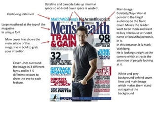
- 1. Large masthead at the top of the magazine In unique font Dateline and barcode take up minimal space so no front cover space is wasted Main cover line shows the main article of the magazine in bold to grab your attention. Main Image Celebrity/Aspirational person to the target audience on the front cover. Makes the reader want to be them and want to buy it because a trusted name or beautiful person is in it. In this instance, it is Mark Wahlberg. He is looking straight at the camera which attracts the attention of people looking at it.Cover Lines surround the image in 3 different fonts and in 4-5 different colours to draw the eye to each feature. White and grey background behind cover lines and main image which makes them stand out against the background Positioning statement
- 2. Front Cover featured small in the corner, reinforces what is in the magazine and the brand Headings for each subsection in bold along with page number Image from the page featured in bold, makes the reader want to read them and makes it easier to navigate. Splash features offer to claim something for free Articles Featured on the cover in a separate section to make navigation easy Positioning statement featured under contents
- 3. Masthead at the top of the page in a unique font Splash shows an offer to win a weekend trip, encourages someone to buy the magazine Main cover lines show the main feature of the magazineBarcode and price No text covers the front of the car as it’s the main focus of attention and catches the readers eye. A close up angle of the car has been used, the colour of the car contrasts with the background making it stand out. Other cover lines with images to illustrate other features Positioning Statement
- 4. Splash showing advert for subscription and how you can save money Front Cover easily visible to remind reader of the magazine they're reading and also the features inside Issue number and month shown at the top. Large newsworthy big picture keeps the reader interested Colour coded sections allow for easy navigation between regulars and features along as well as individual sections in each Limited range of fonts used for clarity Noteworthy feature in special box to attract the readers attention