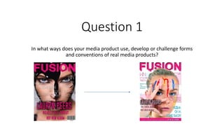
4. Masthead
• The masthead is the biggest on the page covering 1/5 of the space making
it clear to the audience that this is vocal point and name of the magazine.
Following conventions.
• This magazines target audience is girls so I chose a vibrant pink with a
shadow drop to make it stand out on the page, following the conventions.
• The text is also bold and stands out on the page in capitals and the font
also looks like its dripping paint or splattered resembling the idea of mess
and like paint parties which fits in the style of teens. Also paint is used in
the cover image to fit in with the style.
• I didn’t develop my masthead from my draft to my final cover as it fits the
genre well!
Although the background changed making a
difference and it my final cover the writing is behind
the image, the text, font, colour and size hasn’t
changed
5. Cover image
• The cover image follows conventions of
most magazines with eye contact.
Drawing direct attention to the audience.
• Also the coloured paint on the face is very
bright and bold therefore fits in with the
genre of ‘pop’, you wouldn’t see things
like this on a rock or classical music
magazine as its very spontaneous
• The image also is an up close shot so the
emotion is very clear and nothing else
drags the attention away from the face.
6. Headline
• The font for Headline follows on
with the messy paint splatter
idea. The name being in the
larger font draws attention to
the intriguing celebrity. This
follows the conventions of
music magazines of any genre.
• The strap line underneath the
name is in a smaller font as that
isn’t the attention grabbing
feature, it just informs the
audience of what’ in store.
• The head and strap line isn’t in
the center so it goes against
conventions!
7. Cover-lines
• The cover lines are in a different, neater, readable
font and same for both so they don’t look
cluttered.
• Despite both having the same font they have
different colours and effects making them quirky
and not boring!
• Following conventions they are both aligned to
they’re side and are both in block capitals.
• The bottom graphic bar is also an additional
informative add on to fill space and can be seen
like a slogan. Although conventionally the slogans
are at the top of the page with the masthead.
• My magazine follows the conventions of a music
magazine by having easy to read font. Not all
cover lines can be big, bold and colourful as it
would clash and make it difficult to read.
14. Title and date line
• The title follows the same theme as the cover with the same font
and colour. The blue date next to it also runs with the colour
scheme. Keeping the magazine aligned and neat is a convention of
any magazine to keep it readable and no too clustered/messy. In
most magazines that you come across the headline, mast head and
title are generally at the top of the page so it makes it easier for the
reader to spot when flicking through.
• A date is also very necessary as the reader needs to when the
magazine was issued so they’re keeping up to date with the latest
magazine, so this follows the conventions of magazines
15. Article Information
• The column layout is very neat
with the same format, font and
colour for each article.
• It follows the conventions of
any magazine for the
title/celebrity to be the bigger
and most stand out part of the
article description.
The font of the description
continues through the cover and
now the contents to keep it
following the same theme/idea.
The the introduction about what
will be in the articles is also very
brief so the audience don’t get
bored and not too much
information I given away.
16. Page numbers
• I chose to make the page numbers stand
out but not too bold on the page that it
looks weird and distracts away from all the
other features. The page numbers follow
with the page but still isn’t difficult to find.
• I put the numbers against coloured
squares which continue the same theme
and ideas as the rest of the contents which
as have bars:
• Graphics such as bars and shapes are
conventional to music magazines as it
makes it more visually pleasing.
17. Image
• The image isn’t the main
focus on the contents but
it still big and ambiguous
so it is still eye catching,
especially as it continues
with the same ‘painting
dripping’ theme as the
front cover but this time,
more up close and
personal.
• It is common for the main
image to take up have the
page unlike the contents
which takes up the
majority of the front
cover.
• Like the cover, the image
is often a close up.
The smaller images on my
contents page is very
conventional. These smaller
images make it more
visually pleasing for the
reader and can also be used
to correlate with the text if
my magazine is on the shelf
and the reader is looking to
quickly scan.
These images are also
between more graphics to
separate them for each
other so its not
overwhelming and makes it
easy to the eye. This is very
conventional, most
magazines have many
images in to engage the
audience.
18. Extras
Typically a contents page consists of a
editors letter. I challenged these
conventions and didn’t include an
editors letter. Despite not doing this I
did add an ‘extras’ section yet again
in a square which has become a
graphic conventional to my magazine.
25. Headline& lead in
• Yet again the headline is at the top of
the page is a different colour, font
and size to make it stand out for the
main body of text.
• Conventionally most articles include
a pull quote from the article to give
the audience a sense of what there
are about to read.
• The headline follows the same
format as the cover and contents
keeping it nice and neat following the
conventions of most magazines!
• Also I added colour in so its not as
dull against the black and white
background and image. Although the
colour isn’t very bold because of the
thin font, the shadow makes it stand
out against the rest of the text.
The lead in is yet again in the same font that runs throughout!
The text is in black as I didn’t want it to stand out as much as
it’s the lead in, not the headline. Also I kept the colour black as
its talking about shadows showing it’s a serious topic.
Additionally adding in a drop shadow makes it seem more
mysterious.
The lead in text sounds very serious and important which will
bring in the audience and make them want to read on.
26. Body of text
I put the body of text in fairly small and clear to read font.
This makes it easy to read and understand and as it’s the
main body of text it doesn’t need to be highlighted to stand
out by using whacky effects. Continuing on with the pop
colour scheme the pink and blue graphics were essential to
follow conventions of a pop music magazine.
Having the black and white background juxtaposes with the
colour and draws the attention to the text.
The layout of the text makes it easy to read rather than it
being random and scattered in lines across the page.
A recognizable convention of a music article is having a
hyperbolized capital letter to start the article with.
27. Pull Quote
• The pull quote is yet again in this same format
with a drop shadow and following the colour
scheme with the blue writing to make it stand
out!
• The text is central of the image making it
stand out even more rather than the text
being on the side of the image and of focus.
• The text itself is ne of the most dramatic lines
in the article so making it vocal with a pull
quote will make the readers want to read the
article.
• This is a convention as all magazines use there
most important and attention grabbing lines
as pull quotes.
28. Article Image
• The article image fits the idea of the
article; being serious! The image being
large and taking up most of 1 page shows
its importance compared to the other
photos in the article.
• It is typical of the article image to be
zoomed out in comparison to the cover or
contents. This is full-body shot allows the
audience to get up and personal with the
star but also step back and look at her as a
person.
• I challenged conventions of a typical
music magazine as the article image isn’t
the same as the cover or contents images.
29. Additional images
The 2 images both contrast with
the bigger full cover spread. The
screenshot of the Instagram post
makes the article feel more real
and makes the star seem more
accessible. This is common in many
magazines for the same reason.
The headshot shows a different
expression to the full body shot, yet
again showing the audience
another side to the star, Lauryn.
30. Extras
• I added these smaller details to
make the magazine seem more
realistic as these are typical
conventions of any magazine.