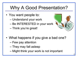
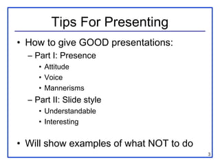
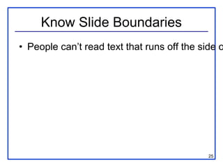
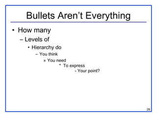
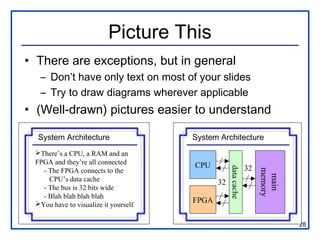
The document provides tips for giving good presentations by discussing presence, slide style, and design. It recommends engaging the audience through attitude, avoiding distracting mannerisms, using understandable and interesting slides, and designing slides that are readable from a distance with appropriate font size and limited text. Pictures and diagrams are suggested wherever applicable to help convey information more easily.
My Communication Skills instructor, Mrs. Rumessa Naqvi, gave us a lecture on how to give a presentation that is really knocks the audience out, "IN ALL THE GOOD WAYS". I noted all the points down and made this powerpoint file for the best of us all. Have a look! Boost utilitarianism.
How to give a good scientific oral presentationJosh Neufeld
This presentation outlines the basic philosophy, strategy, and skills needed to give a good scientific presentation. This talk outlines compassion, clarity, enthusiasm, preparation, and uses examples throughout.
Can you begin to wonder just how the value of your presentation is dependent upon your story and how that is portrayed? What would choose...traditional Powerpoint or the modern exciting Prezi for impact and wow factor? Check this out now to enable you to decide.......
Unconventional wisdom: Putting the WHY Before the WHAT of Presentation DesignSheila B. Robinson
This is my second slide deck on presentation design and is designed to complement (and overlap a bit) my first: Data Visualization and Information Design: One Learner's Perspective. This one is in answer to the many questions I've been getting: How do you know this stuff and where did you learn it, and WHY are there all these new rules?
Enjoy!
Since I can't embed fonts on my Mac, I had to convert to pdf. Here are the links that are no longer live in the presentation:
Slide 23: http://sethgodin.typepad.com/seths_blog/2011/10/the-atomic-powerpoint-method-of-creating-a-presentation.html
Slide 71: http://www.perceptualedge.com
http://www.perceptualedge.com/files/GraphDesignIQ.html
http://www.perceptualedge.com/examples.php
Slide 72: http://www.garrreynolds.com
http://www.garrreynolds.com/preso-tips/design/
http://www.garrreynolds.com/resources/
Slide 73: http://p2i.eval.org
http://p2i.eval.org/index.php/slide-design-guidelines/
Slide 74: http://stephanieevergreen.com
http://emeryevaluation.com
http://www.storytellingwithdata.com
An introduction to the cryptocurrency investment platform Binance Savings.Any kyc Account
Learn how to use Binance Savings to expand your bitcoin holdings. Discover how to maximize your earnings on one of the most reliable cryptocurrency exchange platforms, as well as how to earn interest on your cryptocurrency holdings and the various savings choices available.
Discover the innovative and creative projects that highlight my journey throu...dylandmeas
Discover the innovative and creative projects that highlight my journey through Full Sail University. Below, you’ll find a collection of my work showcasing my skills and expertise in digital marketing, event planning, and media production.
B2B payments are rapidly changing. Find out the 5 key questions you need to be asking yourself to be sure you are mastering B2B payments today. Learn more at www.BlueSnap.com.
Top mailing list providers in the USA.pptxJeremyPeirce1
Discover the top mailing list providers in the USA, offering targeted lists, segmentation, and analytics to optimize your marketing campaigns and drive engagement.
In the Adani-Hindenburg case, what is SEBI investigating.pptxAdani case
Adani SEBI investigation revealed that the latter had sought information from five foreign jurisdictions concerning the holdings of the firm’s foreign portfolio investors (FPIs) in relation to the alleged violations of the MPS Regulations. Nevertheless, the economic interest of the twelve FPIs based in tax haven jurisdictions still needs to be determined. The Adani Group firms classed these FPIs as public shareholders. According to Hindenburg, FPIs were used to get around regulatory standards.
LA HUG - Video Testimonials with Chynna Morgan - June 2024Lital Barkan
Have you ever heard that user-generated content or video testimonials can take your brand to the next level? We will explore how you can effectively use video testimonials to leverage and boost your sales, content strategy, and increase your CRM data.🤯
We will dig deeper into:
1. How to capture video testimonials that convert from your audience 🎥
2. How to leverage your testimonials to boost your sales 💲
3. How you can capture more CRM data to understand your audience better through video testimonials. 📊
Implicitly or explicitly all competing businesses employ a strategy to select a mix
of marketing resources. Formulating such competitive strategies fundamentally
involves recognizing relationships between elements of the marketing mix (e.g.,
price and product quality), as well as assessing competitive and market conditions
(i.e., industry structure in the language of economics).
Putting the SPARK into Virtual Training.pptxCynthia Clay
This 60-minute webinar, sponsored by Adobe, was delivered for the Training Mag Network. It explored the five elements of SPARK: Storytelling, Purpose, Action, Relationships, and Kudos. Knowing how to tell a well-structured story is key to building long-term memory. Stating a clear purpose that doesn't take away from the discovery learning process is critical. Ensuring that people move from theory to practical application is imperative. Creating strong social learning is the key to commitment and engagement. Validating and affirming participants' comments is the way to create a positive learning environment.
1. Terrible Presentations
(…and how to not give one)
Katherine Compton Mark L. Chang
Dept. of ECE Dept. of ECE
UW-Madison Olin College of Eng.
2. Why A Good Presentation?
• You want people to:
– Understand your work
– Be INTERESTED in your work
– Think you’re great!
• What happens if you give a bad one?
– Few pay attention
– They may fall asleep
– Might think your work is not important
2
3. Tips For Presenting
• How to give GOOD presentations:
– Part I: Presence
• Attitude
• Voice
• Mannerisms
– Part II: Slide style
• Understandable
• Interesting
• Will show examples of what NOT to do
3
4. Part I
• Keep audience interested
• Keep them with you
• Things that can affect this
– Topic, topic depth
– Attitude/Presence
– Mannerisms
4
5. Know Your Topic
• Be prepared to get questions!
• “What if I don’t know the answer?”
– Know WHEN to say “I don’t know”
– Know HOW to say “I don’t know”
– Don’t just stand there uncomfortably!
• Be able to recover from interruptions
• Know what to skip if you’re running late
– Don’t just talk faster!
5
6. Know Your Audience
• Do they have a background like yours?
• How much hand-holding?
• Can you jump right in to specifics?
• How much motivation for your work?
• How detailed should you get?
6
7. Know Your Location
• Need to bring a laptop?
• Need to bring a CD, or email
a PPT in advance?
• Need to print transparencies?
How far is audience from screen?
• Can you point with your hand,
or do you need a laser pointer?
7
8. Attitude. (Yours)
• Are you INTERESTED in your topic?
– If no, get a different one!
– If yes, ACT LIKE IT
• If YOU aren’t excited…
– Can’t expect OTHER people to be!
• Don’t talk down to audience
– You know more than them about THIS…
– They know more than you about other stuff
8
9. Dead Man Talking
• Are you hiding behind the podium?
• Are your hands/face motionless?
• Are you staring…
– at your advisor/boss?
– at your laptop?
– at the screen?
– at the ceiling?
• Is your back to the audience?
• IF SO… you’re probably BORING!
9
10. I Drank A Case Of Mountain Dew!
• Sometimes nerves make for fast talking
• Calm down. E-nun-see-ate.
• It’s not a race
– People need time to absorb information
• Take a bottle of water if necessary
– Bottles if you can work a cap (spillage)
– Glass if you’re using a laser pointer
10
11. Is This Thing On <tap tap>?
• Feedback kills people!
• Most PA systems are tuned so that the
microphone can be middle of your chest
– Not 2mm from your mouth
• Modulate your voice evenly
• Careful – turning head affects volume!
• If not using a mic – project your voice!
11
12. Where are your hands?
• You have a set of “moves”
that repeat during your talk
• Make sure they aren’t silly looking
– Don’t point with your middle finger
• Can videotape yourself speaking
• Do a practice for friends
– Make sure they’re not too nice
– You want real feedback! 12
13. Look Ma, I have a L-A-S-E-R!
• If necessary, get a laser pointer
– Will depend on your talk
• Get it a few weeks before your talk
– Play with it. Circle things. Make shapes.
– Be comfortable
– Get Borg impersonations out of the way
• Get a second one for backup, or make
sure session chair/host has one
13
14. Common Laser Pointer Moves
• The circle
• The underline
• The back-handed flick
• The epileptic-seizure inducer
• DO NOT POINT AT EVERYTHING
– Not everything is equally important
– Your voice can provide emphasis too
14
15. Right Here. See?
• Don’t point at your laptop screen
– They can’t see it
15
16. Ummmm… The… Uh… Yeah.
• Practice makes perfect
– Caveat: OVER practicing can be bad…
• Do not read your slides like a script
• Most people lose 20 IQ points in front of
an audience
16
17. Part II: Slide Design
• Goals:
– Convey the necessary information
– Be readable/understandable
– Be interesting (enough)
• Avoid:
– Over stimulation
– Booooring
17
18. Logos
• We know you had support
• Don’t need to list all of them every slide
• If on first slide, don’t obscure
title/authors
• Maybe save it for last slide
18
19. Outline
• Title Slide
• Introduction
• Outline
• My Work
• Results
• Conclusions
19
20. Outline Slides
• Previous slide didn’t “help” audience
• If use outline slide, make it USEFUL
– Everyone (hopefully) introduces their topic
– Everyone explains their work, gives results
– What is specific to YOUR talk?
• Talk length correlates to outline need
– Talk is 45 minutes, maybe!
– Talk is 5 minutes… probably not.
20
21. README.TXT
• Do not attempt to put all the text, code, or explanation of what you are talking
about directly onto the slide, especially if it consists of full, long sentences. Or
paragraphs. There’s no place for paragraphs on slides. If you have complete
sentences, you can probably take something out.
• If you do that, you will have too much stuff to read on the slide, which isn’t always
a good thing.
• Like the previous slide, people do not really read all the stuff on the slides.
– That’s why it’s called a “presentation” and not “a reading” of your work
• Practice makes perfect, which is what gets you away from having to have all of
you “notes” in textual form on the screen in front of you.
• Utilize the Notes function of PowerPoint, have them printed out for your reference.
– The audience doesn’t need to hear the exact same thing that you are reading to them.
– The bullet points are simply talking points and should attempt to summarize the big
ideas that you are trying to convey
• If you’ve reached anything less than 18 point font, for God’s sake, please:
– Remove some of the text
– Split up the text and put it on separate slides
– Perhaps you are trying to do much in this one slide?
• Reading a slide is annoying.
• You should not simply be a text-to-speech converter.
21
22. Font Size
• You are close to your monitor
• Your audience is far from the screen
Tahoma TNR Courier Comic Lucida Sans
32 pt 32 pt 32 pt 32 pt 32 pt
28 pt 28 pt 28 pt 28 pt 28 pt
24 pt 24 pt 24 pt 24 pt 24 pt
20 pt 20 pt 20 pt 20 pt 20 pt
18 pt 18 pt 18 pt 18 pt 18 pt
16 pt 16 pt 16 pt 16 pt 16 pt
14 pt 14 pt 14 pt 14 pt 14 pt
12 pt 12 pt 12 pt 12 pt 12 pt
10 pt 10 pt 10 pt 10 pt 10 pt
22
23. Squint City
• If you find yourself saying “you probably
can’t read/see this, but…”
– Then you probably have a BAD SLIDE!
– There are exceptions, but very few
• Test on real screen in conference room
– Not just your computer screen 15” away.
23
24. This is a really long title for this
single slide, I should have just
summarized
• Hard to read
• Many people don’t read the title anyway
• Should have been “Long Slide Titles”
24
26. Bullets Aren’t Everything
• How many
– Levels of
• Hierarchy do
– You think
» You need
* To express
- Your point?
26
27. Speelchick
• How samrt will poeple thikn yuo are?
• Watch for:
– there/their/they’re
– too/to/two
– its/it’s
27
28. Picture This
• There are exceptions, but in general
– Don’t have only text on most of your slides
– Try to draw diagrams wherever applicable
• (Well-drawn) pictures easier to understand
System Architecture System Architecture
There’s a CPU, a RAM and an
FPGA and they’re all connected CPU
data cache
32
memory
- The FPGA connects to the
main
CPU’s data cache 32
- The bus is 32 bits wide
- Blah blah blah blah
You have to visualize it yourself FPGA
28
29. Example Diagrams
wwwwwwwwwww
wwwwwwwwwww
wwwwwwwww
wwwwwwwwwwwwwww
wwwwwwwwww
wwwwwwwwwwwwww
w
wwwwwwwwwwwwwww
wwwwwwwwww
wwwwwwwwwwwww
wwwwwwwwwwwwww
wwwwwwwwww
wwwwww
wwwwwwwwwwwww
w
w
Source code FPGA
• Compute-intensive sections on hardware
• Hardware reconfigured for each
29
30. Example Diagrams
wwwwwwwwwww
wwwwwwwwwww
wwwwwwwww
wwwwwwwwwwwwwww
wwwwwwwwww
wwwwwwwwwwwwww
w
wwwwwwwwwwwwwww
wwwwwwwwww
wwwwwwwwwwwww
wwwwwwwwwwwwww
wwwwwwwwww
wwwwww
wwwwwwwwwwwww
w
w
Source code FPGA
• Compute-intensive sections on hardware
• Hardware reconfigured for each
30
31. You are not Pixar Studios
• Previous slide(s) used “animation”…
Animation Use it sparingly
Can
(it can be annoying)
Be Very
Distracting
• Use only where it is USEFUL
• Know if presentation system will handle
– Different versions of PowerPoint, Macs, etc.
• Or use multiple slides to safely animate 31
32. Line ‘Em Up
• This is a bad drawing
• Put in some effort
FPGA
CPU
32
38. The Art of Suspense
• Don’t
• Be
• A
• Tease
38
39. Anticipatory Lecturing
• Don’t Be A Tease
• Let the audience think at their own pace
• It only provides benefit if there’s a
“surprise” result
39
40. Mommy, my eyes are burning!
• Can you look at this for 45 minutes?
• Colors look different on every LCD
projector
• Colors look different between
transparencies and projector
• Side note: if printing slides, may want to
choose white background to save ink!
40
41. I See A Ghost
• More contrast on monitor than projector
• Different projectors == different results
• Colors to avoid with white are:
– Light Green
– Light Blue
Usually can’t read this…
– Pale Yellow
• Your slides should have good contrast
41
42. Contrast Guidelines
• White background, black text is clearest
– Can use other (dark) text colors…
– But be careful -- don’t be distracting!
• Make sure to not use light-on-white or
white-on-light
• Don’t using glaring colors
– If not an art major, don’t have to get fancy
42
44. Keep It Simple
• Do you really need all those equations?
– This is very instance-dependent!
– Depends on what you’re discussing
– Depends on your audience
• Sometimes you may need them
– Explain the variables and what they mean
– Give a “plain-text” description of it
• If you don’t need them, don’t use them!
44
45. Use Simple Examples
• This isn’t one. It doesn’t help.
BB D N l g
h B
A a FF EE HH
q V o c
GG F E H n
DD VV
YY
R p II m
NN h K KK JJ
Y OO k
CC L I
t J
O TT QQ
C X
LL f Q PP ZZ
M MM P Z RR XX x r
y T u SS
d z G WW
w UU
S W s v
b AA U e j
45
49. Summary/Conclusion
• If your talk is more than 5 minutes, nice
to summarize work & results
– Bring people back if they zoned out
– Remind them why you’re great
• Give “selling” points here
– 30x performance increase with only 10%
area penalty
– Described novel method to create clean fuel
from used cat litter
49
50. Bad Presentations
• Audience won’t see your work is great
• But will make fun of you from back row
Those are What does that
some NASTY slide say?
colors… Dunno, I’m playing
Hey – it
minesweeper
Please let it matches my tie.
zz
be OVER… z
50
51. Good Presentations
• Interesting topic, explained at audience’s level
• Slides are understandable and easy to see
• Good presentations reflect well on speaker!
I wonder if this I understood
technique would this one!
work for my problem You should
with a PhD…
Let’s talk to them
But it’s outside
I never thought at the break Interesting my main area
of that!
51