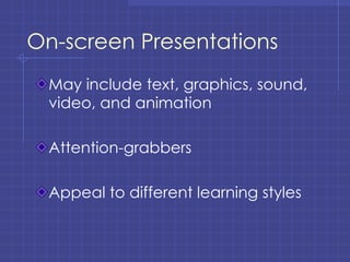
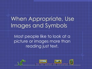
PowerPoint  Effective Classroom Presentations
How can PowerPoint be effectively used in the classroom?
On-screen Presentations May include text, graphics, sound, video, and animation Attention-grabbers Appeal to different learning styles
Handouts Can be printed 1, 2, 3, or 6 slides per page Students spend less time taking notes and more learning the material Presenter has more time to discuss and explain
Outline View The slide presentation can be printed in outline form, giving the speaker an easy-to-follow lecture outline with notes.
Notes View A place to write detailed information Question prompts Cues or reminders for learning activity
Designing Effective PowerPoint Presentations
Consider the Audience Is it appropriate for the majority of your students? Is it appropriate for the subject matter?
Be Consistent This creates an orderly look to the presentation
Tips Summarize the point of each slide Confine each slide to a single point Include only key points
The KISS Rule K eep  I t  S imple  S tupid
Tips Select one orientation (vertical or horizontal)and stick with it. Don’t change background or color schemes between slides except for emphasis.
Avoid Excessive Use of: Unrelated image or illustrations Overpowering  or illegible  colors Obnoxious special effects
Also, Avoid Fancy Borders Borders should frame the message, not overpower it.
Use Short Phrases Long sentences or paragraphs are unsuitable and, to the audience, unreadable.  They also take away from the flow of you presentation and keep your students struggling to read rather than listening and participating. The details should be part of the discussion, not the presentation.  The presentation should be used more like an outline or springboard for discussion.
Use Short Phrases Long sentences or paragraphs are unsuitable. Use the presentation as a springboard for discussion. 3 to 5 bullets per slide
Avoid Static Balance and Excessive Symmetry Keep the audience’s eyes moving around the screen.
The KILL Rule K eep  i t  L arge and  L egible
Text Size Choose a font size that is at least  24 point This is 40 point Century Gothic
Tips Use Upper and Lower Case Letters (ALL CAPS IS HARDER TO READ THAN MIXED)
Tips Don’t   use   too  many   typefaces Sans serif fonts such as Arial or Helvetica are most readable Use  Italics  sparingly
Using Color Effectively Use colors, especially  red , sparingly. Use contrasting colors, but limit the number of colors used.
Tips:  Best Color Combinations White letter on dark blue or black Yellow  on dark blue or black Black or dark blue on white Black or dark blue on pale gray, yellow
Contrast Text with Background Be sure to contrast between lightness and darkness of text color and background No white text on a white background
When Appropriate, Use Images and Symbols Most people like to look at a picture or images more than reading just text.
Graphics Should Support the Presented Concept Supporting charts and graphs Appropriate clip-art Relevant photos
Multimedia Can Be Movies Animation Sounds
But… Only use them if they contribute to effective communication of ideas.
Questions to Ask Yourself: Is it monotonous? Is it unified? Is color used indiscriminately? Do some areas seem to be “in competition” with others as to their importance?
Questions to Ask Yourself: Is the presentation balanced, but not static? Are the shapes of the text on the slides too near the same size? Does the presentation look hurried in preparation?

Power pointws

  • 1.
    PowerPoint EffectiveClassroom Presentations
  • 2.
    How can PowerPointbe effectively used in the classroom?
  • 3.
    On-screen Presentations Mayinclude text, graphics, sound, video, and animation Attention-grabbers Appeal to different learning styles
  • 4.
    Handouts Can beprinted 1, 2, 3, or 6 slides per page Students spend less time taking notes and more learning the material Presenter has more time to discuss and explain
  • 5.
    Outline View Theslide presentation can be printed in outline form, giving the speaker an easy-to-follow lecture outline with notes.
  • 6.
    Notes View Aplace to write detailed information Question prompts Cues or reminders for learning activity
  • 7.
  • 8.
    Consider the AudienceIs it appropriate for the majority of your students? Is it appropriate for the subject matter?
  • 9.
    Be Consistent Thiscreates an orderly look to the presentation
  • 10.
    Tips Summarize thepoint of each slide Confine each slide to a single point Include only key points
  • 11.
    The KISS RuleK eep I t S imple S tupid
  • 12.
    Tips Select oneorientation (vertical or horizontal)and stick with it. Don’t change background or color schemes between slides except for emphasis.
  • 13.
    Avoid Excessive Useof: Unrelated image or illustrations Overpowering or illegible colors Obnoxious special effects
  • 14.
    Also, Avoid FancyBorders Borders should frame the message, not overpower it.
  • 15.
    Use Short PhrasesLong sentences or paragraphs are unsuitable and, to the audience, unreadable. They also take away from the flow of you presentation and keep your students struggling to read rather than listening and participating. The details should be part of the discussion, not the presentation. The presentation should be used more like an outline or springboard for discussion.
  • 16.
    Use Short PhrasesLong sentences or paragraphs are unsuitable. Use the presentation as a springboard for discussion. 3 to 5 bullets per slide
  • 17.
    Avoid Static Balanceand Excessive Symmetry Keep the audience’s eyes moving around the screen.
  • 18.
    The KILL RuleK eep i t L arge and L egible
  • 19.
    Text Size Choosea font size that is at least 24 point This is 40 point Century Gothic
  • 20.
    Tips Use Upperand Lower Case Letters (ALL CAPS IS HARDER TO READ THAN MIXED)
  • 21.
    Tips Don’t use too many typefaces Sans serif fonts such as Arial or Helvetica are most readable Use Italics sparingly
  • 22.
    Using Color EffectivelyUse colors, especially red , sparingly. Use contrasting colors, but limit the number of colors used.
  • 23.
    Tips: BestColor Combinations White letter on dark blue or black Yellow on dark blue or black Black or dark blue on white Black or dark blue on pale gray, yellow
  • 24.
    Contrast Text withBackground Be sure to contrast between lightness and darkness of text color and background No white text on a white background
  • 25.
    When Appropriate, UseImages and Symbols Most people like to look at a picture or images more than reading just text.
  • 26.
    Graphics Should Supportthe Presented Concept Supporting charts and graphs Appropriate clip-art Relevant photos
  • 27.
    Multimedia Can BeMovies Animation Sounds
  • 28.
    But… Only usethem if they contribute to effective communication of ideas.
  • 29.
    Questions to AskYourself: Is it monotonous? Is it unified? Is color used indiscriminately? Do some areas seem to be “in competition” with others as to their importance?
  • 30.
    Questions to AskYourself: Is the presentation balanced, but not static? Are the shapes of the text on the slides too near the same size? Does the presentation look hurried in preparation?